An Egg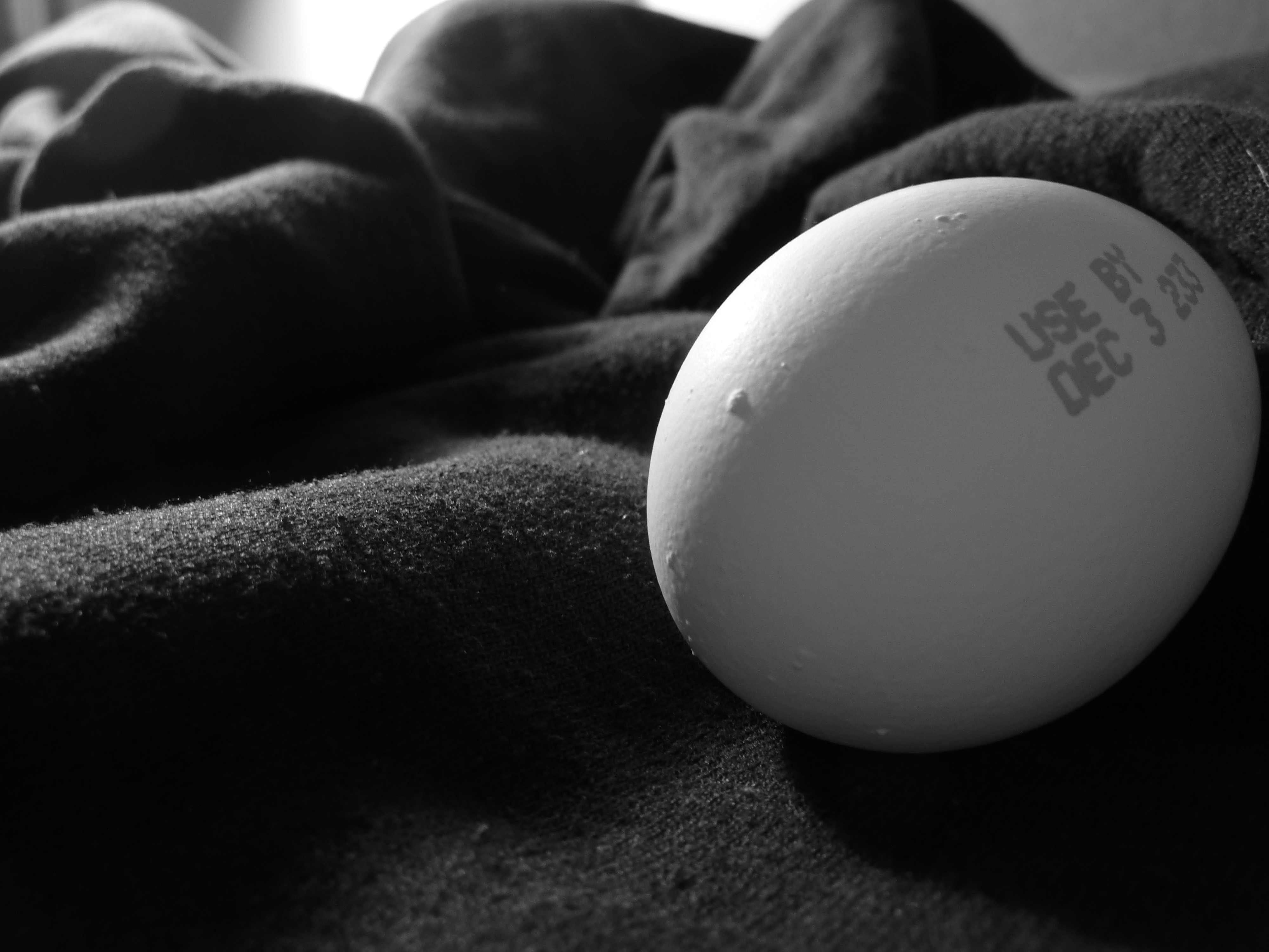
I selected this photo because I liked the interaction between foreground and background. I al had been messing around with the aperture, and I was excited I could get a shallow depth of field so the egg was in focus, but it got fuzzy in the back. I also messed around with lighting so that the egg didn't look like a flat white circle and you could see some of the the imperfections along the surface. Overall I like my composition, but I wish the egg was more in the bottom third of the picture so it balanced the lighter section in the top left more. I found it challenging to get the contrast I wanted without making any one particular part of the picture too tonally flat.
A Landscape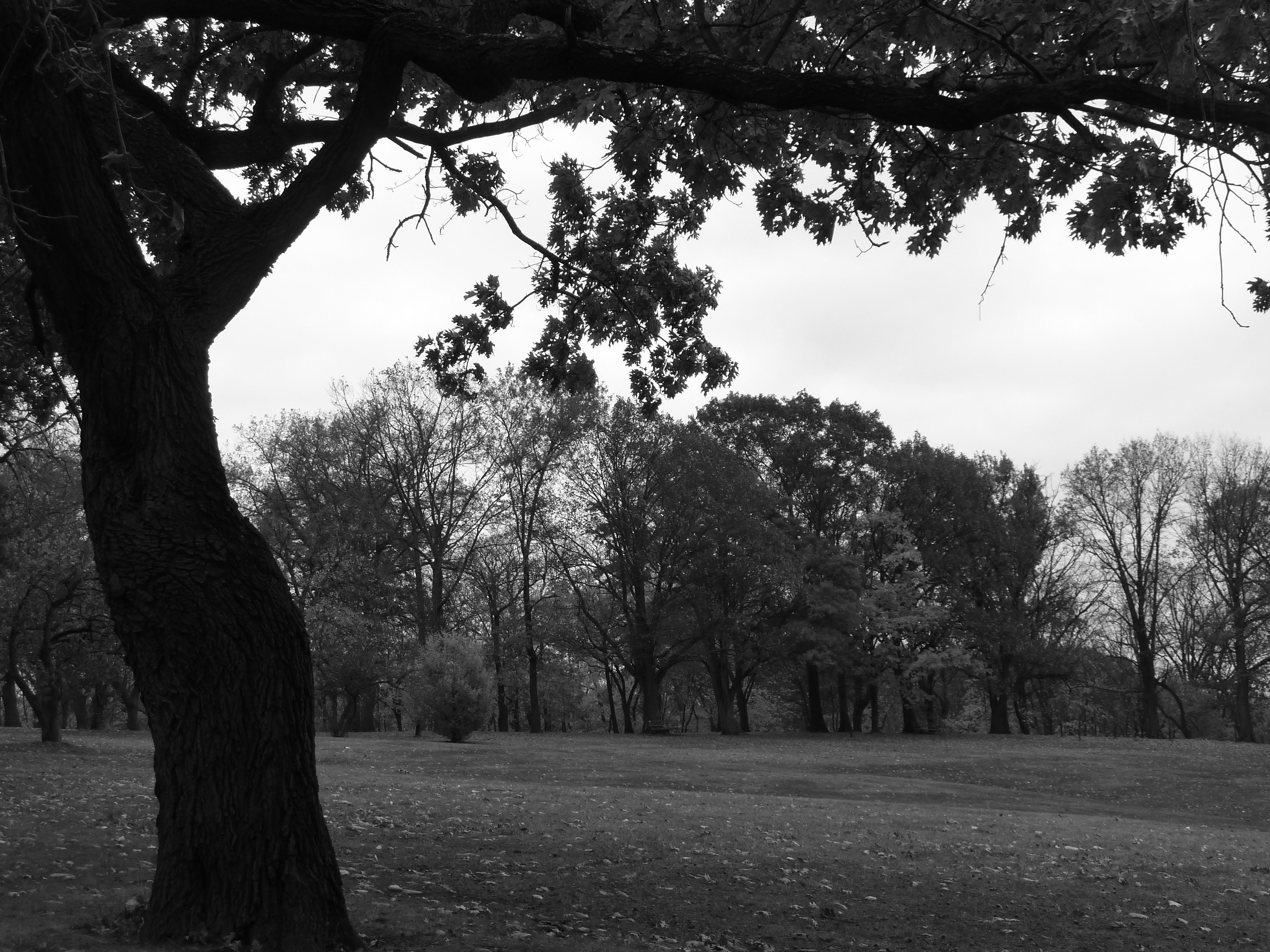
I spent a lot of time wandering around trying to find a scene that I felt could fit into a single frame. Often I found that I needed a higher or lower vantage point than I could easily achieve. Overall though, I was fairly happy that I found this tree, because I liked that the trunk could split the frame vertically while the branches cam a crossed horizontally. I wish that I have gotten 4 feet higher though, so that there was more branches in the photo. I also feel like the right side of the picture is a little unbalanced because of the strong presence o the dark tree in the foreground, but I am unsure how I could have framed it differently to create a better balanced picture. I think that if there was something else that was a similar density or darkness as the tree that may have provided more balance.
A man made object or structure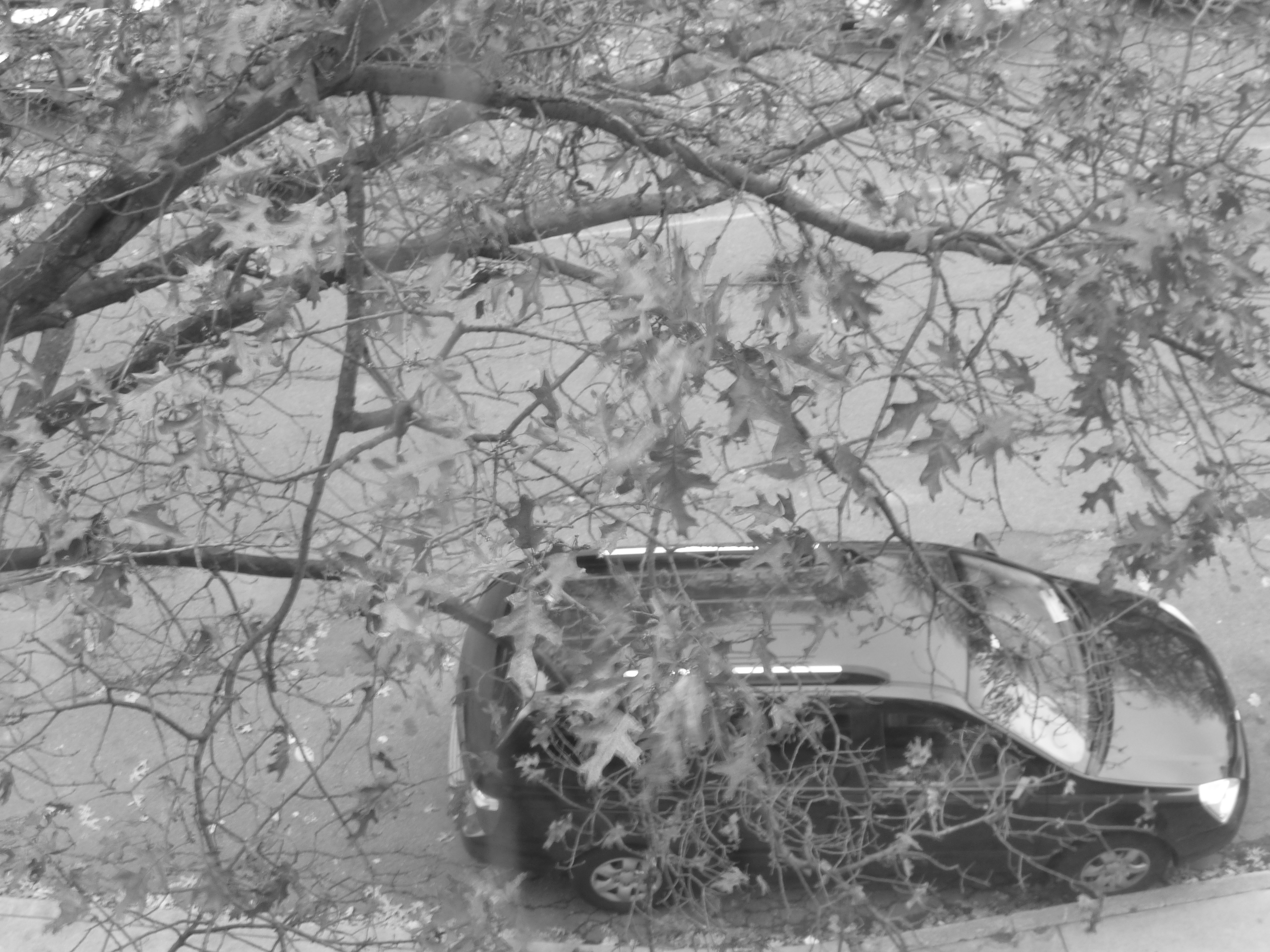
Overall, I found this one of the harder pictures to take. I wanted to get a car from a different angle than we normally see it, and I liked that from one of the windows I found I could see the car through the branches of the tree. I felt that the tree could fill some of the negative space that I had in my other pictures. I liked having the car not fill the entire frame, because then I feel like you get a feeling of motion since the car is trying to travel in your minds eye out of the picture or towards the center. I wish that I had tried to take a picture with a longer shutter speed so that some of the darker colors came out more. As it is I feel like it is a little underexposed and there isn't a lot of contrast between the lights and darks. I think with more exposure the branches and the car would be ore defined and that might separate it from the pavement, adding some depth to the picture. My cars also kept driving away, so that was frustrating.
The human body in motion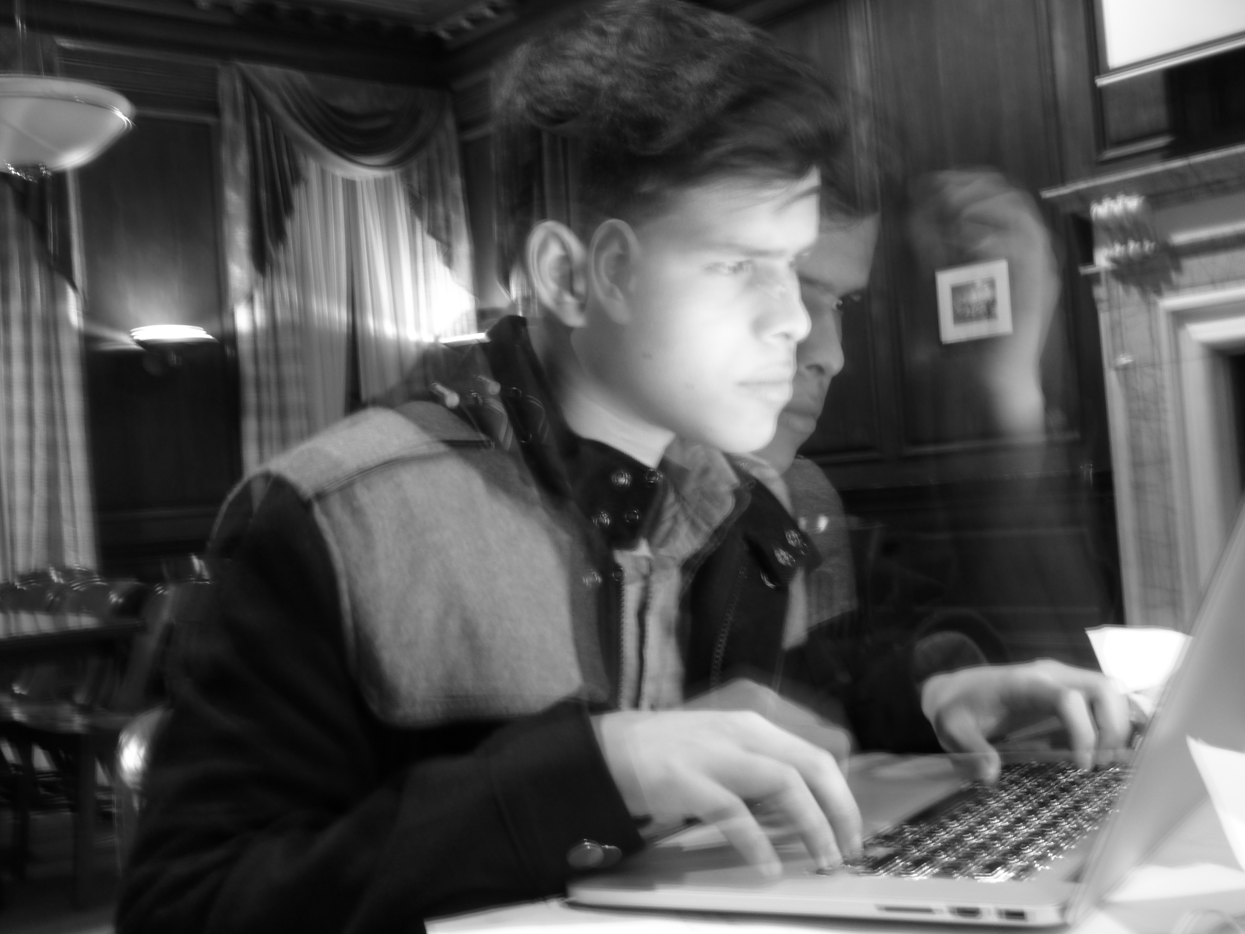
I ended up with this picture by accident when I was trying to get the human emotion shot, I was messing around with shutter speed and ended up taking a really long exposure. My subject wasn't really paying attention, and as a result, I ended up with a shadow image. When I tried to replicate this process later, it didn't work as well, and as a result, I liked this one the most. I think you can get a sense of motion more easily when there is more clearly defined stages. Other images just looked like a lot of blurry lines, but since you get a sense of two different positions in this picture, your mind can create a story connecting the two. So overall I found it wasn't necessary to capture a lot of motion, just capture two moments with motion in between, since the human mind puts in the rest. Overall, I really wish I had been able to replicate this process, but I think when I was trying to recreate it, I was shooting in areas with too much light, so that everything became very washed out. As it is, I think that his face is a little too light, but the rest of it I like. I wish in terms of composition he was less centered and more towards the left had side with the computer in the right, but I feel like the lamp helps to balance out the lightness of the table a little.
A human emotion (anxious)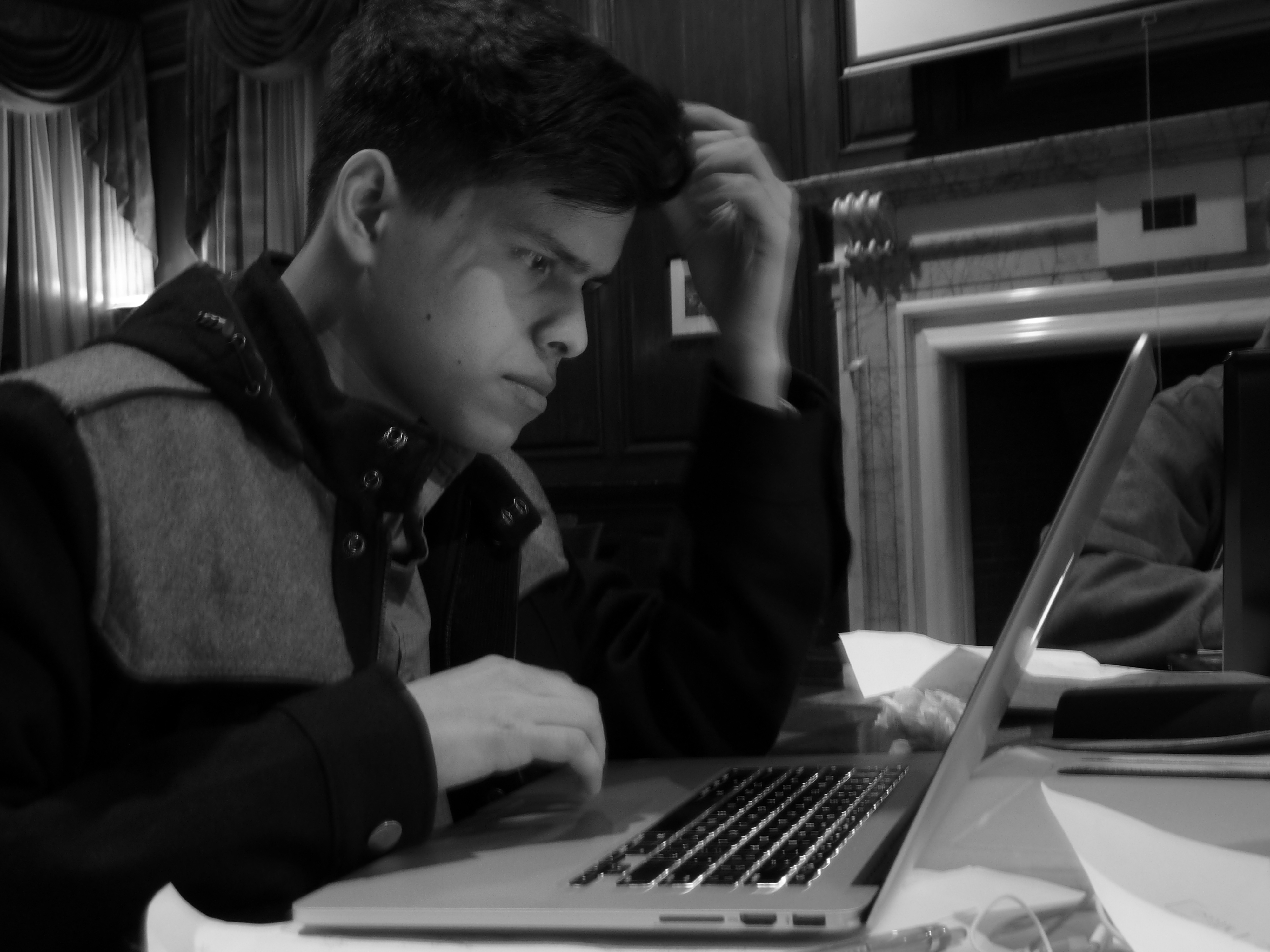
I decided on this composition because his gaze in the top left draws the reader further into the picture towards the computer. I think the brightness of paper in the bottom right is of set by the lamp over his shoulder without detracting the viewer away from the main subject. I think the picture is a little dark, but that might add to the feeling of anxiety and concentration. I couldn't increase the aperture any more due to limitations on my camera, and I felt that the shutter speed was already to slow, since you can see blurring n his hand. If I had either a camera with more options or some other source of light I think I might have been able to decrease the blurring. Perhaps then I would have felt that a brighter picture would have felt less dark, but it would be nice to be able to compare the feelings between a bigger variety of pictures.
Content Rating
Is this a good/useful/informative piece of content to include in the project? Have your say!
You must login before you can post a comment. .