I will focus on the amount of time spent on email sites, either reading or writing email, because those are the two main activities that take time when dealing with email. I want to bring attention to the amount of time I spend looking at email, and cut down that time.
I will add an app or software that detects when I am logged into an email site and am actively reading or writing email by scrolling through email, clicking and dragging email, or typing in a new composition. If I am scrolling or clicking and dragging, it will be logged as reading email, and actively typing will be logged as writing email. If you are logged in and not active for two minutes by not scrolling, clicking, or typing, the timer will stop recording until I am active again in order to avoid counting dead time where I am logged into my email but not actively paying attention to it.
I will present these streams as a large series of bars on a graph over the axis of time, measured in days. Each bar will be composed of two sections in differing colors or tones, which are blue for reading email and orange for writing email, respectively. These colors are complementary and together do not have any connotations of "good and bad" that red and green might. Together they will create the bar that will measure total minutes on email sites daily. I am organizing the presentation this way because, as the goal is to decrease email management time, the bars will hopefully become shorter over time and this kind of bar graph will make it easy to see change in behavior over time. 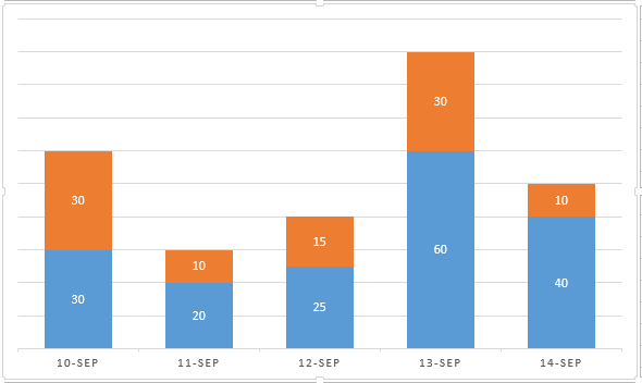
This incorporates the Tufte's Principles of Graphical Excellence by being multidimensional; the graph incorporates day, time spent, and what the time was spent on while organizing email.
It also incorporates the principal of presenting the data as accurately as possible. As a computer will be logging the time spent on the computer, it will be as accurate as possible within the scope of irregular human behavior and dead logged-in time. Even with that variable, the computer-logged data will be consistent each day within that instruction. In order to compensate for Viegas' Forceful Point of View, I tried to keep my data and its presentation as neutral as possible, by taking the time recorded by a computer and inputting it directly into a graph. However it is possible that on certain days I switched back and forth from my email to other programs and confused the timer, and it is also possible that the graph created can be skewed in order to make a pattern more apparent than it is in actuality.
My graphical data representation also relates to Laurie Frick’s Data Art, which makes a graphical representation of personal data. In my case, my data is personal time spent checking email, instead of taking a census of a large group of people.
Along the line of Viegas' Forceful Point of View, my work can be interpreted like Lozano-Hemmer: Pulse Room. The room is interpretive by taking one “representative” data sample of a person and incorporating it into the art. My graphical representation takes one representative time slice of my day, answering email, and the graphical representation of it interprets that data into bars that can be interpreted by how long the bar is. The longer the bar, the busier I possibly am in the rest of my life, as email have that correlation. However, because there is only one representative data slice, it is impossible to be completely sure, much like even though some light bulbs are flashing faster than others, it is impossible to decipher what emotion each participant was feeling at the time of data collection.
My graphical representation also incorporates ideas from Andrew Blauveit's Strangely Familiar, by creating a graphical representation design in order to incorporate data from everyday life and rethinking it in the context of data and graphs instead of actual tasks and physical objects. By taking the time to think about the everyday and bland tasks that we all do, it focuses the attention on what it is we do and what it is we want to do, and whether or not they are the same.
Content Rating
Is this a good/useful/informative piece of content to include in the project? Have your say!
You must login before you can post a comment. .