Thoughts:
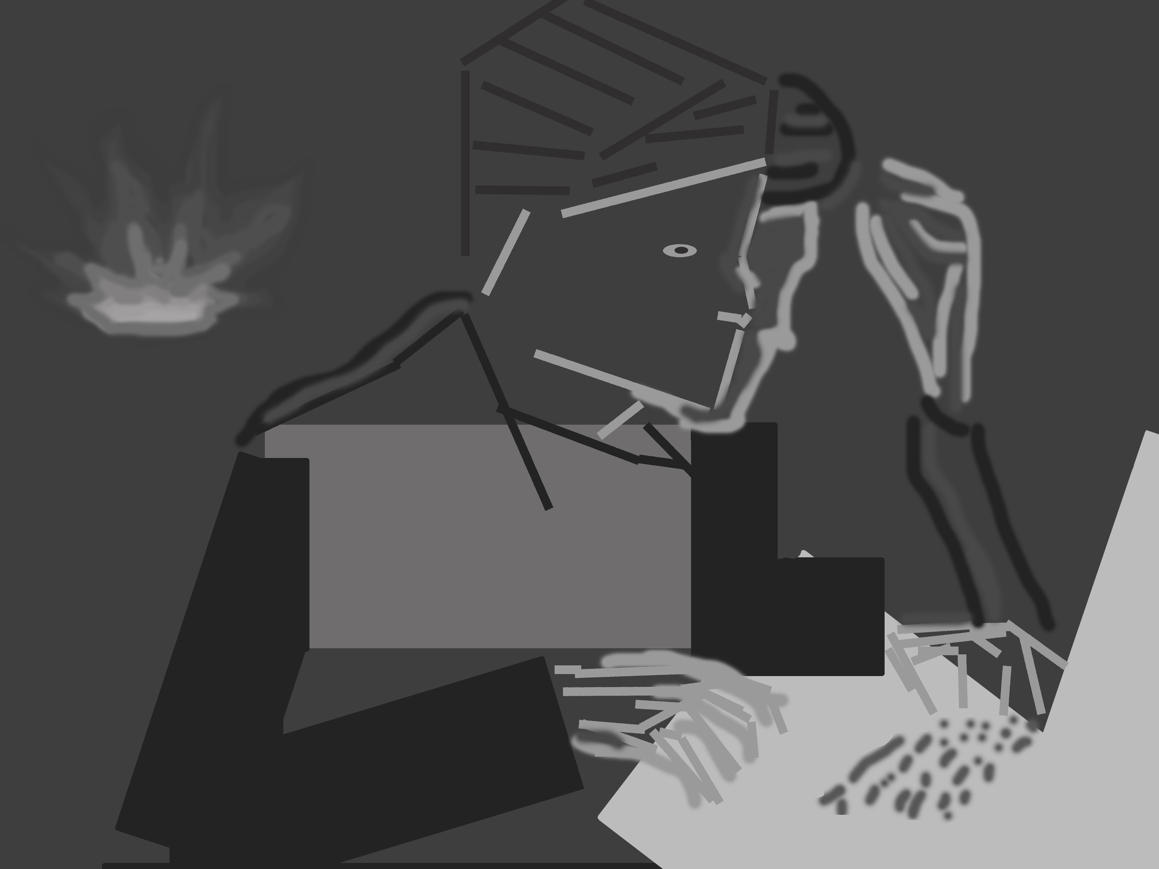
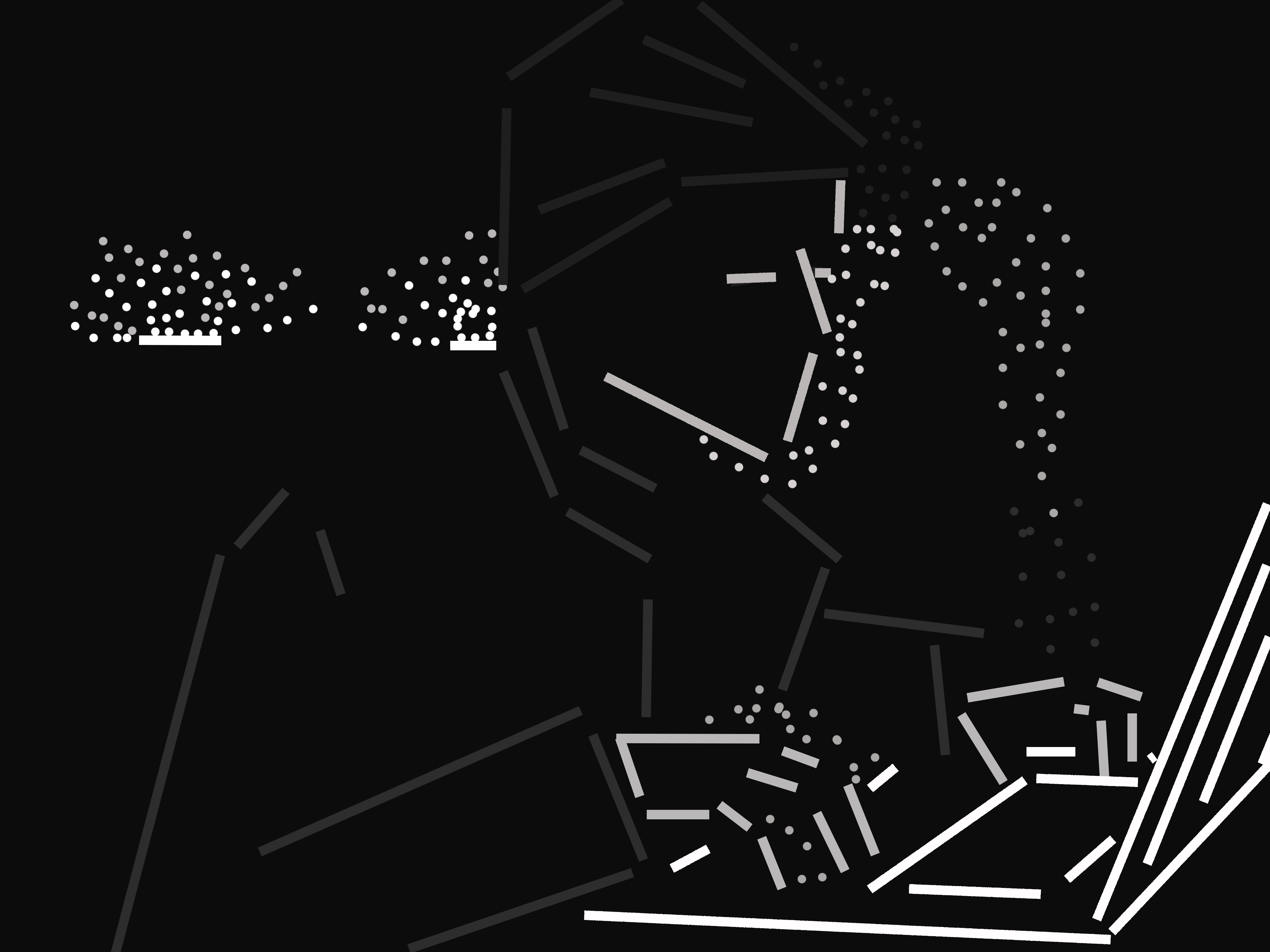
I tried to balance the lightness of the balance with the brightness of the light in the left hand corner. I think between the two different compositions, I struggled with finding a good range of tones for the piece. In the first I think that My colors were all too dark or too light, leaving it hard to distinguish between some shades and overall contributing to a visually confusing piece. In the second composition, I think all of my tones are clustered too close to one another in the middle, making it hard to determine the focal point of the image. Also the contrast between the hard lines and soft lines, while I intended them to show movement, I think ended up making the soft lines seem very out of place in the composition overall. Perhaps if these lines weren't quite as soft they might have blended in better.

Content Rating
Is this a good/useful/informative piece of content to include in the project? Have your say!
You must login before you can post a comment. .