
Thoughts:
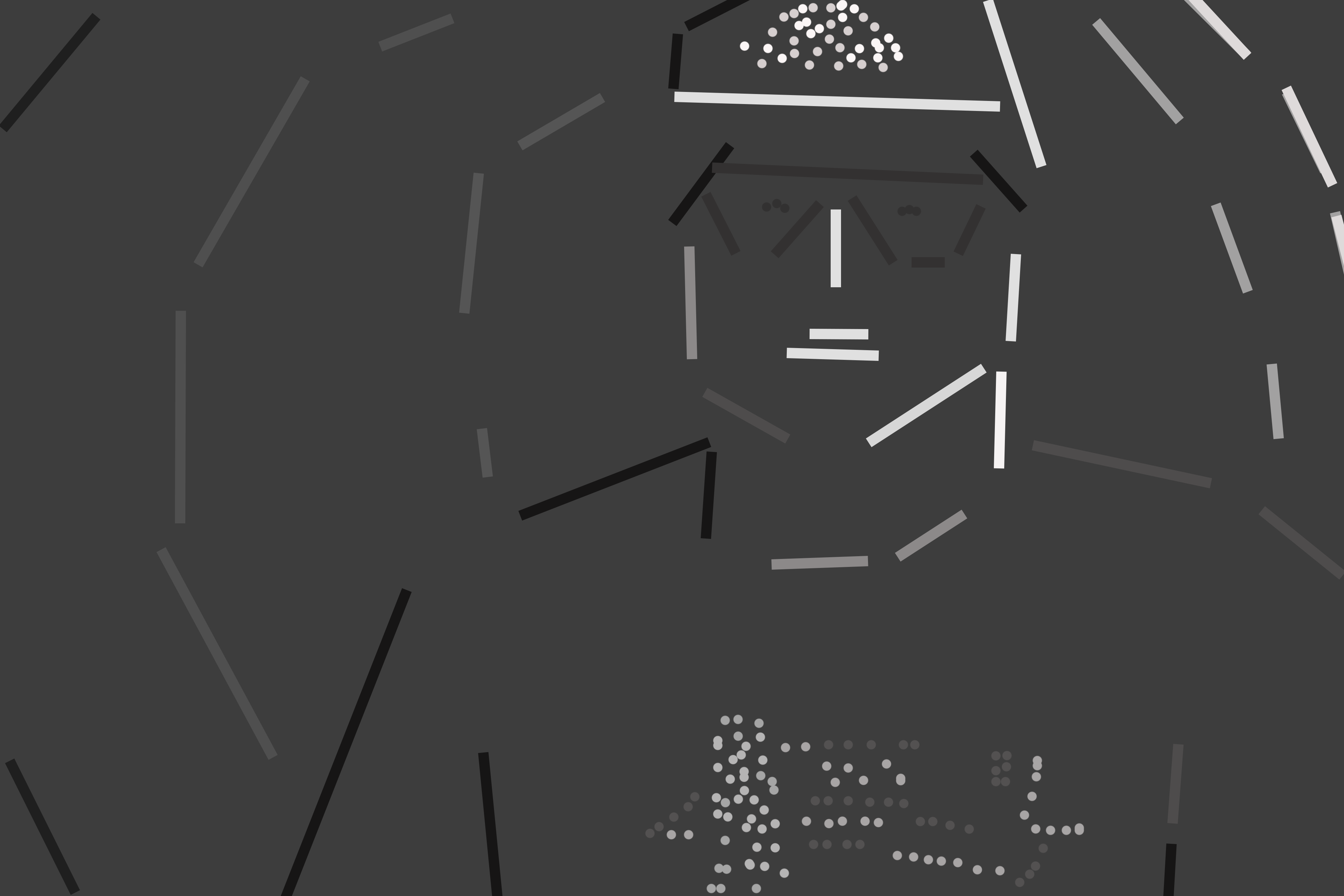
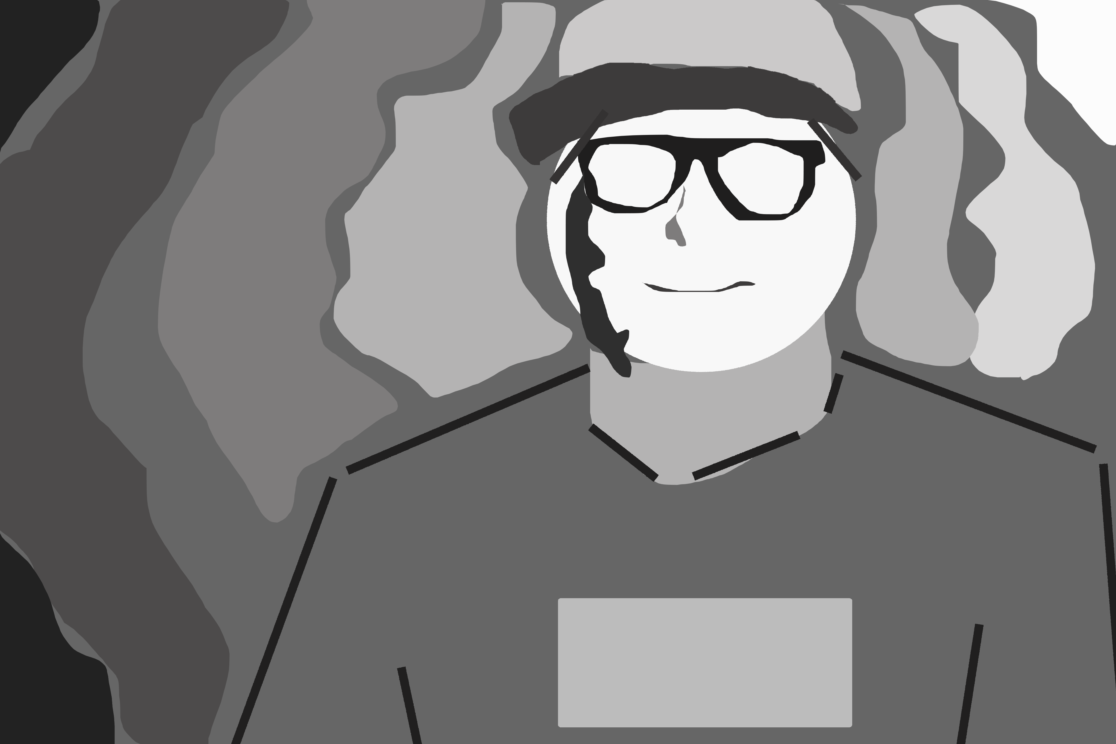
I think the second piece of these two captures the intent of the original photo much better than the first. While the first gives a general impression of the photograph, there is little distinction in tones to create a feeling or emotion in the viewer(for me). I think the variety in the second piece, between hard lines and flowing shapes are diverse enough to engage the audience and draw the viewers eye to the lightest part of the piece, the face. I think then it is easy to see the quiet joy apparent in the original picture.
Content Rating
Is this a good/useful/informative piece of content to include in the project? Have your say!
You must login before you can post a comment. .