The phenomenon I have chosen to address is that of a comedy performance. Comedians often do the same set many times, but change various aspects of it (such as timing, delivery, etc.) until it is perfected. The process of improving a set is hard because analyzing audience reactions accurately while simultaneously performing is overwhelming, and filming and re-watching all performances is a time consuming and inherently flawed method of analysis. As someone who has worked alongside various comedians and has been unable to give them useful advice on changes in their sets, I know that this a process that could be significantly improved upon. If given accurate data after each performance, comedians would be able to quickly and accurately workshop theirs sets in a way that would be nearly impossible to do otherwise.
In comedy shows, it is relatively easy to judge an audiences reaction because it is mainly based in the amount of laughter that they elicit. Therefore, the data stream I will record is sound, which will then be analyzed based on its volume. This will embody a “forceful point of view” because there is no disputing the data - all the information you need is right in the sound waves. The performance will be recorded from the comedian’s cell phone, which is given to a friend in the audience or placed somewhere facing the audience. Before the performance, the comedian will attach a small device with a button on it around their mic. As soon as they starts each joke, they will press the button, sending a signal to the phone to partition the audio into each joke of the act. After the set is over, the comedian will input the size of the venue into the application on the phone so the data can be analyzed accordingly.
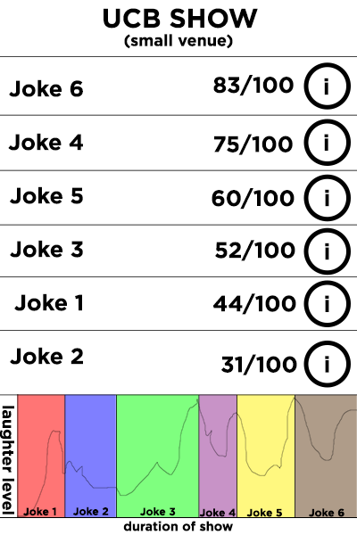
The comedian can see which jokes went over the best in any particular show, and can also see which version of each joke was best received. Audio clips of the jokes can be heard so that the comedian can note the differences between each delivery. Using this data, a comedian can pick the best version of each joke and have optimal sets each time they perform.
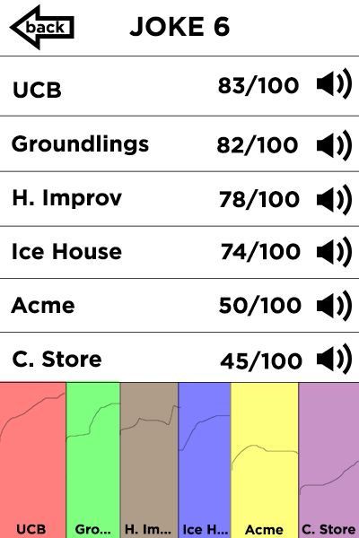
This application incorporates Tuft’s principles of graphical excellence in many ways. I decided to display the sound in wave lengths because it presents a list of numbers in an easy to read, “small space” (Tufte, 2). On the screen where different versions of the same joke are compared, the eye is encouraged "to compare different pieces of data" - the wave pattern of each of the versions, and use that data to help improve the delivery of the joke (Tufte, 2). Looking at the "Time-Series" plot on page 28 of the Tufte reading, I realized that graphing the sound over time is the best way to represent my data. In "Visualizing Natural and Cultural Phenomena," a visualization called "History Flow" was presented. The graph was color coded, and I decided to use that idea in my project.
I did not receive Thursday's email, so I was not prepared to present an idea to my group on Friday, but they gave me a lot of inspiration. After I came up with this idea, I met with Jeremy Sonpar, who helped me workshop this project until I was confident that the right data would be collected and displayed in the best possible manner.
Content Rating
Is this a good/useful/informative piece of content to include in the project? Have your say!
You must login before you can post a comment. .