Intention
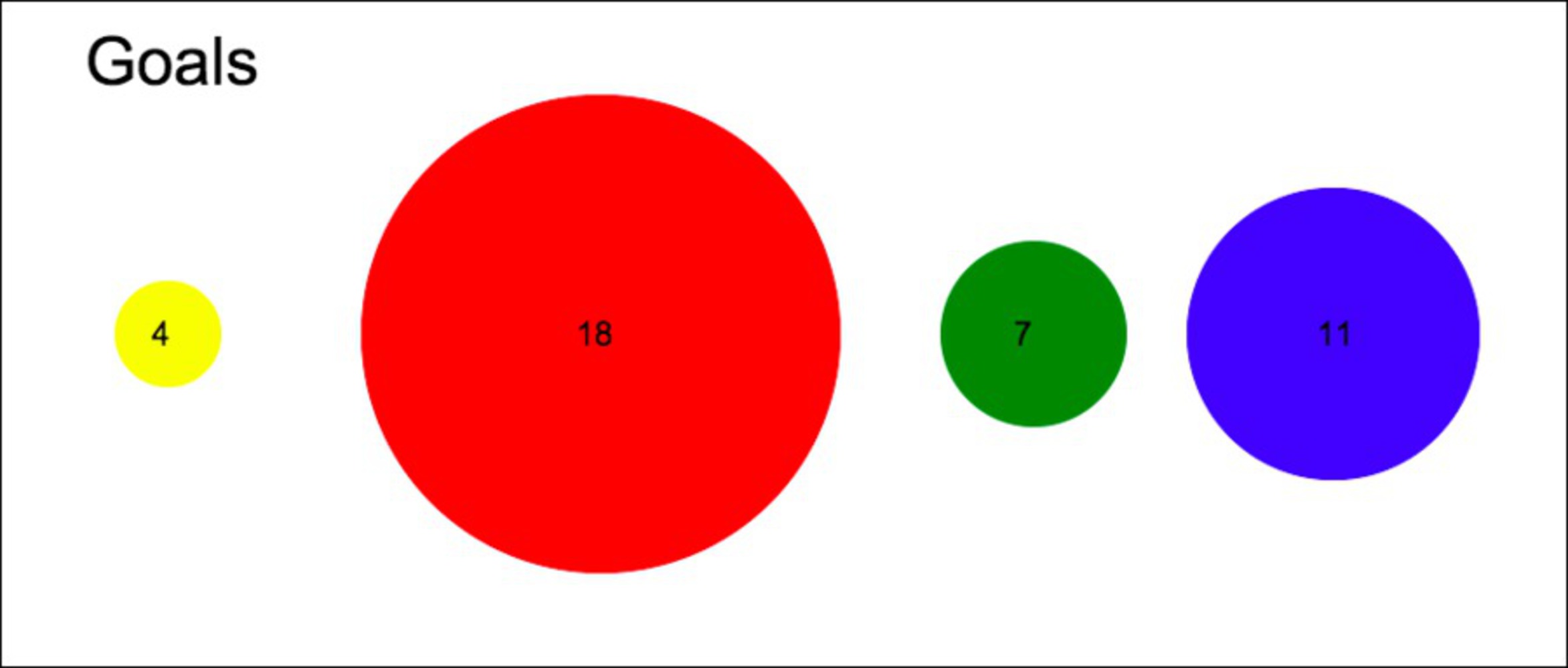
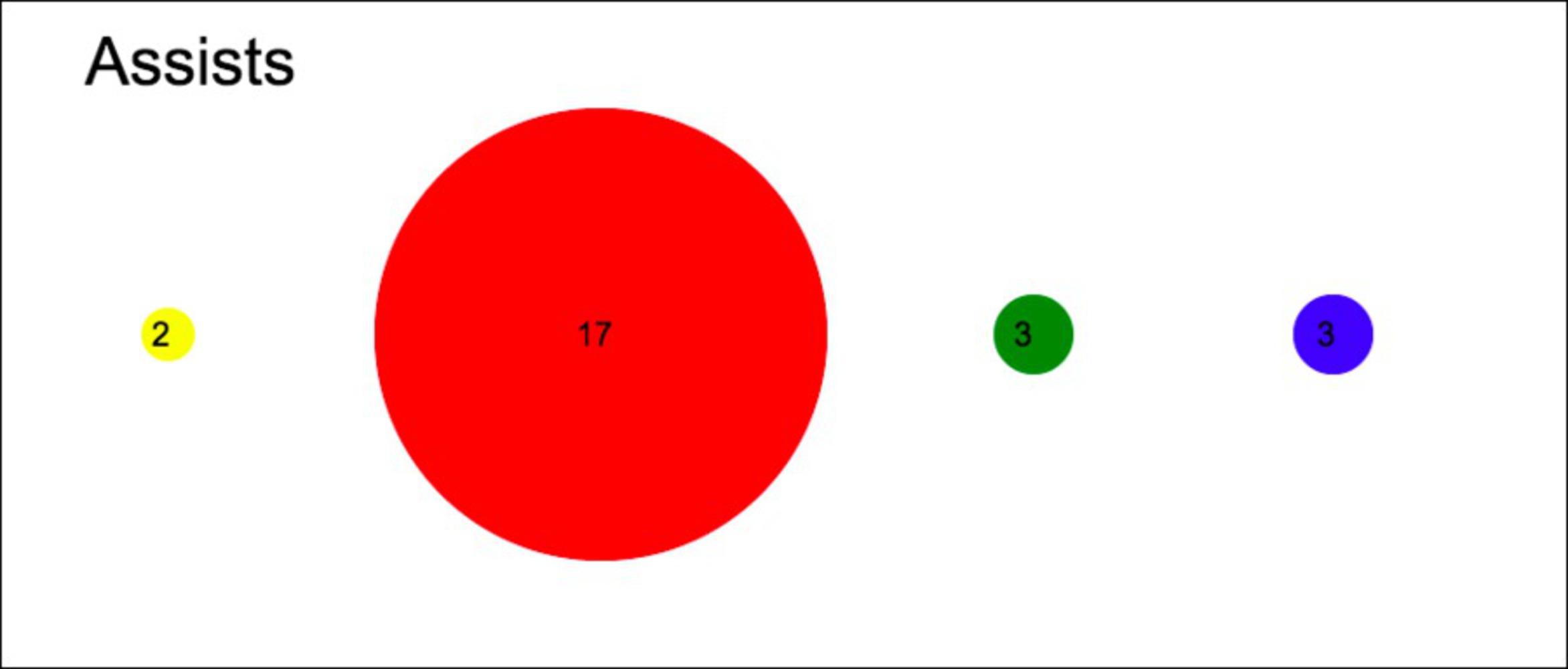
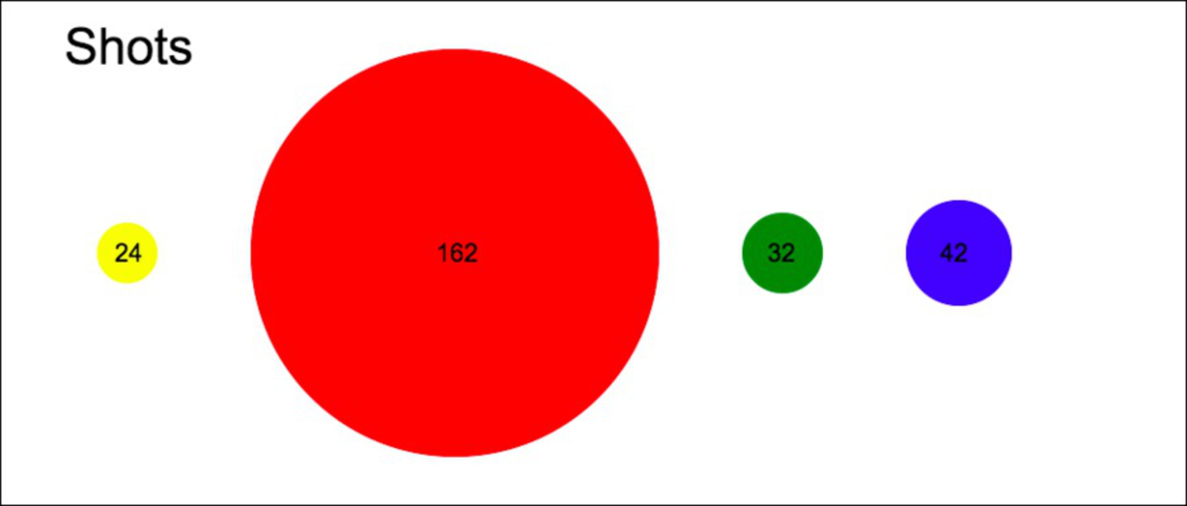
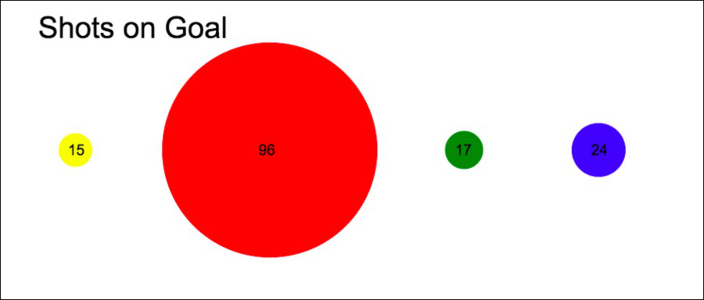
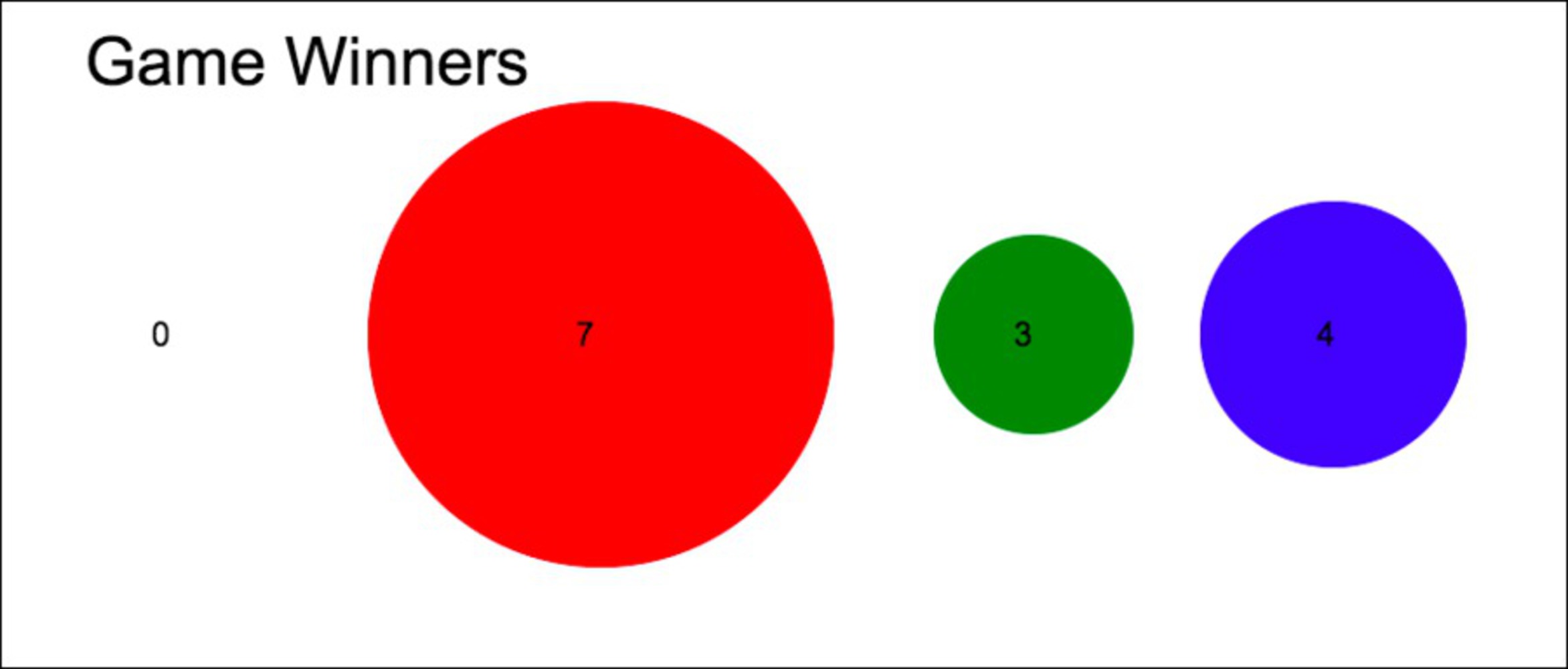
I am a sophomore on the CMU varsity women’s soccer team and we look at our stats a lot. People call our sophomore class the “heart of the program” so I wanted to present the individual statistics in a manner that made the sophomores look even more awesome that we really are. By creating an ambiguous visualization of the data, I made it look like all the sophomores are superstars who absolutely carry the team and provide most of the important statistics for the team. These plots make it look like the sophomore class is by far the most impactful and dangerous when it comes to playing offense.
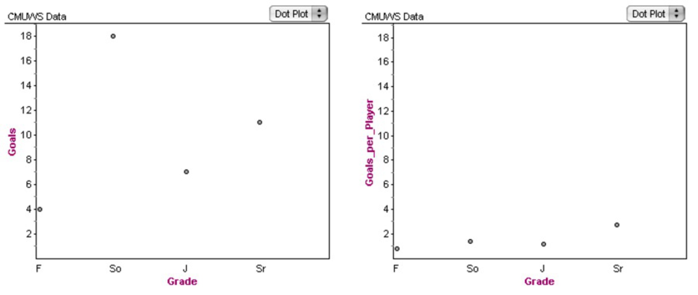
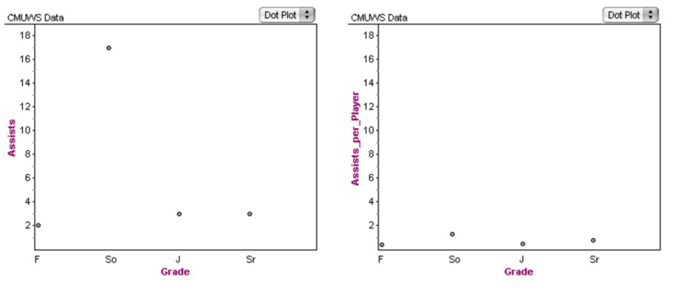
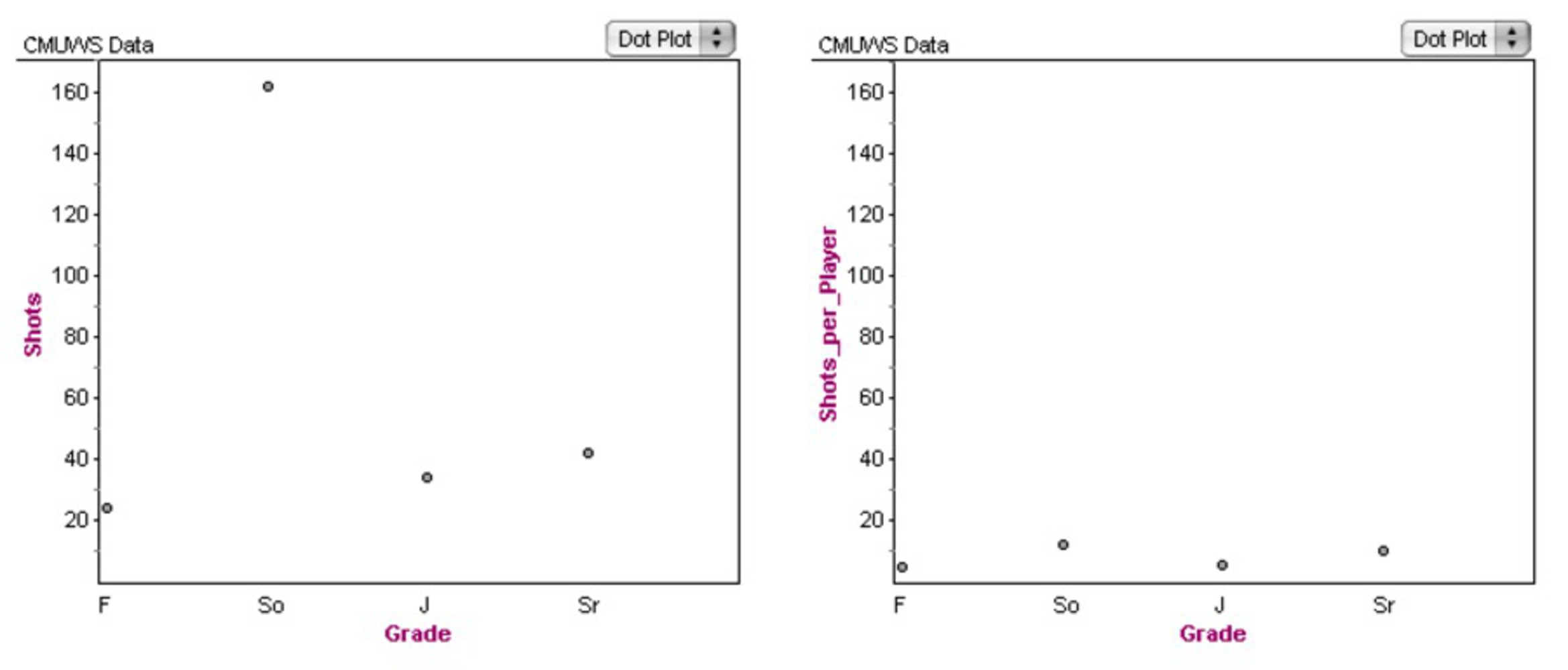
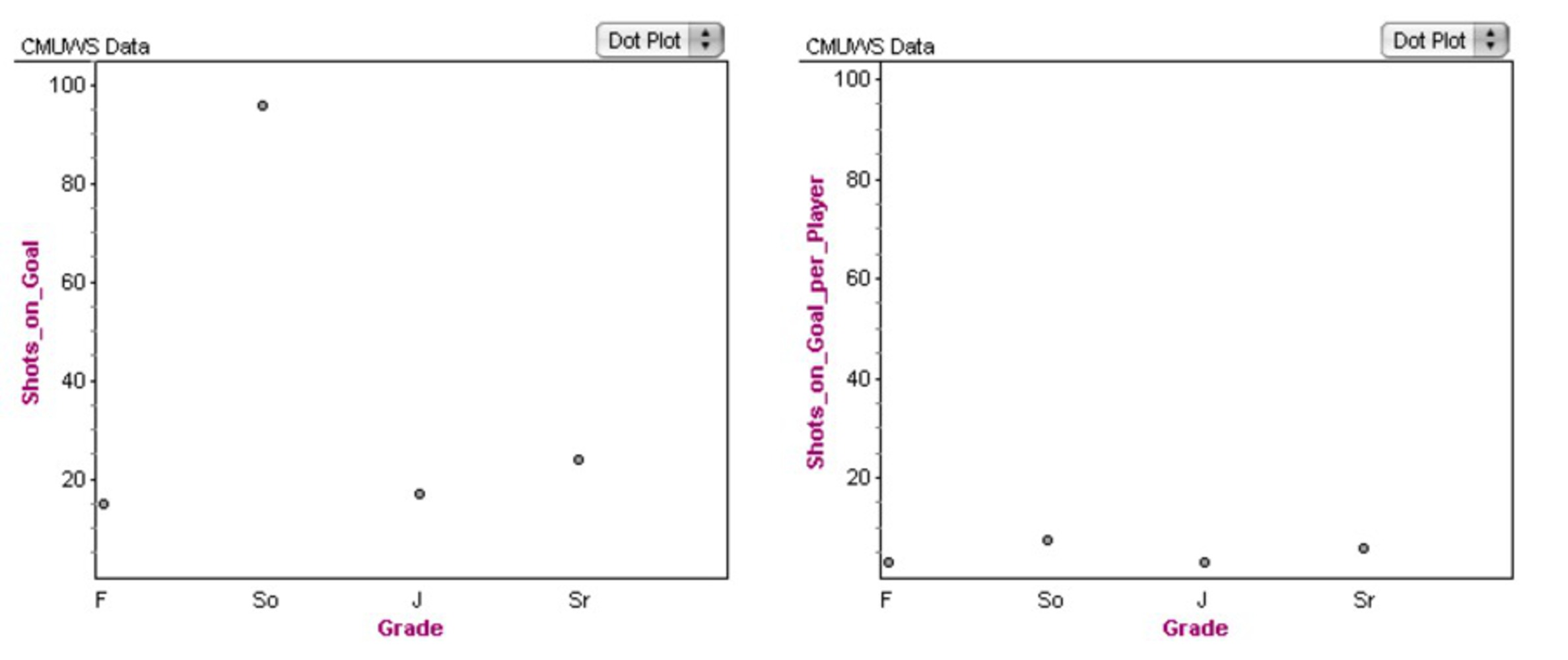
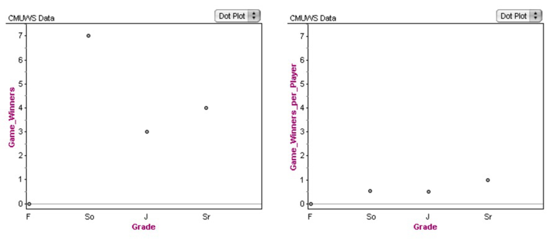
The trick, though, is that of the 28 members of our team, there are 13 sophomores. So the bubble plots do not tell the whole story – it makes sense that the sophomores score many more goals than the seniors, because there are over three times as many sophomores as seniors! In order to show how much my bubble plots distort the data, I also created the following series of graphs. For each statistical category, the graph on the left shows the total for each grade (F = freshman, So = sophomore, J = junior, and Sr = senior). The graph on the right, which is adjusted to have the same scale, shows the average number for a player in each class. We can see from these charts that the skill or impact of players across the grades is relatively consistent. Sure, in some cases, sophomores still have the highest statistic per player, but the effect is not nearly as dramatic as when we consider the raw totals.

