Back to Parent

Outcome


Product

Detail what you created. What did you create, how, etc. What methods or techniques did you use? What tools and technologies were involved? Include images, code or video.


I created a Bar Graph meant to show the different Myers Briggs Personalities and their distribution in the population. It lies in that I removed the numbers on the side so one just know how common or uncommon their personality is. I used the website infogram to create the initial chart and then used Paint to get rid of the numbers. 
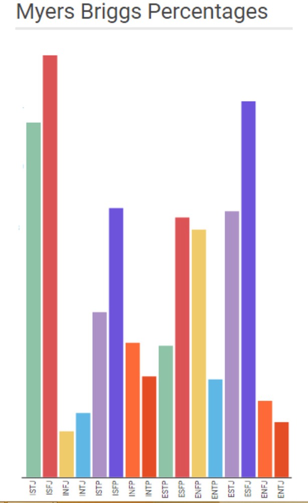
Myers briggs.thumb
Show Advanced Options

Intention

Write about the big ideas behind your project? What are the goals? Why did you make it? What are your motivations?


I made my project because I remember when I took the Myers Briggs the first time it told me that my personality was very un-common and found only in 5% of the population and to me that number seemed really small. But with 16 different personality types, each personality type is supposed to average around 6.25% so my so-called uncommon Myers Briggs personality type wasn't actually that uncommon. I thought it would be interesting to do a project on this data since I find it interesting how we look at how small the number is to decide whether something is common or uncommon, how the myers briggs test is very inconclusive, and how the personaliy est is very well-known.

Context

Describe what informed your ideas and your outcome. How does your outcome relate to other work in the field? What are the precedent projects? Situate your ideas relative to work you've seen in class, or elsewhere


My first idea was to do a graph which showed a correlation between two data sets even though clearly there is no correlation (http://www.tylervigen.com/spurious-correlations). However, this seemed to me something that had already been done and I wanted to try something different. I thought it would be interesting to do a graph similar to one of the FOX News graphs where the data is correct but because they manipulated the values on the side the data points to something that isn't really there. I chose the Myers Briggs data since its something I used to find really interesting before it was pointed out to me that the information given by the test is not really indicative of personality. It seemed like a good idea to tie lying data and misrepresentation of said data.

Process

Outline your approach to the project.  How did  you arrive out the outcome? What did you research and explore? What were the design choices? What challenges were encountered and how did you resolve them? Document design decisions and challenges encountered.


I first started by looking up the percentages of the 16 Myers Briggs data types from the Myers Briggs site and then inputting that data into infogram. My original idea seemed to work well with bar graphs so I played around with organizing the data and setting the graph height to try and make the data difference seem bigger. When I was finished, I didn't feel like it gave off the impression I wanted it to have so I took away the numbers and thought it looked a little better. I then started played with a size difference chart in infogram to see if that would represent the data better but it came out much worse since the bubbles looked almost non-existent. 

Reflection

Reflect on the process of making this project. What did you learn? What would you do differently?


Something I learned was the difficulty in making what I think is a good looking graphical representation of data. The balance between showing the data, pre-existing ideas built in to certain graphs, and graphical excellence is hard to keep track of. I think if I were to do this differently I would look at other graphing formats. I want to find a better format for the information I want to give. I don't think the bar graph got the point I was trying to make across the way I wanted it to but the other graphical representation I thought of using also didn't work. 

Drop files here or click to select

You can upload files of up to 20MB using this form.