Outcome
Intention
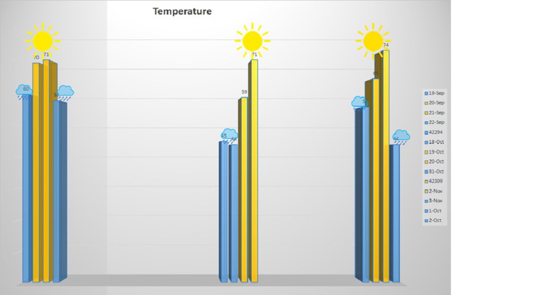
I wanted to make this project to support a conspiracy theory I've been peddling for about a year now -- that there is a secret lab in the basement of Newell-Simon that has a weather machine that the university periodically employs to make the campus prettier for prospective students.
It's a widely known myth that the weather improves when prospective students are visiting, but since my theory takes it one step further, I wanted to support it with solid data (or seemingly solid data).
Process
I started by trying to build a graph using google charts. This took up many hours and wouldn't compile, so I switched to Excel. Unfortunately, I have no images from the google charts fiasco because I couldn't get it to show up.Excel gave me less freedom, so I tried to rely less on the graph and more on manipulations that I could do after it was done. In the end, I decided to highlight the relevant days to make them seem warmer, and throw in some sunny skies and rainy days. The Rain is thrown over any day that's "cloudy or partly cloudy" and the sun is thrown over days that are "partly cloudy or sunny".
Reflection
Overall, I think I flopped on this project. I really liked my idea, but I didn't execute it well in the time given for the assignment. Next time, I won't spend so much time using a program I couldn't figure out how to use.I did learn that there's a lot that goes into fudging the numbers, and if I had more time, I'd radically change my graph. I'd want to show more misleading "vs" data, and have more data in general. Some "temperature vs. power output from Newell-Simon" or even "predicted temperature vs observed," would have been nice. Also, I would've loved to find another way to build the graph that was more aesthetically pleasing.
You can upload files of up to 20MB using this form.