This Saturday, I went to the Andy Warhol Museum and saw the exhibition of "My America" of Chuck Connelly.
Realistic Painting
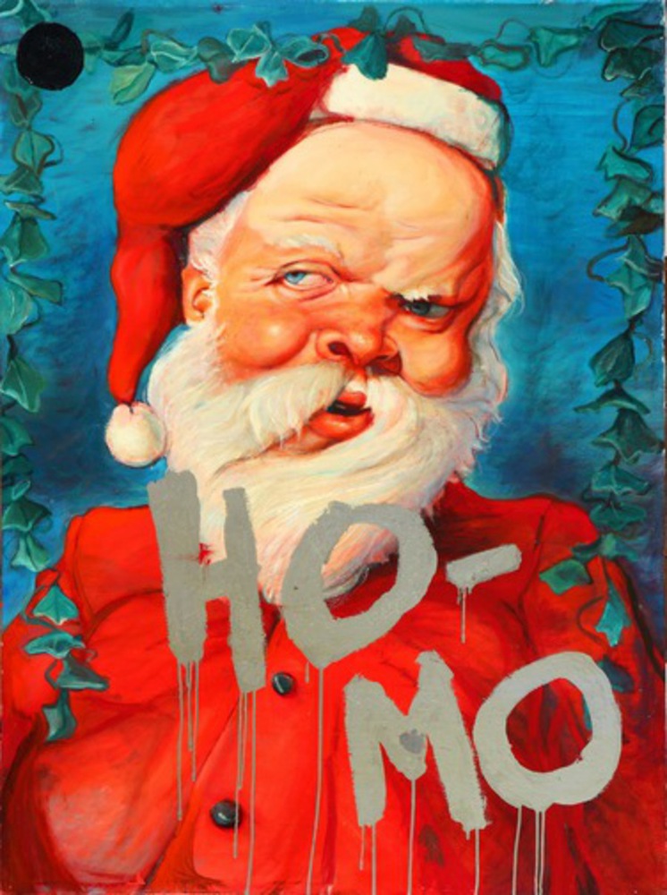
Ho-mo(1979)
This painting shows a Santa with a twisted and reddish face, and there is also a word "Ho-mo" written in a bullying-way. The strong and bright colors on Santa's face draw my eyes immediately. And then I noticed the silver word "Ho-mo". The simple blue background does not distracts the viewer from the main objects, and the rich values of it make the painting more 3 dimensional and realistic.
He used lots of bright, bold and complementary colors, which make the drawing very visually dynamic and compelling. Strong colors also give people strong emotions. I can clearly see the light comes from the right up side, where Santa is looking at, with a sardonic gin. It seems like he is showing his contempt to people who are accusing ho-mo. Also, His beard brings movement in this picture since it indicates there is wind from the right hand side.
The texture of this painting is very smooth and metallic, he actually applied a shiny smooth paint on the top of this painting, which make this painting distinguished from other works and help to grab viewer's attention.
Overall, I think what strike me the most are all the contrasts Connelly put in this work, not only contrasting colors but also the contrast between the image and the theme.
Connelly claims that everybody is ashamed for something. He likes to show the dark side of people in his works. So for this painting, he uses Santa, who is usually relates to happiness (like Santa in this case) to show his opinion on contentious topics. It is hard for people to relate Santa with negative emotions. But here, I believe he wants to show the contrast that even Santa who almost never has bad faces is so discontent about bullying ho-mo that his face becomes distorted. Using cheerful color and image to show serious, controversial topic gives a great impact on viewer's mind.

