Back to Parent

Outcome


The Tour

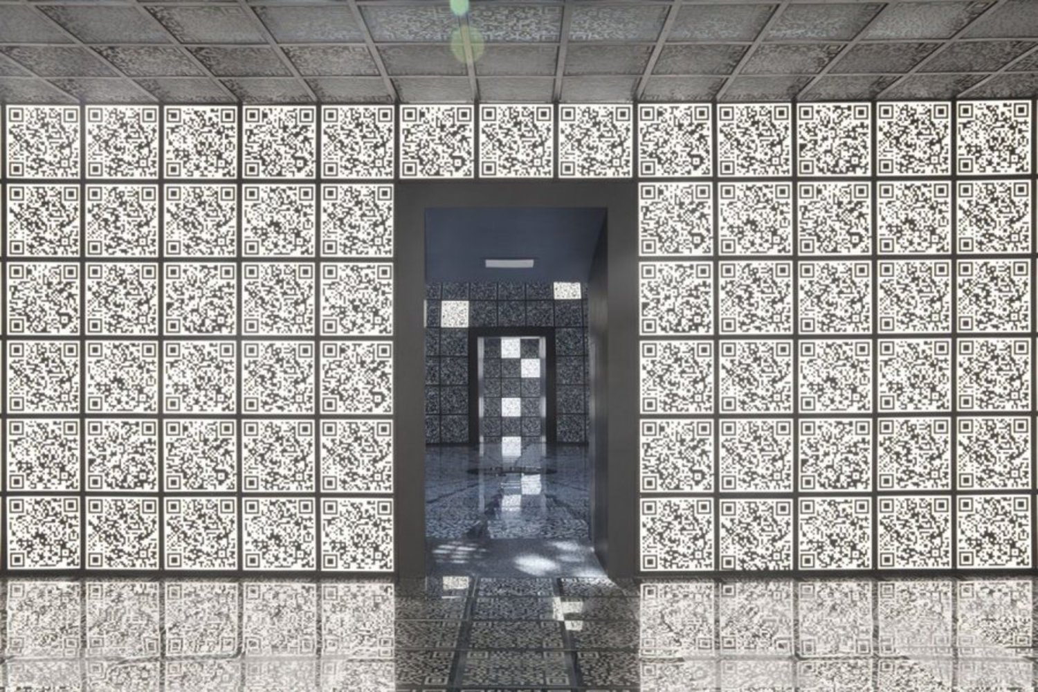
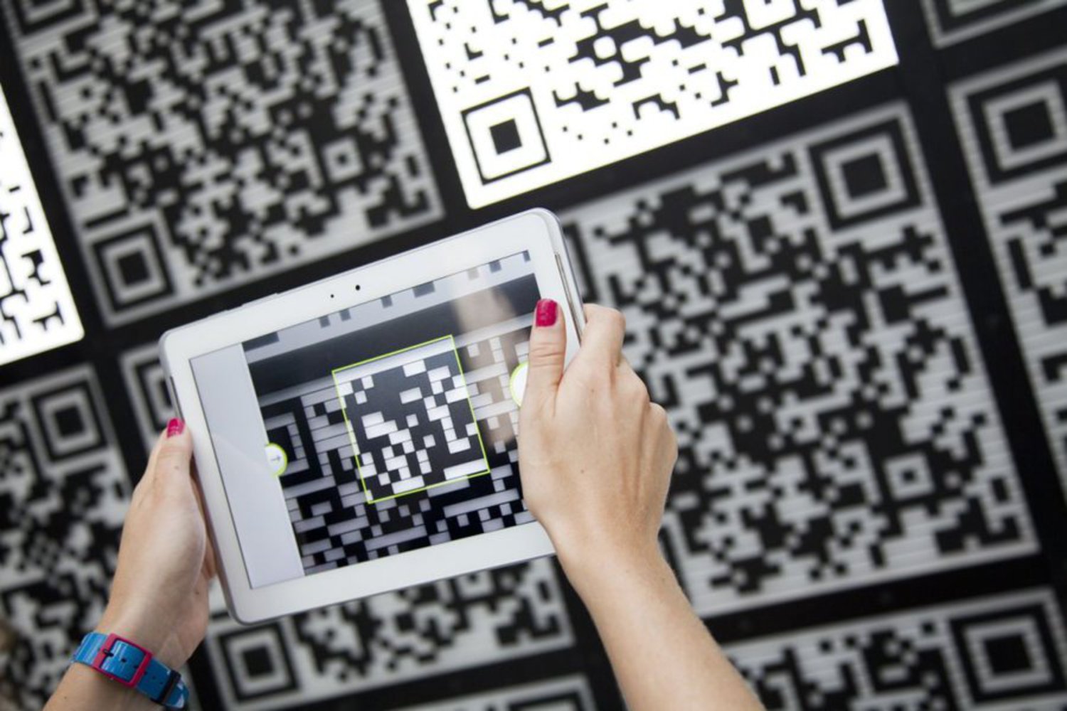
Designer Sergei Tchoban's exhibition at Venice's 2012 Architecture Biennale combined art and publicity to create an interesting interactive experience for visitors. As they entered the exhibit, they were given tablets capable of scanning QR codes. As codes lit up, visitors could scan the codes with the tablet and follow through to websites giving information about a new Russian city being constructed.
9405dda2c8ae61c0f6424aff1a8500cd.thumb
Show Advanced Options

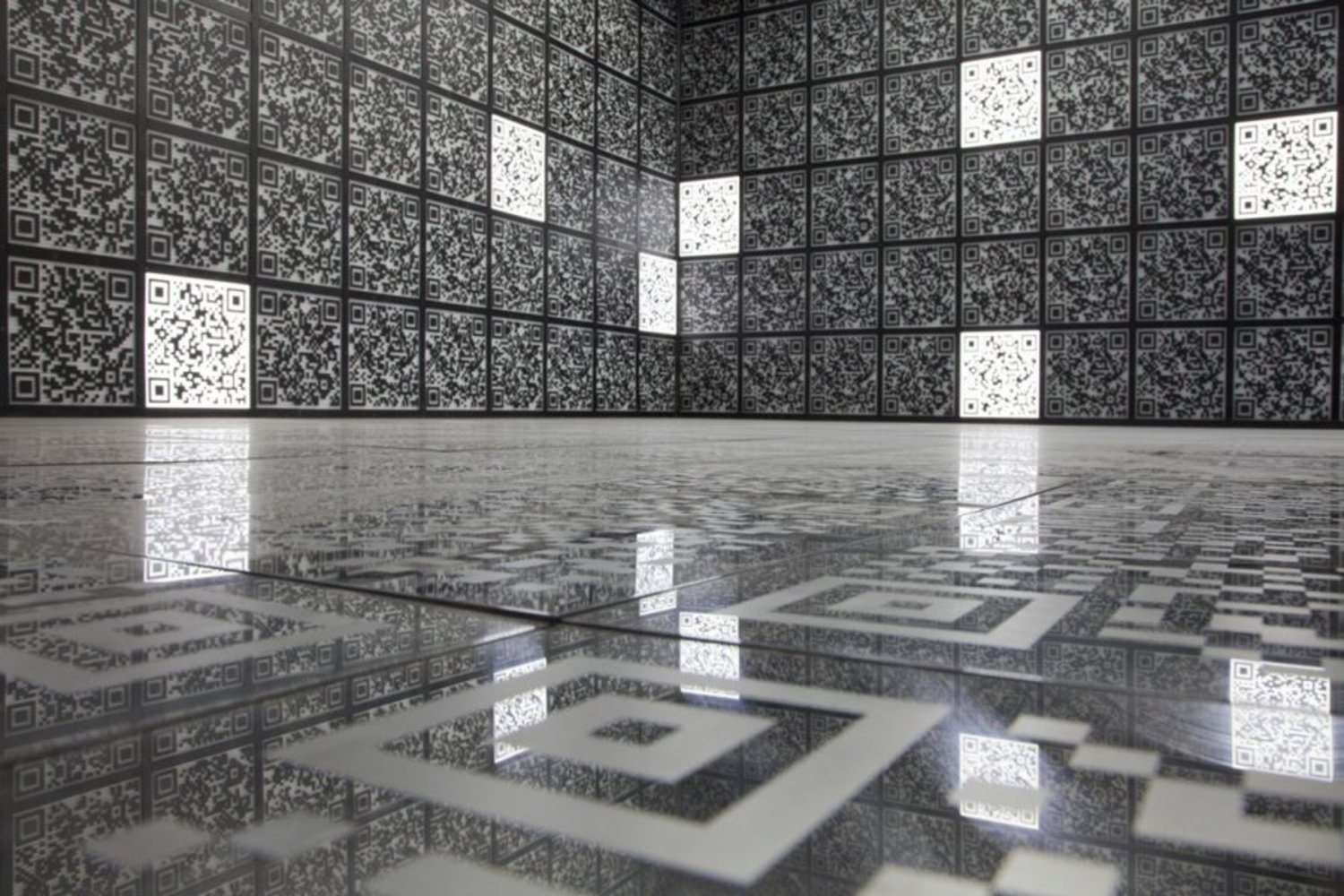
Placed over the 1913 Russian Pavilion, the QR codes oddly fit well into the atmosphere of the structure. The static nature of the QR codes was offset by the sporadic lighting behind some codes  (which was required to get a good scan). While most of the QR codes were entirely functional, some were altered (or simply QR-code-like squares) to match the surroundings. As can be seen in the video below, an incredible job was done in fitting this exhibition to the surroundings.

Show Advanced Options
B8c932673590aa4b5bf7fa0ad1457bcc.thumb
Show Advanced Options

These QR codes led to information about Skolkovo, a new hi-tech city being constructed outside of Moscow, Russia. As an ingenious campaign to gather interest for the project, this exhibition let users discover the information and pore over many pages and videos related to the project.

848d4206710c5e5d5f435022c9604e70.thumb
Show Advanced Options

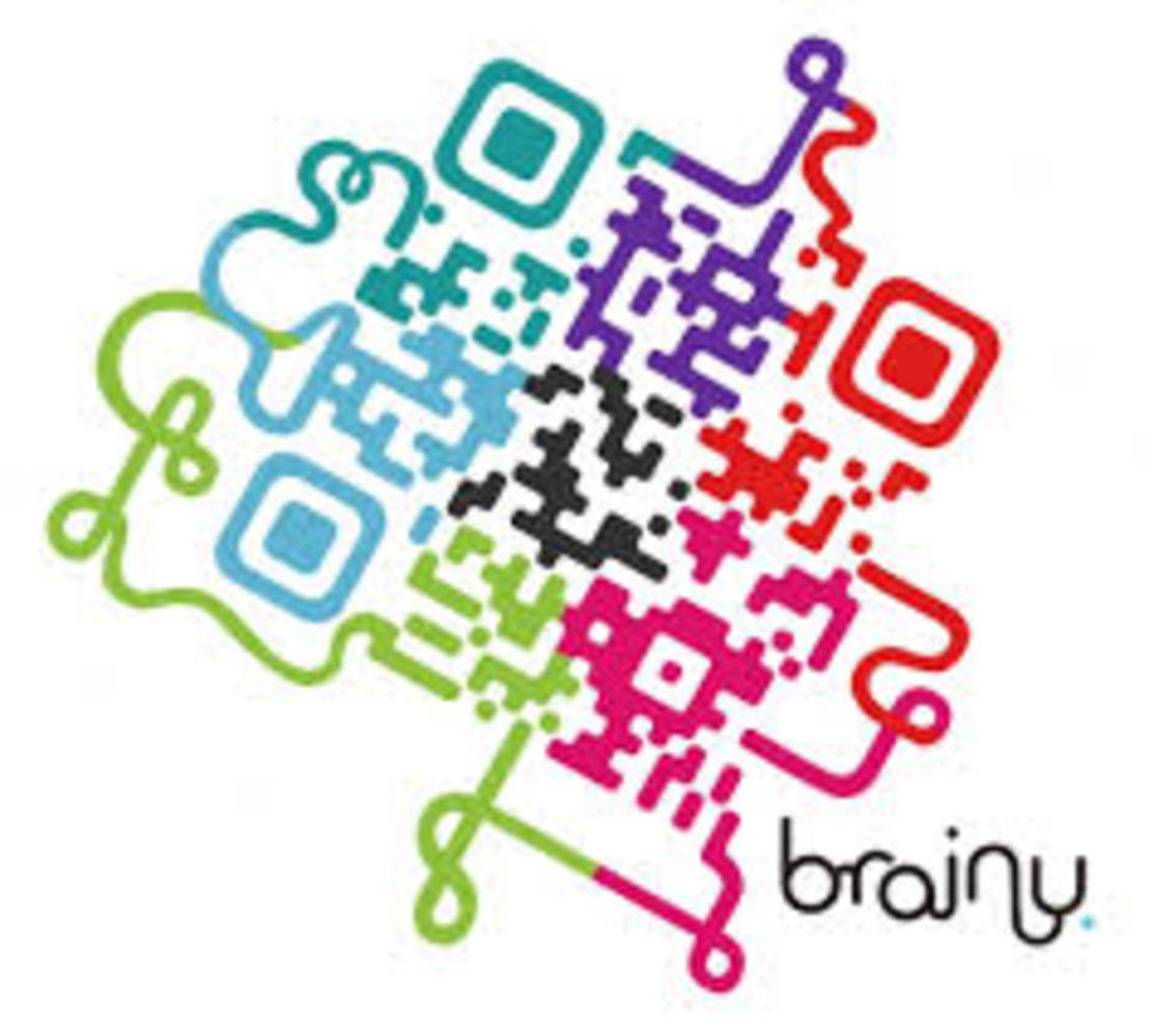
This instantly reminded me of QRt (pronounced "queue art") -- taking QR codes and making them as interesting, colorful, and decorated as possible while still retaining the information required for the image to be recognized and decoded by a QR code reader. While I believe that this project was incredibly well done, I feel like something could have been done to mix up the monotony of very similar-looking codes covering every surface. It begins to look a little more overwhelming and static-y in places (like above).

Images.thumb
Show Advanced Options

Overall, I'd love to incorporate something like this into my final project -- though I'd much prefer to keep the content more interactive than was presented. Though the visitors could scan the codes, what greeted them was mostly static images and pages.

Drop files here or click to select

You can upload files of up to 20MB using this form.