Back to Parent

Outcome


Curatorial Statement

Absolutely No Ball Playing Allowed is a media installation that explores the idea of the playground by creating a space where people can respond to their environment in unexpected ways. In re-creating the classic playground game handball, this project invites audiences to reconnect with their inner kid. Inspired by the notion of "no ball playing allowed," this project directly breaks this rule, instead encouraging people to put down their smartphones to re-engage with their environment and with each other

Intention 

We chose to emulate handball since this game is universal across cultures, its power being in its simplicity. Requiring only a wall and a ball, this game can easily be played. However, we chose to simplify it even more by ridding the need of a physical ball. Instead, users can engage with the game using only their bodies, or the controllers. 

Overall, the intent of this project was to draw from our myriad experiences to create a space where viewers can interact in unexpected ways. While the product itself uses controllers, the intent of this project is to project the game on a large wall in a public space. By installing this game in such a space, passersby can play the game by moving a projected ball around with their bodies using motion tracking software, getting rid of the need to 

In creating an installation in a familiar place, we hope to create a media installation where viewers have the opportunity to play and have fun in a space that clearly denotes it should be used for otherwise. We made a very intentional decision to create an installation that can be put anywhere to hit a wider audience and to "break a rule." In doing so, this project ultimately invites play by encouraging people to break from their routines and re-engage with their surroundings.

Oakland.thumb
Show Advanced Options

Product 

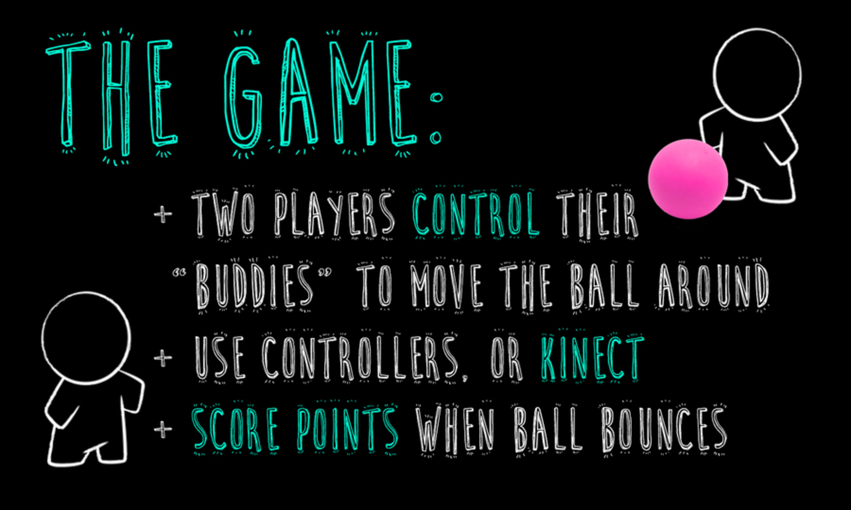
While the stretch goal for this project is to integrate motion tracking software, the current product uses Xbox controllers to move "buddies" on the screen that can push around a ball around. By hitting the ball onto the opponent's side wall, players can score points. Though the game ends when one player scores three points, we made an intentional decision to not include a scoreboard or leaderboard. In doing so, we hope this game will invite people to play for the fun of it, and not to be competitive or to win. 

The script for the game was written on Python and went through multiple iterations after our group had spent a lot of time exploring the Kinect system for motion tracking. The graphics were created in Photoshop and animated in After Effects. Because of the simplicity of the gameplay itself, we wanted to create unique graphics that felt inviting and playful. 

Game.thumb
Show Advanced Options

Context

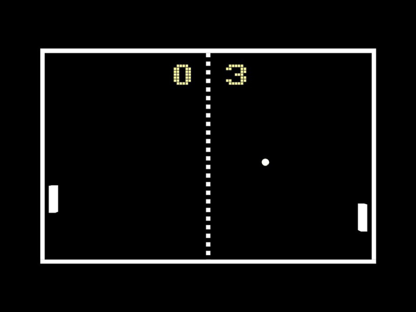
Our work pulled from a wide range of games, projection art, and interactive, social engagements. Starting with the classic, Pong, we sought to reimagine simple, intuitive games through means experimented with by many artists in innovative ways. 

2dbcc300 1359 11e4 9d16 0759e16cb1a6 pong game screenshot.thumb
Show Advanced Options

Pong - A clear and obvious inspiration, Pong provided us with a basic game mechanic, as well as an easily understood visual layout. We ended up not having time to implement some of the UI niceties (score, a center line, a delineated playing field), though they were definitely goals of the project. 

Text Rain, Camille Utterback - While our final project did not reflect this due to the issues with running a Kinect, we were heavily inspired by engaging, projection/interaction art such as this. We wanted to incorporate the physical engagement as well as foster community interaction by having people engage with each other directly.

Show Advanced Options

PROJECTIONS, Aakash Nihalani - Technically, this work does what we had hoped to accomplish.  Nihalani uses a Kinect to track the viewer's hands as they engage with the work and does it seamlessly. Our visual style completely departs from the one used here, but we felt that a cute, quirky game would be more likely to engage people on the street.

B0bfdd8bb7558ab49b9f7db57ebf3a71.thumb
Show Advanced Options

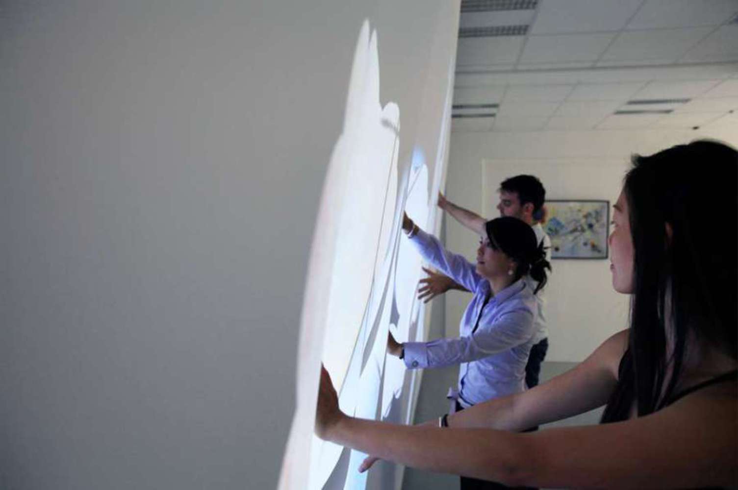
Plane White, Carina Ow - This work allows people to physically, collaboratively engage in "art-making" through the use of technologies similar to what we had hoped to use. It directly ties the audience to the art, both through the uncovering of the Kandinsky work as well as through the actual process of uncovering. The work also engages a sense of community, regardless of your familiarity with the others involved in your experience, which is something we really wanted to bring across.

Inno1 14.thumb
Show Advanced Options

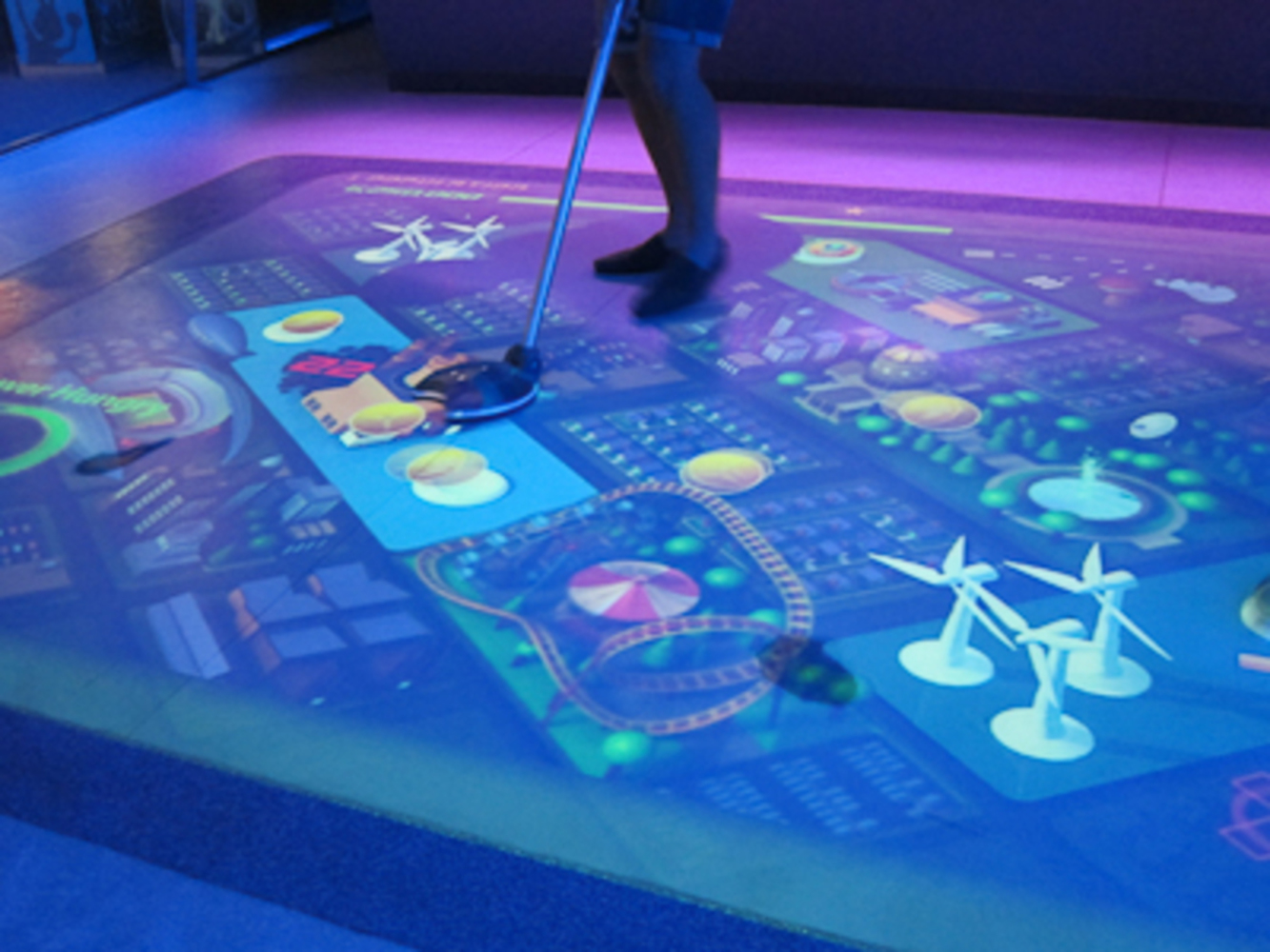
Power City, Siemens, Disney - Power City was an installed game projected on the floor in Disneyland's Innoventions exhibit while it was open. The idea was to build up the most efficient city by pushing resources around with the stick show in the picture. Interestingly, it had a precursor that alternated between hockey and soccer, and allowed two people to play a 2D version of these sports. It didn't use motion tracking - instead it simply calculated which parts of the project were being interrupted, so you could play with your whole body. Sadly, the precursor appears to be undocumented, though I definitely remember playing with it as a kid. In either case, both of these installations were probably early inspiration for how our game might work.

Process 

Before settling on the game approach, our project ideas were much wider. Notably, we considered creating an "unexpected performance" by placing a small camera somewhere unexpected and projecting the video feed somewhere similarly unexpected, but highly visible (ie. the side of Wean).

Once we chose our realized idea, we started as large as possible, knowing that we might not get to all the details. We then generated a collection of elements we wanted to incorporate. Some of those ideas were:

- Physical play using the Kinect

- One-off games or more intensive tournament style system

- Gravity, so the game feels like you're playing it in real space

- Scoreboard, so people could have a connection with past users of the game

- Work WITH the surrounding environment, rather than create something to project /display over it. 

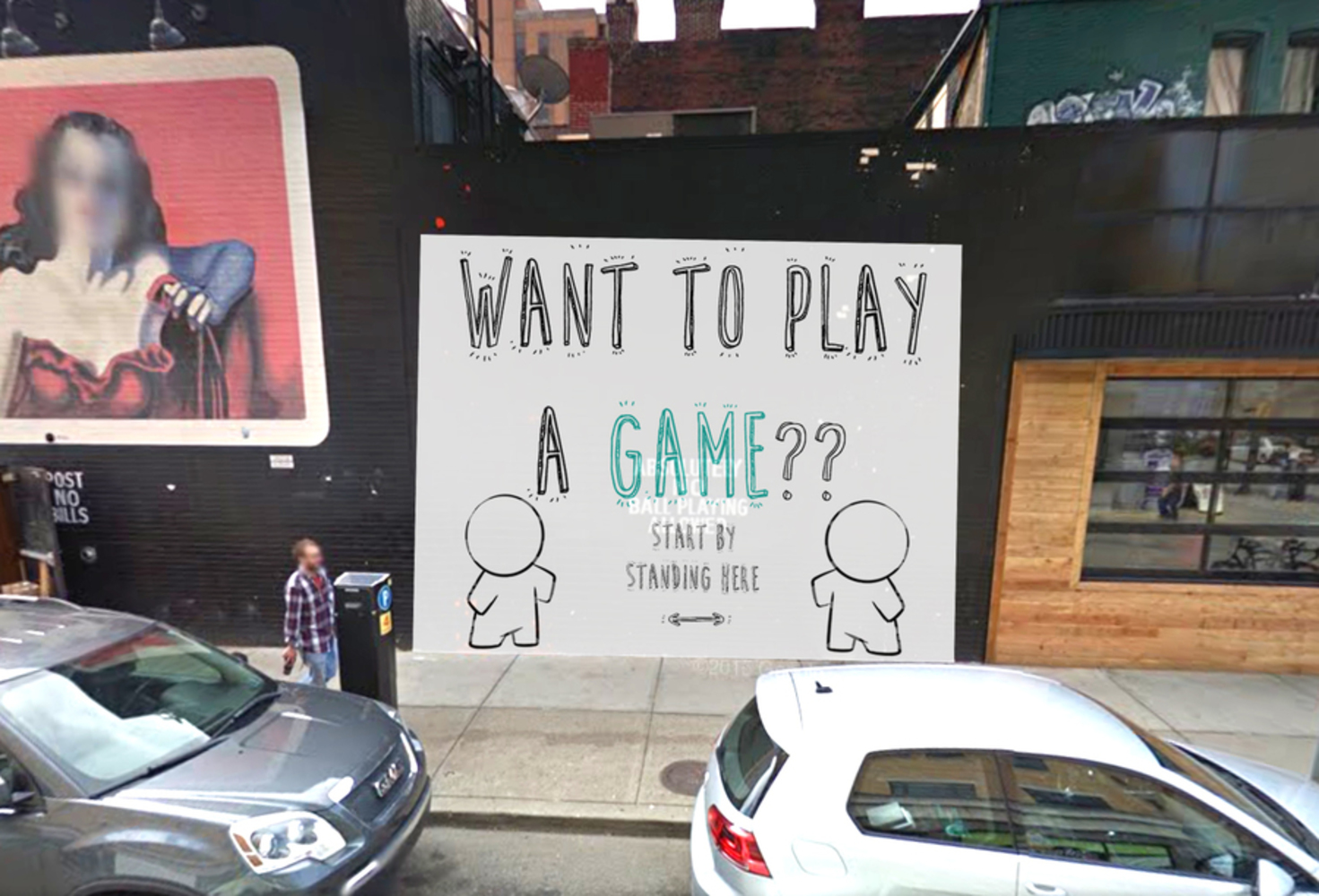
- Direct engagement with passing people to invite them to play, ie. 'Hey you! Wanna play a game?' 

- Game initiation by getting two people to stand in the indicated spaces

Obviously, our final product didn't include all of these details and although some were left out due to implementation issues, some things were cut as design decisions. We definitely opted for the one-off game over tournament play so that people could have a 'walk up and play' experience without feeling committed to the time. The scoreboard offered a particular challenge to implement while maintaining a purely body based interface. We first decided it would not mesh with the overall game experience and chose to end games on a 'first to 3' basis rather than timed points system. Once we decided to switch to controllers, we considered bringing it back as a way to reengage community interaction that might have been lost in the move from body-tracking (and even mostly implemented it!), but ultimately we were too short on time to fully realize it. 

We had high hopes for the Kinect, and it certainly still seems like an attainable goal. Technically, the system would have fit neatly into our project and really brought out some of the ideas we were aiming to use, but we ran into technical problems with having hardware powerful enough to run the Kinect and had to back out on the idea pretty last minute.

Our final product ended up being more of a compromise with technology requirements than we'd hoped, and it definitely lost something by being displayed on a screen rather than projected, as well as being played with controllers rather than motion control. However, these issues were largely temporal and our design experience was much more fleshed out. While we encountered a large and unexpected block, we were able to adapt to the problem and still bring out a fun and engaging experience.

Our version control was poorly maintained (due to not all of us being familiar with Git), albeit extant and posted here.
Collaboration

As soon as our idea started becoming concrete, the two aspects necessary for our media installation became clear: art and technology. Although obvious now, how we were going to tackle this required some serious brainstorming. The more we discussed it, the more we settled into our respective roles based on our strengths and experiences. Katherine and Jan divided up the programming and tech aspect of the game, while Melissa created the large majority of the designs and images used throughout. Constant communication was important to avoid conflicts with other engagements, and to form an action plan when technical constraints stopped us from realising our full potential.

The toughest part, however, was the actual presentation. Due to this week being finals week, it was an extremely busy time for all of us. For example, Katherine was able to program the bulk of the controls beforehand, however she would not be able to show up to the installation because of an exam. Luckily, Melissa pulled through and was able to stay to present throughout and show off our masterpiece, with Jan helping set things up.

Reflection

Although, it is a bit of a shame that we never got to test it out in the real world, the project itself was a success. Visually, it came to be remarkably close to how we intended to make it look. The game itself was functional and fun to play. We came together as a group and were able to create an awesome installation piece. Honestly, as sad as it is that we never showed it off in Oakland, the experience alone was worth the hard work. The cool game we made is a bonus.

Drop files here or click to select

You can upload files of up to 20MB using this form.