Reflection
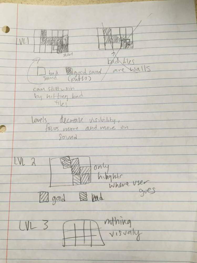
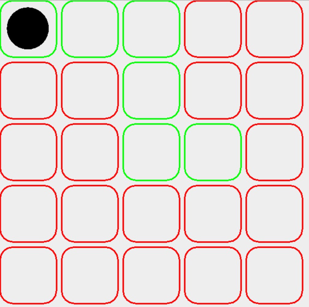
Emilio is very satisfied with the finished project. He likes the minimalist look of the mazes and how it's not distracting to the overall point of the piece. The lack of any real instructions allows for the player to interact with piece however they like; the nonpath tiles being organ noises instead of an intentionally unpleasant noise encourages play as opposed to herding the player to the next level. He learned the benefits of minimizing design. If done again, he would like to add alternative levels that incorporate different styles of music.
Sophia:
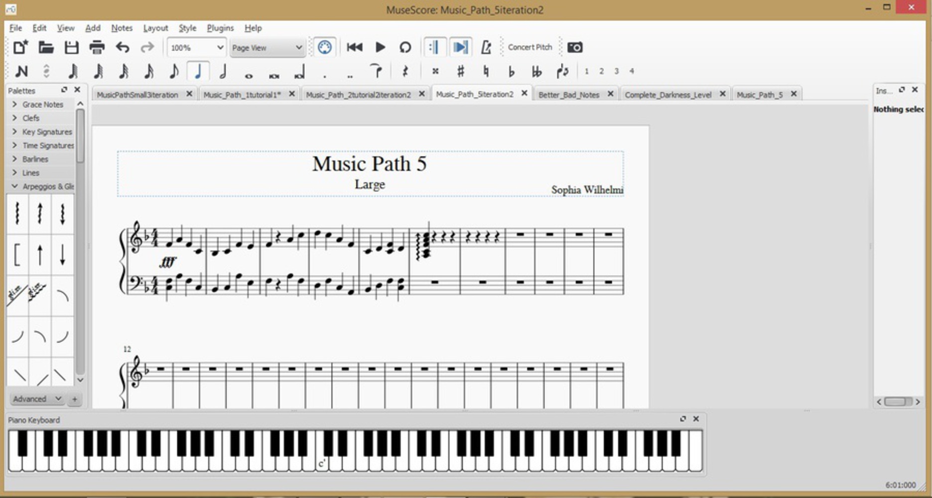
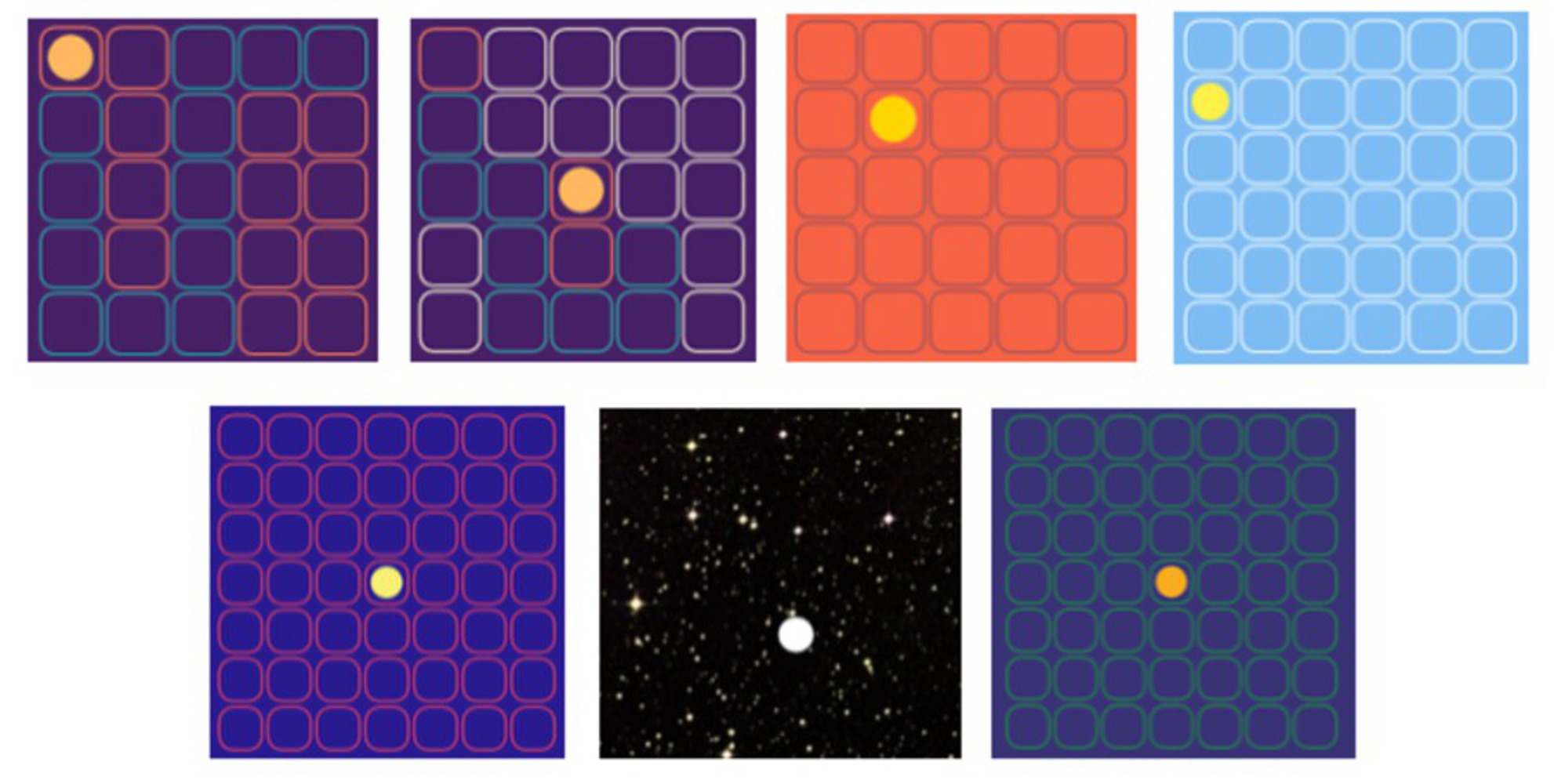
I think this project turned out extremely well. Besides an unavoidable screen flicker from the software, there were no bugs in the execution of the product. I think that the minimalist design makes for a very simplistic and widely liked design, and that the color combinations used are well-thought out and aesthetically pleasing. I'm satisfied with how the maze sounds as well. I think it's clear telling between the path notes and non-path notes, without necessarily knowing which one is "good" and which is "bad". One of the players liked the "bad"/non-path notes more, which I appreciated. I think the songs reflect the time of day for levels 3-6, though it is very subtle, and is probably not recognizable to the audience. I think the drawback is that the audience must be patient, both while figuring out the maze game aspect, and while waiting to use it. It did take some time to get through it all, but I think the non-participating audience still enjoyed watching the gameplay. I learned a lot about what it means to make multiple iterations, and how to better refine songs. With such specific direction for each level, I was able to create multiple things, knowing when I was closer in the direction I was heading in each piece. Something I would do differently, would to make it more interactive, by adding a Dance Dance Revolution mat that the participator had to step on to move. Additionally, I would encourage the use of rhythm in one way or another, by showing the tempo of the song. One suggestion from a participator during the gallery was that we should play back the rhythm or the song that the user created, instead of the less rhythmic path song.
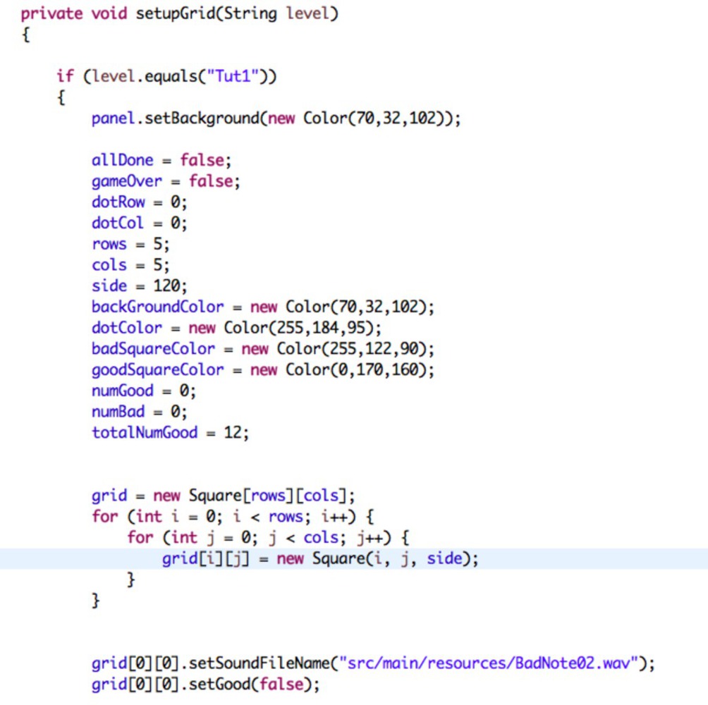
Sienna: I'm really pleased with how the project turned out. I think it's very pretty and our final product was really well received during the presentation. Our viewers were engaged and seemed to have fun. Although the code works, it's really ugly. A lot of it consists of hardcoded values and it would be a little tedious to abstract or generalize for more levels. Also, I wish I had the chance to make it a little more robust. The using key presses to switch between pages is a little clunky and I feel like I could have done a better job making seamless transitions using buttons or something.
Janine: I liked how the piece turned out. I think it was very polished and really liked how it looked. Besides the slight flashing due to the grid being re-painted, my only issue with it is that I didn't take into account it being in a gallery setting. Since only one person could play at a time and since the game takes a while to finish, there was a line and I think some people felt pressured to end early rather than try to reach the end of the game. I think watching people interact with it was really fun to see people figure out it was a maze and how to play and the few people who aimed to get three stars rather than finish the game. If I were to continue this project as a gallery project I would like to condense the game to the first two tutorials level to be sunrise and day themed then have the sunset level and then the night level. If I were to continue the project as a game, I'd like to add a lot more levels and to make it into a mobile app. I think the design is really good and I really enjoyed how the project came out and that people enjoyed the game.
