Outcome
We created a multi-player board game called "Territory". The game involves role-playing and multiple negotiating tricks. The players are going to play as a king and they want to rule the largest land among other competitors. Since we are living in 21st century, fight is not a good option, so they are going to have short meetings to negotiating (and bluffing) and then vote for the land they want to rule. Each land on the map has specific values, and, if multiple players choose the same land, the value will split evenly among those players. The trick is that players can lie about the land they are going to choose in order to get the best profit they can have. However, as hosts, we can also lie about the data we received from the voting server to mess up with the players' intention.
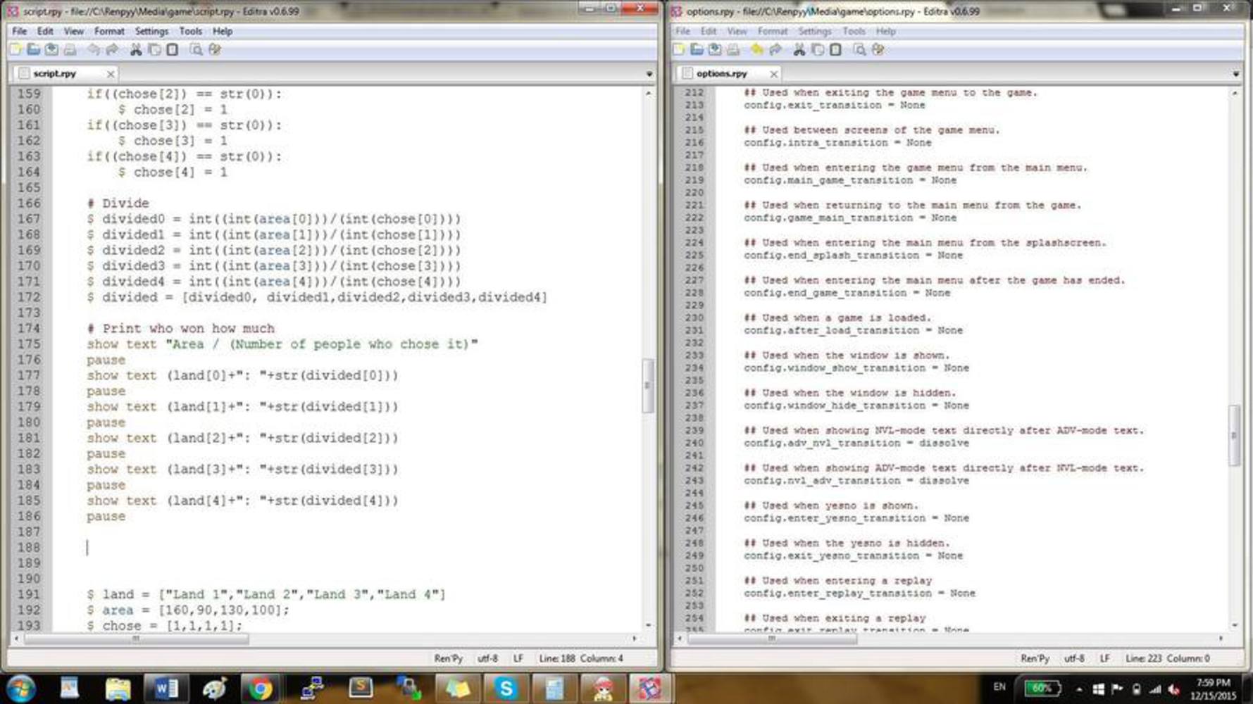
The technologies involved are photoshop, premiere, Renpy Game Engine and Socket.io.
The big idea behind the game is "lying about data". The game, in some sense, is similar to poker game, as the players use bluffing as a technique of playing the game. But the rule is that the host may never lie. However, we chose to lie as a host to mess up the intention of the players. In this way, we are breaking a rule in the game but it doesn't hurt our player.
The application of this idea is to remind our players that we can't fully trust companies that seem to kept certain rules about privacy or security, for we never know when or why they are going to lie about data that we can't see but actually deeply relevant.
Examples of play:
http://random-international.com/work/rainroom/
The Rain Room. You can walk through the room without ever getting wet. I look at this project and I am compelled to run and play in it. It evokes a natural childlike urge to play in the rain mixed with a weird supernatural sensation of being rained all around but never rained on. It must be like being separated from the world a little bit, looking around and seeing that it's raining, but not being touched by it at all. I imagine one of the first urges a participant would have would be to try to break it, which may be a sort of connection back to reality, shattering the illusion. Mostly it just looks amazing. Fun, exciting, soothing, and strange all at once. Super cool.
I also imagine a sort of importance/self-centered feeling coming out of this. Not in a bad way, but sort of in the inverse of those unfortunate scenes where it's raining only on one sad soul. https://www.youtube.com/watch?v=r8_XFtTJfUQ
http://www.thebroad.org/art/yayoi-kusama/infinity-mirrored-room-souls-millions-light-years-away
Infinity Mirrored Room. This one also evokes a supernatural kind of feel, but this one is much more cosmic. I imagine walking through that room would make you feel like your own celestial body among billions of other celestial bodies that are all very far apart. I imagine the fascination with this one, or the "play" would just be walking through it and seeing a vision that you'd never find in the natural world.
For a lot of people, I'm sure this makes them feel like they're exploring space, both from up close and from very far away from anything tangible. People often look up at the stars and wonder what could be out there, and with this installation it is as if they are what is out there. It's a whole new, beautiful perspective on things people were already curious about. In that way, this installation lets people play by granting them the ability to explore the stars that so many people are fascinated by.
In Edward Tufte's article "The Visual Display of Quantitative Information", we learned about data visualization by using graphs and the importance of presenting the data correctly. In the class after that reading, we saw examples of how to mispresent the data to lie about the outcome. So in this project, we borrowed the idea to lie but using different approach and timing to lie.
At the very beginning, we all brainstormed to give out a bunch of idea including building an actual playground using ps3/4 game boxes, pixellating people into funny pictures. It was then when Fred provided his idea to create a game that requires negotiation among players. At first, the idea was very blurry and our professor and TA are concerned about the idea of our project. But it was a good base, and, as we designed the game with more specific rules, the game starts making sense and actually work when tested. During the final presentation, our game attracted attention from our visitors and they gave positive feedbacks after they experienced our game. The challenges we encounter are mostly game design problems: how many minutes we need in the negotiating section, how many players do we need to make the game most enjoyable, etc.. We solved those question entirely based on "how would I feel if I'm playing the game".
We broke up the work into three parts, so Nazli and Jonathan were doing the coding part. They a lot of time in the coding, including searching for the tools and packages they are going to use and learn about the packages and how to use them.
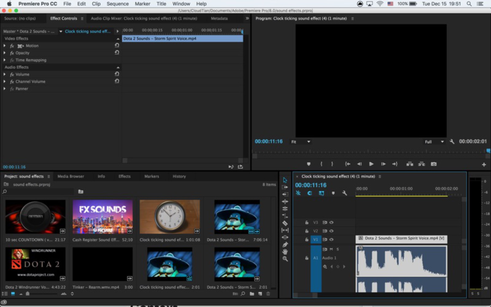
I was in charge of the sound effects. I searched a lot of sounds on google and looking for effects that doesn't directly linked to our project but can fit well. Finally, I came up with idea to use some of the voices from Dota 2 to be our sound effects. After listening to almost 30 minutes of voices, I could finally make up my mind which sound I want. I use premiere pro to edited the videos and extract the audio out and added some effects on the audio to make the sound effects we have in the game.
Here is the link to the game:
https://drive.google.com/open?id=0B2NP19fNnKOcbmNzZmlPWXF3Z0E
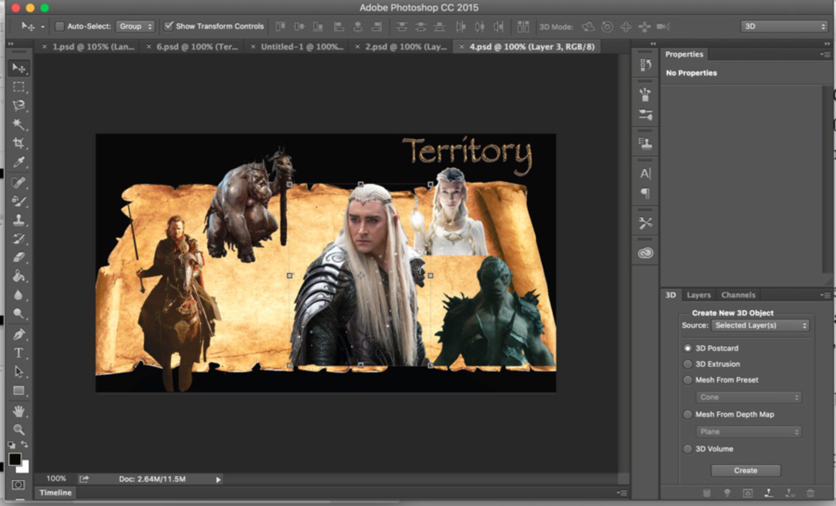
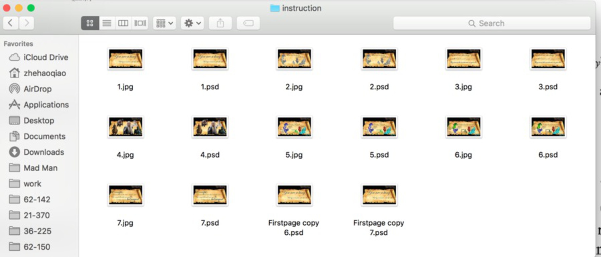
First, I made the tutorial pages for the game. Nazli came up with the perfect Sample Powerpoint for the game and it worked pretty well explaining rules of the game. What I did is to make instructions more clear and pages more beautiful and more fit inside the game. I mainly followed the powerpoint of Nazli and then made adjustments. For this part, I spent 5 to 6 hours trying to figure out the best visualization and photoshopping instruction pages.
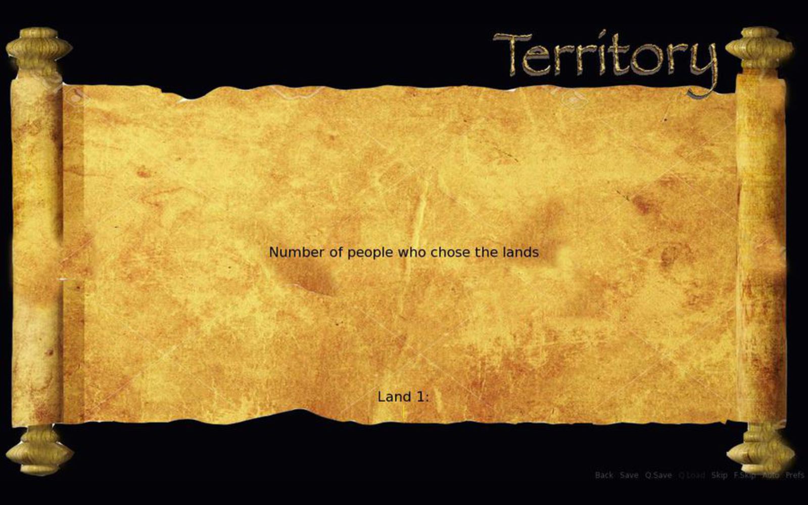
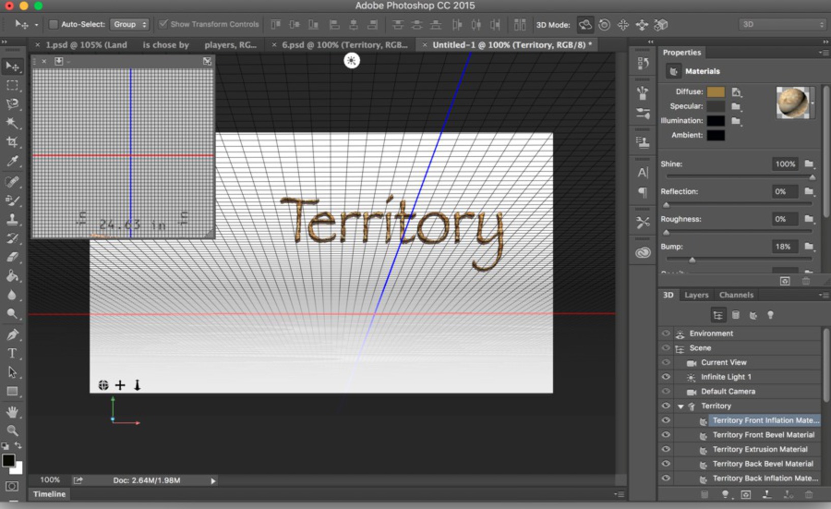
First I made a logo for the game's name. To do this, I used photoshop's 3D model. The tool was actually more handy than I expected. I can change angles and sizes of the texts as I want. I googled some pictures of lands and dirts to make my own texture for the text "territory".
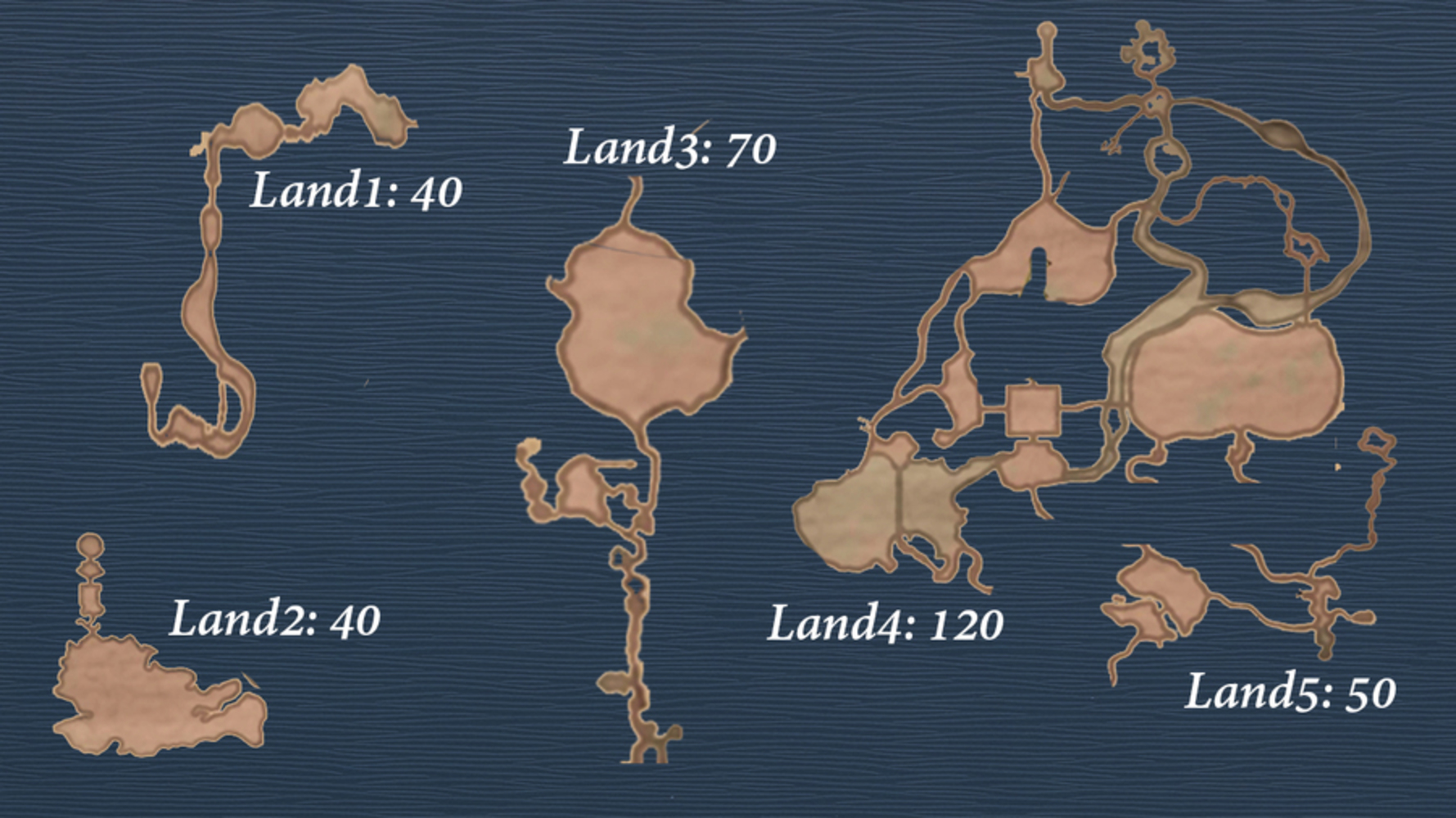
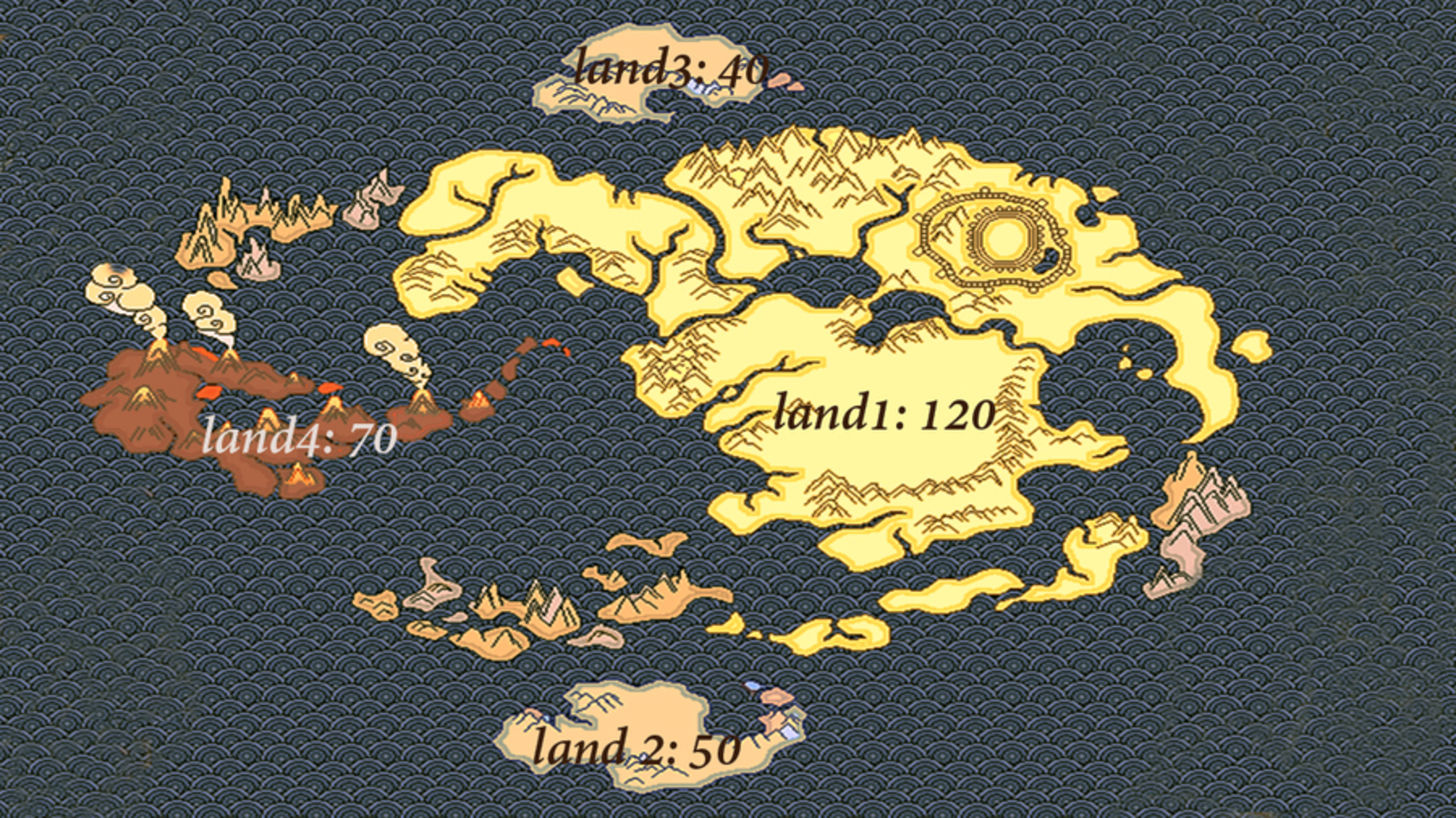
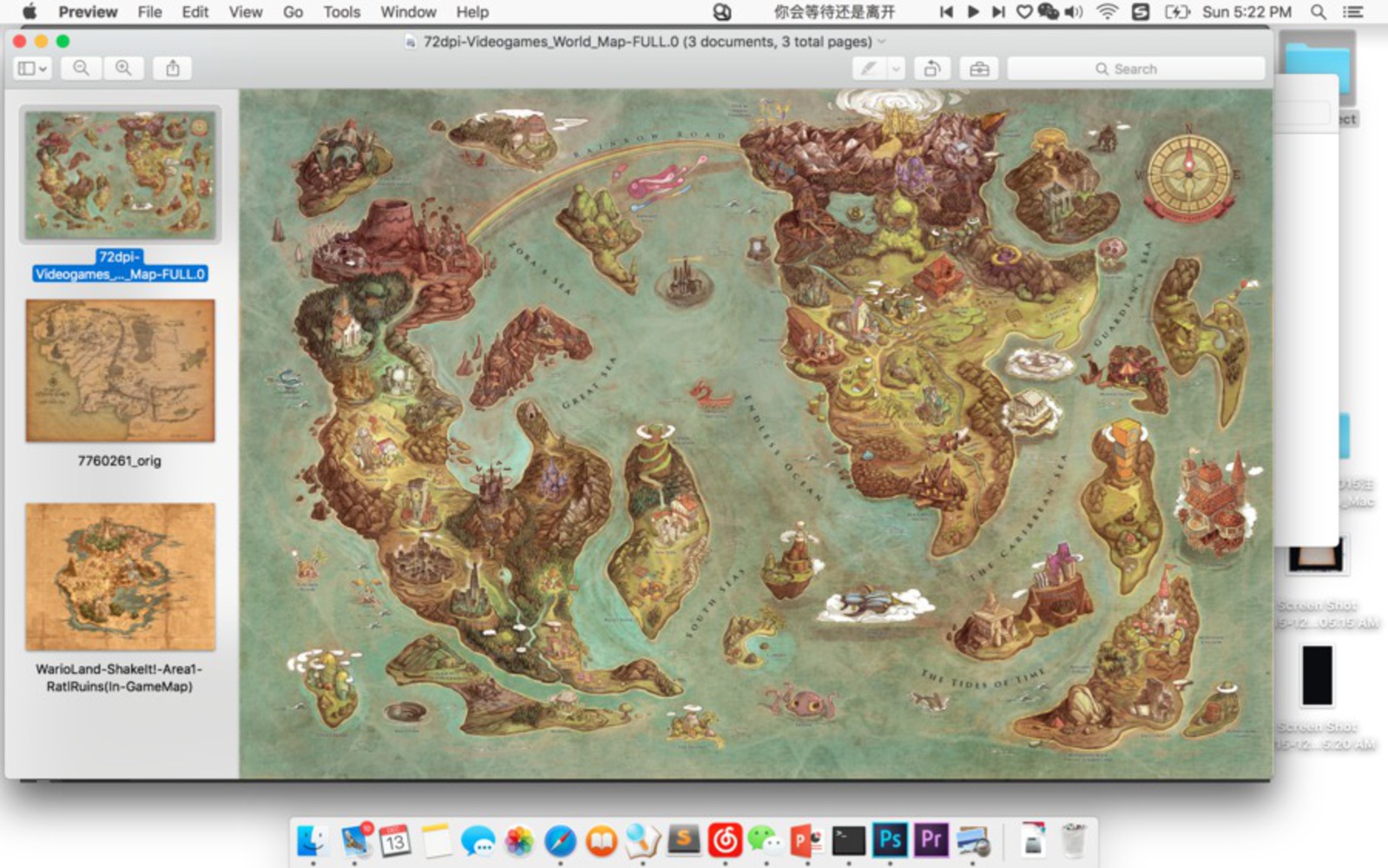
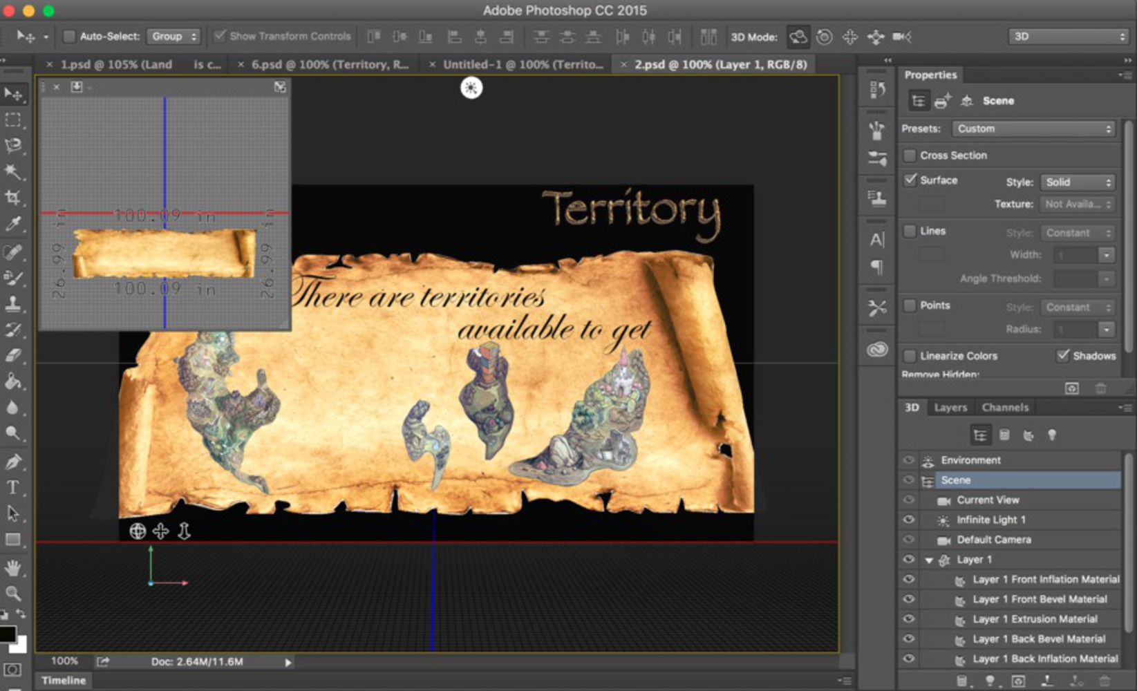
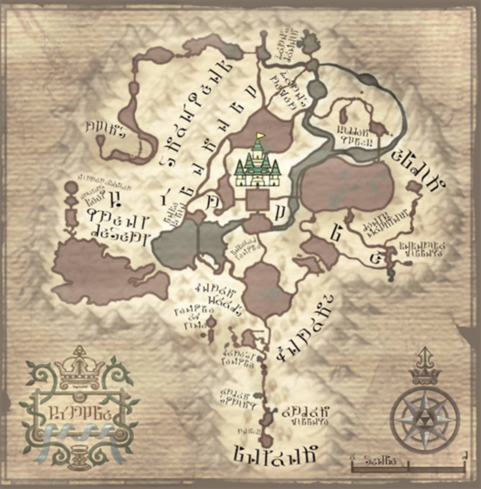
Second, I googled a map for instructions. For the best purpose of tutorial, I chose a game map of islands because it can be easily separated and looked more fit the game. For the page, I also have a scroll as background. I think it looks more classical, mysterious and western.
The original image:
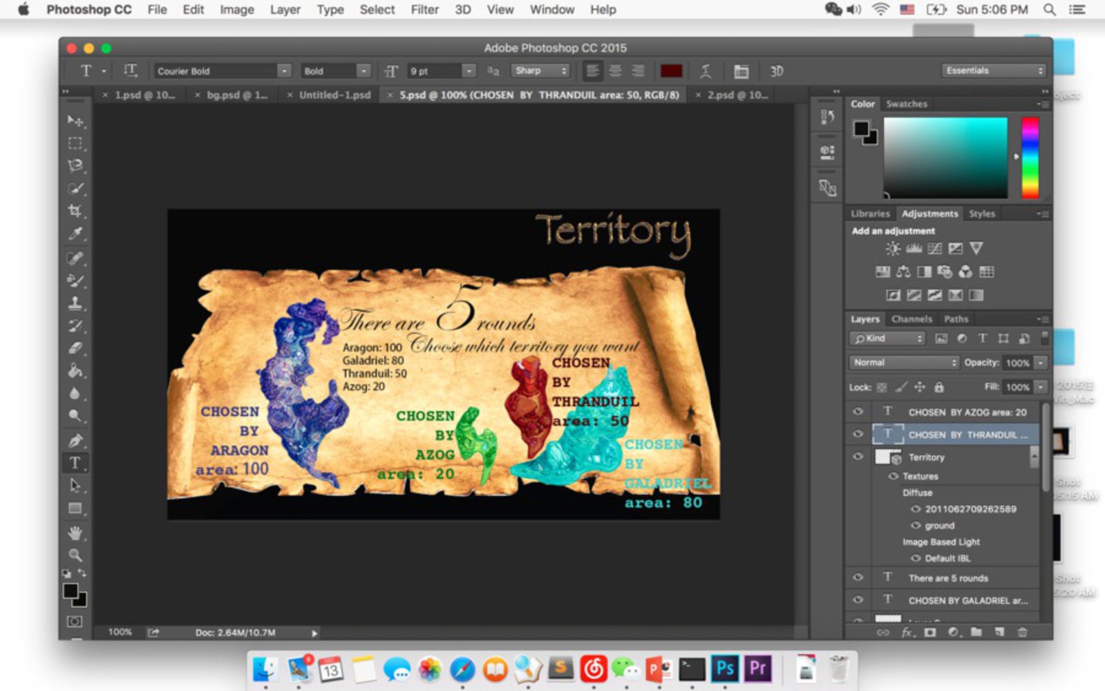
Then, I cut off all the islands I need and edit color tone of those islands to let them consistent to game's style. Next, according to the size of each islands, I assign different values to those lands. There's some trick when I assign values to them: the numbers are not generally multiple of each other and they are not strictly following the sizes of islands. That is part of lies by host(us) in game. Then, I photoshopped some sea textures and used it as background.
By Cloud: To be honest, our project didn't make sense to me at all at the very beginning because the rules seemed too blurry and there's no point in playing. However, after developing the game in detail, our game turns out to be fun and we can actually play that game with friends at home during party time. The only thing that isn't perfect is that the game requires 5 rounds to achieve our original design, and this takes more than 10 minutes to play. This mode of presenting won't work in our final presentation as our audiences are walking around and can probably stop for 1 round top. So if we can come up with an idea to reduce the experience time, our project would be perfect.
In this game, our final project, the main game designer is Fred and all four of us brainstormed ideas for the rules of this game, so we are all designers of this game. After the brainstorming, we distributed the work so that we all have different roles other than simply a game designer. Nazli and Jonathan is in charge of the tech problems, including the coding and internet collaborating stuff. On the other hand, Fred is mainly responsible for the visual and graphic part to make the game looks more enjoyable. And Cloud is working on the sound effect for the game and responsible for the documentation of the final project. In this way, our rules covered all parts of works of this final project and the work has been evenly distributed and effectively.
By Nazli: I think that this was a great project. There were things that we were aiming for and couldn't implement, but as a final product I am happy with what we produced and I'm happy with people's reactions. There have been cases where everyone was honest, and they were so shocked when "we" lied and tricked them into thinking there was someone among them who lied; there were times that every single person lied even without us doing anything, and there were times when a player got very competitive and was collecting our chocolate. I think our game was well-received and that says something good about our product.
We used images from the internet such as the map of Avatar: The Last Airbender, Game of Thrones and Hyrule from The Legend of Zelda. We also used a few TV shows' figures in our demo ppt.
The sound effects come from youtube videos and Dota 2 hero voices.
https://www.youtube.com/watch?v=eHlwkFnGtzs
https://www.youtube.com/watch?v=OC098Nm5__E
https://www.youtube.com/watch?v=dDbXkI4sbUM
You can upload files of up to 20MB using this form.
