Back to Parent

Outcome


Intention

Start the Stop is intended to encourage strangers at a bus stop to interact with each other in the process of making art together. It is deliberately built with no instructions or obviously expressed expectations of the users, excepting arrows indicating that the control knobs should be turned but without any explanation of what might happen when one does that.


People who are traveling around in public choose to not engage with strangers, probably often enough for very good reasons. However, the cumulative network effect of many socially disengaged people in the public sphere leads to a significant loss of connection, camaraderie, and humanity on the part of everyone. Intentional disengagement leads to a mitigation of effort and risk on a personal level (if you don't talk to a stranger they're less likely to be motivated to scream at you, etc.) but is a really large loss at a public level.

Start the Stop intends to give people entree to a simple, interesting, naturally engaging mode of interaction with strangers. It aims to bridge the self-enforced silence that dominates so many public spaces, using as its base case the archetypical locus of detached, alone-in-a-crowd waiting: the city bus stop.
Product

Start the Stop is designed to physically and emotionally create a particular type of engagement among its intended audience, predicated on some assumptions about human behavior. 

The project does not hide its movement mechanism, which appears as a confusing and intriguing device to an uninitiated viewer. It is also, at the outset, a peculiar thing in a space that is generally absent any sort of interactive, tangible installation. (If they have anything at all to see or engage with, bus stops usually either offer printed ads or public service announcements, mounted behind often cloudy plastic.) Start the Stop is a weird thing, out of place, and worth attention for that if no other reason. It aims to intrigue and draw users in through curiosity.

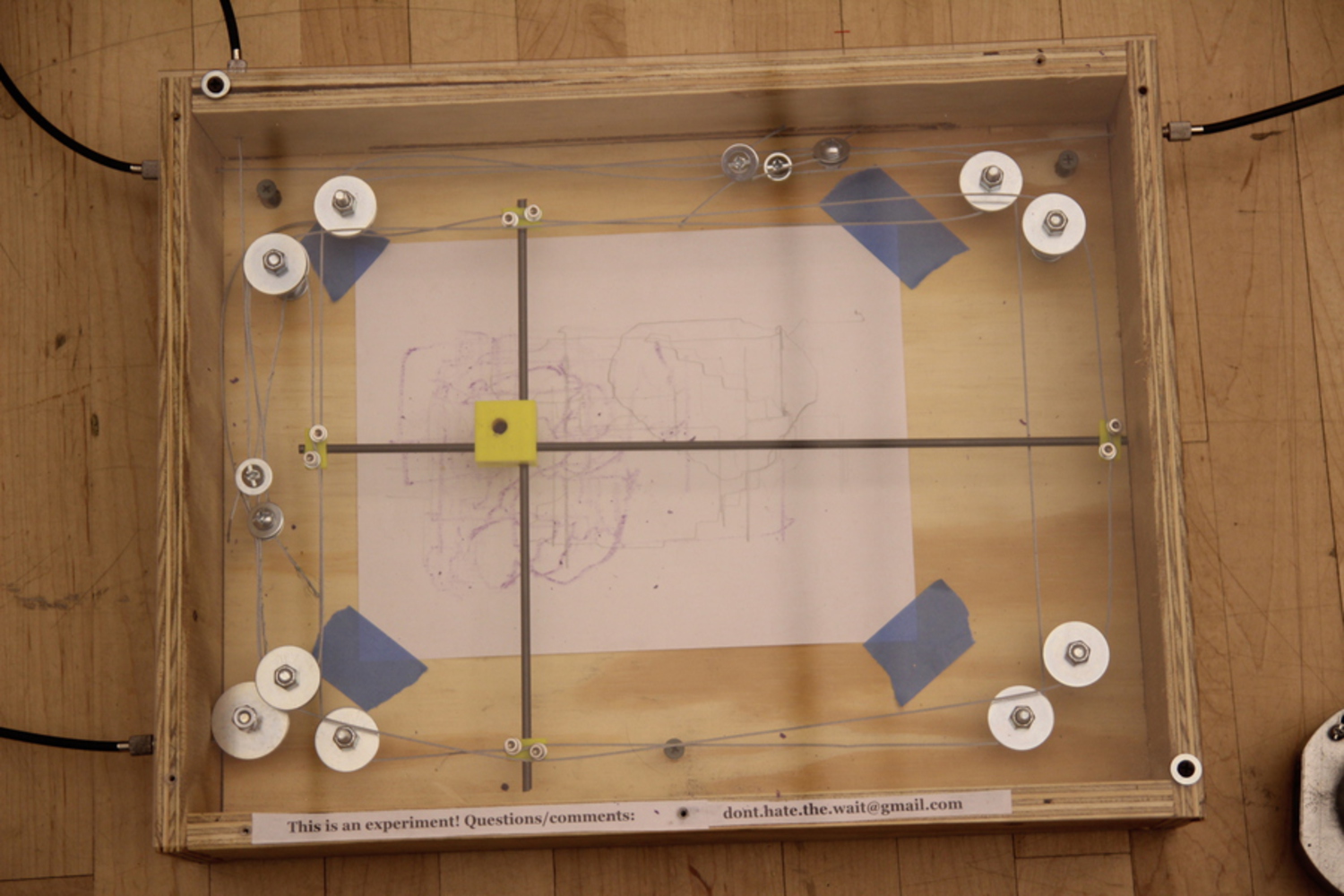
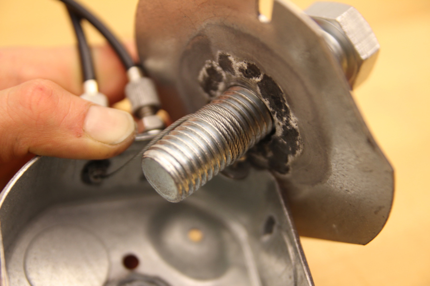
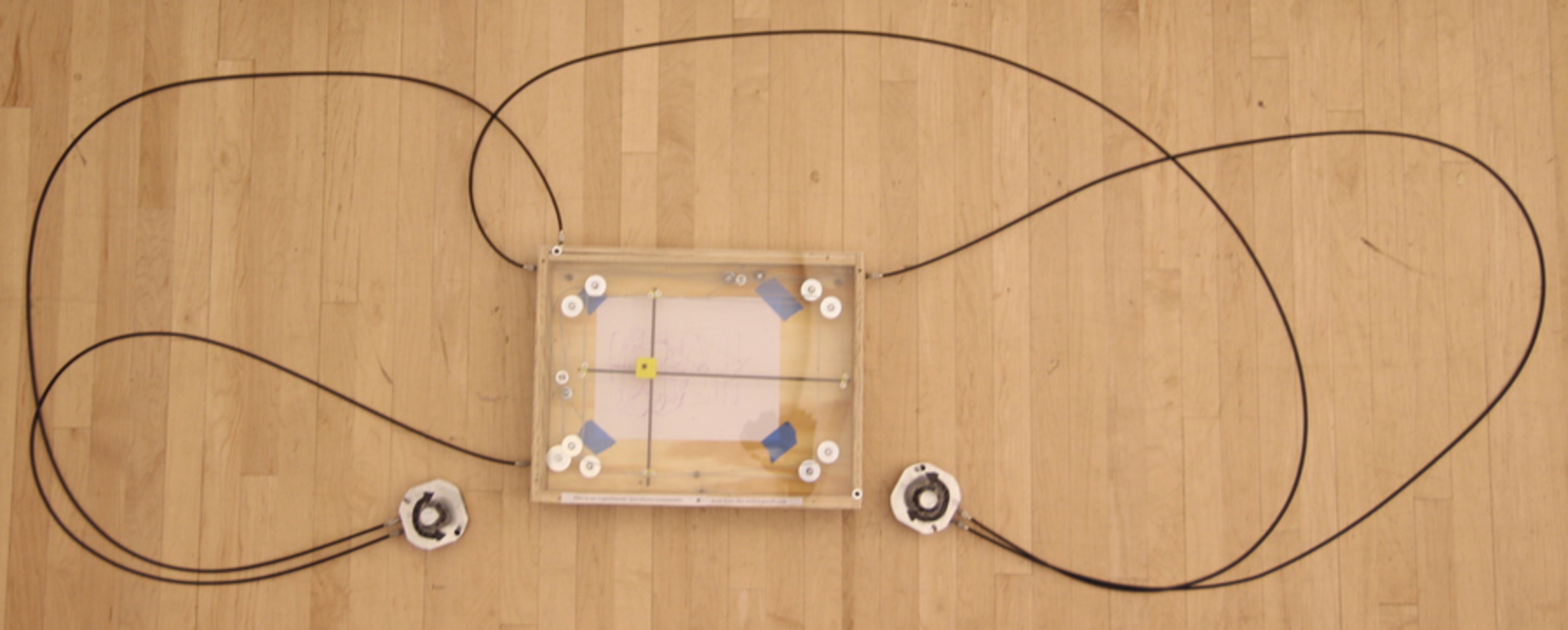
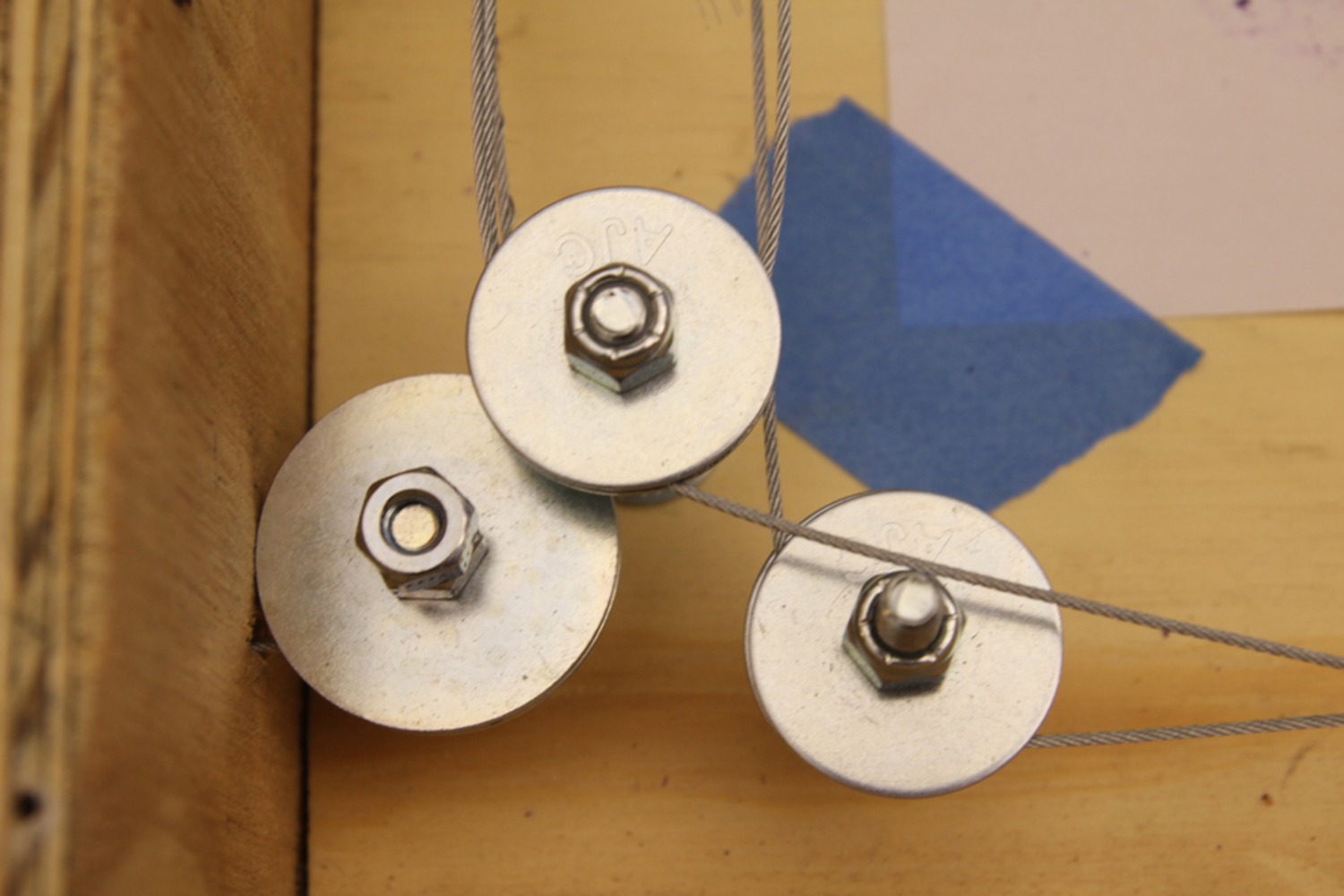
The device essentially functions as an Etch-a-Sketch. It's different in a few key ways: it does not have any erasability, is larger, draws on paper rather than a magnetic screen, and is built to withstand the elements. Coming out of the right and left sides of the main device box are long cables, each with a control knob in the middle. Turning one of the control knobs drives the pencil/crayon/etc. inside the main box left and right, whereas turning the other knob drives that same pencil/crayon/etc. up and down.

And while most people would probably use an Etch-a-Sketch by themselves, that's not possible with Start the Stop by design: the two control knobs are about 8 feet apart from each other, each mounted on one of the support columns of the bus stop. If you want to make a drawing, you'll need to find a friend to manage the other axis. This is, of course, the entire conceit of the project: encouraging (without explicitly stating this encouragement) fun collaborative engagement with strangers on a creative effort.

Img 6023 copy.jpg.thumb
Show Advanced Options
Img 6032.jpg.thumb
Show Advanced Options
Img 6025.jpg.thumb
Show Advanced Options
Img 6054.jpg.thumb
Show Advanced Options

Process

I was interested in making something mechanical that would be interesting and fun to engage in, and realized that something that could be used to create art would be ideal. (Probably any sort of machine that helps people with open-ended expression would do.) The idea of an Etch-a-Sketch drawing machine emerged early on because it's so particularly suited to being operated by exactly two people. A one-person Etch-a-Sketch drawing is really quite boring: just a vertical or horizontal line. It very obviously takes two dimensions to make the drawing even remotely effective.


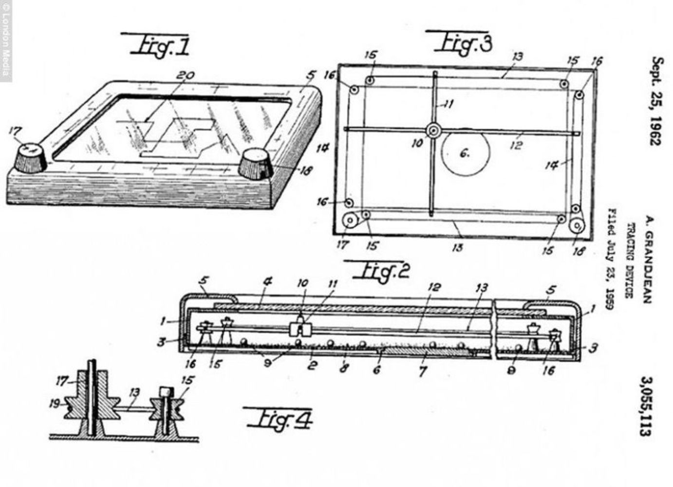
However, I didn't know how to go about making the device, and spent many hours thinking about different possibilities before a friend who has been a fabrication mentor in the past suggested that an excellent resource was right under my nose: the Etch-a-Sketch patent, filed in 1959. This was a great piece of advice. With the patent in hand, I did not need to create a novel way of moving two rods in parallel remotely; all I had to do was adapt the existing old method of doing so to my purposes.

I went through a trial-and-error process of building the device, with many, many failures along the way. Major difficulties included: tensioning the cables properly, affixing cables firmly to each other with improvised hardware, measuring cable run lengths correctly to match the bus stop installation, and tweaking the perpendicular rods so that they would lie exactly perpendicular to each other at all times and not bind in the 3d-printed junction block. I had a very hard time finding a device that could reliably cut the cable I was using, which made threading the newly cut end through the cable housing extremely laborious. Additionally, I found myself approximately 2' short of cable when all was said and done; I needed to twice modify the cable housing (involving unthreading and rethreading the cable) to adjust for the discrepancy. I tried to add a feature where a piece of paper with a drawing on it could be rolled out and ejected so the user could keep it; this was just too hard in the time I had and I abandoned that effort. Ultimately, I installed a pencil as the writing implement in the prototype device, which wasn't especially satisfactory. I substituted in a crayon which somehow was also very unsatisfactory. Many things didn't go to plan and I had to change course repeatedly throughout the fabrication process!

Reflection

I'd like to have spread my design and building time out better. I stayed for too long in the good-idea phase—this is a particularly bad habit of mine—without moving to the give-it-a-try phase. Earlier and more effective prototyping would've allowed me to build successive generations of drawing machines, or if not truly different generations, then versions with piecemeal improvements to the mechanism.


It would also have been nice to have had longer to observe the finished product installed in the bus stop and this would've allowed me to make further design changes in response to watching people's interactions with the machine as well as approaching and discussing it with them.

These frustrations aside, I'm glad that in the end I had a functioning (if frictiony!) prototype that I was able to install and actually observe in its intended environment. I only saw a few people actually notice that the project was even installed in the bus stop; though the project is intentionally out-of-the-way so that it doesn't interfere with people's regular use of the stop, it actually probably was too invisible. (What good is the intrigue of the box if nobody sees it!?)

Additionally, the control knobs, which are the most initially-visible part of the project because they're at eye level, frequently seemed not to have been legible as human interface devices. Metal bolts projecting out of electrical junction boxes simply do not look like things that you're supposed to touch! I would like to make more inviting controls in the next project iteration to increase people's sense of being able to interact with the device.

I believe this was an effective first prototype of this bus stop interactivity project, which was chiefly very instructive in showing the sorts of improvements that could go into making a more successful second iteration.

Attribution

The Etch-a-Sketch patent drawing, below, was very helpful in figuring out how to make the working model of this device. I'd also like to thank Billy Zelnick for his significant advice on questions of fabrication and design, as well as for generously giving me some of his own materials to use on the project.

Etch a sketch patent.thumb
Show Advanced Options
Drop files here or click to select

You can upload files of up to 20MB using this form.