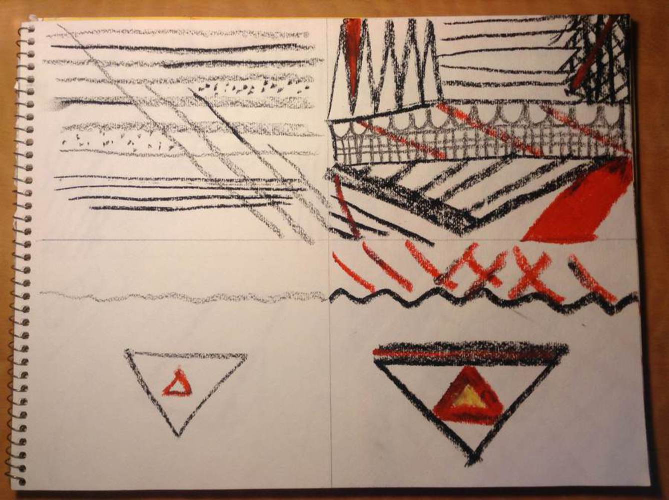
The emotion I chose to experiment with was "dread." I thought it would be an interesting emotion to attempt to convey, and while I'm not sure that I feel my experimentations are really representative of it, I enjoyed the attempt. I found it very hard to think of what might represent dread, given the equipment I have (I feel much more comfortable working with acrylic paints on large canvasses, but all of my supplies are at my parents' house in California, and I can't afford to buy all new stuff). Working with charcoal and pastels is much more portable, which is why I have a set of those supplies here. Attempting to elucidate emotions using them, however, was very difficult. I thought that dread is connected with fear, especially fear of the unknown, which is often violent, which is why I chose to use fiery color. Top row from left to right: a) lines/dots, b) color/shapes. Bottom row from left to right: c) subtle, d) bold. Charcoal and Oil Pastels.
Outcome
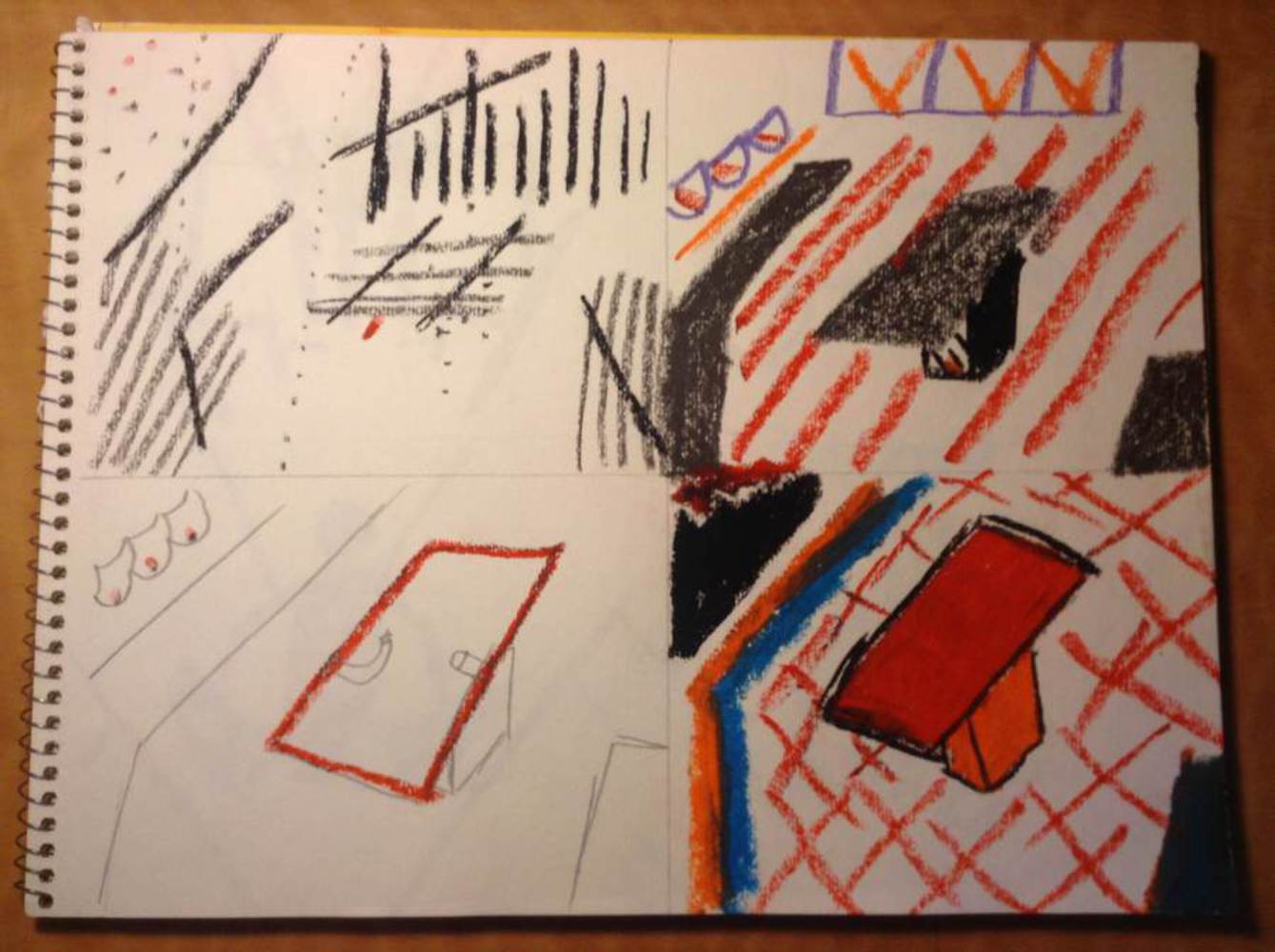
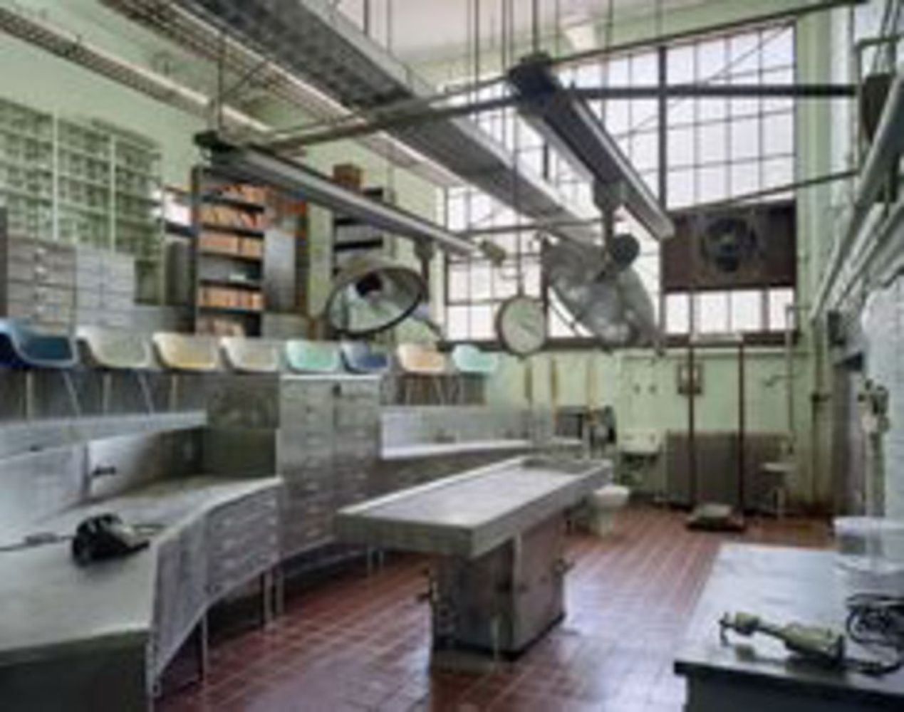
For the next set of drawings, I attempted to create a set of drawings inspired by an old operating theatre. These were located in teaching hospitals, and (in line with the above them for dread) were places where people would be strapped down and operated on in front of an audience, for many years without any kind of anesthetic. I tried to make it as creepy as possible, but again, this was very difficult. I think I did not succeed in making the drawings creepy, but I am not sure how I would have done them differently in order to do so. Top row from left to right: a) lines/dots, b) color/shapes. Bottom row from left to right: c) subtle, d) bold. Charcoal and Oil Pastels.
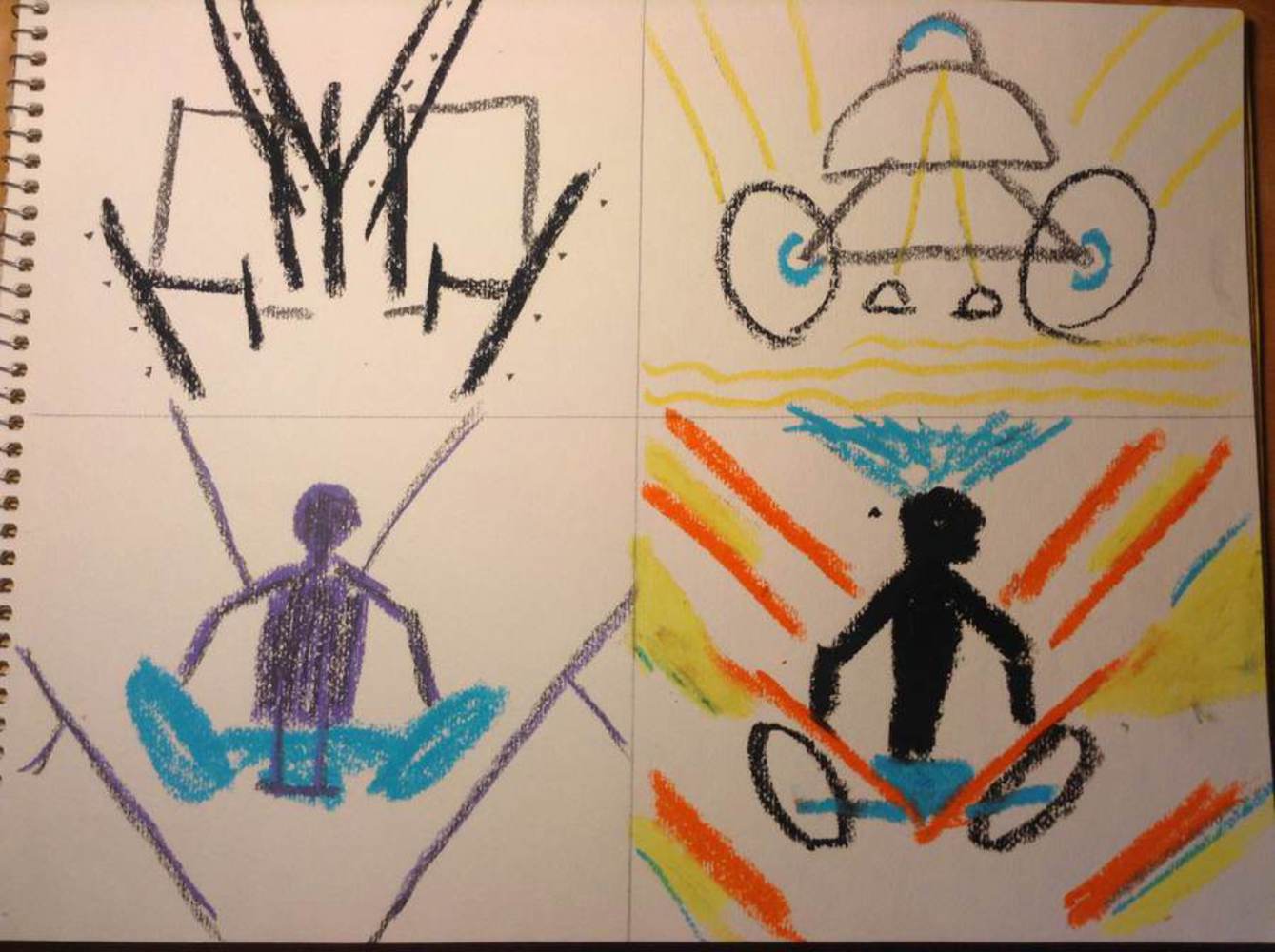
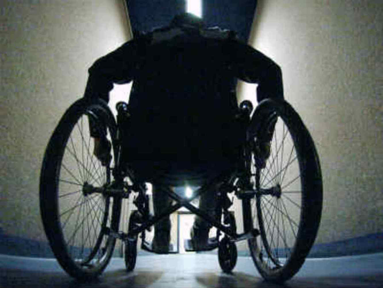
Finally, I used a person in a wheelchair as my human body form. I chose this form because it was on my mind because I've been reading about the Disability Rights Movement. People often laud the performance of bodies that are in peak physical condition, perfectly "able," but rarely to present a person who is physically handicapped as having physical prowess. I think that through the use of bright colors, I was much more successful with this than with the other drawings. Top row from left to right: a) lines/dots, b) color/shapes. Bottom row from left to right: c) subtle, d) bold. Charcoal and Oil Pastels.
You can upload files of up to 20MB using this form.