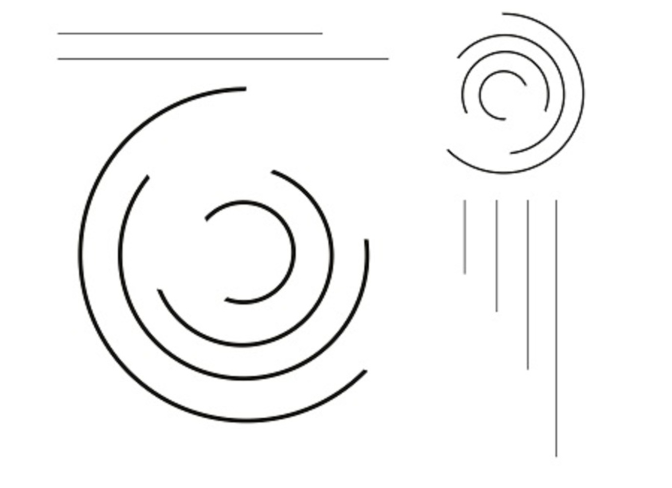
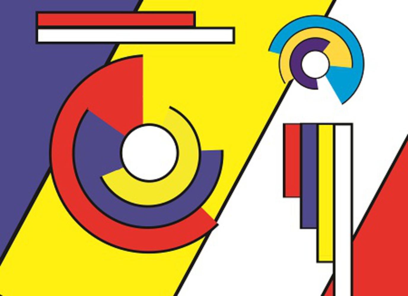
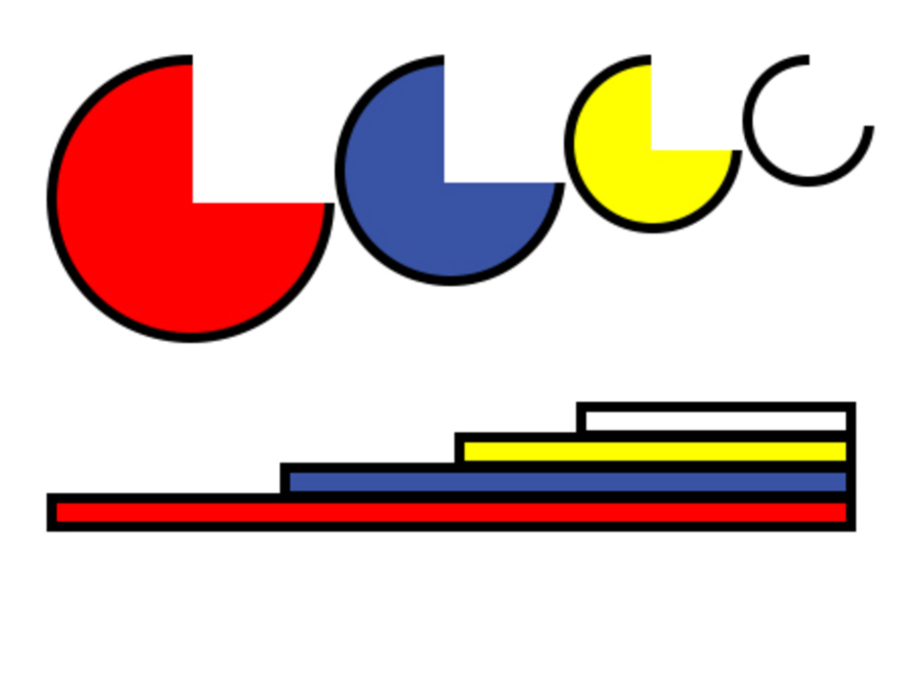
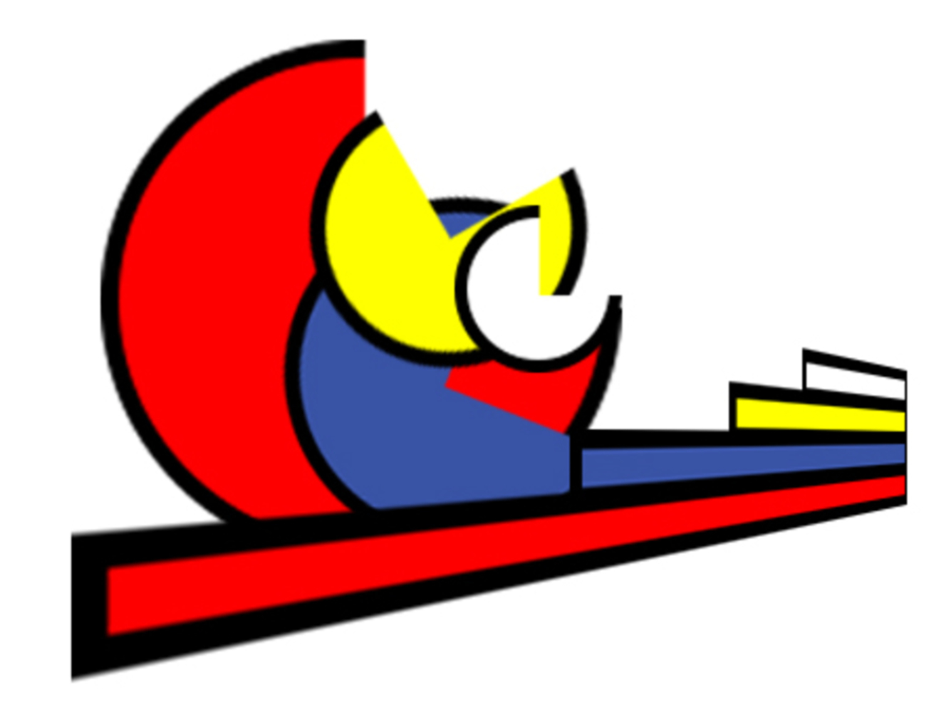
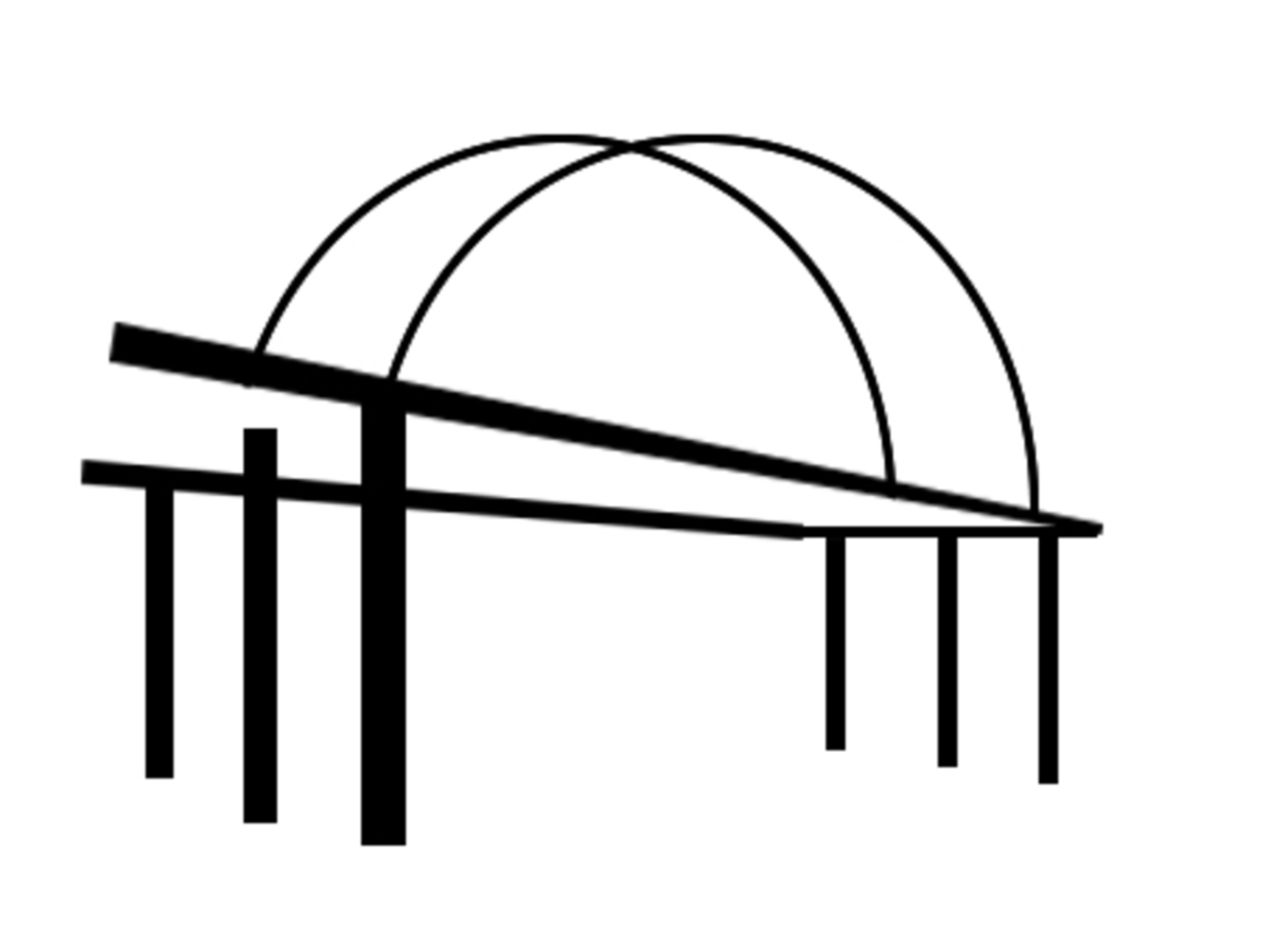
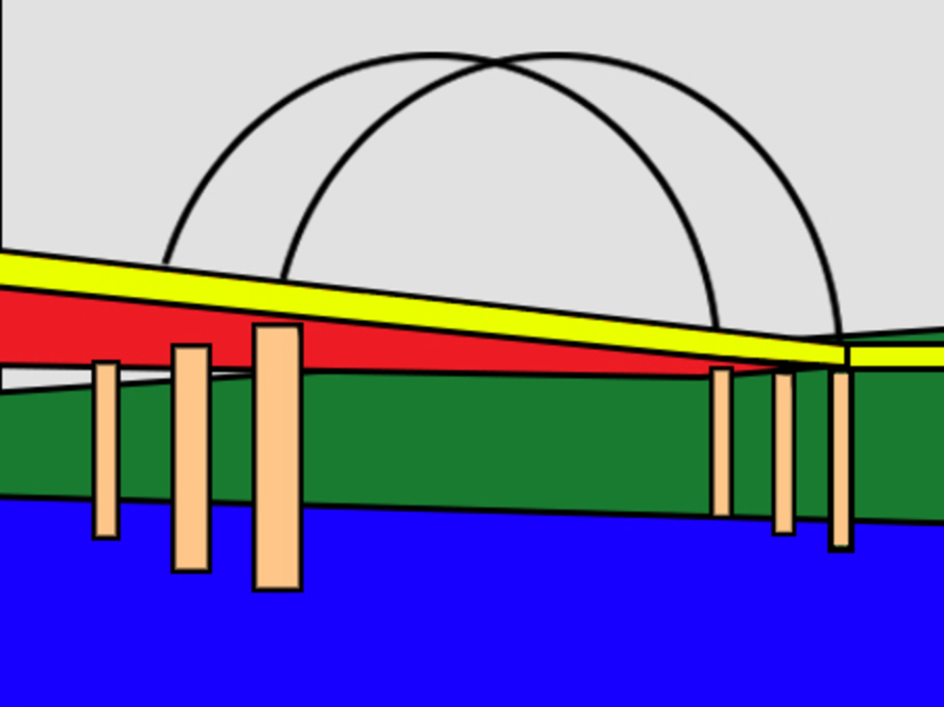
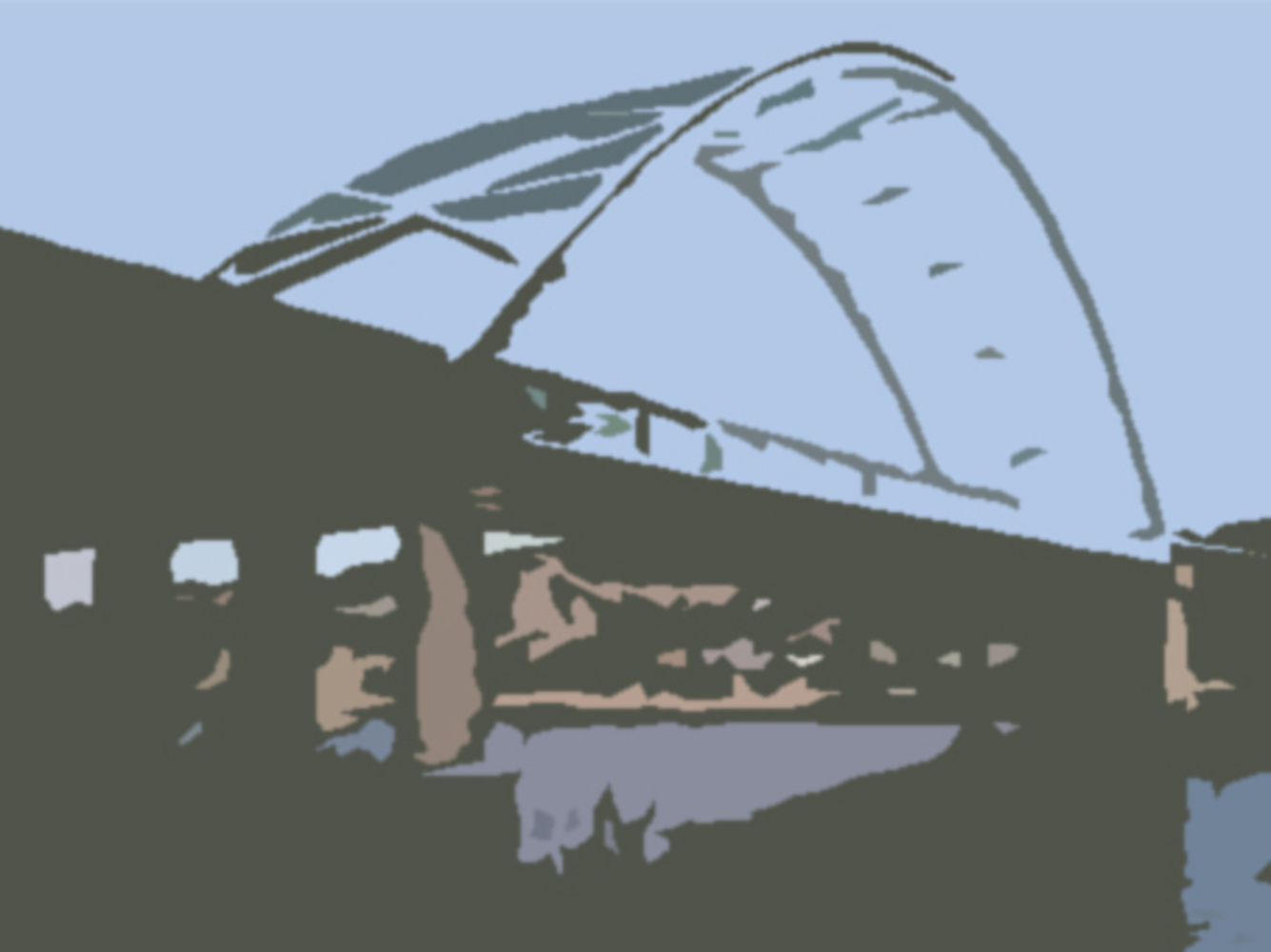
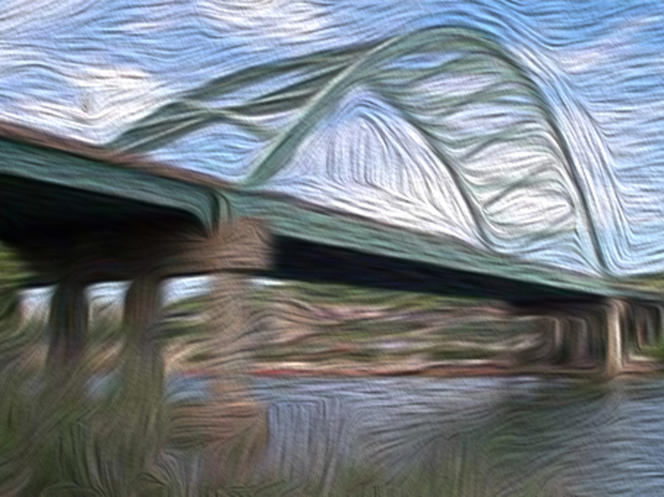
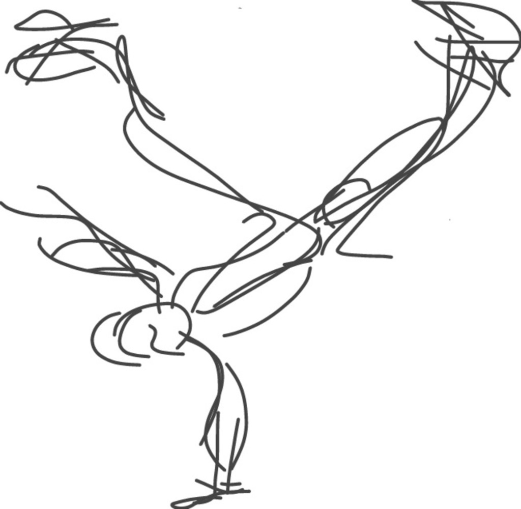
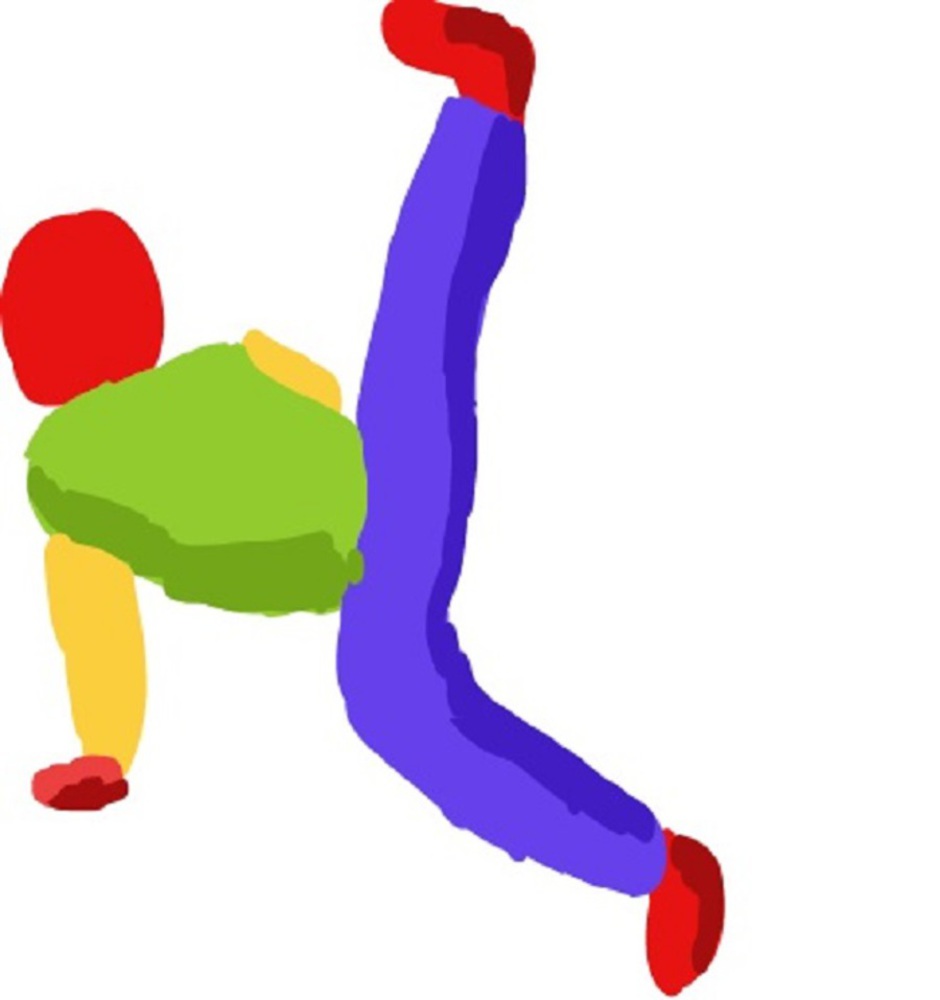
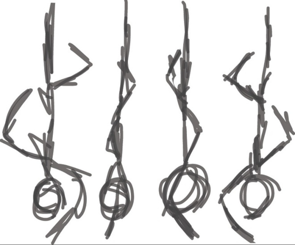
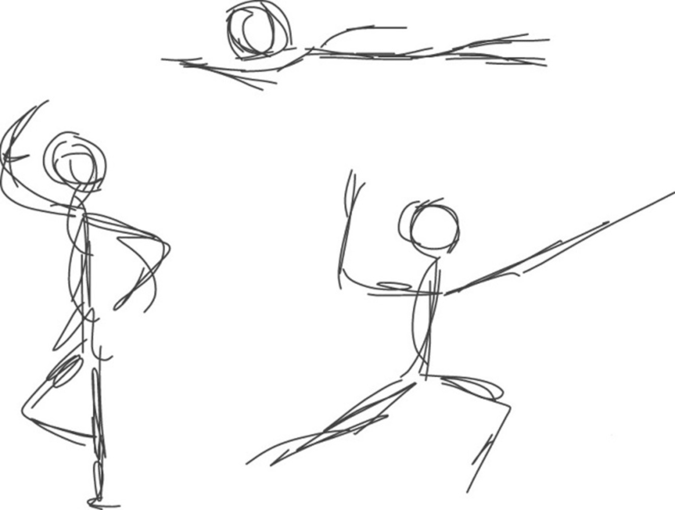
Composition set 1: Emotion - Wonder.
Composed using a strong sense of rule of 3rd. Color scheme of pop art.
Theme of Statis vs Active.
Outcome
Reflection:
After completing this project, I have to say it was not close what I envisioned myself doing. I quickly sidetracked from my original plans as many approaches seemed near impossible to translate onto the digital tools I'm using. So especially for the set for landscape, I had to simplify a lot from what I intended to do. A lot of the pieces originated from a flow of consciousness which I tweaked here and there until I liked the composition. This project also took a lot longer than I anticipated, so there were some parts that were a bit rushed. But overall I am happy about the completely diverse styles for each set, which I used different tools for, and feel each set presented the themes well.
You can upload files of up to 20MB using this form.
