Back to Parent

Outcome


Artist

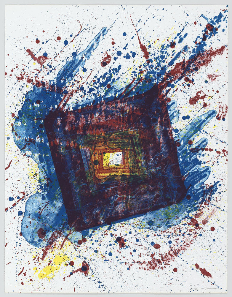
Sam Francis was a prolific American painter and printmaker. He was primarily characterized as an abstract expressionist who focused heavily on expressive color. His artwork often represented events and themes from his personal life: what he was thinking, feeling, etc. Although originally he started work as a painter, he expanded his repertoire over time, delving heavily into printmaking later in his career. He was also influenced by the he spent among artists in France and Tokyo: specifically, he was affected by Asian Culture, Zen Buddhism, and also French modern painting. Francis was responsible for founding The Lapis Press. He is also credited with helping gain recognition for postwar American painting. His work is most popular in Europe and Japan.

Work

I have selected to work with Falling Star created by Sam Francis in 1981. He created this piece as one of a series of eight lithographs for the Foundation for Contemporary Performance Arts. He uses a primarily dichromatic color scheme, and compositionally, the work consists of overlapping and rotating rectangles surrounded by seemingly random spatter, representing a contrast between order and disorder. I chose this piece because when I was originally researching artwork, the title of this piece was intriguing to me and I wanted to know more about it. Additionally, the piece has very interesting color and composition, which directs the eye towards the center of the piece, evoking curiosity in the audience.   


Fallingstar original.thumb
Show Advanced Options

Approach

I approached this assignment by trying to work in the style of Sam Francis. I did not want to directly recreate the artwork exactly as it was. This artwork brought out a strong emotional response in me, and so I wanted to try to focus on that response and re-interpret the artwork in my own personal way. However, I also did not want to completely drift away from the style of this piece, and I wanted my work to look recognizably quite similar to Sam Francis’s piece and style. I wanted to keep the compositional elements the same, but wanted to somewhat change the color scheme to reflect my own personal choice. This is what I attempted to do in Photoshop by keeping the artwork as a reference on the side but not exactly copying it in order to develop my own personal interpretation of the piece.

Product

I created a work in Photoshop in the style of the original piece. Since I wanted to follow the style but make it more personalized, I decided to keep the same overall composition but change the color scheme to reflect my own personality. For me, there is a strong distinction between order and disorder. I see them as very different with very few middle points. Therefore, while Sam Francis did not have a strong color distinction between his rectangles and spatters, I decided to do all my rectangles (order) in grey and black and my spatters (disorder) in a variety of bright colors. This large contrast identifies my personality better. I first created several layers of rectangles using a custom made brush in Photoshop. Then, I created several layers of splatter on top that do not fully mask the rectangles underneath, but somewhat merge with them because I feel I am equal parts organized and disorganized.     

Fallingstar uppal.thumb
Show Advanced Options

Reflection

I believe I captured the themes of the work accurately. Sam Francis was known for capturing his personal themes in his artwork, which is exactly what I attempted to do. Additionally, the work is titled Falling Star which might refer to the order and disorder in the piece itself. I captured this order and disorder in my piece as well; only, I turned up the contrast between the two using my own color scheme instead of the one used by Sam Francis. While working, I realized that I could not possibly plan it all out before I started. If I tried to deliberate about every single mark and every single stroke, I would never have finished this project. I learned that some of the process needed to simply be instinctive instead of calculated or forced. If I was to redo this, I would probably spend even less time deliberating and start almost immediately in order for the piece to be more natural and intuitive. This quality would be easier to capture if I was working on a physical canvas rather than on Photoshop.

Drop files here or click to select

You can upload files of up to 20MB using this form.