Back to Parent

Outcome


Output xtxkz8.thumb
Show Advanced Options

Artist

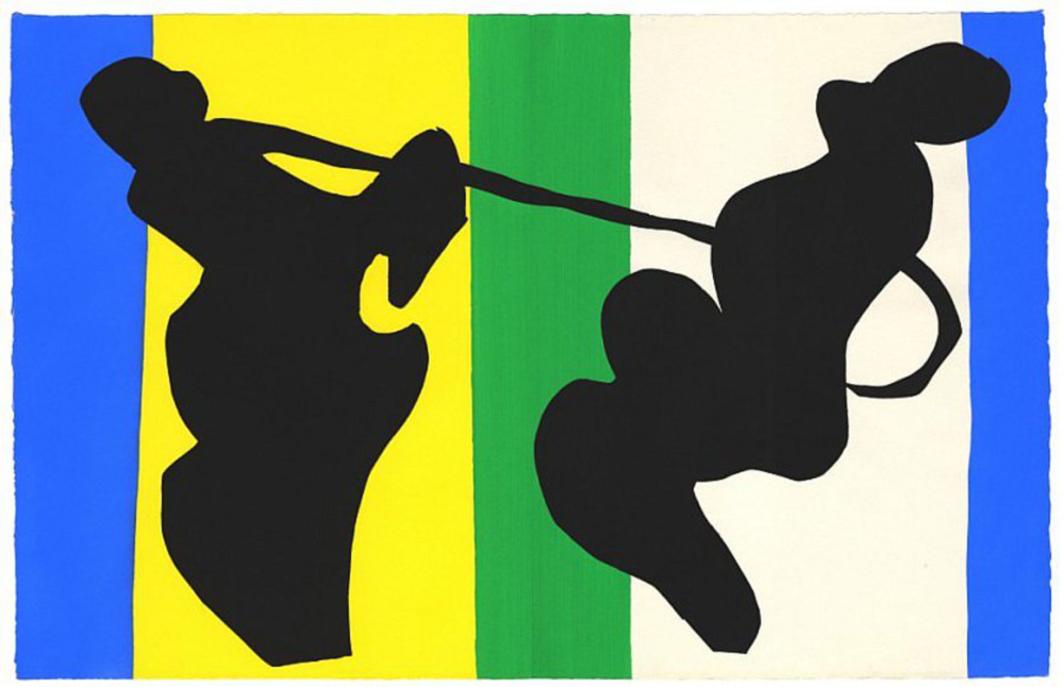
Henri Matisse is a French artists who has experimented with many different styles in his life. Matisse created this piece when he was bound to bed due to cancer. He used a very unique and creative technique: he and his assistants pre-painted pieces of paper, cut them into into shapes, and then arranged them into a collage of shapes and colors. It may seem like a very simple technique, but the creative shapes, the round edges, and the diverse choices of colors give Matisse's cutouts a unique beauty. In his earlier life, he was one of the leading artists in the Fauvism art movement -- a branch of the French impressionist movement. He painted with bright, expressive colors and added a sense of wildness to everyday scenes. Matisse carried his obsession with vibrant colors onto his new style of art -- cutouts. Although he was not working with paint and brushes anymore, he began to portray movements and scenery with abstracted shapes in powerful colors.
Work

The original piece is The Cowboys. The form is so abstract and simple that it leaves infinite room for viewers to reimagine. How I interpret it is this: the black shapes symbolize the cowboys, and the colorful yellow and green background signify a field. The combination of the colors create a cheerful mood. It feels as if we can see the sunny weather in the scene. I was very amazed by his use of vibrant colors in his cutouts, because they create a sense of movements in a still piece. The black shapes barely look like cowboys, but the sharp contrast between the black and the colorful backgrounds add tensions between the two figures, as if they are in combat or playing a game on a green field under the clear blue sky.

Henri matisse cowboys.thumb
Show Advanced Options

Approach

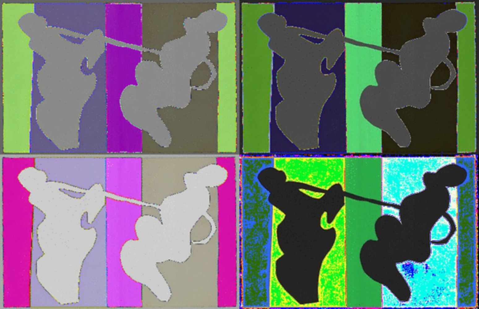
The colors are what I find most fascinating in this cut-out. They are beautiful by themselves, but in Matisse's arrangement, they contrast and compliment with each other to create a sense of motion. I wanted to explore the effect of colors on this piece, and how different colors affect the viewer experience. Therefore, I chose to manipulate colors of the original piece to experiment with different color combinations. I created a gif where I showcased a series of manipulations that I made. Their fast transitions can also highlight the sense of motion in the original arrangement, intensifying the viewing experience. 

Product

In my recreation, I maintained the original arrangement of Matisse's piece, and reconstructed it with alternative color choices. I used Processing to manipulate the colors and generate the gif. Specifically, I changed the color of the piece pixel by pixel. Every 200 milliseconds, I change the RGB values of each pixel. The value of change differs for each of the four pieces in the gif, so they all look different in each frame. I decided to use four different smaller pieces because I think that is a good way to sharpen the contrast between colors and color combinations. 

Reflection

Having played around with Processing a little bit in the past, this gif is my first real project using it. It is a really powerful tool and I am really looking forward to experimenting with it more. Initially, I thought since I am manipulating all the pixels with the same colors in the same way, all the colors will just change together as a block. However, after I coded it, the blocks turn out to have multiple colors, and the outline areas have glitches. I actually liked this unexpected effect, because it shows the colors are not perfectly even, since they were hand-painted. This digital manipulation exposes a lot of details that were hidden in the original format, and I find that very interesting. 

Drop files here or click to select

You can upload files of up to 20MB using this form.