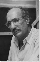
Back to Parent

Outcome


Artist

Mark Rothko (1903 - 1970) was an Abstract Impressionist painter (although he rejected classification) famous for his paintings of large colored rectangles. These reduced color and form to their most basic, and allowed for a wide range of interpretations from the viewer. He was influenced by mythology, inspired by its use of symbols to represent deeper meanings. Originally, Rothko painted more "normal" works with obvious human figures, but eventually moved towards more abstract shapes. Rothko himself said, "It was with the utmost reluctance that I found the figure could not serve my purposes....But a time came when none of us could use the figure without mutilating it." (https://www.nga.gov/feature/rothko/myths1.shtm) For him, all the meaning of the figure is packed inside the rectangles. He was also inspired by philosophy, particularly that of Nietzsche. He created a total of 836 paintings in his lifetime.


Work

No. 2, Blue, Red, and Green is not one of Rothko's more popular works. There are many variations of the name used to refer to it (without commas, different color order, etc.) and its most significant role was as part of a legal settlement regarding Rothko's will. Nevertheless, this piece appealed to me due to its unique colors. Rarely do you see red mixed with green in a painting, as it usually creates an ugly brown. But the imperfections in the red paint reveal it was put down after the green dried, allowing them to mix together pleasantly. The colors and proportions also remind me of Pepe the Frog, an Internet meme, which I find somewhat odd- the rectangles by themselves look nothing like a frog, but I have seen the color pattern so many times that the shape is almost irrelevant.


Approach

My first thought about how to recreate the work was to just use the rectangle tool in Paint.NET- after all, it's just rectangles, isn't it? But a large part of Rothko's works is the imperfection. The colors bleed through, the texture of the canvas is visible, and you can see the individual brushstrokes. To replicate this, I instead used a drawing tablet and drew the shapes by hand. I also set the opacity to about 90%, so that the viewer is able to see where my hand actually moved when drawing. I ended up going over most areas 2-3 times, some areas only once, and a few small areas I missed entirely. I also drew the red part on top of the green part like Rothko did, so some of the green shows through.

Product

I titled this picture "No. 2 B, R, and G" to reference both the original painting and the RGB computer color scheme. It shows a green rectangle, a thin red rectangle, and a blue rectangle on a black background. Some parts of the rectangle are more vividly colored than others, depending on how many times I drew over that spot. I used Paint.NET(a drawing program like Photoshop) and a drawing tablet to create this image.


Reflection

I am pretty happy with how this turned out. The layered transparency effect ended up looking very nice, especially with the black background. I was initially curious why Rothko had chosen a black background instead of a more traditional white, but at least on my own work, it does not look nearly as good:


I understand how difficult it was to paint those simple-looking rectangles a lot better now. I also realize how important the colors are. The colors are probably the biggest difference between my reproduction and the original, and I like the original's much better. Maybe it is because they are made of physical paint, but Rothko's colors appear much richer and more nuanced than mine. Even so, I think No. 2, B, R, and G is a reasonably accurate reproduction that takes the process of painting and translates it into the digital world.

Drop files here or click to select

You can upload files of up to 20MB using this form.