Back to Parent

Outcome


Intention

Write about the big ideas behind your project? What are the goals? Why did you make it? What are your motivations?

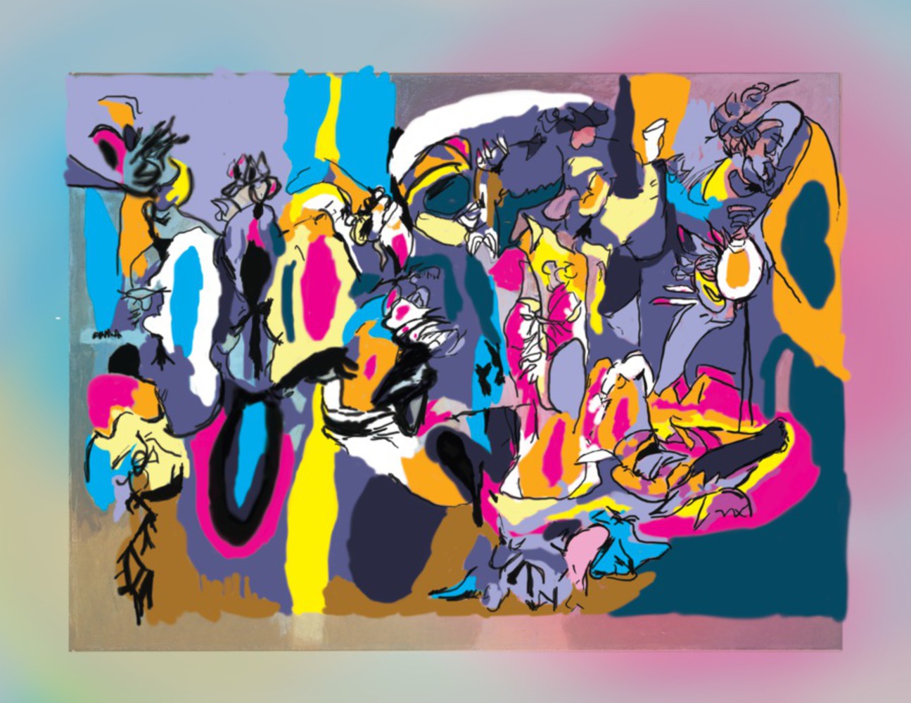
The goal behind this work was to re-interpret Gorky's original piece in essence while making it distinctly modern in color palette as well as thematically similar stroke, line and shape. Gorky's original work evokes at once feelings of familiarity, and the natural, with a looming, growin sense of dread that magnifies as you struggle to find forms in the abstract figures and forms he presents.
Work

Describe the work you selected and why? How is it composed (color, tone, form, shape, space, line, surface, proposition, context, symbolism, response, etc.)

Gorky's The Liver is the Cock's Comb evokes the feeling of the familiar and recognizable upon the undefined. It is abstract, but Gorky positions lines and colors to suggest figures. These figures, bright in color and contrast and frenetic line weights invite the viewer to try and define them through a combination of black outlines that seemingly fade out under the weight of other color swatches and shapes and the contrasting shapes themselves the bend into each other. The end result is a work that engages the reader to constantly struggle to define objects within, with the objesct purposefully mangled together to prevent that definition. The colors, shapes, and figures are are familiar enough that they ease the viewer into a sense of the known, and then challenge them with an omnipresent formlessness.

Approach

In order to capture that same uncanny, familiar-yet-unfamiliar feeling of Gorky, I specifically attempted to redefine "familiar." I swapped Gorky's color palate- in most places- to CMYK substitutions in order to capture a more modern palate. At the same time, I painted the outlines of all the figures from Gorky's original with varying degrees of opacity and hardness in order to create similarly definition-less shapes (in general, the outlines become sharper as the eye moves left to right. In addition, I used the colors themselves to form similarly uncomfortable transitions between hard outlines and other color shapes. Finally, there are a variety of brushes used in between each separate shape and portion, colored shapes weave over and under themselves with varying degrees of roughness. Specific lines are sharper than others which are sharp and taper in a similar manner to Gorky's own. As you move inward, there is simultaneously more detail collapsing on itself and less detail in textures, with the intention of making everything flow relatively smoothly into itself at macro level, but leaving no two spots of the piece looking recognizably similar in figure, form or color.

Product

The product itself is a false implication of sorts. Any decision made with a specific color, line style, or texture is reflected by it's opposite somewhere else on the piece. There are 4 or so distinct planes but it is intended to be difficult to place where they fall relative to each other as the implied boundaries of things are intended to muddle themselves into obscurity if you follow any one direction for too long.

Reflection

I believe I managed to capture the anxiety of Gorky's original, but the palette swap I chose prevented me from touching on as much of the macabre, almost menacing aspect of Gorky's original. In swapping to vibrant neon colors, I feel I swapped "familiar and unsettling" with "familiar and childish." I personally think my own figures are therefore amorphously menacing and edgy in their own right, but framed in a more whimsical and naive sense of the unknown than Gorky's original, which captured a more mature sense of dread and menace within the frenetic figures and colors.

The liver is the cocks comb remix.thumb
Show Advanced Options
Drop files here or click to select

You can upload files of up to 20MB using this form.