Back to Parent

Outcome


Statement

I intend to use the ideas of other artworks, such as multiple layering, to create a political poster that calls for attention to terrorist acts.

The series of terrorist attacks in France in 2015 and 2016 were both heart-wrenching and alarming. I personally feel that the world population has not truly understood the enormous strength and serious danger that terrorist organizations possess. 

Additionally, while researching online, I was fascinated by the ideas of using the colors of a national flag as a background. I think that in this way people would be more empathetic to the theme conveyed in the poster.

Second version.thumb
Show Advanced Options

Context

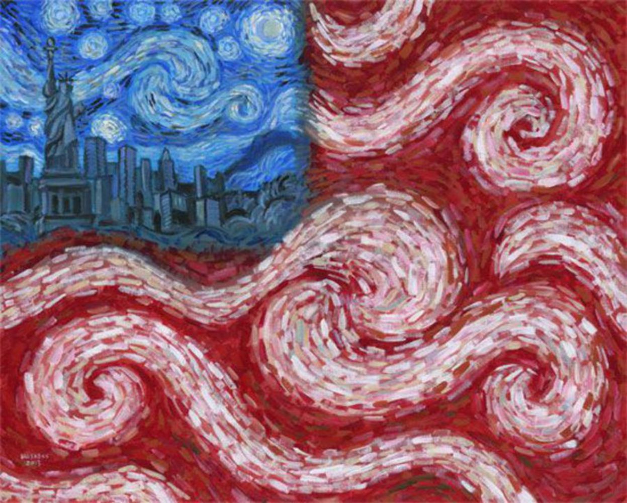
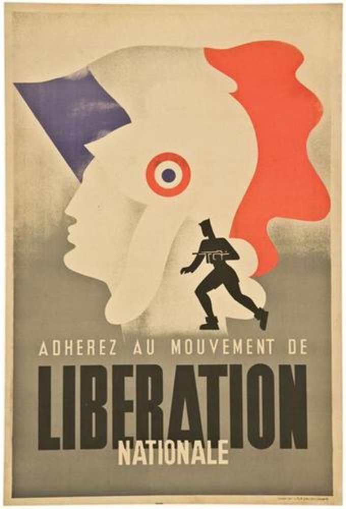
I was influenced by a number of artworks when creating this project. As stated in the proposal, I was interested in incorporating the colors and shape of the French national flag to convey the theme. The first two pictures below influenced the style and content of my project.

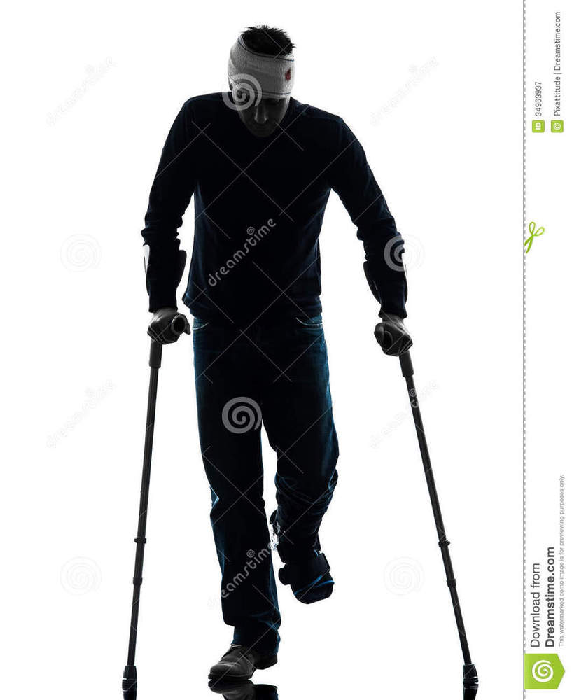
Also, I am fascinated by the style of creating multiple layers, some more opaque than others, in order to give the feeling that terrorism is looming and approaching us. One of the layers that I spend most time on is the injured soldier silhouette, which is the third picture below. By coloring the silhouette in the colors of the French flag, I want to convey the message that France is injured herself, and that this incident both needs help and attention.

French flag.thumb
Show Advanced Options
American flag.thumb
Show Advanced Options
Injured man walking crutches silhouette one studio white background 34963937.thumb
Show Advanced Options

Process

At first I wanted to create something abstract and dreamy as in the second picture above, but later I realized that in a political poster the idea should be as clear as possible. Therefore I decided to make the project rather simple to be understood.

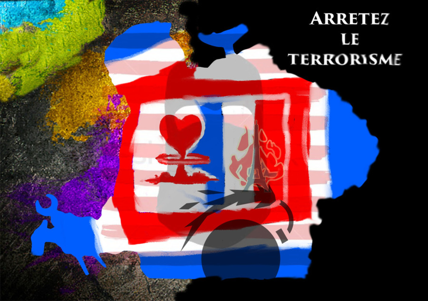
My first-cut was attached below. As it can be seen, I incorporated the concepts of multi-layering with different opacity, colors of a national flag, and a clear slogan in the project. However, there are a few things that I am not content with. Thanks for the staff for pointing those out and giving me advice during the desk crit!

Most importantly, the background does not fit with the French flag in the form of a person in the center. I tried to represent terrorism as pure black, and the colorful painting on the left as people's happiness in everyday life. However, it was hard to understand, and the abrupt transition in color made the picture not esthetically appealing.

Some other things that need improvement are the confusing figure in the center (it's hard to see that this is an injured person), the strange red stripes, and the rather chaotic layering. I changed these in my final work.

Creative project.thumb
Show Advanced Options

Product

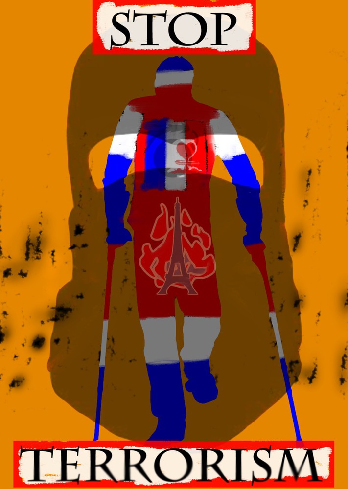
Here is my final product.

I mainly used Adobe Photoshop to create the poster. The opaque layers are all borrowed from the Internet, as well as the contour of the injured soldier. The blue, white, and red colors, the scratches on the two sides of the picture, and the two words are all painted and composed by myself on Photoshop. 

Basically, the idea of the picture is that France, as represented by the injured person, is under serious threat and damage by terrorist attacks. The bombed away heart in the center, the black bomb, as well as the Eiffel Tower on fire, all strengthened this point. The black terrorist mask in the background covers nearly the entire body of France, indicating that terrorism is now a serious problem in France. The burned scratches on the sides indicate that terrorism leaves holes and wounds in the society. Orange is the color of terrorism. Finally the "terrorism" slogan is blurred, meaning that we have not yet established a clear definition of terrorist acts, and this should be resolved.

Second version.thumb
Show Advanced Options

Critique

I think my work reflects my intentions well. But there are certainly a lot of places where I can further improve the picture.

The composition is relatively simple, but balanced.

The colors are pretty contrasting. The orange background can create a sense of fear and disgust, since they represent the color that terrorists wear. Thus the tone is urgent and fearful. I think one improvement might be that I should have used a more smooth color scale.

The form and shape are rather uniform. There is transparency and intentional holes involved in the drawing. There is also symbolic connotation, as in the black mask and burning Eiffel Tower. However, the painting of the colors of the French flag might not be appealing. The lines are also not clear enough. I am not an adept painter, but I would try to refine my skill.

Personal Reflection

My main takeaway from this project is that I should be more brave when creating something artistic. Honestly, I have not had much experience with artistic creations in the past, so for this project, I was not sure if I could even complete it. As I worked on the project, however, I felt that I really enjoyed the process of painting and modifying pictures, even though I was not so familiar with the tools. In the end, drawing is not as hard as it seems to me.

That being said, I realized that there is still a long way to go for me to create something that can really reflect my true intentions and ideas. I look forward to doing more creative things in the course, and learning from others!

Proposal

I intend to combine the ideas of the two images attached to create something patriotic, yet in the form of abstract expressionism. 

The first picture is a copy of French propaganda during World War II. It features a soldier whose hat and silhouette resemble the French national flag.

The second picture is an American Flag painted in the form of abstract expressionism, by Lisa Priestley on pinterest (“https://uk.pinterest.com/pin/417005246724015289/“). Although the artwork preserves the color scheme of the original national flag, it blurs the spangles and blends the Statue of Liberty into the stars. 

From these two, I would like to create a piece which arouses attention to the series of terrorist attacks in France. The background should be a person’s body in the colors of blue. white and red. The person is seriously wounded, so are the French monuments featured in each of the three colors. As a form of propaganda, the picture should also have some slogans, possibly the same as the one in the WWII poster. 

Drop files here or click to select

You can upload files of up to 20MB using this form.