Back to Parent

Outcome


Logocollage.thumb
Show Advanced Options

Statement

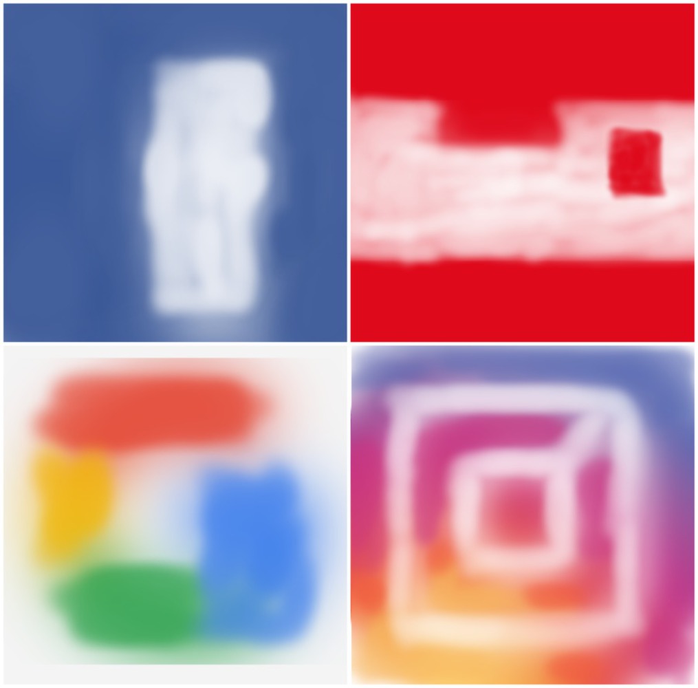
I was inspired by the works of both Mark Rothko, and Andy Warhol to create abstractions of recognizable brand logos. I find the subliminal recognition of logos to be an interesting thing about society, and I would like to see if I can make something that causes that brand recognition without explicitly showing the brand. I made several of these pieces with different logos in mind in order to see if my audience connects the dots in their head between the basic colors, and the more detailed logo. 
Context

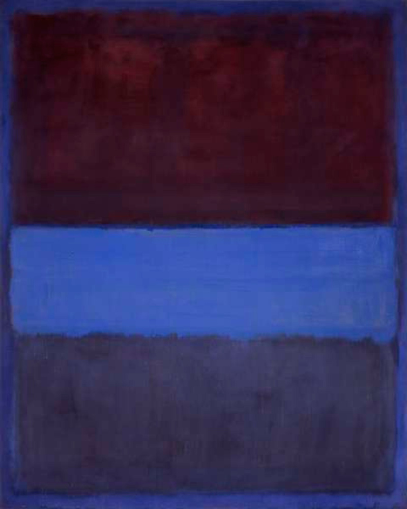
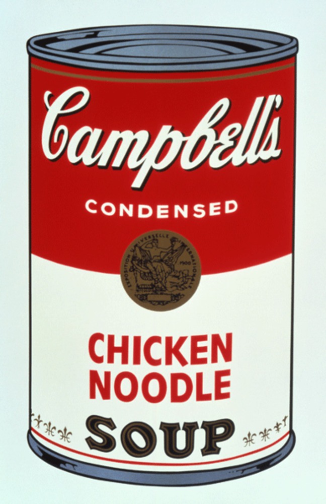
My project was heavily influenced by both Mark Rothko's paintings, and the pop art movement of the 20th century. My creations are sort of a mix of both Rothko's abstract expressionism, and the pop art of Andy Warhol. I tried to emulate Rothko's simple, or basic, colors and shapes to express what I wanted to create. I like Warhol's popular works relating to the Campbell's Soup can, and so I thought I could work with more modern brand names to evoke some sort of abstract recognition of popular brand logos. Below I have included examples of a Rothko painting, and one of Warhol's Campbell's Soup pieces. 

No 61 mark rothko.thumb
Show Advanced Options
02212012 edu 1998.1.2393.2 large.thumb
Show Advanced Options

Process

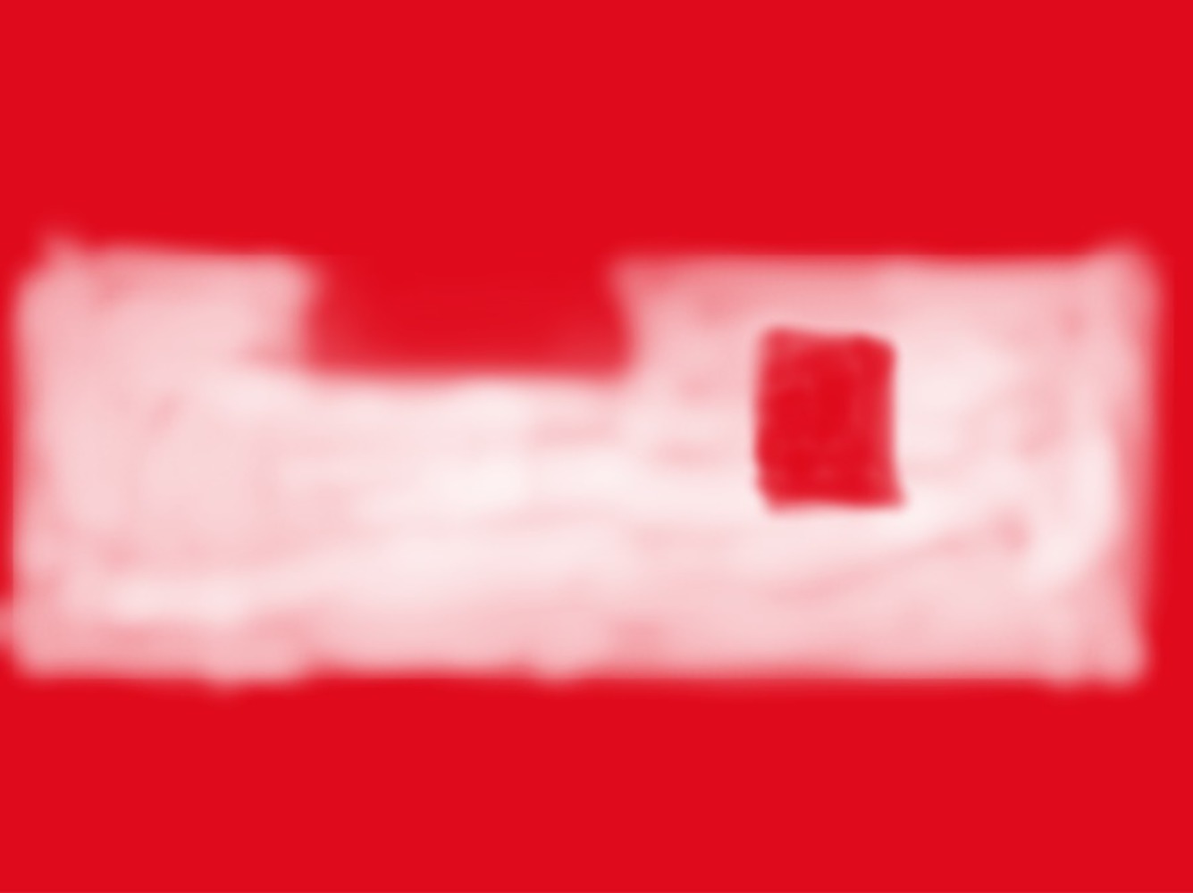
I originally intended to make everything using a shape tool in Photoshop or GIMP to make squares and fill them with the appropriate color. However, after thinking about how that would look compared to my inspiration, it felt a bit too digitally manufactured. What I did instead was load an image of the logo into GIMP and blur the image until the logo was barely recognizable. Below I included one of the images I made just after blurring the Coca Cola image. Using this blurred image I took the airbrush tool and used the outlines of the blurs to make square-like shapes around the logo in the right colors. Using this method I think I managed to replicate the style Rothko had. The finished product looks much more handmade with this method compared to what how it would look if made with perfect shapes generated by GIMP.

Red background white logo.thumb
Show Advanced Options

Product

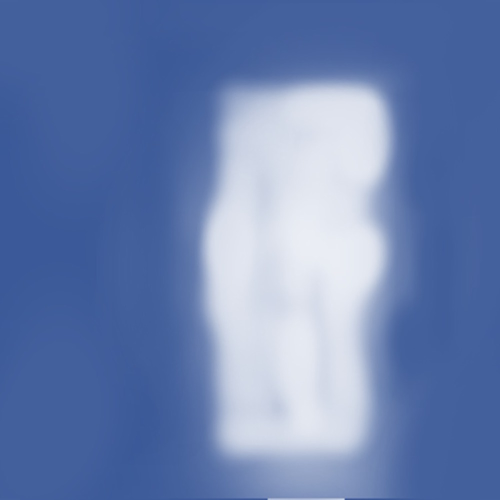
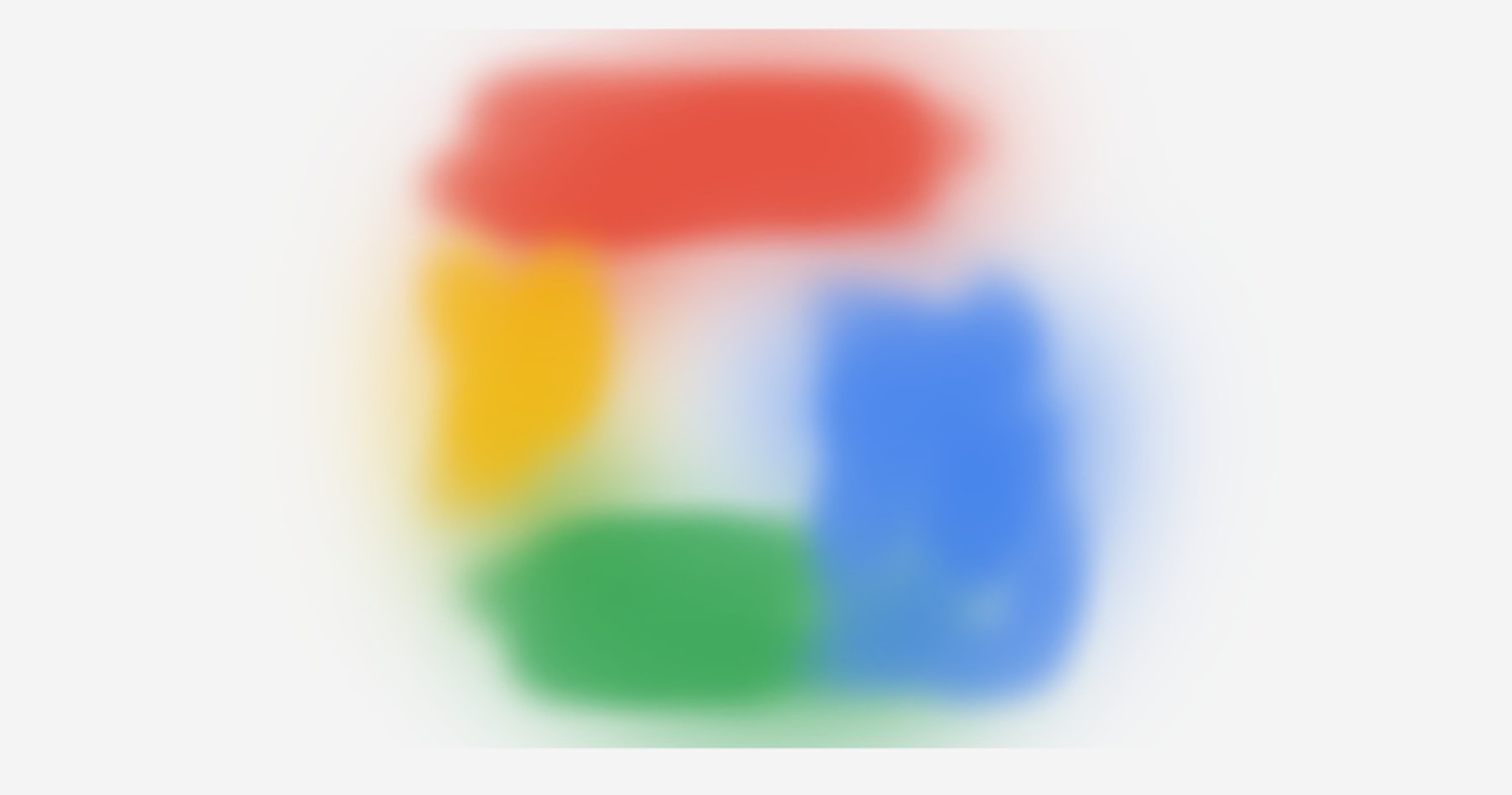
The finished product is a collage of the four works I made using the method described above. Top left is Facebook, top right is Coca Cola, bottom left is Google, and bottom right is Instagram. I chose these logos to work with because they are pretty different looking from each other, and they are fairly well recognizable. I decided to collage the four images together to resemble Warhol's Campbell's Soup compilation works. I used gimp for the individual images, and a collage software online to put the four pieces together. I will also include the four images separately below.

Fblogo.thumb
Show Advanced Options
Cocacola.thumb
Show Advanced Options
Googlelogo.thumb
Show Advanced Options
Instalogo.thumb
Show Advanced Options

Critique

I think my final product accomplishes what I set out to do, in that they look similar to Rothko's works in style, and the content is more closely related to Warhol's pop art. I do think the Instagram image least resembles Rothko's paintings, but it was also the last one I made, which means I may have put my own spin on it unintentionally by that point. I think maybe I could have used more layers of color in my images, as Rothko does. If I were to do it again I might  hand paint each one on a canvas to improve the handmade aspect of the images, as to better emulate Rothko. Other than that I think my work overall succeeds in what I set out to do with it, and the four images of the logos are recognizable despite being abstract and discrete.

Personal Reflection

I took away a greater appreciation for Rothko's paintings, and a better understanding of pop art as a whole. I now know first hand how every stroke of a brush in Rothko's paintings was intentional, and had a purpose. Working with popular culture icons is fun because they are very commonly seen and used, so everyone can immediately connect to them. I have addressed what I would have done differently in the critique section.

Drop files here or click to select

You can upload files of up to 20MB using this form.