Back to Parent

Outcome


Intention

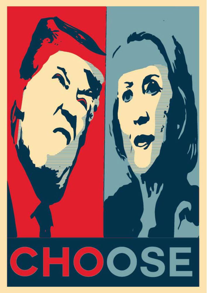
My original goal was to create an image that shows the ridiculousness of this year's election by using unflattering photos of both candidates, and to add quotes spoken from each that shows how childish each candidate has been. After receiving some feedback and doing some self reflection, I decided that I wanted to be a bit more subtle with my image. I decided I only wanted to hint at the unfortunate choice that we have to make people want to learn why I made this image. With that being said, I decided to try to make it as simple as possible with it still delivering my message well.

Context

I decided on this subject after hearing many complaints about both candidates from a plethora of people. What stuck out to me was that it was not only one side attacking the other's candidate, but both sides attacking their own. Even the most devout Republicans and Democrats that I know complain about their candidates. I feel that, with this election, neither candidate seems like the right choice for most people. I find that there are many examples showing the childish nature of both candidates. Examples of this are when Trump tweeted "If Hilary Clinton can't satisfy her husband, what makes her think that she can satisfy America?" As you can see, Trump is using Bill Clinton's scandal against Hilary to try to show that Hilary is unable to keep America happy because of it. Clinton has also used her fair share of childish comebacks as well. She has stated " You know, to just be grossly generalistic, you could put half of Trump’s supporters into what I call the basket of deplorables. Right? The racist, sexist, homophobic, xenophobic, Islamaphobic—you name it. And unfortunately there are people like that. And he has lifted them up.” She obviously lashed out at Trump supporters calling them "deplorables" to help show that her supporters, being the apparent ideal citizens, know what is best for our country, not Trump's. This ridiculous behavior shows that neither candidate truly deserves to govern our country.
Process

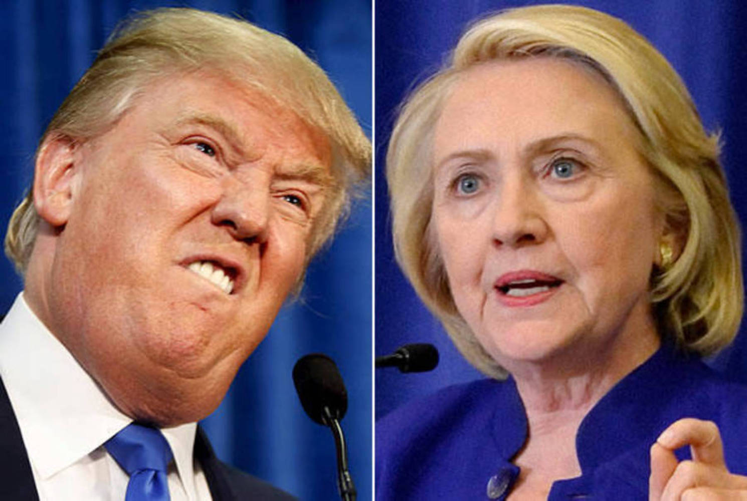
 I allocated the Obama "Hope" poster from the 2008 election as a base for the photo. I felt it worked well for the subject of the photo since they both pertain to the presidential election.  I then tried to find unflattering images of each candidate to use as a base for the photo. I then debated how exactly to go about making my own version of this iconic photo. I decided that I would leave each party's colors on their respective candidate's side of the frame to emphasize their connection to the party.

Product

I used Adobe Illustrator to create the image in its entirety. I found a template for the image online that I used as a base. When I had both the template and image ready , I removed the backgrounds of each image, and simplified the images to give them the feel of the Obama image. I then changed the backgrounds of each candidate, giving them the color corresponding to their party. I then used the cream color to highlight their faces, similar to Obama's. I then played around with each image until I was satisfied with the final result. To complete the project, I changed the word "Hope" to "Choose" to compliment the intent of the image. I made the first three letters red and the last three blue to match the colors above the word.

Critique

My inner critic is fairly content with my work. I feel that the image easily shows the decision that every American has to make during this election. I also feel that the image hints at the unfavorable choices we have enough to make those who know little to nothing about the election want to investigate on why I choose images that were not flattering for either candidate. For those who are knowledgeable on the subject, I feel that it is pretty clear why I was shedding them in this light.

Personal Reflection

My main concern with my image is how this style of image changed Hilary's photo. In the original, both images were unfavorable for each equally. I feel that simplifying the images slightly took some of the unfavorable qualities of Hilary, making Trump look a little worse in the end result. I hope that the message still holds even if this yields true to the viewers as well.

Donald trump hillary clinton 614x412.thumb
Show Advanced Options
Artboard 2.thumb
Show Advanced Options
Drop files here or click to select

You can upload files of up to 20MB using this form.