Back to Parent

Outcome


Proposal

I plan to apply Andy Warhol’s multi-color printing skill on the fastening clips of Pepperidge Farm. The “loaf of bread” picture will also be mapped onto each clip. As it turns out that the colorful fastening clip from Pepperidge Farm on each bag of bread represents the production time during the week, I would like to expand this idea by using colorful clips to record date, or time.

By mapping varying pieces of bread onto each clip, I intend to ask the often- debated question that “whether we live to eat or eat to live”.

P1.jpg.thumb
Show Advanced Options

Statement

Inspired by Andy Warhol’s Campbell’s Soup Cans, I chose bread, my daily snack, and the colorful fastening clip of each bag of bread as the main objects in the work. Six rows of differently colored versions of bread& clip were made by imitating Warhol’s style in screenprints of Mao and Marilyn Monroe. If each row were viewed as a person, then the varying opacity from dark to light intends to convey temporal change and the decreasing pattern of the pieces of bread can be viewed as a presentation of one’s eating habit or more generally, pace of life.    

Context

Andy Warhol’s Campbell’s Soup Cans challenges consumption and consumerism, but also surprises the audience by using daily commodities to create art. Therefore, I suppose that bread, an ordinary food, can also be used to express my ideas.

Soup can.thumb
Show Advanced Options
I came up with the idea about bread because I eat Pepperidge Farm bread, bought from the school convenience shop (Entropy), as snacks almost every day; and I started to collect the fastening clips on each bag of bread around a year ago as I was first attracted by the different colors of those clips; later, I find keeping those clips an interesting way to record time. Thus, as Warhol’s screenprints about Marilyn Monroe and Chairman Mao look very impressive with the help of contrast or discordant colors, I want to borrow his technique to see whether this expressive style can create any special effect on my topic about time and food.
Favim.com andy warhol art beautiful color marilyn monroe 84015.thumb
Show Advanced Options
Mao full suite1 1024x405.thumb
Show Advanced Options

Process

I planned to take photos from the real bread at first, but as I always forgot to do that and for convenience, I just searched bread photos online and pre-processed them using Photoshop. Same for the fastening clip pictures.

Breads.jpg.thumb
Show Advanced Options
Clips.jpg.thumb
Show Advanced Options
After mapping the bread onto fastening clip, I picked one of the Mao screenprints and applied the color it used to mine. However, probably due to the simplicity of objects in my work (only three main parts—bread, clip and the background), the effect created by contrast colors are not as strong as expected. Therefore, I painted the upper part of the clip with straight brushes (2% spacing) in order to add some more stuff into the picture (these strokes come from the “graffiti-like scribbles” in Mao Full Suite and the hair part in Marilyn Monroe).
Two.jpg.thumb
Show Advanced Options

Product

I photoshoped a 6 by 6 multi-colored bread & clip picture as the final product with opacity changing from left to right and the color from top to the bottom; and the order of rows, that is, the order of differently colored versions of bread & clip were arranged in a way designed to maximize the effect of contrast color (by avoiding similar colors between two neighboring rows).

Bread.thumb
Show Advanced Options

Critique

I somewhat managed to imitate the style in Warhol’s colorful screenprints, but the final product doesn’t look very appealing. In fact, opacity of the bread part might still be too high (currently 80%) or I should have reduced its size as it looks like a big chunk of paint violently thrown onto the canvas; each picture also lacks complexity or details even with the upper part of clip colored (the only improvement was instead of three main parts, it now has four).

To be honest, I felt quite lost and didn’t have a clear idea about what I want to express during the process after I made some testing samples and the original idea seemed failed. As stated in the proposal, I intended to ask the frequently-debated question that “whether we live to eat or eat to live”. Yet, the outcome didn’t seem relevant to such a “serious philosophical question”. The idea behind this work, right now, might be different eating habits or more generally, pace of life of different people (if each row were viewed as a person and the decreasing pattern of the pieces of bread as a representation of one’s eating habit or living tempo). 

Personal Reflection

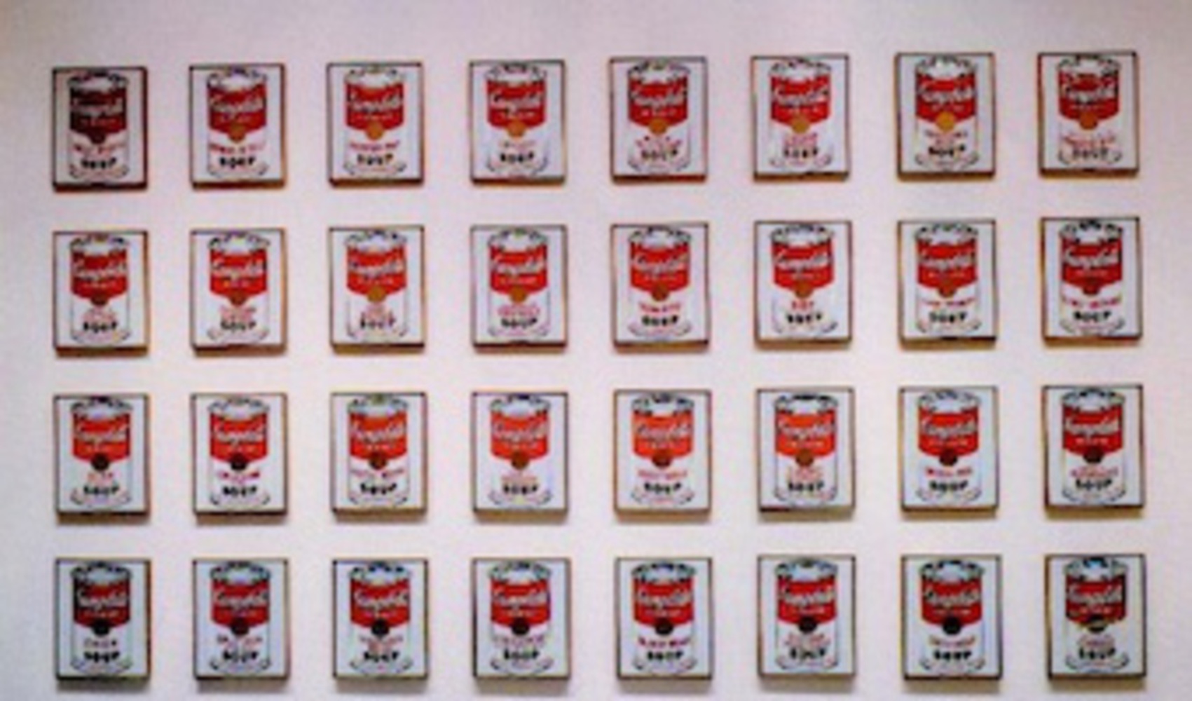
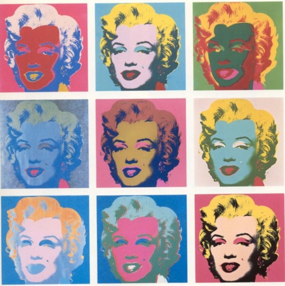
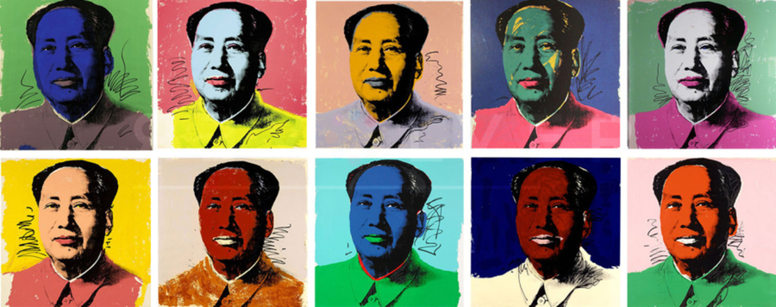
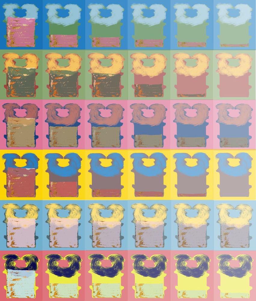
First, from both the readings The Ecstasy of Influence by Jonathan Lethem and the topic of this project, I learned that appropriation plays an important role in producing artworks. And it seems “easy” for beginner or even non-art students to create some work that is truly amazing via appropriation.

Secondly, as Ben Shahn stated in The Shape of Content, “I do not at all hold that the mere presence of content …will magically guarantee the emergence of such content into successful form” (70), choosing an appropriate form to represent the content is hard.

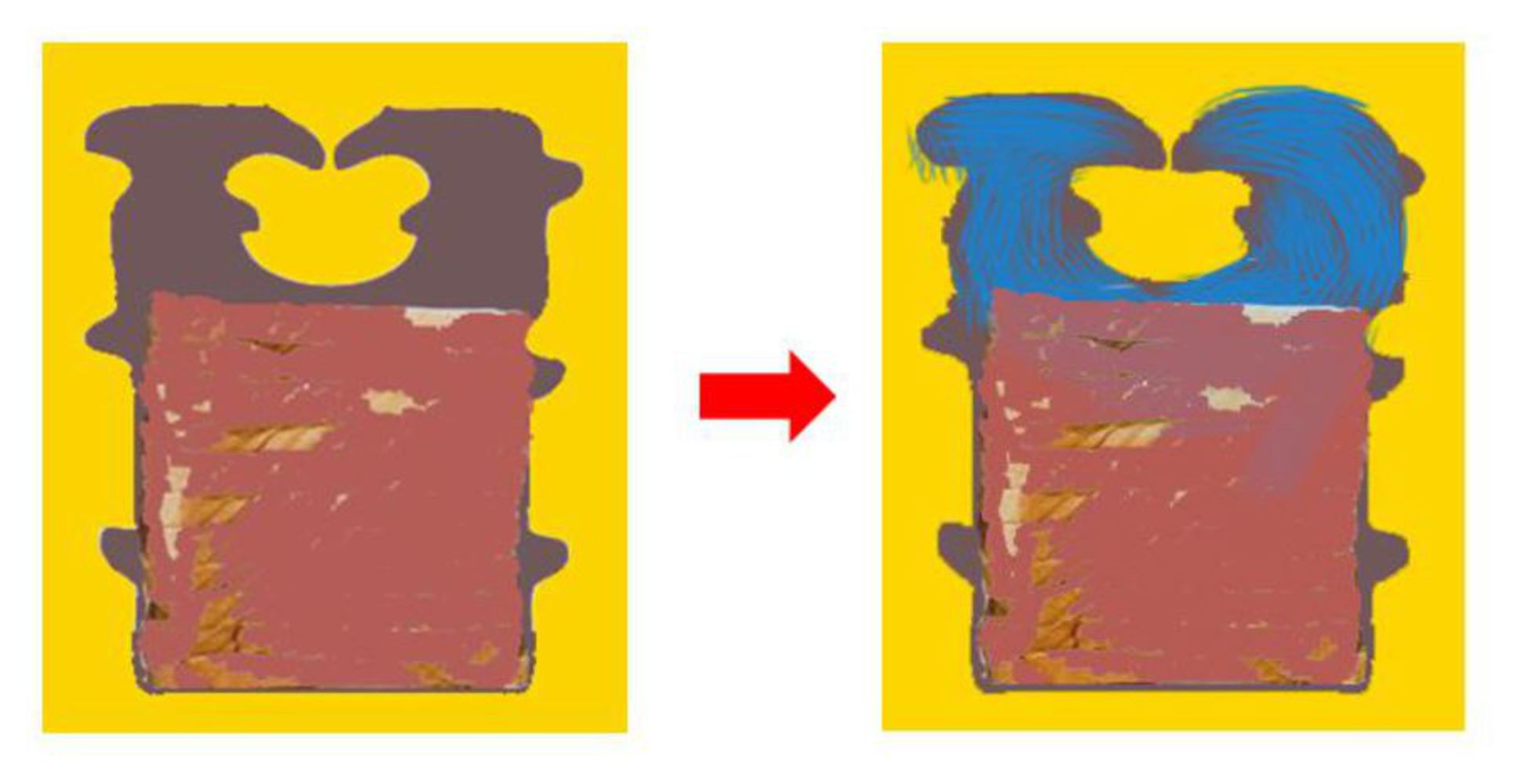
And in this case, I failed to embody the original content that I intended to express through the form chosen. I tended to realize or extract the content from the artwork created, which reverse the correct process from idea to work.

Besides, 
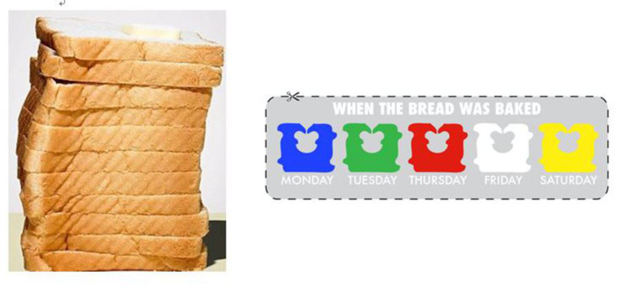
I should have learned or at least searched online about how to arrange several pictures 
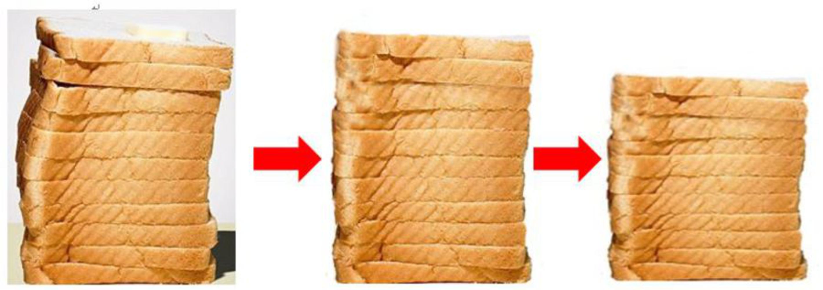
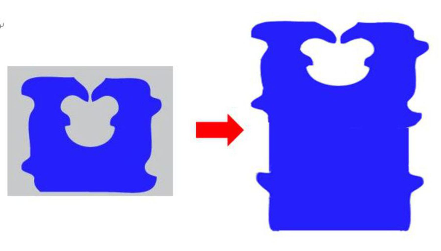
into a matrix form in Photoshop instead of adding individual graph to a huge canvas one by one, leaving very thin and annoying white space between the graphs (and had to waste time refilling those places afterwards).

Drop files here or click to select

You can upload files of up to 20MB using this form.