Back to Parent

Outcome


Statement

The made-up word "Pokézombie" refer to people so intent on playing Pokémon Go, that they forget about the real world and get in the way of other people or get hurt stumbling around fixated on their screen. [1] Rather than discussing this incident as a right or wrong problem, I'm going to let people who see my project decide by themselves how they want to interpret this art piece. My goal is to put forward my feeling that people have been focusing on this game too much that they sometimes see other people as "Pokémon Go players" instead of who they should talk to to know more about. I am a player myself, so I feel the need to look at this same phenomenon from different angles and try to listen to what non-players have to say. From my personal experience, at first it was a good thing that suddenly everyone around the world has a common interest; strangers greet each other on the street just because they are all playing. But now that the fever has cooled down a lot, I started to think that being a Pokézombie is sad and a bit ironic. 
Context

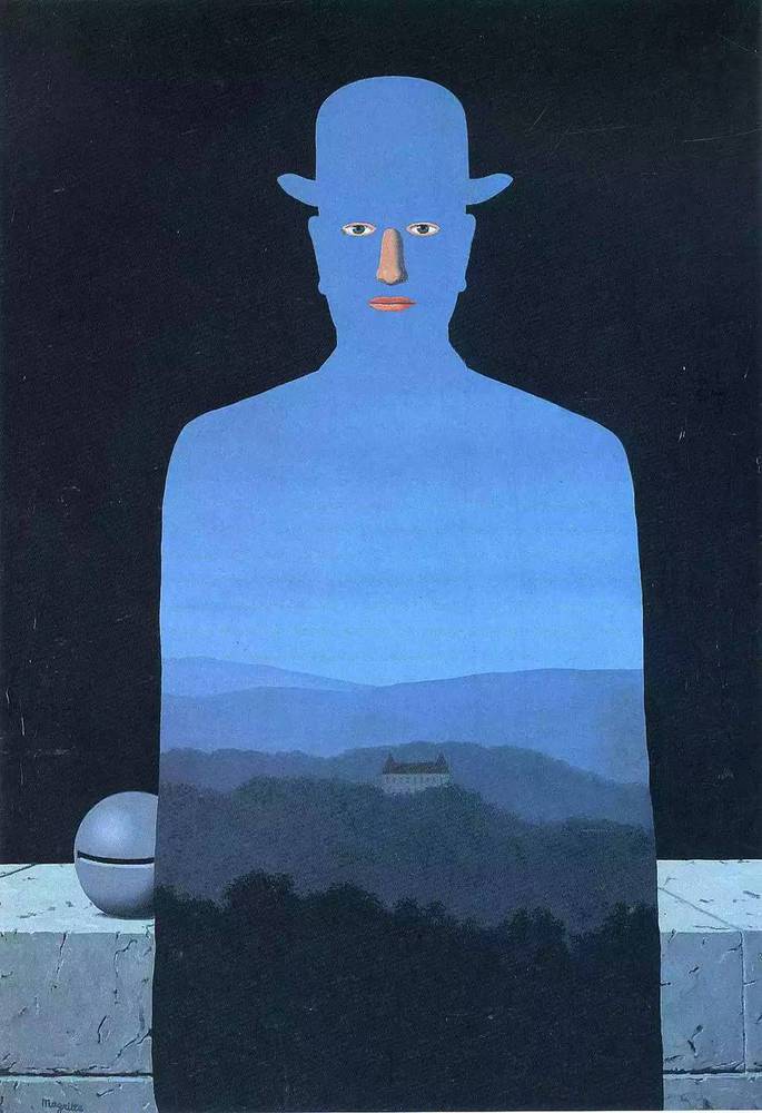
I was inspired by Ai Weiwei's art work "Safe Sex" when I went to Andy Warhol museum. It illustrates what was happening around him during the time when AIDS was the biggest problem. The fact that a lot of artists are inspired by headline incidents makes me want to report on what's currently going on in my world. By combining Tim Burton inspired Pokémon art Vaughn Pinpin[2] created and Rene Magritte's "The King's Museum"(1966,) I want to implicitly relate the idea of Augmented Reality(AR) used in this game with Rene Magritte's style of blurring the borderline between virtuality and reality. 

The opening ceremony.thumb
Show Advanced Options
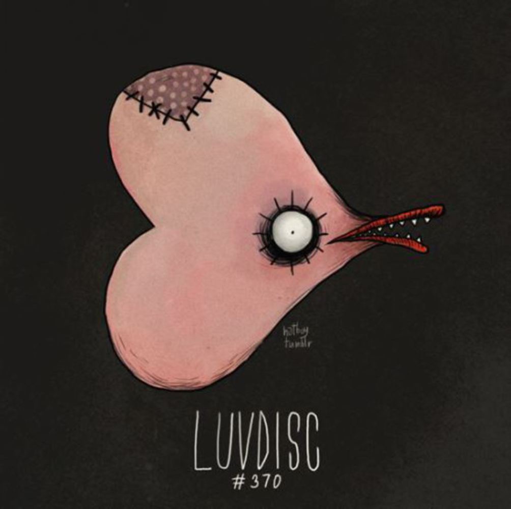
Luvdisc.jpg.thumb
Show Advanced Options
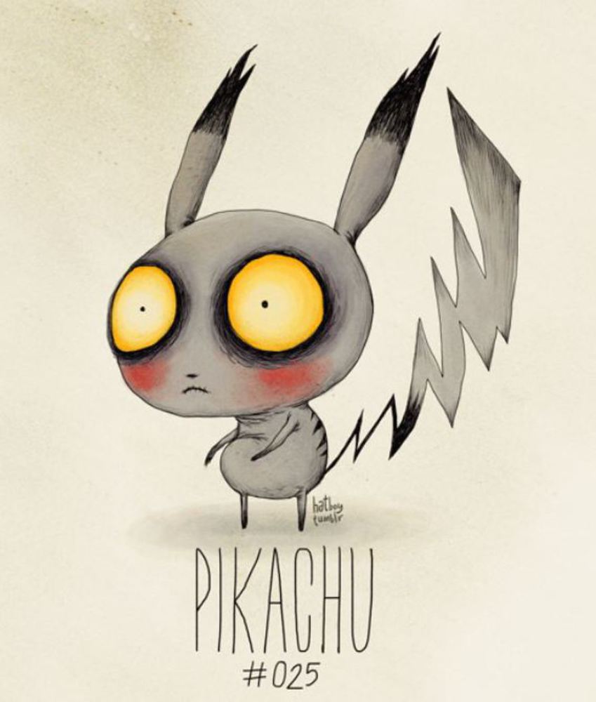
Pikachu.jpg.thumb
Show Advanced Options

Process

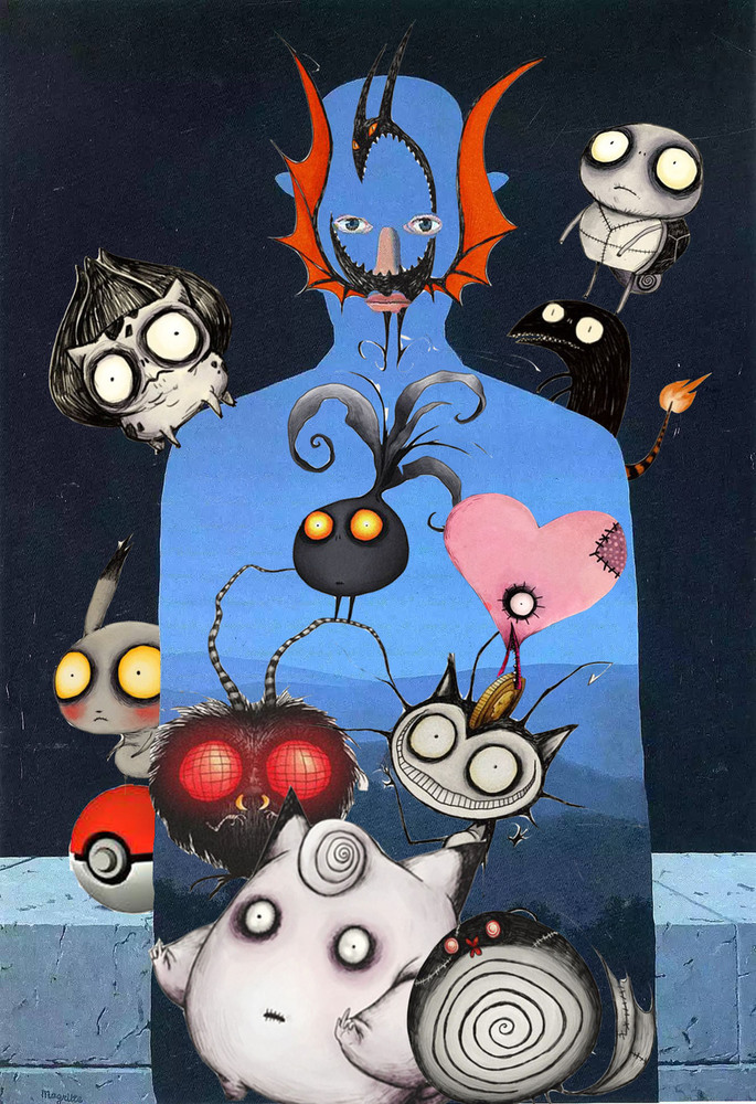
I tried to create the feeling of Pokémon taking over the world and controlling the person's mind and body, so I chose zombie-styled Pokémon arts, and used Adobe Photoshop to put them into Magritte's painting. The process of deciding where to put which  Pokémon took a long time because it was hard to find the balance among their shapes and colors. Originally I was going to put all the Pokémon inside the person to communicate that the person is fully occupied by this game, but after I actually did as I planned, I found that the effect wasn't as good as expected, so I deleted some of them and rearranged their positions. Instead of leaving the background completely blank as I previously planned to, I decided that maybe putting some Pokémon in the background will make the picture look more lively. So it turned out that I made the Pokémon react with the blue person in the painting. The reason I chose to place them in this way is that, I wanted to put the Luvdisc(the heart shaped Pokémon) at the position of the person's heart, and the Golbat at the person's face to make it look like a "living mask." I also put several filters on the Luvdisc so that it appears a little brighter than before. 

Product

My resulting artwork consists of 11 different Pokémon on Magritte's painting. The selection of these Pokémon were relatively random based on how much I like their colors and shapes except for the major ones that everybody knows about. I also focused on small details such as modifying the painting to include a Pokéball, placing the Bulbasaur on the person's shoulder, making the Oddish stand on the Venonat's tentacles, and hiding a Pikachu behind the person's back. It isn't intended to be a straightforward piece, but maybe the outcome is still a little vague.

Poke zombies.thumb
Show Advanced Options

Critique

I think I did a fine job combining the two art styles together and communicating my thoughts. However, my inner critic isn't satisfied because this artwork is just not perfect, it could have been better if I spend more time to think about the arrangements of Pokémon positions, and also what each individual Pokémon can mean to the resulting artwork; Meanwhile I feel that I did express my idea to some extent in this picture, and at least it turned out interesting to look at.

Personal Reflection

From the process of making this project, I learnt that appropriation is also an art style, which I did not know previously. I always thought that borrowing and stealing from other artists isn't a proper way to make art, but now that I've done it myself, I feel that it still takes a lot of time and effort even though the idea might be based on others'; also the original piece and the appropriation can be of two completely different meanings, so it really implies that art is very context based. 

Drop files here or click to select

You can upload files of up to 20MB using this form.