Back to Parent

Outcome


Intention

During WW2, propagandists relied on pop culture images to promote the war in the US. Characters such as Mickey Mouse and Captain America were used to raise morale, provide funding, and unite America towards a singular cause. Looking back at these efforts, its almost incredible the extent to which propaganda went. You would never assume that Donald Duck would fight Hitler or Mickey Mouse is selling war bonds. However, these propaganda has quite an effect on the youth at the time. I would like to highlight these effects by imagining a modern pop culture icon marketed towards children undergoing the same propaganda efforts.


Context

Disney is notorious for dominating the media market. With the takeover of Marvel Studios and the Star Wars franchise, two of the biggest movie franchises in existence, Disney gained incredible power over the entertainment industry. 

During World War 2, cartoons were used for propaganda. Well known cartoon characters, like Mickey Mouse and Donald Duck, were seen fighting Hitler and asking for war bonds.


While such practices won't be tolerated in today's society, we can only wonder how much power Disney can have to subtly manipulate our opinions. With the power they currently have, it would be EASY for them to exert their influence. They could easily brainwash us if they chose. I decided to connect Disney's influence on media today with their influence on WW2.

Shepard Fairey was most known for creating street art. The following image is one of his most iconic images:


This image features Andre the Giant with the giant words "OBEY" in the style of propaganda.

Process

As I looked into propaganda, I started thinking about the style and aesthetic that my propaganda poster would take on. As I did more research, I realized I liked Shepard Fairey's work the best. While it isn't authentic propaganda, the emotional response I had to this art was much more stronger than I expected. So, in the end, I decided to parody Fairey's work for my own.

The usage of Mickey was simple, because Mickey is the most iconic Disney character. Therefore, I felt that Mickey is a good representation of the company as a whole.


Product

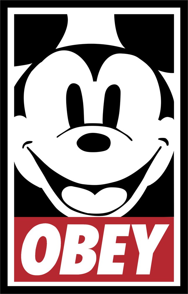
As a parody of Obey Giant, I started by using a front view of Mickey Mouse. I notice that most of  Andre the Giant's face bleeds out of the frame of the picture, so I made Mickey's face be a bit too big to fit in the frame.

When it came to design choices, I made sure to keep flat colors, and the overall layout of the original OBEY poster. Just like the original, I used hard edges, no shading, and fairly thick lines. One difference I made was making the orange in the original poster red, to represent Mickey Mouse's colors.

Critique

I liked this a lot, actually. I was worried about drawing, since I lacked a tablet. However, the final product looks pretty clean and captures the aesthetic of Obey Giant. I'm especially glad that its easy to  recognize that its a picture of Mickey Mouse. Overall, I would say it went pretty well.

Personal Reflection

I really learned the idea of synthesizing something new from existing artwork. As I turned Mickey Mouse into the style of Obey Giant, I learned to notice small design choices that the original Obey Giant had. I really liked seeing how my original idea warped into a completely different product. For example, my original sketch featured a completely different character!

Obey.thumb
Show Advanced Options
Drop files here or click to select

You can upload files of up to 20MB using this form.