Back to Parent

Outcome


Intention

The intention of this project is to attempt to present the viewer two messages behind the piece.  The first is the impact advertising is having on digital news media, specifically the rise of the importance of the marketability of the news, native advertising disguised as news, and more.  The second is to present another view of the internet; while the piece itself is titled news and is form the exterior designed to lead the user to believe that the code should link to the news, instead it leads the user to a page bombarded with advertisements, hopefully illustrating the nature of distraction of the internet from the user's intentions.

UPDATED

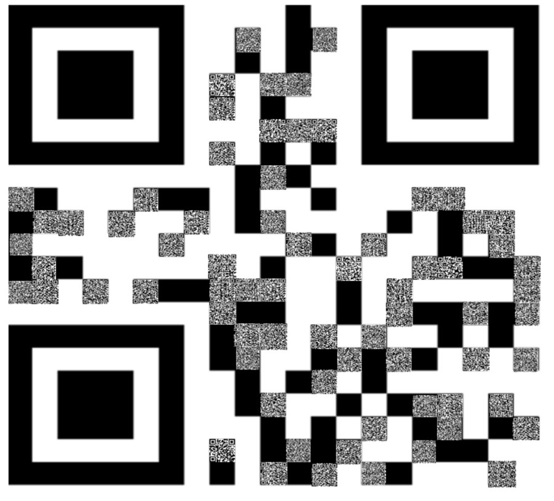
The new intention of the project is to present a more visible version of native advertising and how it affects news and the sites it affects.  First off, the large QR code is the homepage of Buzzfeed, which to many may be seen as the start of access for information for a lot of people.  And to a degree, it is, reflected in the random real unsponsored articles scattered int he QR code.  Yet there are many more which are sponsored content or lead to sponsored content, a mix of banner ad growth on sites and the rise of native advertising.  Finally, a top ten article on Buzzfeed ads and the book it advertises also is scattered within, showing an external effect that Buzzfeed's effective advertisement integration has had on the business of the news as a whole.
Context

The biggest inspiration for this work is the work of Marcel Duchamp, specifically the creation of readymades and assisted readymades.  Although the piece I intend to create is not attempting to provide the same message as those of Marcel Duchamp's, it hopefully will be similar in process and creation to readymades, except in a more digital format.

UPDATED

This is an assisted readymade; the QR codes already exist for the sites listed, and in a way it just borrows the QR codes which encode the sites into a collage.

Process

For a while I was reconsidering the first project that I had in mind, as the amount of work and skill required would be too much.  So in the spirit of a readymade I changed the original idea to be even more interactive.  I imagined what I could do if I had access to a large display, a gigantic QR code, and so the idea came to create a QR code out of QR codes (not fully just so that it can still be readable by the phones).  The actual creation was simply by taking QR codes from the sites I found and fitting them to the squares of the Buzzfeed QR code in Excel, the most efficient tool I had at my disposal for a piece which needed high resolution.

Product

The result was created in Microsoft Excel (for the high resolution required to maintain the readability of the small QR codes), and in an optimal setting it would be printed out on a very large scale and viewed with phones.  The QR code for Buzzfeed itself consists of 441 total squares of white and black, and a fraction of those black ones are necessary to the process of reading, and are deliberately left out of the mass QR coding of the page.  The other method of viewing is to take the file and make an incredibly high resolution image and use that as the final result, however I maintained it in Excel because of the ability for high resolution and the subtle extra feeling of order it gives as a spreadsheet program.

Critique

The goal is to present the nature of native advertising, and in complete honesty the ability for it to convey the message may be challenged by the large QR code itself.  Buzzfeed is not a major news source, although it does have a basis in news reporting.  Because of that it may undermine the message I want to convey.  Also, due to resolution issues, not all the QR codes are aligned perfectly.  The pixelation of the black square boundaries made it hard to align up the QR codes exactly.  And finally, not having the entire readable field covered with QR codes might not have the same scale, although completely filling it may break the original QR code as well as possibly making it harder for phones to read the individual ones.

Personal Reflection

I learned that first off I might have needed more proof of concepts before actually creating the piece, as it highly depends on the end result's clarity.  While creating the code I tested it and had a few failures at reading, which resulted in the smaller amount of QR codes used and the realization that the more white space around it the more the phone could read the QR code.  But in general I should have drafted a few more tests to see if the idea would work, and if it could work with a higher amount of images or even a more descriptive QR code (an article about native advertising, a CNN article with native advertising etc.)

Screen shot 2016 09 19 at 8.38.54 pm.thumb
Show Advanced Options
Drop files here or click to select

You can upload files of up to 20MB using this form.