Back to Parent

Outcome


Proposal

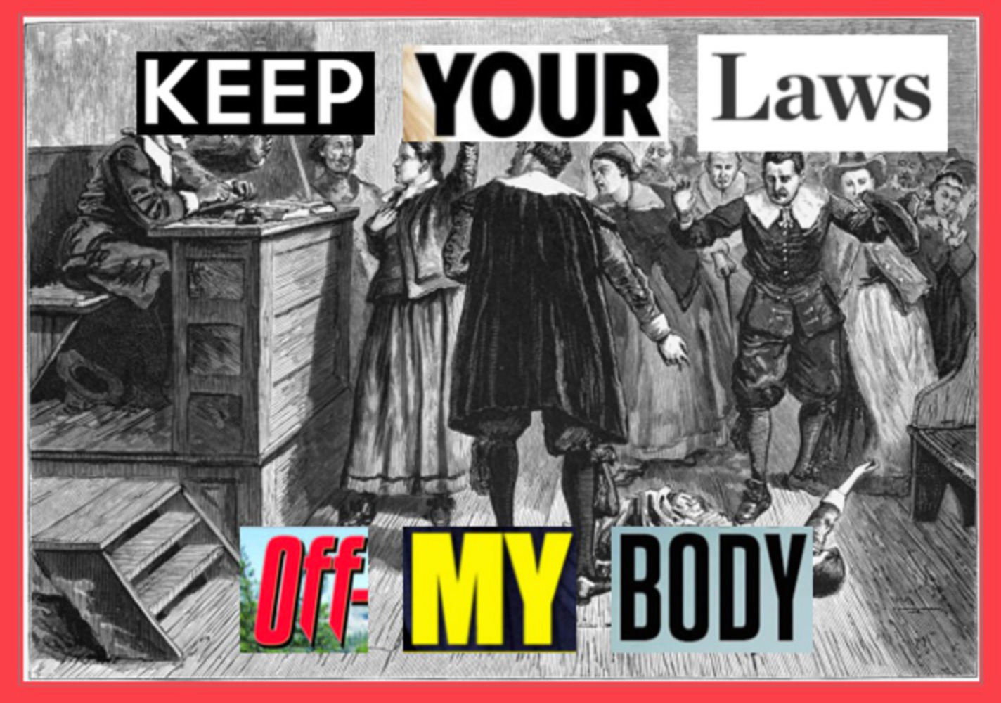
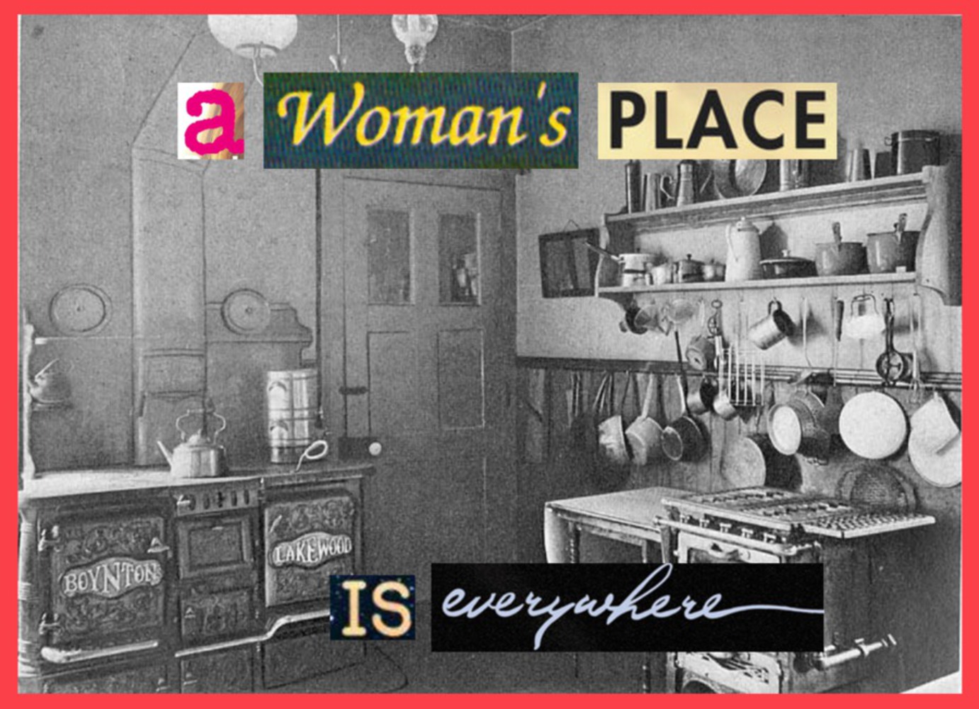
Barbara Kruger was a feminist artist in the 20th century. I want to recreate some works in the same style that she has used throughout her artistic career, using bold messages and clear lettering to communicate a very concise and aggressive message. I think that this is very important in today’s day and age in which gender is becoming more and more of a widely discussed issue.

In order to do this, I will have to first compile some messages that I want to have on the artwork which are clear and short, but powerful. A lot of her work seems to be cutting-pasting and overlaying the words over images which pertain to the message, so I will also have to search for or create such images which evoke the appropriate emotions that go with the message.

Link to “illustrations” (some examples of her work that I want to borrow/steal)

http://www.arthistoryarchive.com/arthistory/feminist/Barbara-Kruger.html

Intention

For my project I wanted to imitate the works of Barbara Kruger  to bring more light to the issues with gender equality which we face in our society today. The goals are to evoke anger or passion in people, for them to want to do something to actively change it. I wanted to make it pretty simple and concise so that people don't have to spend a long time looking at it to extract meaning, however if someone were to look at it for a longer period of time, they could analyze the choice of font and the background images as they relate to femininity and gender.

Context

My main inspiration of this project was Barbara Kruger. Kruger is a feminist pop artist born in 1945 who, along with Jenny Holzer and other iconic activist/artists, used public spaces to communicate messages with their audiences. My project does not exactly mirror the works of Kruger, but "borrows" her style of overlaying words, almost ransom-note style, which pop out against a black and white image to spell out a message. My themes are also similar to hers in terms of content, relating to gender and identity. I drew upon her juxtaposition of vibrant words and visually dull but contextually powerful images to create my own version of her work which has similar themes but maybe more aggressively.

Process

I approached the exercise by first compiling some messages that I wanted to have on my art, some string of words which are similar to Kruger's original pieces but are more applicable to the political climate today, touching on some commonly debated issues. Sadly I found that the things which Kruger found problematic decades ago are still problematic today, so a lot of the messages I chose were quite similar to hers. In Kruger's original work, her words are all one font and either red or laid over red rectangles. I chose to use different styles of words so that each word and its font and color could communicate a little more. However I bordered the final pieces in red to make my piece more like hers, in which the color red was a very important theme. Some challenges I encountered were difficulties finding the appropriate style of word for some words which I really wanted to hold meaning, sometimes I just settled for a neutral styled word rather than one which would not match the emotion that I wanted each word to have. I rejected the approach of completely stealing her style, using red words on black and white images, and decided instead to just borrow, creating what I have right now. 

Product

The outcome was what I expected it to me. I composed it by pulling images from the internet of relevant content: steel workers in the piece involving wage gap, a courtroom in the one involving laws, etc. The words come from headlines from magazines, news articles, or album art. The words were chosen from these sources because they were often emotionally or politically charged, so I thought that would be appropriate for the project and what I'm trying to communicate. Also, they are often very colorful and come in many different styles. I screenshotted pieces of these headlines and pasted them over the images I chose word-by-word.  Then, to more closely imitate the style of Barbara Kruger, I bordered each image with red. Tools and technologies involved include powerpoint, screenshotting, and a lot of google image searching for words which were high enough resolution to use in the images. 

Critique

I think that the work was mostly successful. Comparing my work to the original, I realize the importance of her choice to keep her words more consistent in color, typeface, and style. It looks cleaner and keeps focus more on the message and its chosen image, whereas mine looked almost tacky. I think in that aspect I was a little ambitious in trying to use the visual aesthetic of each word to communicate a little more than just the word itself and to have emphasis on certain words, but it was worth a shot. I think the red border did a good job of tying the work back into itself as well as the original work. With the magazine-style words and the red border, it almost looked like they could be Time Magazine covers or something similar. The border seemed to give it more credibility and importance, which was really relevant in the context of the artwork because it is definitely something that needs to be talked about, not just a visually appealing piece. The contrast between the words and images, similarly to Kruger's works, is quite apparent and probably one of the main driving forces of what makes the piece pop out.

Personal Reflection

I enjoyed this project for many reasons. Starting with doing research for the proposal, it opened me up to the world of Barbara Kruger's art, which I now greatly appreciate. I learned how to appropriate and why it is so important in the world of art. It is such a concept to be able to beg, borrow, or steal in this world where plagiarism or unoriginality is usually so looked down upon, and it is refreshing that it is greatly accepted in an artistic way as long as appropriation is credited (or if what you're appropriating is so iconic that credit is unnecessary, such as parodies of the Mona Lisa). Appropriation is quite interesting because although you're drawing upon the ideas of others, there is always something new to bring to the plate. What I would do differently, as I touched on in the self-critique, is I would keep my words and visual style more similar to Kruger's. I think that her method was a lot more effective and clean than my approach was. 

Screen shot 2016 09 15 at 9.43.57 am.thumb
Show Advanced Options
Screen shot 2016 09 15 at 9.44.59 am.thumb
Show Advanced Options
Screen shot 2016 09 15 at 9.53.48 am.thumb
Show Advanced Options
Screen shot 2016 09 15 at 10.05.25 am.thumb
Show Advanced Options
Drop files here or click to select

You can upload files of up to 20MB using this form.