Back to Parent

Outcome


Intention

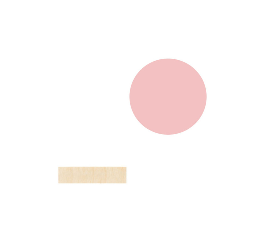
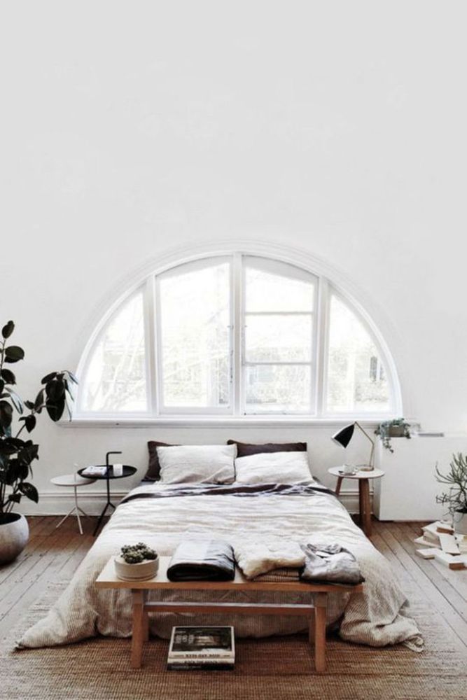
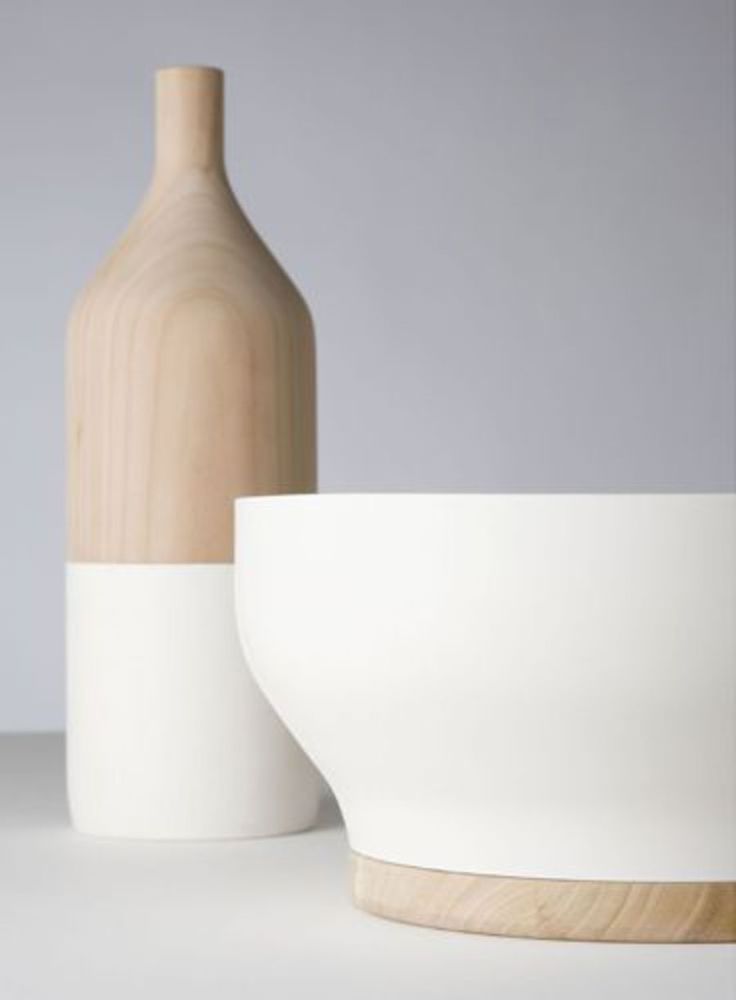
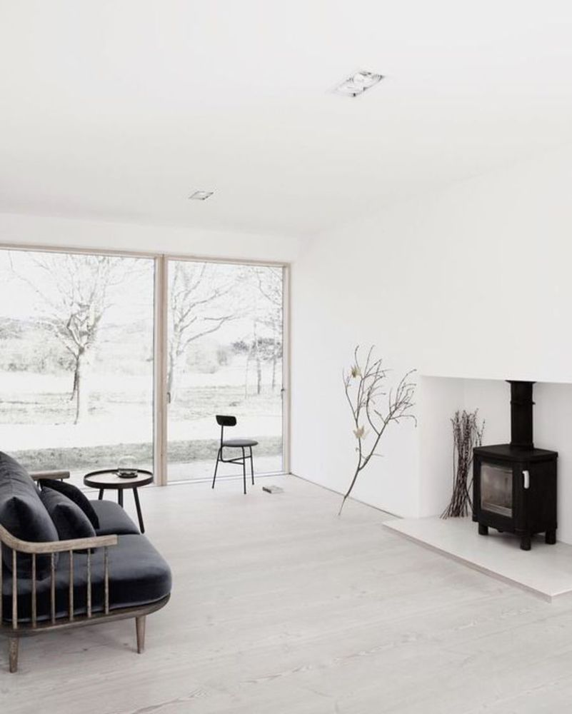
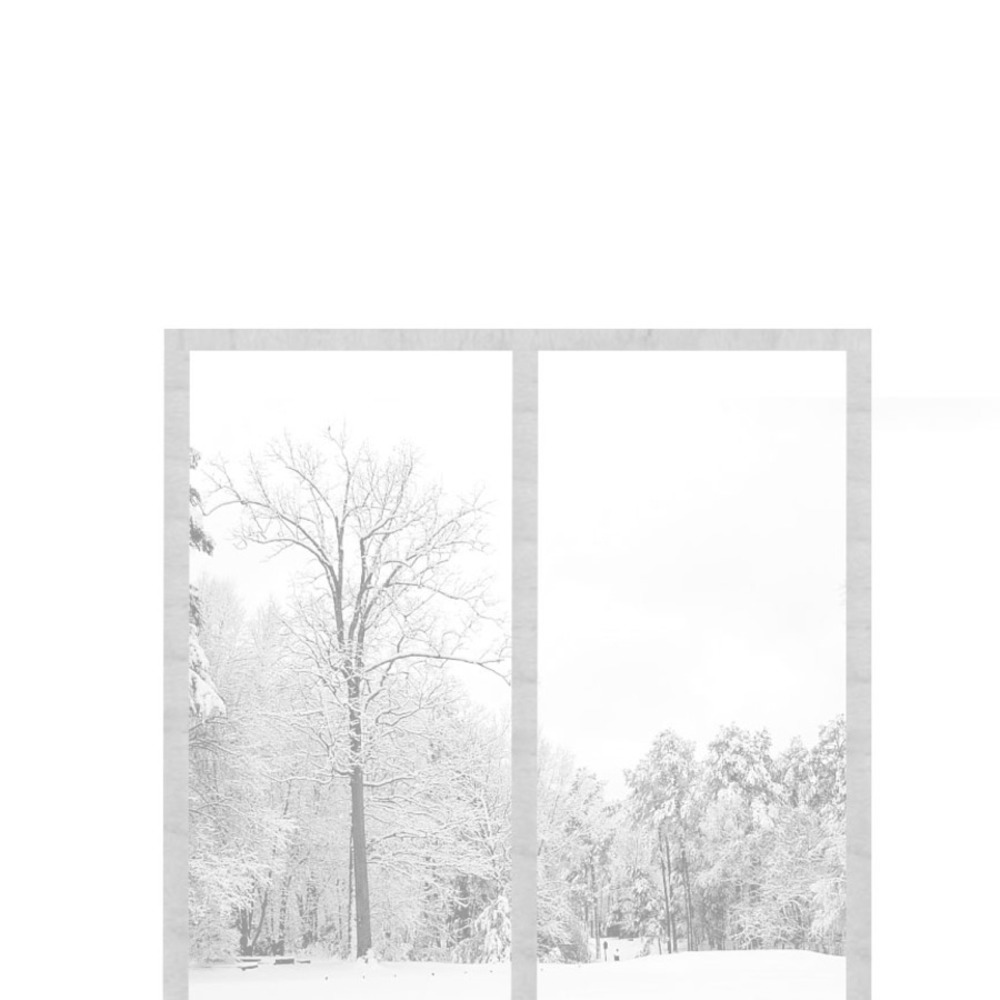
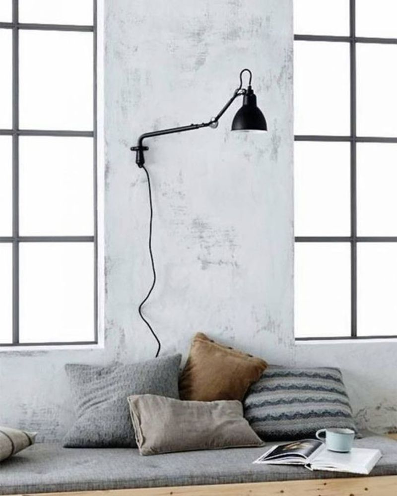
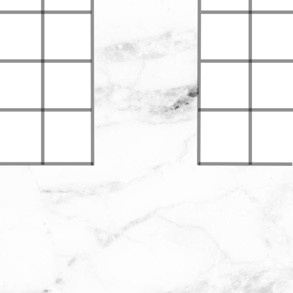
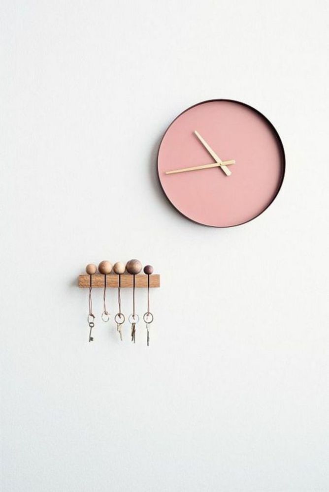
When brainstorming for this project, I was trying to think of something I found really beautiful to steal. This summer I travelled around Europe, and became really fascinated with Scandinavian design. I love the clean, elegant feeling of really simplistic and minimal designs, and I wanted to show use this in my project. As I love looking at home and interior designs, I decided to "steal" photos of rooms or interior decorations, and flatten them into simple 2d designs that could be sold as prints, while keeping in line with certain fundamental Scandinavian design trends or "guidelines".
Context

There seems to have been a surge of a trend of minimalism lately, especially with regards to graphic design, photography, and clothing. There are many artists I follow that use a lot of minimalism in their work, such as photographer Max Wanger, who is known for his simple, beautiful photos that have small splashes of color: http://maxwangerprintshop.com/

I also researched some Scandinavian designers such as those featured in this article: http://www.curbed.com/2016/1/26/10843070/scandinavian-design-maison-et-objet-2016

and took some notes on some specific characteristics of Scandinavian design: https://designschool.canva.com/blog/scandinavian-design/

In summary, I found that these were the commonalities of the designs I liked:

-Black accents ( ex - http://www.curbed.com/2016/8/15/12485730/tel-aviv-minimalist-apartment-renovation-black-frames-maayan-zusman-amir-navon )

-Cool tones

-Wooden/natural materials ( ex - http://www.curbed.com/2016/5/31/11823040/interior-design-wood-apartments-japan-hong-kong )

-White space ( ex - http://www.curbed.com/2016/8/17/12524284/white-interiors-homes-in-japan-taiwan-hong-kong-italy-lisbon-london )

-Clean lines and forms

-Simplicity

-Minimalism

-Using light to enhance room shapes

Process

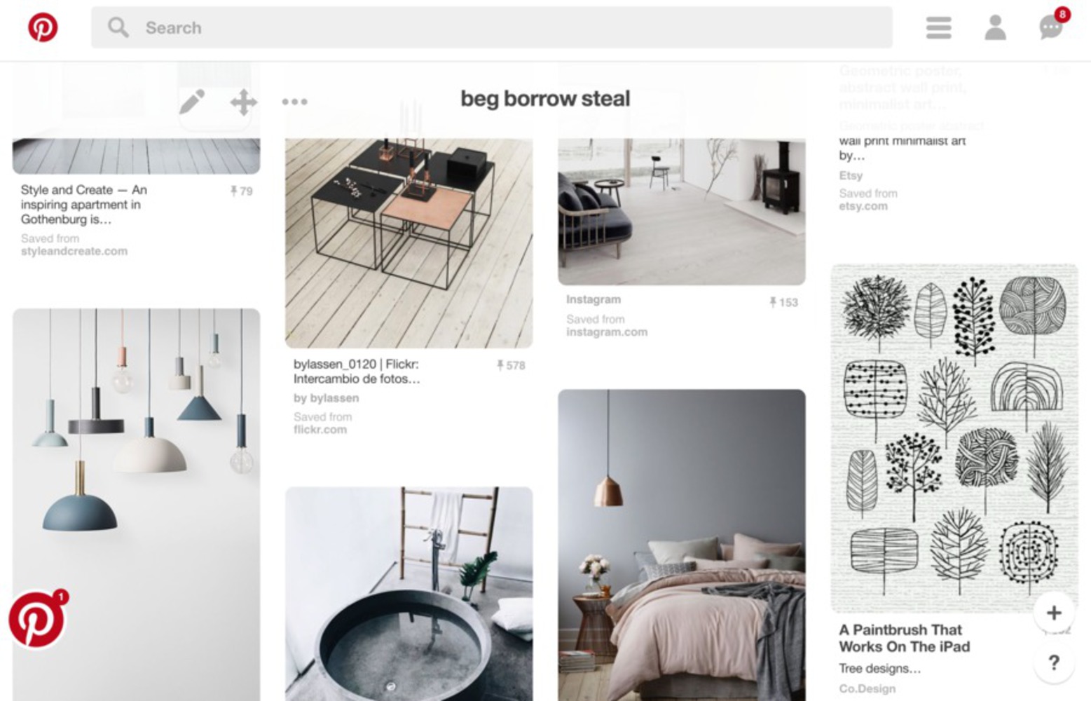
One of the first things I did after I chose the topic of my project was start a Pinterest board, where I stored images that I liked from all over the internet. I looked through Scandinavian design blogs, design agencies, and design tutorials to pick some favorites and get a better sense of the focuses of Scandinavian design. I then looked through the board to pick out a smaller selection of physical designs I liked, and envisioned how I could translate them into 2d graphics. This was a bit challenging as some of the furniture or room designs I really liked would be too difficult to flatten, because either their structure was too complex, or they would lose identity by being turned into a simple image. I then took the photos to Photoshop, and tried my hand at turning each one into a simple design that I found visually appealing, and might want to turn into a print and pay money for. 

Screen shot 2016 09 19 at 9.15.51 pm.thumb
Show Advanced Options

Product

Out of the photos I tried to manipulate, I chose 5 of my favorite ones to show, as some of the others didn't come out very well! I used photoshop to combine different images (photos found on the internet and also one of my own photos) and material textures (eg. marble, wood). I also played with the color schemes and opacity's to make each image relate more to the original room/object.

2.thumb
Show Advanced Options
62 150 cp 1 a.thumb
Show Advanced Options
5.thumb
Show Advanced Options
62 150 cp 1 c.thumb
Show Advanced Options
3.thumb
Show Advanced Options
62 150 cp 1 c.thumb
Show Advanced Options
4.thumb
Show Advanced Options
62 150 cp 1 e.thumb
Show Advanced Options
1.thumb
Show Advanced Options
62 150 cp 1 b.thumb
Show Advanced Options

Critique

Although I initially thought my idea was pretty creative, I found that the designs I wanted to create digitally were rather simple, and not as impressive when flattened into images. Although I like the general outcome of the images, I think they would need a lot more work in order for them to become something that might be considered for sale. I also think this would be a lot easier as I learn to better use Photoshop to manipulate images according to my artistic goals rather than as a barrier.

Personal Reflection

I really enjoyed this project, as I was allowed to research and process designs that I find interesting and love to look at. I do wish I'd had more time to perhaps find more designs or process the images more, to make them look even more like I imagined in my head.

One technical thing I learned is that there is a difference between simplicity and minimalism. From the articles I read, it seems that simplicity means simply not involving complex designs or color palettes, and having straightforward designs, while minimalism "means taking the most essential elements and rendering them with stark, radical, reductive forms almost to the point of geometric abstraction."

Drop files here or click to select

You can upload files of up to 20MB using this form.