Statement
Goals: Bring attention to the fact there is pressure in our society to go to university or become a failure (and the fact that, for reasons beyond their control, one may not be able to go to university).
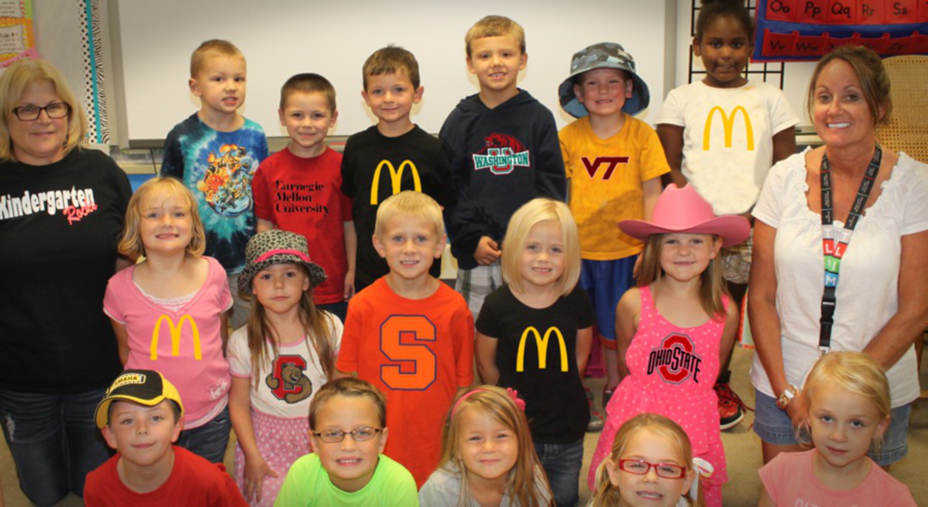
I wanted to make people think about a common "binary" lifestyle choice I see in society. There is an implication that one goes to college to be successful or you're going to be a failure. The job that is often designated for a degree-less "failure" is one at McDonalds. Even the youngest of schoolchildren are introduced and integrated into this view. However, some may be destined to be "failures" simply because their parents cannot afford university and/or their living situation growing up was not conducive to doing well in school. These are things beyond a kindergartener's control.
It is notable that there is one child who does not have a logo on his shirt. He is the standout; the one who won't let the binary option overwhelm him. He will not see anyone not pursuing a degree as failure.
Context
Pop art sometimes incorporates logos from famous brands. By adding logos for various universities, and then McDonalds, I feel as though my work is a part of that (mainly because it relies on the recognition of the logos to understand the piece). Additionally, I have "stolen" the logos and the image. That is to say, I did not receive permission to use any of the elements within this piece.
Process
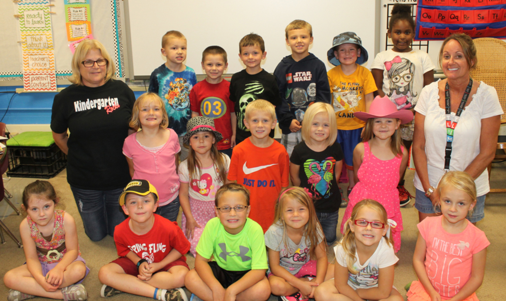
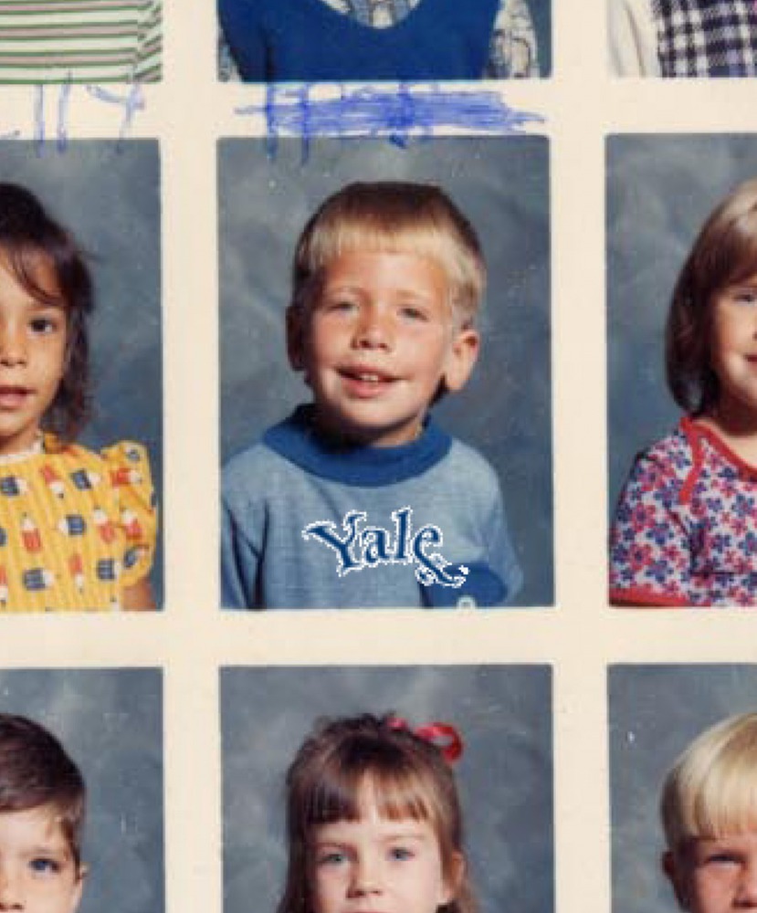
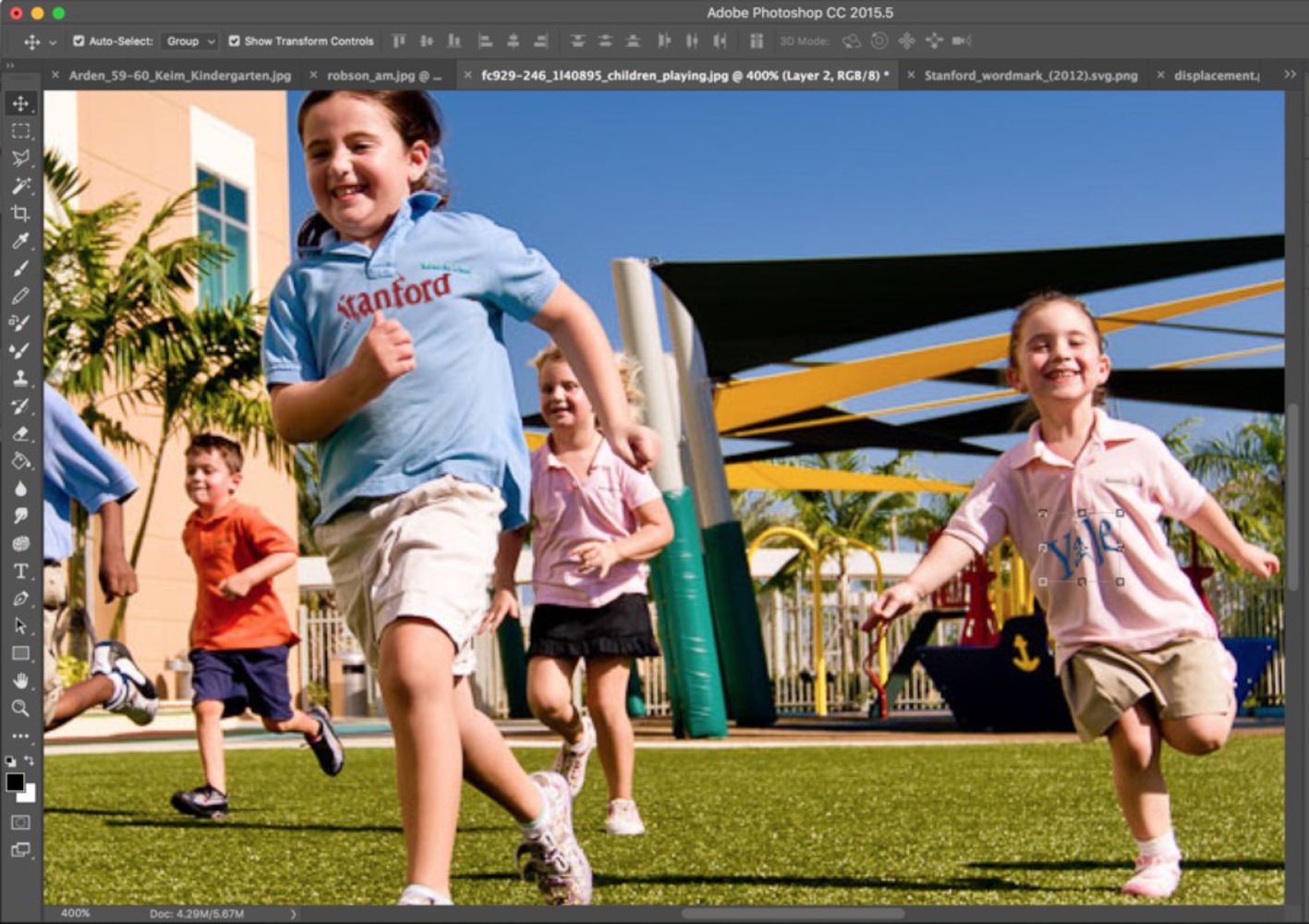
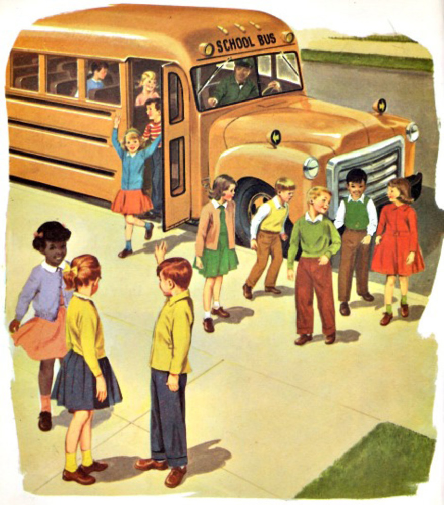
A major part of creating this work was finding the right base image to use. It got to the point where I almost wanted to create my own photo, to have it be just right. I knew I wanted to cover the shirts of adolescence but I wasn't sure exactly which setting/environment to capture them in. I spent the majority of my time sifting through lots of Google Images results to find "the one." I decided Kindergarten aged children would be the right target after I thought I should capture some of their naivety and show that the binary option can be instilled as soon as one goes to school. Furthermore, I show that a child's future can be determined from such a young age, implicitly by things beyond their control. You can see some other images I considered using in the produce process images.
Product
The end result was a digital image of kindergarten children altered to have them wearing a shirt for a university or a McDonald's shirt. I used Photoshop; it was quite the process.
The first step after finding the right starting image was to remove the markings on their shirts to provide a blank canvas for the new logo. This proved to be a bigger challenge than I excepted and took a great deal of time. You will see how in the original image, almost all of the children have huge markings on their shirts, so making it look okay while removing that part was difficult and time-consuming. I thought I may be able to use a content-awareness fill, but the area around the shirts was too cramped and there was not enough information about what the shirts should actually look like to get a proper fill. So I had to use the clone tool. This was really tedious because I had to make the shirt look natural while using the same pattern from another part of the shirt. It is almost impossible to get cloth to look natural, but I tried.
The next step was to get the logos to move as if they were laying on the cloth naturally. This is done by getting a contrast of the original image, blurring it a little, and then adding a diffuse filter with the blurred contrast. I used one of the color channels to get the contrast. This worked but it was hard to tell how much blur I should apply to the contrast and it sometimes produced unpredictable and undesired results. This was probably in part because I had weird contours from using the cloning tool.
I had to blend the logos in with the graininess of the original image as well. I did this with some gaussian blur.
Critique
I'm not convinced that I conveyed my message well enough. For one, I don't think the final product looks good enough. I'm also not sure if it's content speaks well enough. I really wanted to make this statement work in this digital altercation but I still don't think the base image/environment is the right fit. I do think some of the logos look good on some of the shirt though. And I do think that looking at this image can provoke thought in the observer, which is what I want. However, whether they would be thinking about my exact message is hard to say.
Personal Reflection
I learned a lot of Photoshop techniques- content-aware fill, clone tool, blur, diffuse filtering, etc. I would wait to do this at a time where my Photoshop skills were better, as I think that has a big impact on how the final results feel.
