Back to Parent

Outcome


Bully.thumb
Show Advanced Options

Intention

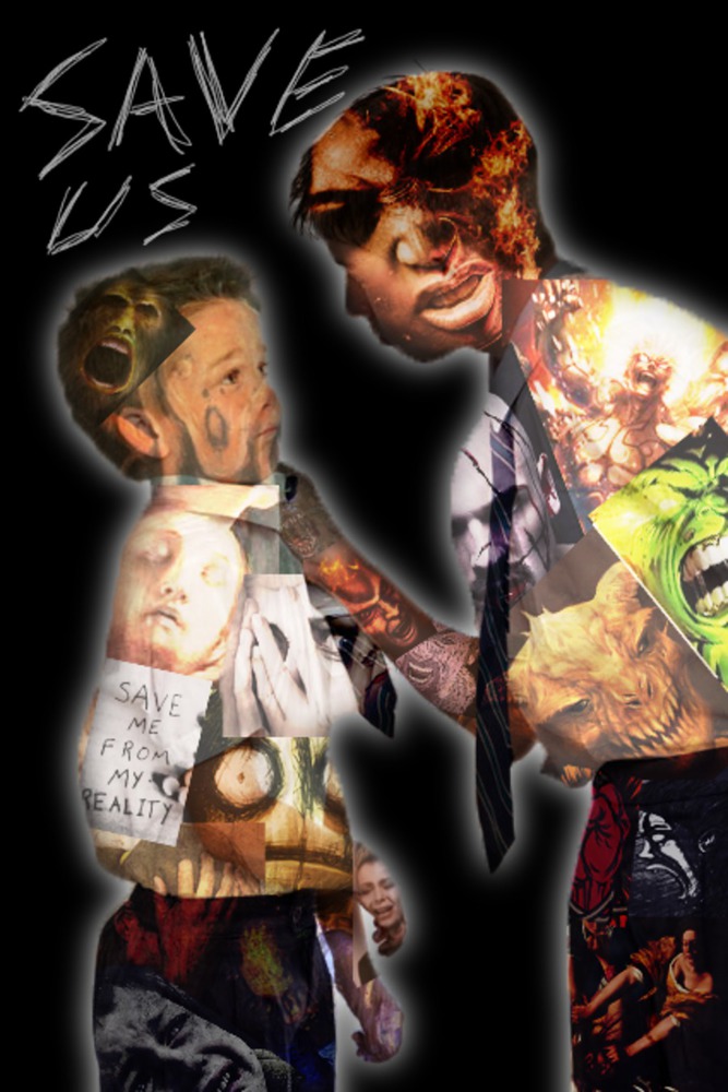
At first, I set out to make a song out of Skype sounds using GarageBand, but GarageBand uninstalled an important feature, randomly crashed many times, and made my life overall very difficult and it made me feel bad. Naturally, that reminded me of bullying, so I set out to create an artwork that uses various already existing artworks to show how it feels to be bullied and also to bully. I wanted to make it clear that both sides feel pain since I feel society makes an effort to show how victims feel, but not the emotions that turn what could be a morally astute person into a bully. 
Context

I started with a stock photo of one kid bullying another and then created the overlay using works by Artemisia Gentileschi, Edvard Munch, Rona Nishliu, Vincent Van Gogh, and other artists. The image essentially uses two separate overlays with their own theme: for the victim, I focused on images depicting fear, sadness, and depression, since those are emotions commonly induced by bullying. For the bully, I focused on artworks depicting anger, vengeance, and power hunger, since those are emotions that, when strong enough, can drive a person to hurt others. However, desire to hurt others does not exist in a vacuum: pain begets pain. That's why I included the words "save us" scrawled in the corner: to emphasize that both of the people involved feel pain.

Process

At first, I used GarageBand, though the tool that is used to easily make instruments out of sound files died sometime after 2011, which really limited what I could do, considering my plan to make a song out of Skype sounds. Then GarageBand kept crashing, and it was really hard to make a rhythm using short tunes that already existed and I could never make something I was satisfied with, so I abandoned sound entirely since after several hours of work I had produced three seconds of dissonant music.

I used Photoshop to create this artwork. My process involved creating one collage of images for each person with their respective themes. I then created a layer mask to make the shape of those collages the same as the people they represented. I then changed the layer type to hard light to simulate the overlay and lowered the opacity to 67% so that the features of the people and the content of the artworks would be distinct. I then made another layer to create the black background (the original image used white, but black seemed more appropriate due to its connotation of darkness and the void and so the rest of the image would stand out better). This layer was black where there were no people and transparent where people were. I then used a Gaussian blur on that layer to create the glow around the subjects. My tablet was used to make the words "save us," which I scrawled to make it seem more dark and desperate.

Product

The product was certainly different from what I expected. My original plan was to create a photomosaic, which I have done in the past, as seen here: http://66.media.tumblr.com/0475c56493deef966aa215ecd7303e12/tumblr_n6q78dNQ711tdiu13o1_1280.jpg However, I decided to make something less organized when I had the idea of putting overlays of faces over the subject's faces, which I thought connected the subjects and the overlay more than a series of small squares would. I like the way it came out more, since I think the look of a jumble of images overlapping and in different orientations is more appealing to the eye than organized rows of squares. 

Critique

My inner critic is happy with this work of art. In hindsight, I may have made separate mosaics for parts of the subject like arms and ties so that the lines between them and their bodies would be more distinct, but since I can still see that the subjects are people and not blobs of art, I will let it slide. I think one of my favorite aspects of this is how long one can look at it and still find interesting new aspects of it to observe without it seeming overly busy. I also think I captured the statement that I wanted to make, though if one were to look at it quickly, they may not look hard enough at the emotions of the various artworks in the overlay, but for the quick and casual viewer, the words will gather their attention.

Personal Reflection

What I learned from this project is that I was not put on this Earth to be a DJ. I'll make a point never to do that again. But GarageBand bashing aside, I think this helped me realize how complex and yet how similar the feelings of a victim and a bully can be. In a way, they are both victims: one of internal negativity and one of external negativity. Next time, perhaps I will do something to further separate the victim and the bully in their overlays. 

Drop files here or click to select

You can upload files of up to 20MB using this form.