Back to Parent

Outcome


Intention

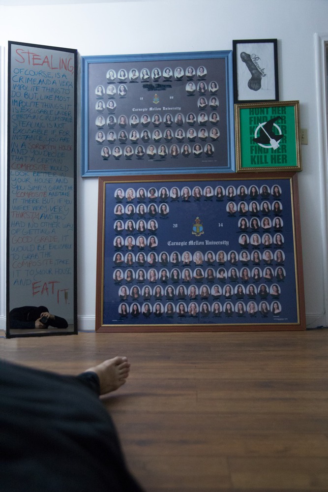
Upon being given the prompt of "Beg, Borrow, and Steal," I promptly decided that I was going to give the impression that I was following the prompt as literally as possible to construct the narrative of the artist slightly unhinged. In this collage of assisted readymades lies the implication that the subject itself, posed in a logically impossible fashion, will do anything to satisfy such an artistic demand. The intention of the end result is to make the viewer uncomfortable-- as work involving appropriation ought to be. While most works we discussed in class subverted the idea of appropriation, "$400 / OBO" is intended not only to embrace appropriation as an obvious facet of the work, but also as a celebration of the task completed in the name of art with an actual emotional impact.

Context

My main influence for the work was Banksy, primarily the flippant attitude expressed in some of his more popular graffiti. To Banksy, his medium is inherently criminal, and many of his works in some way comment on or revel in that aspect: Banksy is an outlaw, and while you may appreciate his art in a vaccuum, in a very real sense there is an act of vandalism involved (although it can be argued now that his "vandalism" actually increases property values, but I digress.) I sought to combine the idea of flippancy through medium and readymade appropriation ala Warhol and Ai WeiWei. The end result endeavors to challenge you: the work presents a clear narrative of the events as they appear to be, it celebrates the subversive means by which it implies it's subjects,  it champions the unusual character of the subject (implied to be the artist) and it even takes the claim literally, prompting the viewer to make a monetary offer on the work.

But why composites? Well, remember, part of the idea behind the work was to make people uncomfortable with the appropriation, and to do this, I elected to make it reminiscent of an actual campus phenomenon: Greek Organizations stealing composites from one another for sport. This typically happens in the summer session, when Greek houses on campus generate less persistent traffic, and there is a sort of reputation metagame for people who can collect -- and manage to hold on to-- the most diverse and modern set of composites before they are inevitably found out and asked to return them. Composites that are more modern, or belonging to a larger organization, are generally considered more valuable because of the difficulty involved in cleanly removing them from a greek org's house and walking them to whatever destination they're bound for. On top of that, sorority composites are more valuable still, since they tend to get very angry when they realize that someone has taken theirs, despite doing the exact same thing over the years.

That being said, the two composites depicted actually would have the market value implied in the work's title... people will pay money to put a composite from a large sorority and place it in a house on, say, Beeler or Wilkins. It's a social status thing, I guess, especially since many people on campus are likely to recognize some of the people in one of the readymades.
Process

Process involved lots of Photoshop, with varying degrees of skill demonstrated to obscure which objects are real and which have been altered or manipulated. Physical composites were borrow from my own fraternity, found post campus events such as last year's booth, or are the literal works of the people depicted in the photograph itself. Composites were both drawn on in real life and altered in post to swap portraits, blur faces, and remove names (as some of the people depicted are actual CMU students).

In truth, there is also a small nod in there to one specific person, who may figure out who they are if they're paying close attention, but the person isn't in this class nor are they probably still keeping up with what I'm doing. That person is the same as the person who created the pictured framed drawing of a large penis, and is pictured somewhere in the photo.

Product

The product itself should stand as sort of a satirical advertisement of sorts. Assuming the narrative depicted is sound, the story implied is that the subject is attempting to sell the items appropriated out of desperation for the grade in the class, hoping to comment on the influence of grades at CMU and the strange relationship grades have with the student psyche. It is typical that some person will go above and beyond the call of duty in some programming class, spending hours upon hours creating a project that tackles the prompt so impressively that you begin to wonder just where in the hell they got that time. I am attempting in this work to bring that same feeling towards a more creative type of project, especially because the terms of the project themselves are inherently morally ambiguous. In sum, I attempted to show what a CMU-intensive creative project might look like with that same amount of sheer "how-in-the-hell-did-they-pull-that-off?" one tends to only find in the final projects of specific CMU classes.

Critique

First and foremost, Photography, specifically lighting, is incredibly tedious to set up effectively. Disregarding the difficulty of manually setting a camera and then trusting the low resolution viewfinder accurately represents the focus of your shot, taking pictures of glass-paned objects was difficult, but then photoshopping over lighting smears, and trying to minimize them in capture while providing adequate lighting and keeping everything in frame and steady was an exercise in patience. That being said, as a collage of assisted readymades, the objects themselves were incredibly fun to fabricate / procure / edit, because the motions themselves were reminiscent of freshman year summers on campus, and it was incredibly satisfying to iterate something that I hoped would get a rise out of some of my personal friends.

Personal Reflection

If given more time, I would've liked to fabricate (or appropriate) more diverse sorority/fraternity composites, with the intention of demonstration a much larger selection. The number of faces I ended up with in my final composition wasn't as visually impressive as I intended, and one personal criticism was that I feel like I didn't make the narrative heavy handed enough. If given a second opportunity, I would like to explore collecting more for the photo and displaying them all simultaneously on a much larger wall.

300obo.thumb
Show Advanced Options
Drop files here or click to select

You can upload files of up to 20MB using this form.