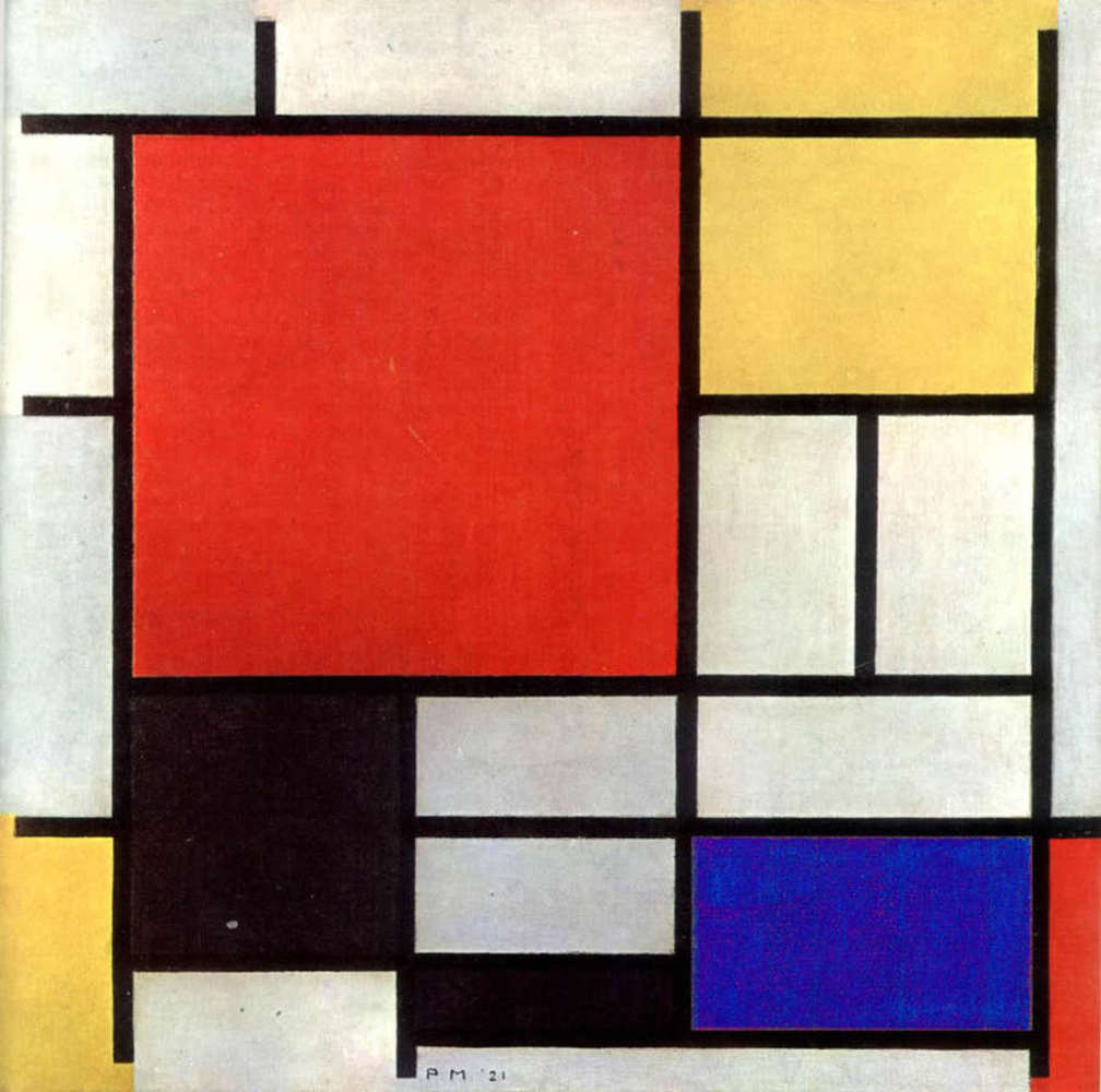
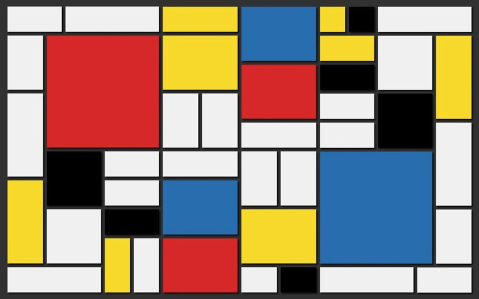
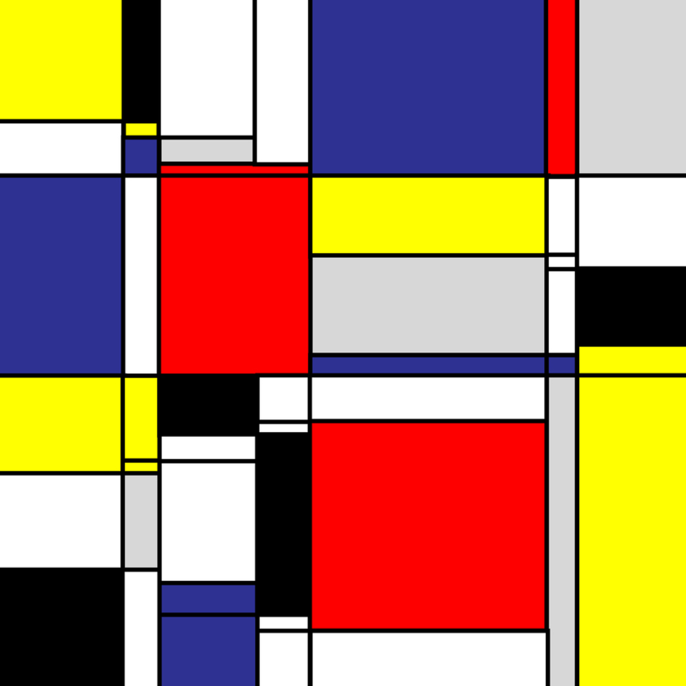
I have chosen to study and give my own take on the art style of Piet Mondrian (1892 - 1944); the style particular, is called neo-plasticism, which he coined himself. Mondrian's work became revolutionary in 1917-1918, when he started the De Stijl movement, which swept across Europe influencing industrial design, architecture, and fine art. This movement is boiled art forms down to its core, emphasizing form and primary colors only. He also appreciated the colors black and white a lot, setting it as the basis for most of his work. These are a couple of the Mondrian's paintings that I studied to make my composition.
Outcome
For my own drawing, I used a combination of techniques. I started off with the constraints we were given for the laser cutout and string assignment. Using two horizontal lines and a series of perpendicular intersection, I was able to create a rough composition of rectangles that was aesthetically pleasing. Another thing I kept in mind was to never use symmetry, as it is a stigma in the modernist movement of art. The colors emulated Mondarian's works using the basic colors of red, blue, yellow, and the shades of black, white and gray. I want to use my own generation of a neo-plasticism work and use it to represent space and form, more specifically, the civil engineering and landscape design of our CMU campus.
I represented the space using colors that signifying different types of spaces or buildings. As one compare this composition to a mirrored view of our campus map, one can see what each piece represent. The reds being large public areas like the Cut and the Mall. The blue are large buildings with specific roles for example the top being Hunt Library and the far left, the engineering building of Hamershlag, and the bottom center the student affairs building of Warner Hall. The white generally meaning open walking spaces. Similarly other color blocks represents some of the other main parts of campus. Of course due to the constraints set initially by the composition, I was not able to show every piece to scale.
In retrospect, I am actually really happy about the composition aesthetically as a whole, from the uncolored version with only outline to the colored composition. Though after a bit of analyzing, I could probably incorporated a bit more and closer to accurate display for the engineering part. This brings up the give and take between following the constraint rigorously or using creative license and break the rules in appropriate times.
Before the semester, I'd say that I did not appreciate abstract art enough. Even though I was exposed to Mondrian's work before, I had no real reaction towards it. And chances are without the experience of analyzing the abstract art in the museum assignment, I wouldn't of decided to give a try at abstract art a try. It is hard explain, but I can somewhat look at and pick up on messages within them now, and in this project, insert some of my own message to it.
You can upload files of up to 20MB using this form.


