Product
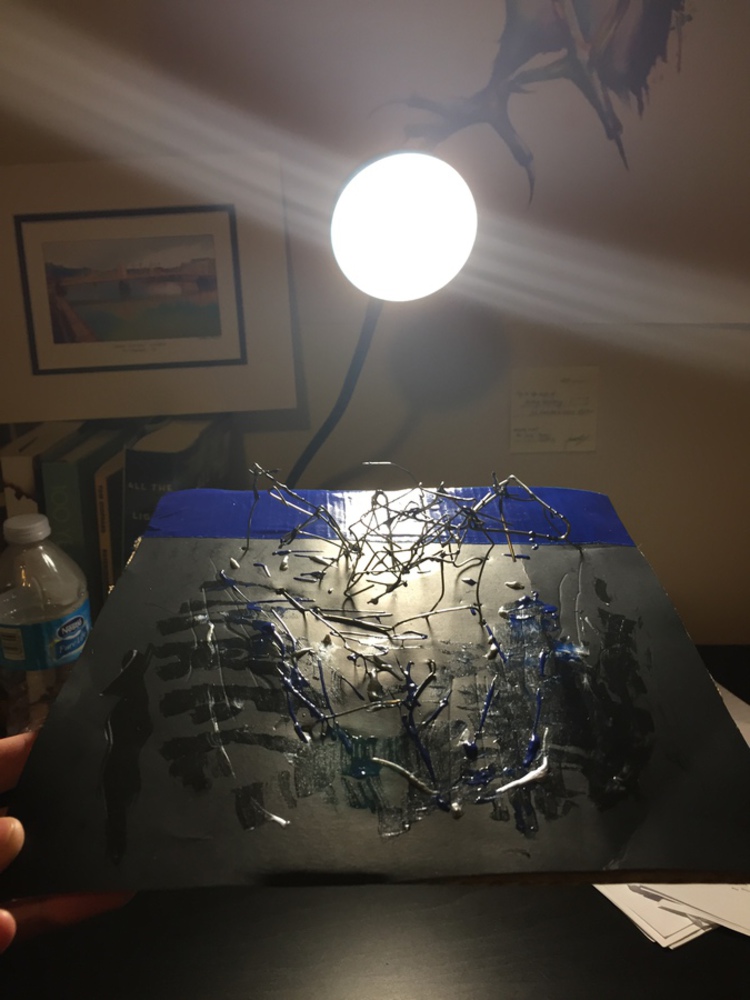
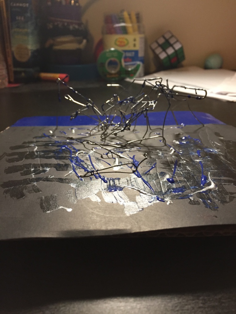
This is the final representation of my project is represented above.
It is composed with cardboard and poster paper, blue duct tape, stiff metal wire, and blue and silver paint for this project. The cardboard (with the black poster paper on it) made up the base, while the metal wire (bent in all sorts of different ways) was used to poke holes and taped to the bottom of the board to keep it in place. The project was then splattered with blue and silver paint, and the area behind the wires was covered with blue duct tape.
I chose to make this product because I felt it represented:
The sound: the first thirty seconds of Radioactive starts off soft, before slowly hitching up to a really awesome base drop that coincides with the words "I'm waking up", which is what my project almost literally represent: a slope of miscellaneous metal wire that sloped up and up until the "base drop", in which it rapidly descended into the blue duct tape (PSA it is really difficult to tell in the photos, I promise it's there, the altitude changes with the wires are really hard to see, no matter which angle I took the photo from).
The feeling: Radioactive starts off with a echoey, ethereal "whoah whoah" tune. It feels insubstantial and unreal, as if it's some background of the dream. As the sound gets louder and louder, the singing gets more and more solid, while, in the background, more and more digital sounds are added (slowly) to keep the anticipation ratcheting up. Then, the singing stops and the pitch continues to get higher and higher, until ultimately, the drop happens. The song creates a feeling of emptiness, and wanting something more, that steadily increases with each passing second, and is only satisfied at the drop and the beginning of the lyrics. In my project, I started off with wispy trails of blue and silver paint and slowly start adding metal wires as the slope gets higher and higher (to add the feeling of substantiality) before hitting the dropoff, in which the board becomes blue.
The message of the song: The song itself, is, as describes above, about waking up and seeing everything in a new way to completely change your life. I felt that the product I made represents that sort of feeling; I picked the colors blue and silver because of what they represented: blue is oftentimes associated with stability and calming, and silver is oftentimes associated with new things, so I interpreted the combination of both to mean a new sense of stability and purpose. As you approach the drop, there's slight glimmers of color, but only after you read the top and hit the drop do you find where you're supposed to be (the blue). This is reflective of what I think the song is trying to portray; that feeling of approaching the moment when you wake up and opening your eyes to see something new. The first lyrics are even "I'm waking up."

