Back to Parent

Outcome


Statement / Proposal

UPDATED:

Our two primary goals in creating this project are: 1) Create a physical representation of progress and choice; 2) Encourage collaboration between participants. 

Because we were assigned to wires, we wanted to use wires in their functional purpose to carry electricity in addition to using them for aesthetic purposes. Because electricity can be used to power objects on, and is, at its fundamental level, a stream of moving electrons, it matched our theme of progress and change very well. This motivated us to use wires to carry electricity. 

We wanted to encourage collaboration in our art because we believe that progress and change does not happen alone. To step forward, we oftentimes need the help of others around us. Working with others in real life can make a challenging task into something trivial. 

_____________________________________________________________

ORIGINAL:

We want to create a physical representation of progression. Progress is an unending journey that constantly gets harder. Often times, people forget that hard work and struggle is necessary for success to occur. People might give up when we lose sight of our goals.  We want to demonstrate this by using projections of figures attempting to progress through our "wireframe" landscape. 


Some thoughts to carry out the concept:

(1) Possible landscapes include: a vanishing point road, a bridge, etc.

(2) We will use the projector to project moving figures along the landscapes. This requires us to make a video in advance that fits well with the wire frame.

(3) We want to set our wire frames in sites that will stick out in the library. For example, the white walls on the first floor, if possible. And we can do multiple frames on different walls.

(4) We will try to incorporate our theme, "progress" in the atmosphere of studying in the library, in order to encourage students to be confident and perseverant.

(5) Materials: We need long, probably colorful wires.


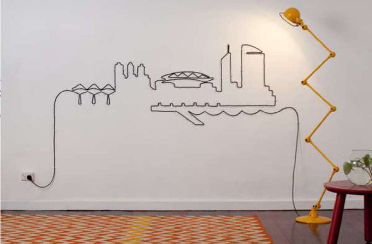
A similar illustration that inspires us:
City wire installation.thumb
Show Advanced Options

Context

Include references and discussion of artists, artworks, movements or aesthetic frameworks/techniques/approaches that inspired your outcome, process or approach. What has informed your outcome? How does your outcome relate to other artists and their work? What ideas, styles, or themes did you draw on any why? You must cite at least 3 critical texts, theories or works.

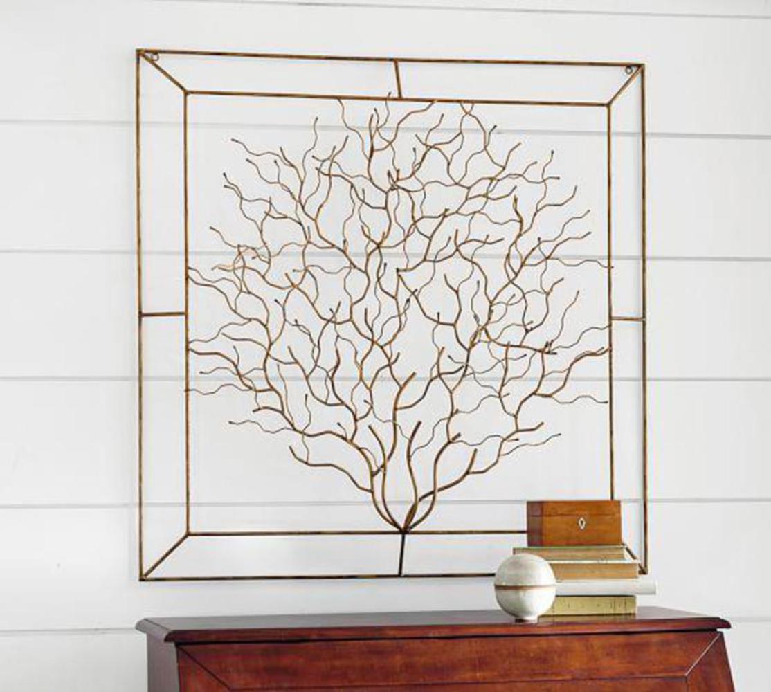
1. Wall art of trees(see below)

Wall decoration is a form of art installations. The flexibility and stretchability of metals and wires make it easy for them to extend from 2-dimensional to 3-dimensional art and therefore give the audience different spatial experience. We were inspired by wall art that themed on trees, and we decided to do our own electrical tree. Our outcome is like a piece of interactive wall art under the influences of the wall decoration of metal trees.

2. Wire Frame Art (see above in proposal)

A collection of wire frame art:

http://www.trendhunter.com/trends/city-of-melbourne-wire-installation

Wire frame art on walls is a branch of wall art. The collection of the artworks are created by numerous unknown artists and they utilize the electrical feature of wires very well. For example, in the wire frame artwork above, the wires are actually connected to the plug base, and used to power the lamp. It inspires us to use the wire not only as an art material but also as a carrier for currents.

3. Interactive art and Embodied Interaction

Text: Paul Dourish. Where the Action Is: The Foundations of Embodied Interaction, Chapter 4. Cambridge, MA: MIT Press. 2004.

Paul introduces the concept of "ready to hand". That is, technology itself should better fade into the "unconscious yet accessible" background for our mode of being.  The idea of making technology invisible inspires us to think of the possibility of making art installation "invisible". In our outcome, we tried to make our approach simple and clear using buttons that stick out, and explicit branches of the tree with lights on them. So passers-by could know that they can interact with the tree by pressing the buttons, without given explicit instructions.

Coralina metal tree wall art.thumb
Show Advanced Options

Process

Initially, we wanted to make a wire frame outline of road, and demonstrate progression by having lights travel down the road. However, this seemed too simplistic in nature, as it was very literal in its description of progression. There was very little abstraction to keep the viewer interested. Also, it did not offer any interaction between the art and the viewer. As a result, we quickly abandoned this idea. However, we did keep the idea of hanging wires on the wall. 

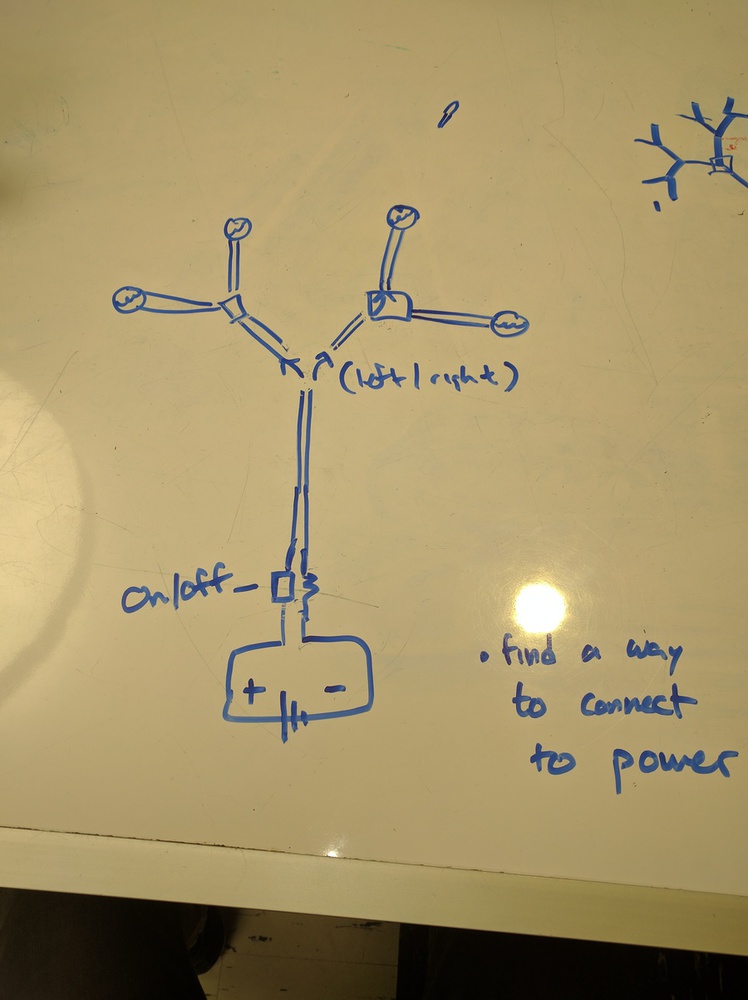
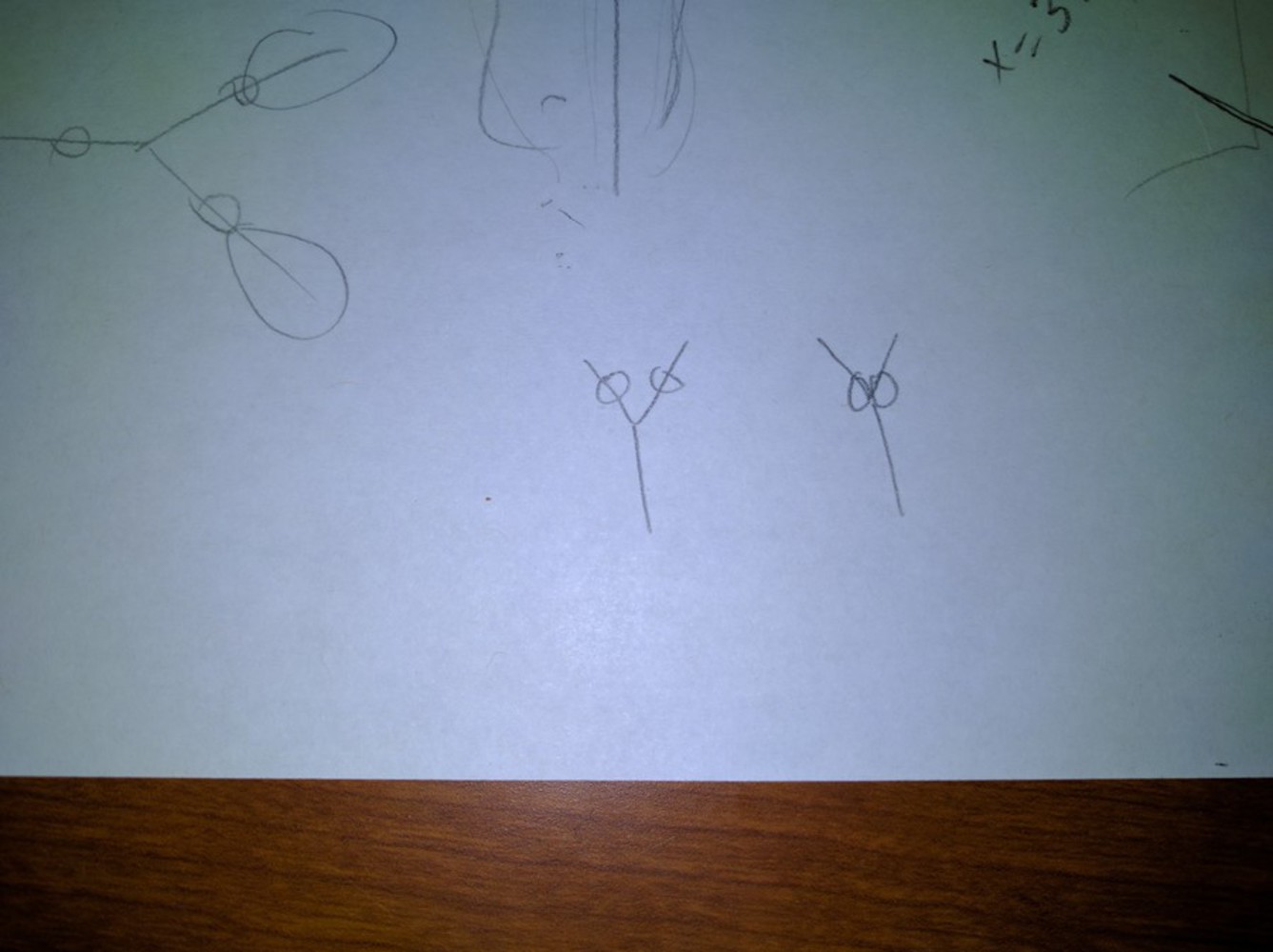
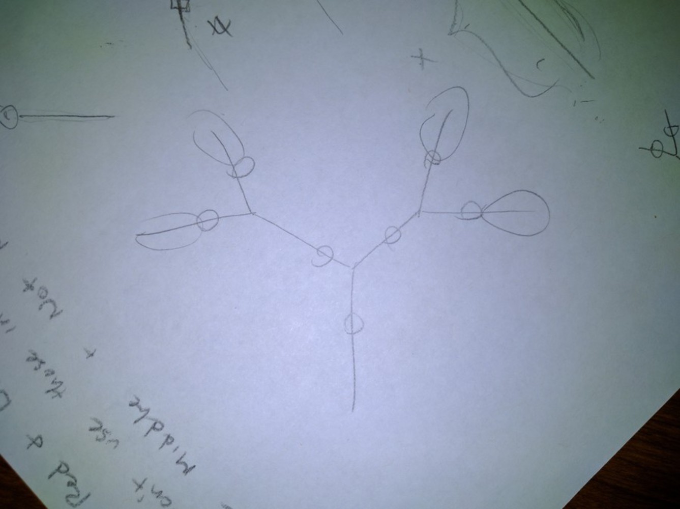
In order to abstract progression and introduce viewer participation, we settled on the idea of a tree. In particular, we found that a Y - fractal tree demonstrated the consequences of choices very clearly- moving up from the root of the tree to it's branches was a clear metaphor for choice. 

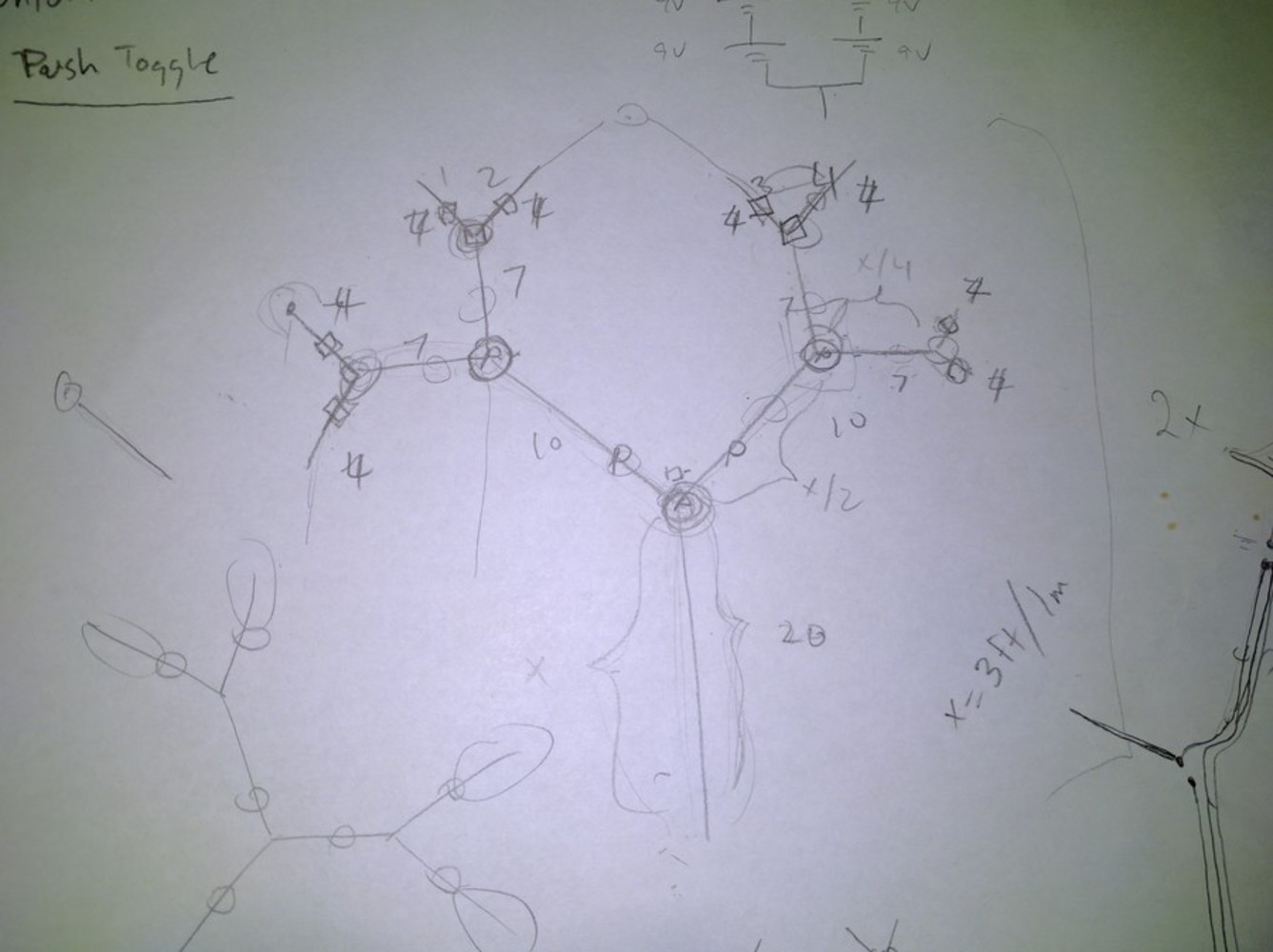
We wanted to use buttons to involve the participants. Our big design challenge was to decide what placement we wanted to put the buttons. Initially, we wanted each split in the tree to be a button. That way, every split represented a different decision. However, the buttons were all congregated really close together in the center, and the whole tree looked very unbalanced. 

We ended up deciding on placing one button in the center and the remaining buttons on the ends of the branches. This way, the buttons would be balanced around the whole tree and not be so squished together. Additionally, this limited the amount of wires we needed to cut and manage because branch ends served as easy start and ends for wires anyways. 

Another decision we debated about was what type of button we wanted- push on/off, or toggle on/off. Push buttons required the participant to hold down the button, while toggle buttons only required the participant to hit the button once to turn it on. We felt that push buttons forced collaboration more easily than toggle buttons did because push buttons required the action of the participant all the time. This fit with our theme much closer. 

Finally, we had to choose a location to set up our installation. We wanted to place our tree in a place of high traffic to have the possibility of attracting the most people. As a result, we chose a wall in the first floor of Hunt. 


Delegation:

Stephen: test the button switches,  prepare the battery group

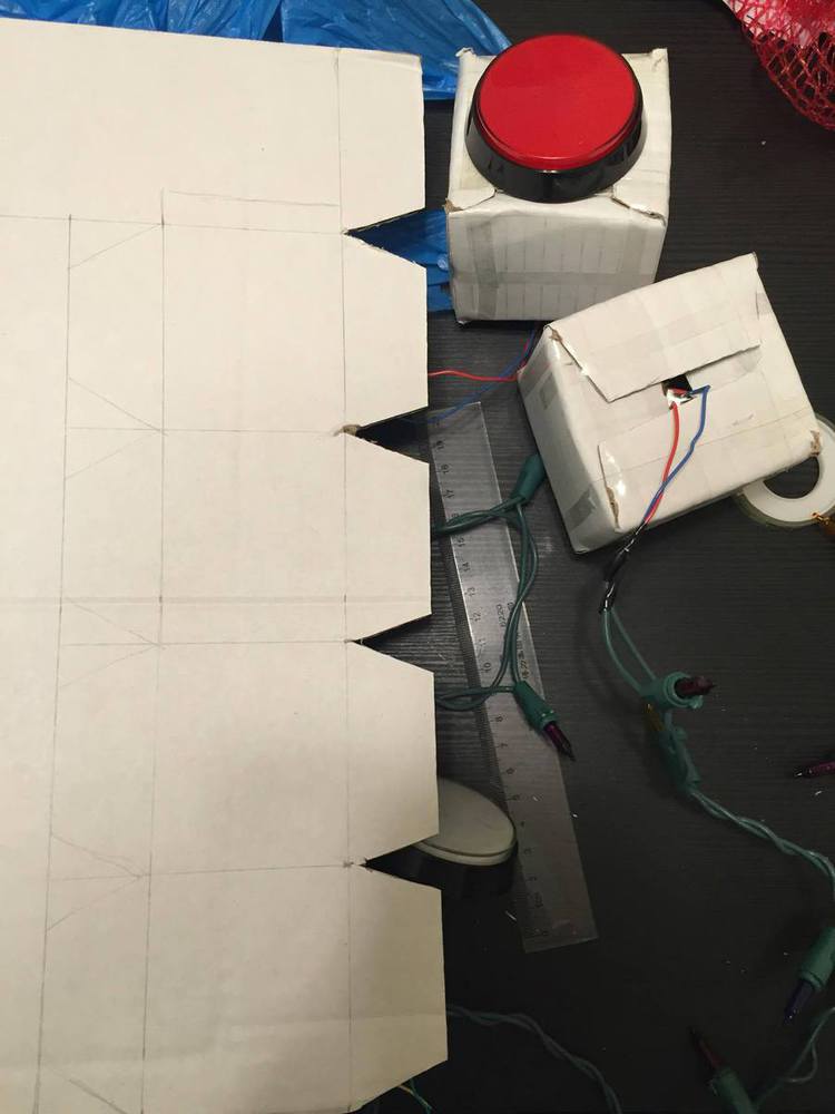
Tian: prepare the materials,  wire and decorate the switches

Together: plan out the prototype of the tree, wire the branches and ground all branches

Img 20161026 142602.thumb
Show Advanced Options
Img 20161101 194826.thumb
Show Advanced Options
Img 20161101 194838.thumb
Show Advanced Options
Img 20161101 194849.thumb
Show Advanced Options
14958024 349863332027251 1354238649 o.thumb
Show Advanced Options
14881768 349862985360619 2117557898 o.thumb
Show Advanced Options
14907793 349863318693919 976125883 o.thumb
Show Advanced Options

Product

Describe the outcome. What did you create, how, etc.? How did you compose your image? What styles, methods or techniques did you use? What tools and technologies were involved?

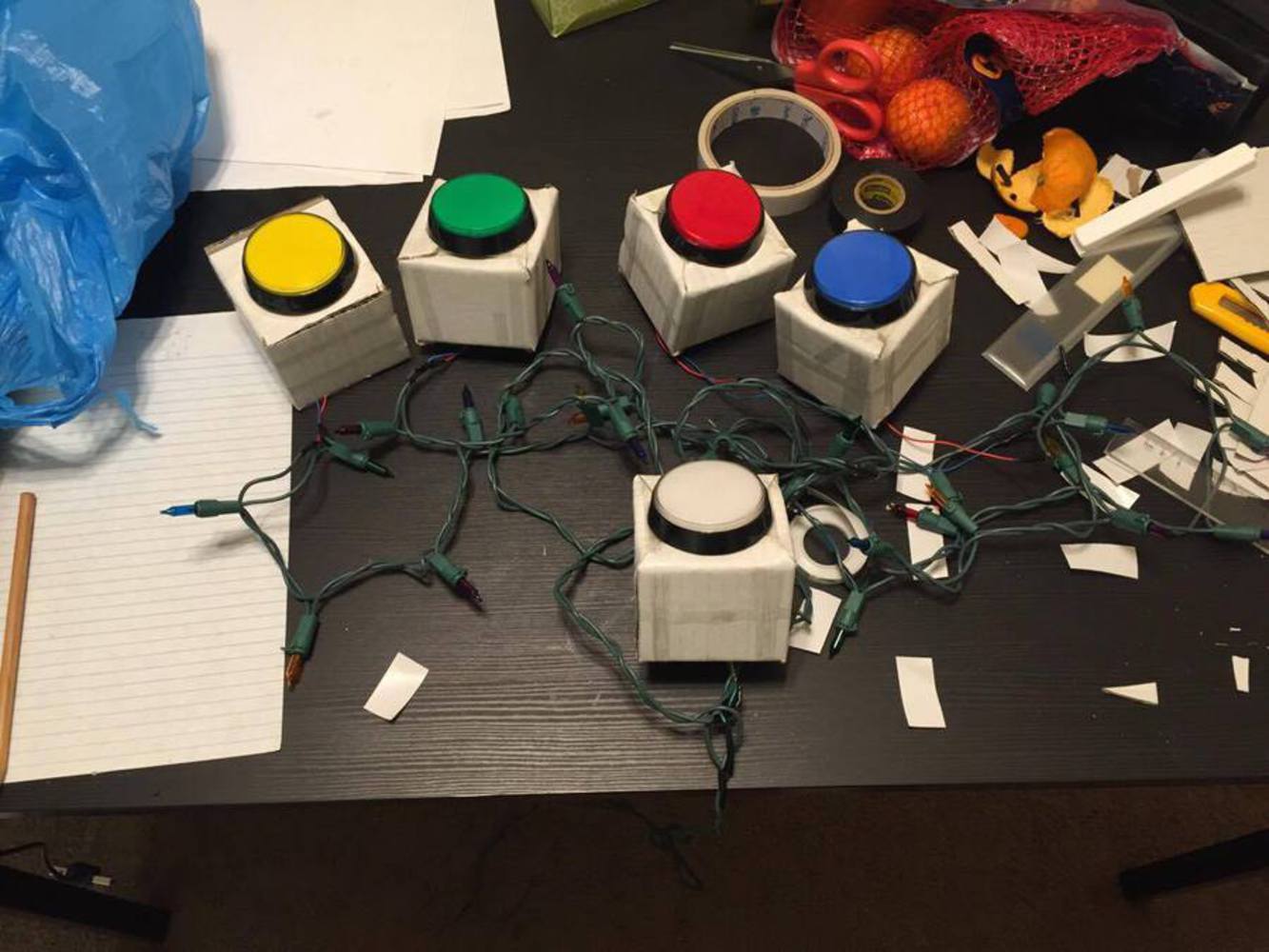
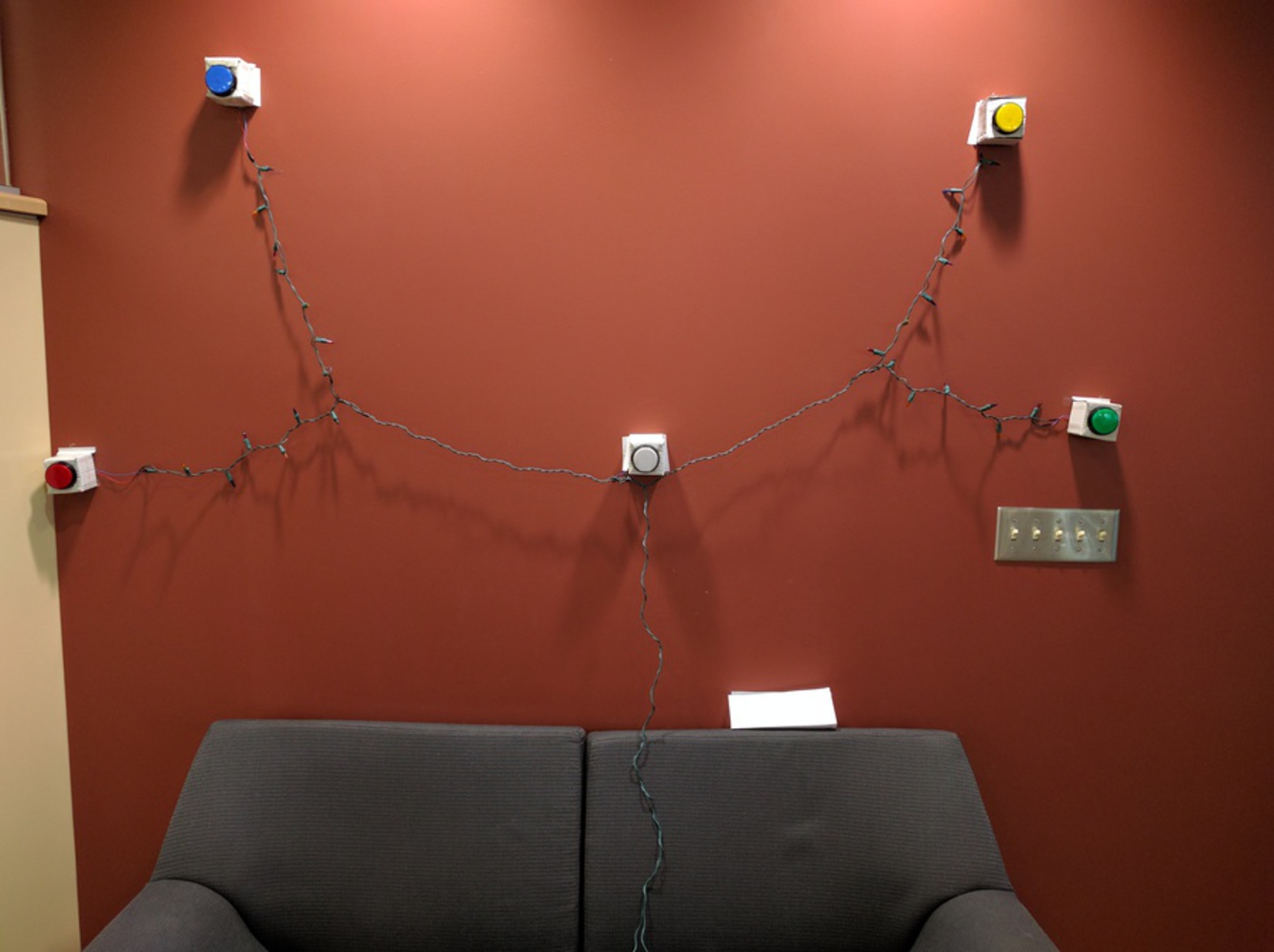
We created a Y fractal tree out of wires, Christmas lights, and colorful push buttons. There are two levels of splits, resulting in four end branches off of one main root. Buttons are located at the end of each branch and in the center of the tree. Christmas lights line the branches, and green wires line the rest of the tree. 

Three buttons were placed at chest height, and two more buttons were placed at slightly above head height. This was done so a vast majority of people can reach each button, and the tree can have the most visibility. We chose large round buttons on white boxes to encourage people to come and press the buttons. We also hoped that the Christmas lights would be intriguing to the average person. 

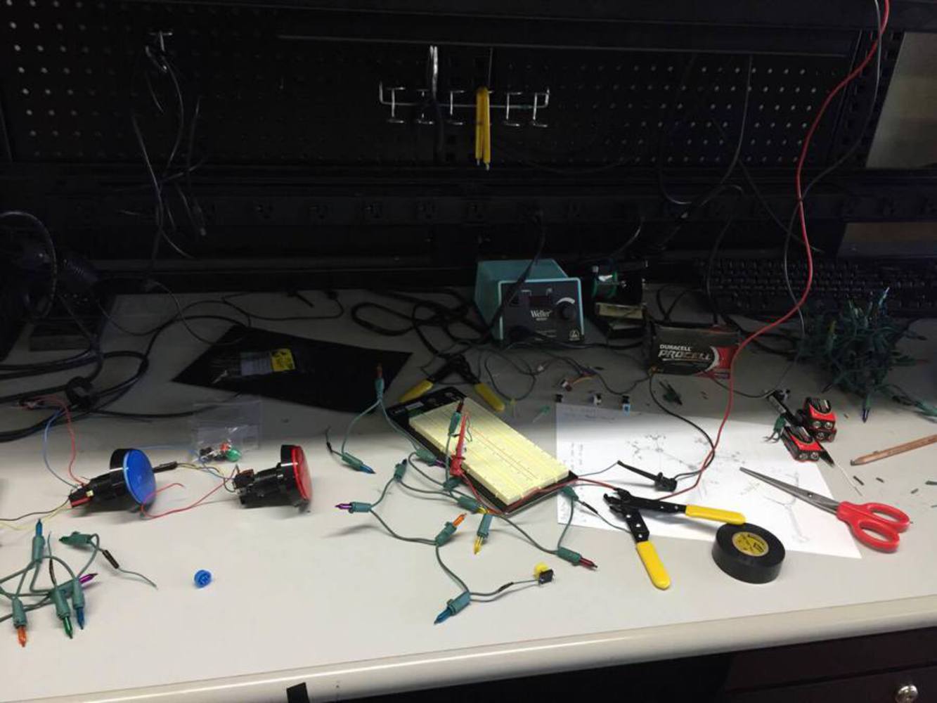
We wired our wires, lights and buttons together using the ECE laboratory facility on Carnegie Mellon University. We used wire strippers, DC voltage sources (for testing), and multimeters (for testing). 

Img 20161101 093338.thumb
Show Advanced Options

Critique

Critically evaluate the success of your own work. What does your inner critic say about this work? Did you match intent and outcome effectively? (note: use the framing questions to guide your response!)

Although I am happy with the end result, I can't help but think there is a lot to improve on this installation. 

One of suggestions I received was to, instead of hanging our installation on the wall, spread our tree on the ground and take full advantage of the space. I particularly was interested in the suggestion that we have the main center button be placed on a coffee table, because a coffee table is already associated with interactivity. I believe that spreading our branches and lights in different patterns along the ground would be very interesting in helping develop scale to our installation. Also, I think it would help promote interaction because people normally move through and interact with space more easily than with walls. I can imagine a whole room with lights and buttons laying across, and people pushing buttons to test how they interact with each other. 

One thing that I am proud of is that this idea is very scalable. Lights and buttons can scale further and further outwards to fill a whole room easily. One positive is that the larger scale this installation gets, its emphasis on collaboration grows. Scale can actually make this concept have a greater impact. 

Reflection

Briefly outline what you took away from this project. What did you learn? What would you do differently?

If I were to do this project differently, I would have planned our installation around a space rather than a wall. I believe that having our tree hang from a wall ultimately limits its potential as a source of collaboration. Ultimately, we were so caught up in the idea of walls that it did not even occur to us to go horizontal rather than vertical. As a result, I have learned that it is easy to become complacent in one's ideas. I believe that with practice, I can become more open minded and forward thinking about how to plan an installation. 

Also, we would have made more branches and spread the tree to a larger spatial scale. As is mentioned in the critique section, the tree would turn out more interactive and would more effectively present our theme, "choices" if we can spread our tree out instead of sticking it to the wall. These changes will make our project more interactive.

Drop files here or click to select

You can upload files of up to 20MB using this form.