Back to Parent

Outcome


Intention

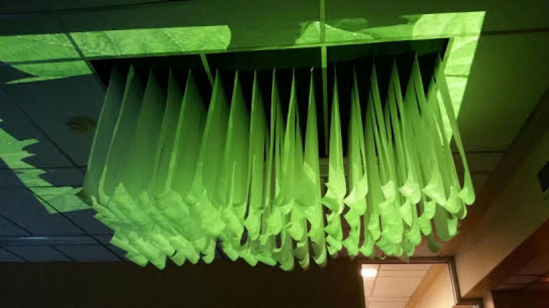
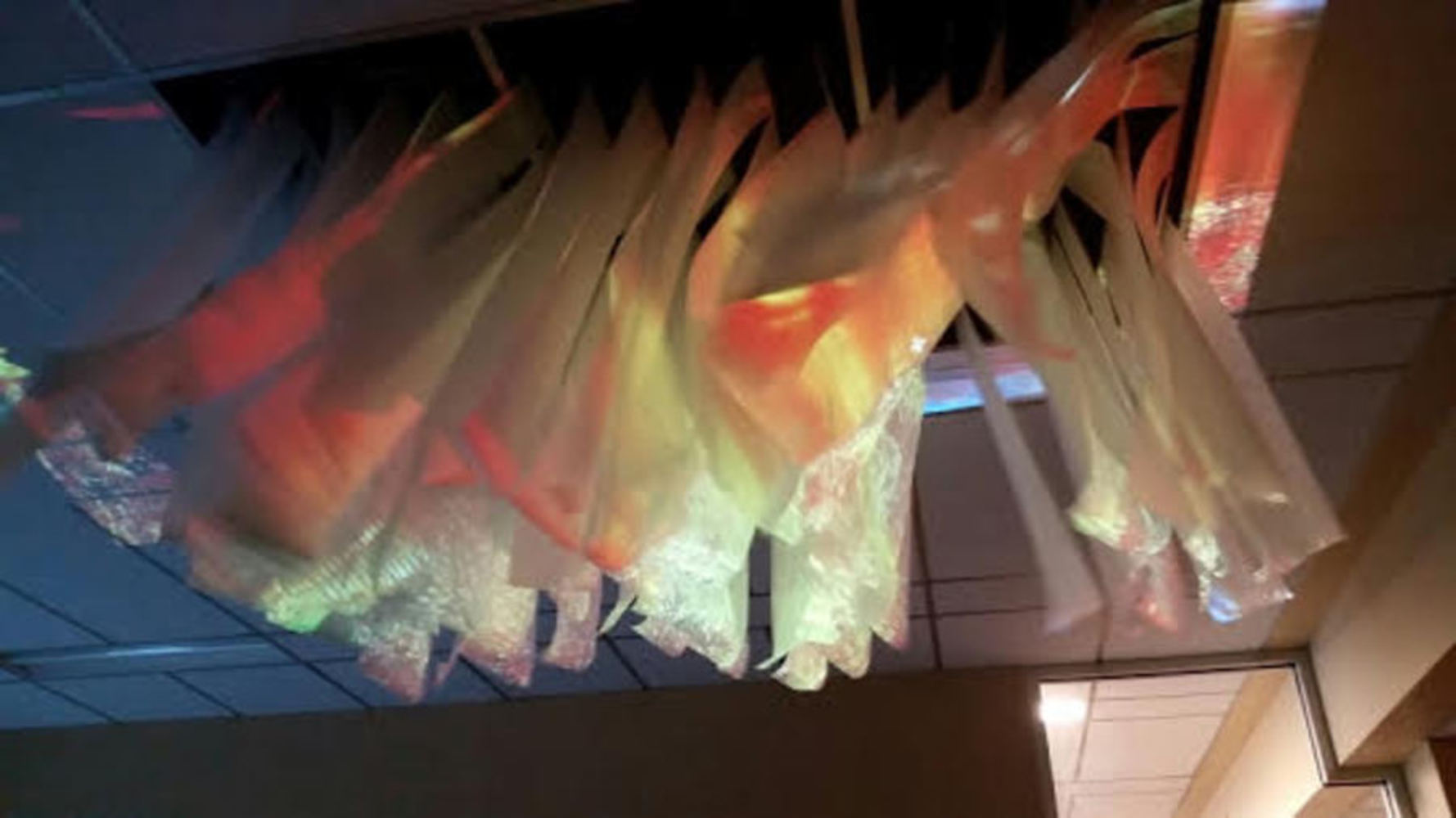
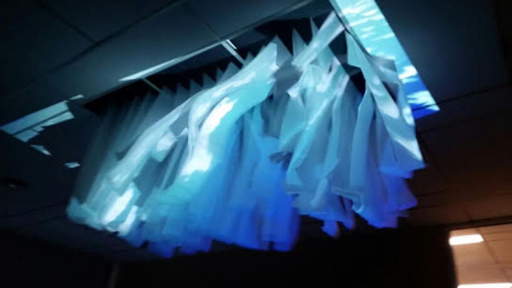
The idea that we came up with is to cut paper into strips and suspend them from the ceiling. We would have them cut to different lengths, but not long enough to disrupt anyone's path. Then we would have a wind source, in this case the vent near the ceiling in Studio A, to blow air at the strips to make them look like waves. The last thing would be a light shining on the paper from a similar direction that the air is blowing to give the paper texture while it flowing.

The assigned material for our group is paper, and since it moves so easily we wanted to exploit that property so make kinetic art. The media portion of work comes from the projection that we used to give the paper strips texture. We decided to use textures found in nature such as a sunset, a cloudy blue sky, and green leaves.

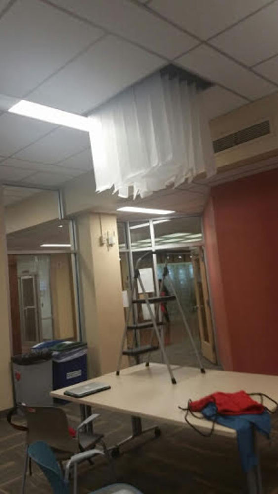
As mentioned before, we chose the site for our installation to be in Studio A in front of the vent near the ceiling. We mounted our strips of paper on the two ceiling panels in front of the vent in order to have an already mounted wind source.
Context

Since we were given paper as our material, which is a rather light material, we wanted to play with movement and perception as through kinetic art as described in the Kwastek reading. With a material that moves with little effort, exploiting that property would be rather easy. For the aesthetic for our work, we were mostly inspired by Zimoun's 36 ventilators, which had fans blowing packing nuts continuously in a framed in window sills. We decided to use wind in a similar way to create an almost mesmerizing effect. Also it gave us the idea to use a pretty controlled setting like Studio A, so that we can ensure that the right effect is being perceived by the audience. Lastly,  embodied interactions as described in the Dourish reading inspired us to exploit familiar experiences to capture the viewers attention through familiar textures projected onto the flowing paper. Through familiar, natural textures being in an unexpected setting, it draws the attention of the viewer onto the paper, while trying to make them forget that the material is paper, which we found to be an interesting effect. 

Process

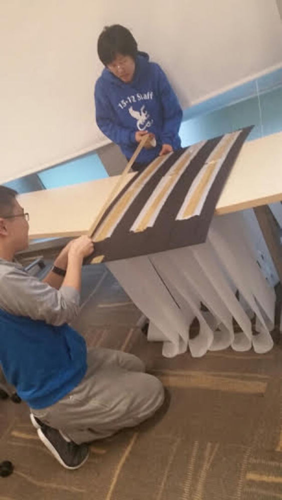
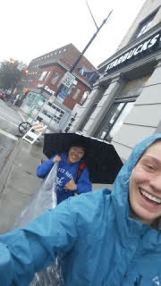
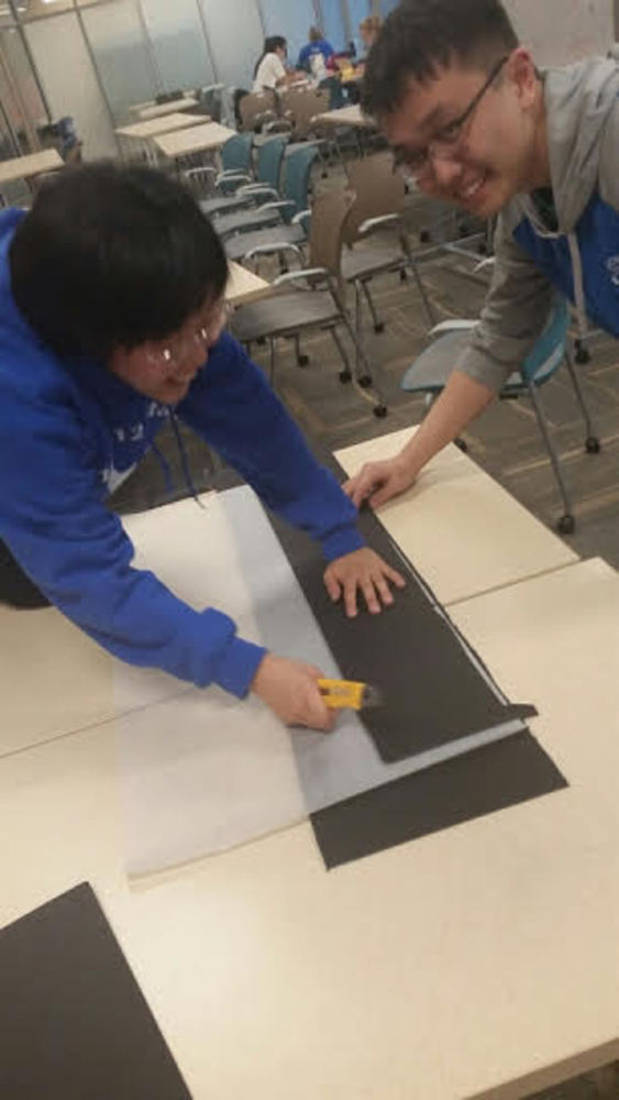
We had a very extensive process of creating this piece. First we had to gather the information needed to even start thinking about execution. We used ladders and tape measures to measure the dimensions of the ceiling panels before going out and buying a board and paper. On the trip home with the board, we were faced with a few obstacles (such as the rain and the sheer size of the boards we purchased). We then began measuring and cutting, for which we used box cutters on both the paper and foam board. Then, we slipped the pieces of paper through the slits in the board and secured them on the opposite side with box tape. The final challenge was putting the project into the ceiling panels. 

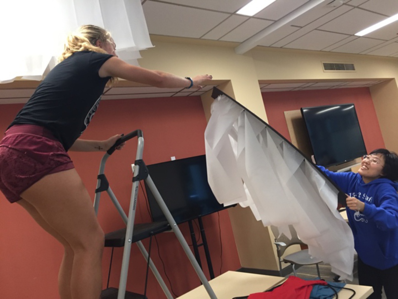
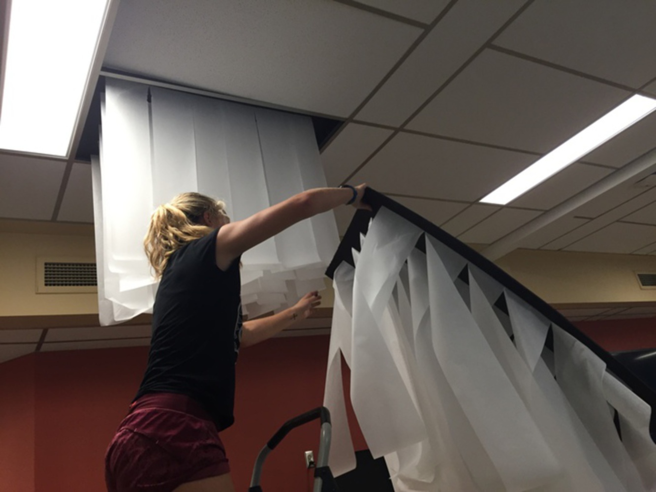
In terms of actually installing the piece, we used a ladder on a table to get close enough to push in the original panel and then squeeze the new ones into place (which was a daunting task for those afraid of heights). We had to do this for all three panels. Overall, the process took about 4 hours to measure, cut, tape, and install. 

Paper4.thumb
Show Advanced Options
Paper6.thumb
Show Advanced Options
Paper8.thumb
Show Advanced Options
Paper7.thumb
Show Advanced Options
Paper9.thumb
Show Advanced Options
Paper10.thumb
Show Advanced Options

Product

The product was something very similar to what we expected. The major difference between our prototype and the final product was the lack of wind. We discovered after installing the piece that we did not have control over the vent positioned in front of our project. However, the projector was successful since our chosen paper was slightly transparent and allowed the light to travel through into the deeper strips of paper. Aside from that, we created our own "wind" be waving an off-cut piece of foam board to move the strips of paper as we intended. 

Paper1.thumb
Show Advanced Options
Paper2.thumb
Show Advanced Options
Paper3.thumb
Show Advanced Options

Critique

Our product was a success for a prototype installation. We got the desired effect and the product turned out to look very good. The textures were projected on to the paper very well and since the paper was slightly transparent, the light filled the paper very well too. A weakness of the work is that it can grab the attention of the viewer pretty easily with the textures, but once a person "gets" what is happening there is not much else to look at. It was not as dynamic as it could have been and did not exactly give the mesmerizing effect like that of the Zimoun's 36 ventilators, despite having the flowing effect. But as a physical piece it is still pleasing to look at, it just leaves something to be desired after the initial digestion of the piece.

Reflection

For a lot of us this was our first time producing a physical artwork that takes advantage of a space with purpose so this was definitely a learning experience  in many different areas. Until this module we had only dealt with digital artwork, so with a physical piece we are able to affect the viewers' perception in a more real way. We also learned about the advantages of having a space to work with and how that affects piece. Since we used Studio A which is one of the more closed off spaces in Hunt, we were able to control things like lighting to ensure the right effect is being shown. But in addition to having some control in a space, we also learned that a space can have constraints as well, such as not having direct control of the vents to blow on the piece. Working with a space requires one to strategically take advantage of everything the space has to offer in order to frame the piece as best as possible.

 If we were to do something differently, a more dependable and uniform wind source would have helped with getting the paper to flow in an more elegant manner, rather than a fan that runs at random times or manually fanning the strips. Also we would have used more dynamic textures to project onto the strips rather than just sticking to nature. A looping .gif with geometric qualities would have probably projected well onto the strips. Another area we could have played with is the sound of the rustling of the strips. If we were able to amplify that sound, our installation could have been a more full experience.

Drop files here or click to select

You can upload files of up to 20MB using this form.