Back to Parent

Outcome


Curatorial Statement:

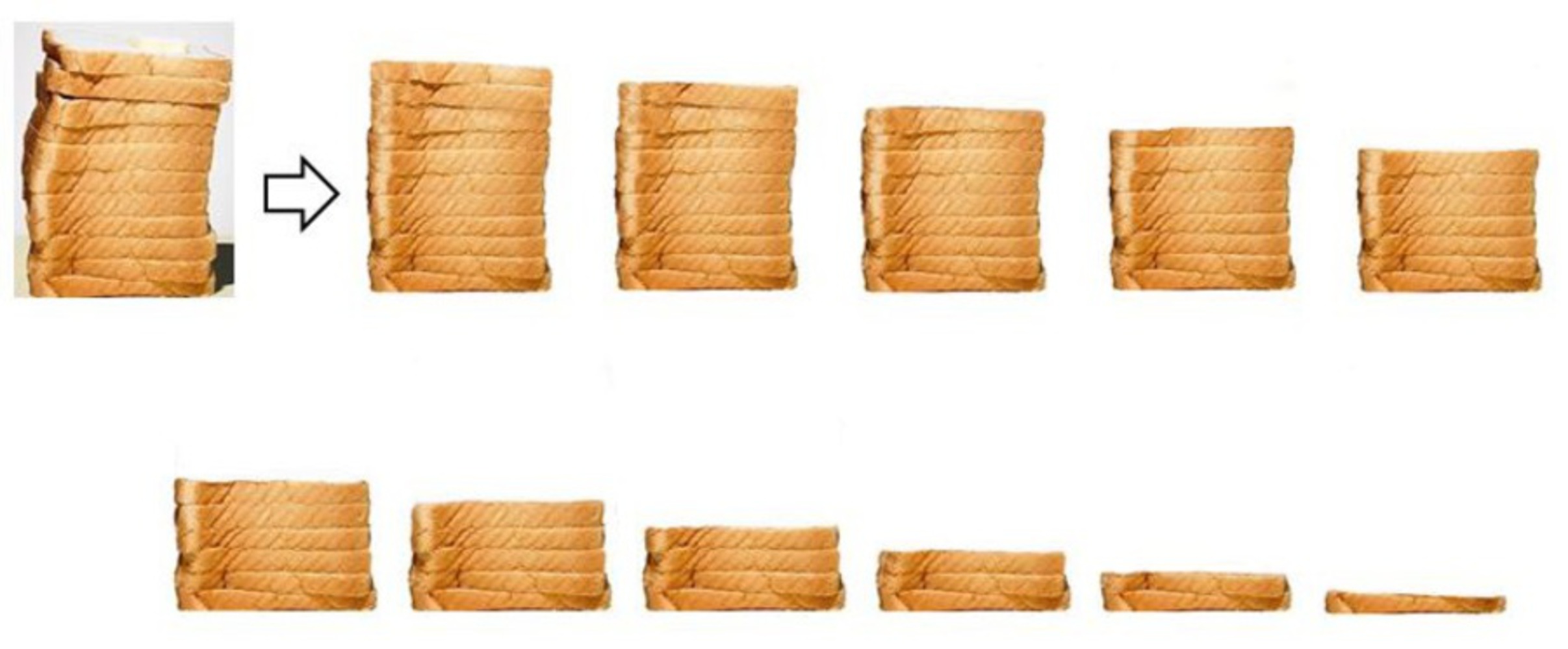
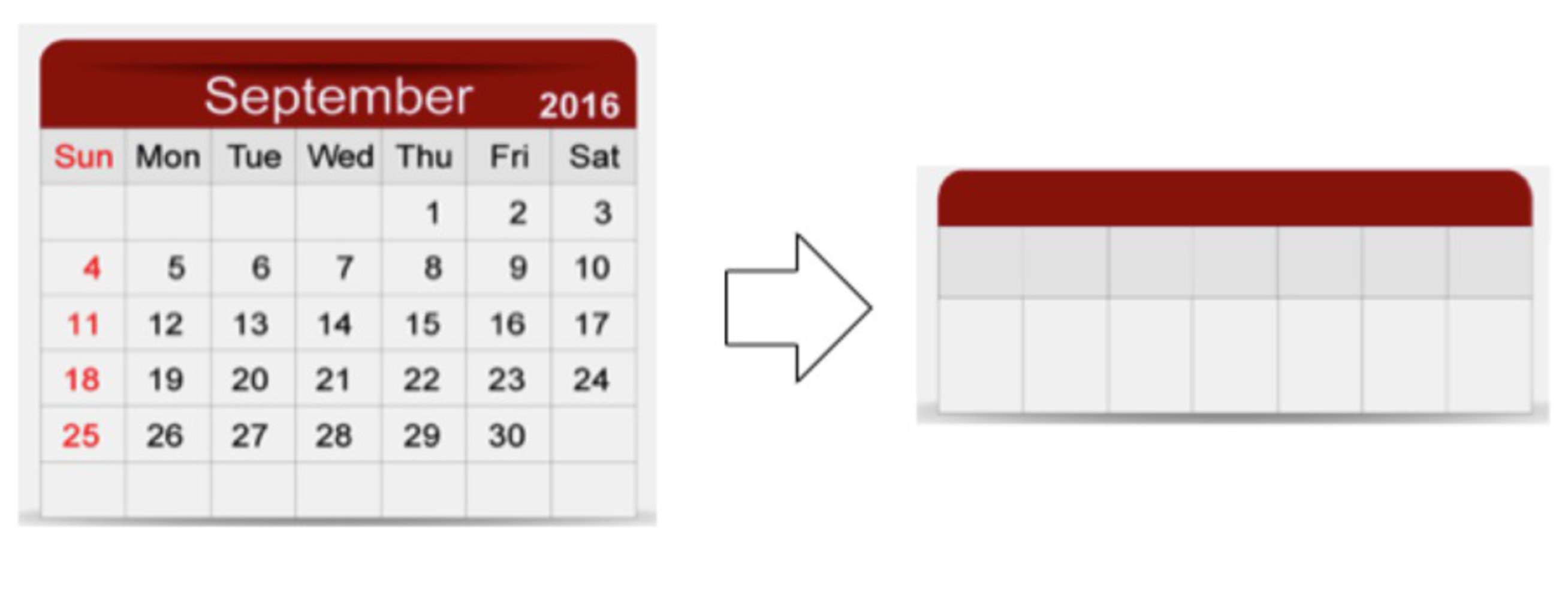
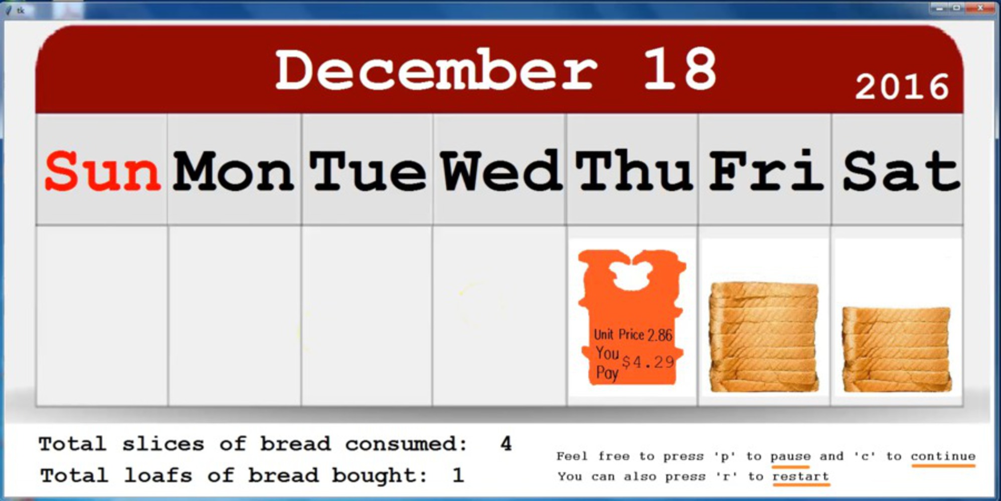
Showing the number of bread left as a record in a weekly calendar, this simplified version of one’s daily bread consumption wants to show that even if something as mundane as the daily consumption process/record can be converted into /presented as an artwork.

Context

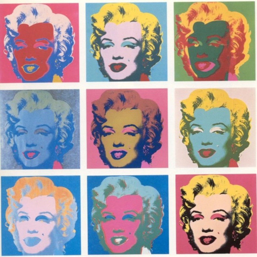
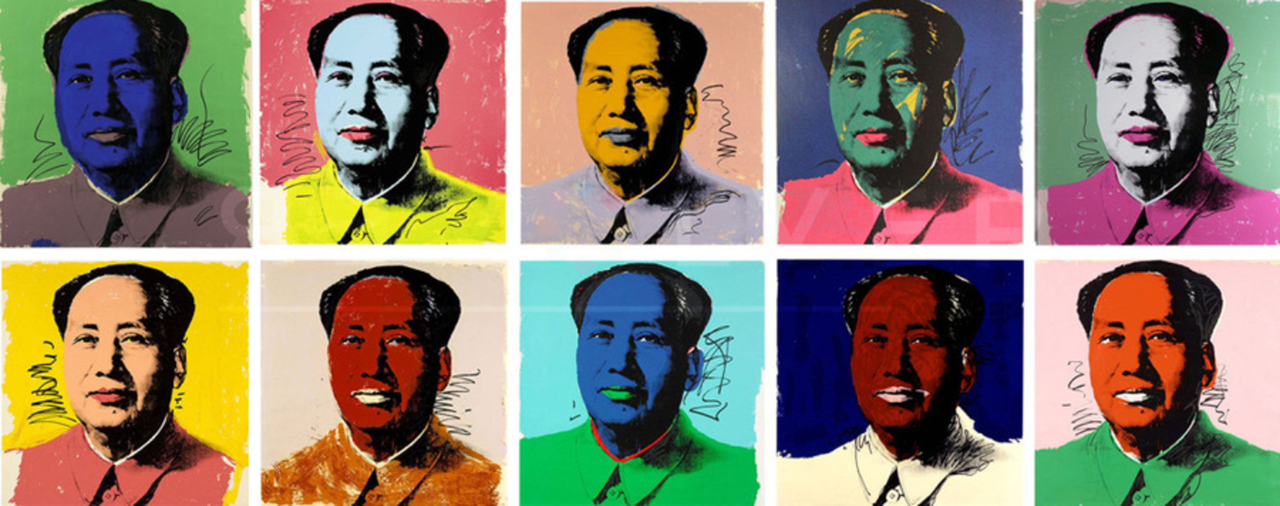
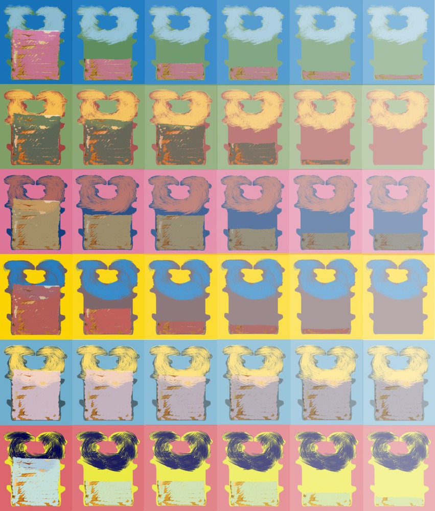
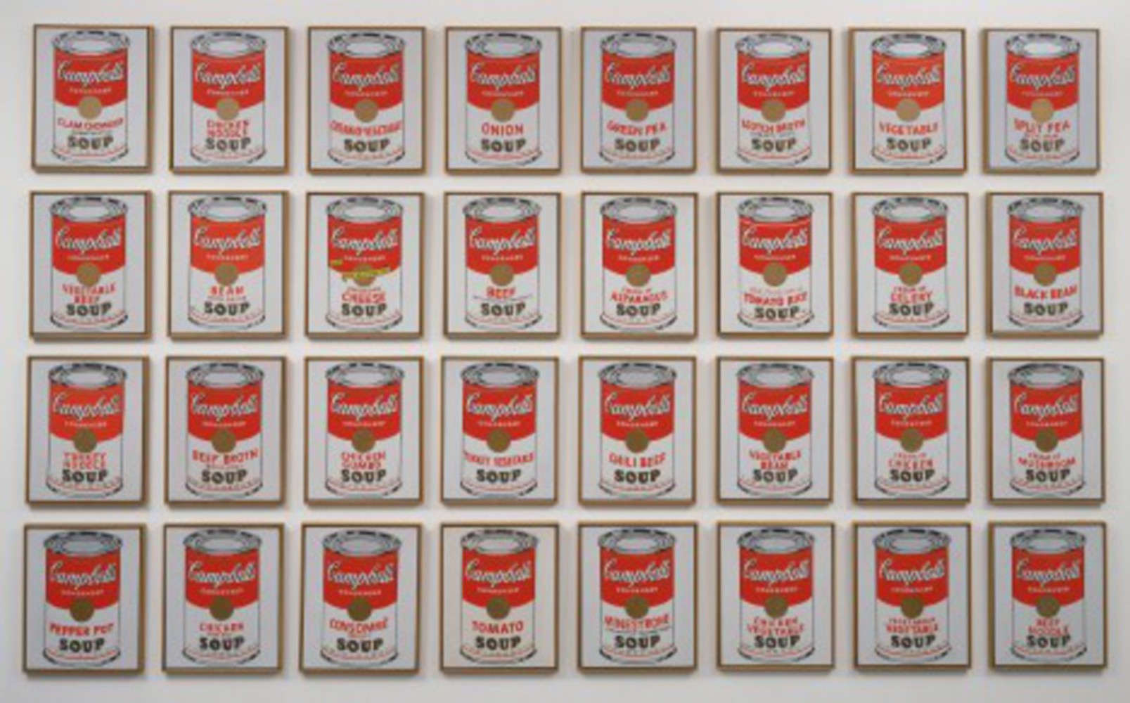
My original work (Multi-color Bread & Fastening Clip, Creative Project, Module 1) was inspired by Warhol's Campbell’s Soup Cans and his multi-color screenprints of Marilyn Monroe and those of Chairman Mao. The idea was to imitate the colorful screenprint style (as it is so expressive and impressive) and make the common object in our daily lives, bread, into an artwork.

The 4 graphs below are 1. my original work; 2. Campbell's Soup Cans; 3. Marilyn Monroe screenprints; and 4. Mao Full Suite.

Bread.thumb
Show Advanced Options
Soup cans.thumb
Show Advanced Options
Favim.com andy warhol art beautiful color marilyn monroe 84015.thumb
Show Advanced Options
Mao full suite1 1024x405.thumb
Show Advanced Options

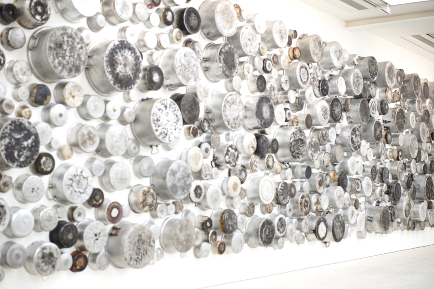
A project that related to food is Maha Malluh’s Untitled (Food for Thought series), 2016, which is composed of 233 burnt pots. The aluminum cooking pots are traditional cooking devices widely used throughout the Arab world (where the artist lives). And those traces on the bottom of each pot seem to record how it was used in the past and tell different stories about those who once valued but now discarded the pot. 

Ffth.thumb
Show Advanced Options

Another interesting artwork about eating is a small part of Jorgen Leth’s movie 66 scenes from America filmed in 1981, which is a video about Andy Warhol eating a hamburger. As far as I learned and interpreted from the notes for that video, Warhol agreed to the scene because it would represent the idea he likes the most that “the richest consumers buy essentially the same things as the poorest”. That is, in that situation, no amount of money can get anybody a better Burger King burger. (And I guess it can also be interpreted as a “proof” that ordinary people eat hamburgers; celebrities eat hamburgers; so celebrities are still ordinary people.)

Show Advanced Options

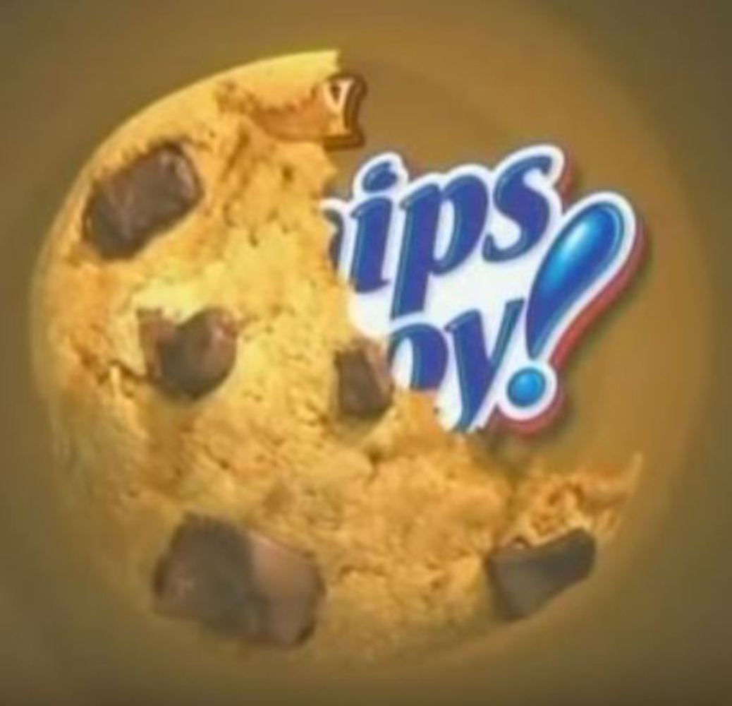
I guess the Chips Ahoy’s commercial subtly influenced the way that I represent the consumption process. Similar to the reduced remaining part of cookie left in screen (see from about 26' to 28'), I showed the bread stacks with decreasing height left for each day.

Chips ahoy.jpg.thumb
Show Advanced Options

Lastly, as the installation becomes interactive after I added some questions at the beginning, it belongs to at least the category of participation, according to Dixon’s four levels of interactivity in media art and performance. The Bread Calendar can also be considered involving collaboration to some extent since players can decide whether the number of bread consumed is constant or random, and the constant/ maximum number accordingly.

Show Advanced Options

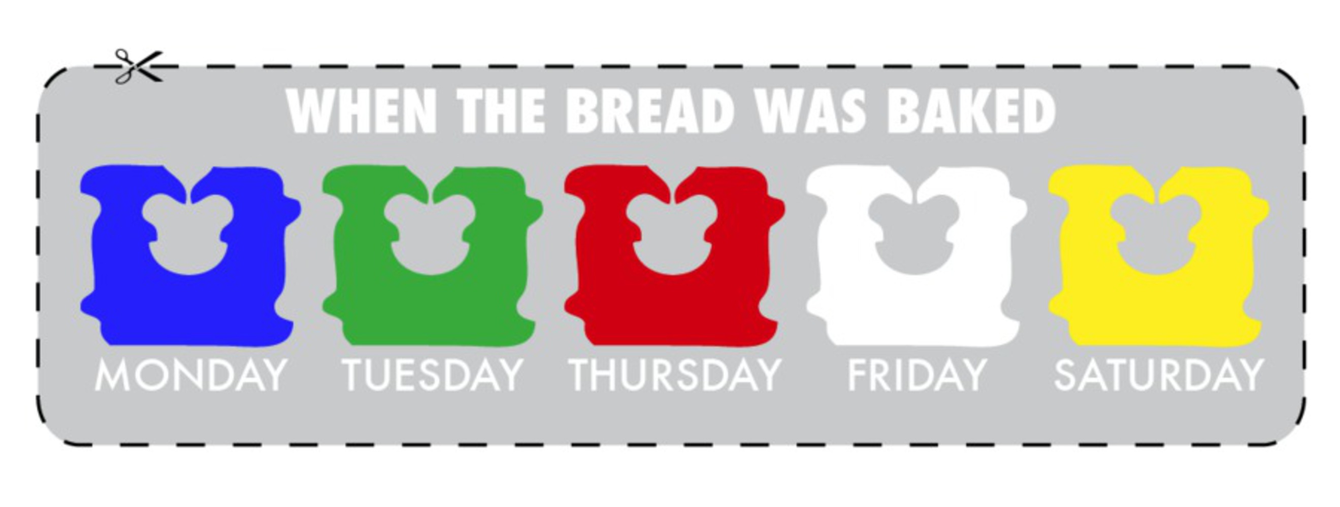
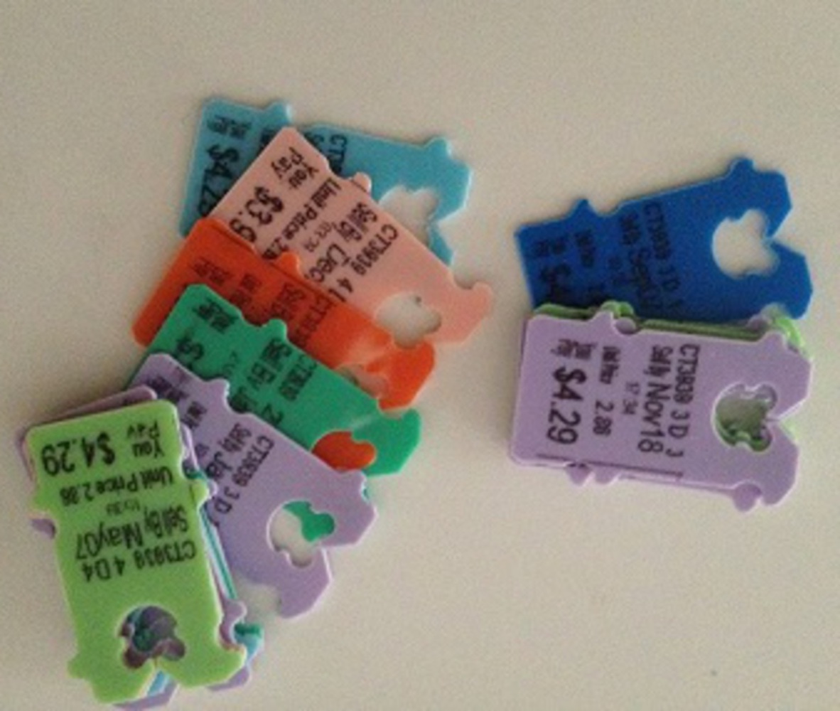
The graphs in the previous project were created as I learned that the color of bread tag corresponds to the specific day in a week that the bread is made. I originally want to keep using them in the installation for the dates when a new loaf is bought, but it turns out that the style of those graphs did not fit into that of the other graphs of plain bread very well… So I replace them with the pure color bread tags same as the ones used for Pepperidge Farm bread in reality. Nevertheless, I modified the original ones a bit (the colored bread parts were switched into plain ones as they are easier to recognize) and I set them in a row in the “splash” screen (as the effect of contrast colors was eye-catching).

The 5 graphs below the recording are 1. bread tag color; 2. original work; 3. modified graphs (from Sun to Sat); 4. graphs of plain bread; and 5. pure color tags (from Sun to Sat). 

All graphs were edited using Adobe Photoshop.    

Fastening clip.thumb
Show Advanced Options
Old.thumb
Show Advanced Options
1.thumb
Show Advanced Options
Slices.jpg.thumb
Show Advanced Options
Tags.thumb
Show Advanced Options

Intention:

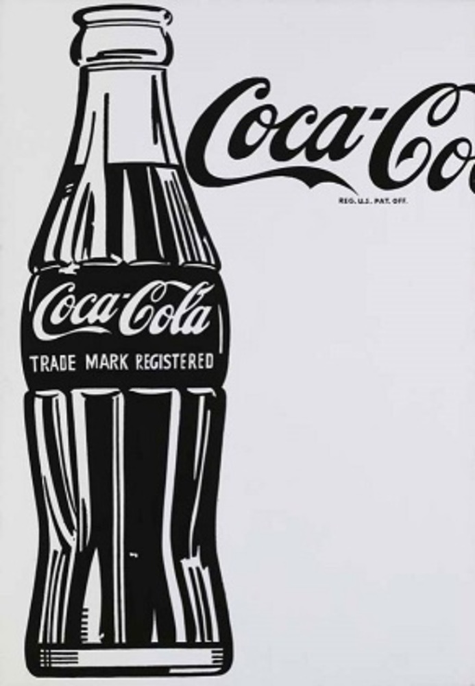
As far as I understood originally, Andy Warhol’s Large Coca-Cola and Campbell’s Soup Cans introduced popular commodities into the art realm and in his and many other pop artists’ wake, mundane objects started to appear in or directly become artworks and be shown to the public in museums. Fascinated in that idea, I decided to appropriate it and create an artwork with a much more ordinary but meaningful food (to me), bread. I particularly chose bread because not only I eat about one or two slices of bread as a snack almost every day, but I also like the “humble characteristic” of it: although plain bread does not look attractive at all and will never be as fancy as a cupcake or whatever, it can fill one’s empty stomach effectively and is also very nutritious.

Coca cola large coca cola 1962.thumb
Show Advanced Options

 In addition, to further implement my idea in Module 1’s creative project that the decreasing pattern of total number of bread in each row represents a person’s bread consumption habit, I placed the whole project into the context of a weekly calendar and the idea of time can then be visualized directly from the changing date. Moreover, since the range of time was extended from 6 days (only 6 small graphs in each row) to (in theory) unlimited (as the program of my calendar can go on forever), the bread consumption process sort of records one’s everyday life/ living. And I believe that everyone comes to this world by chance; that he/she has his/her own unique stories and that everyday life of any person (everyone’s living in this world) is art.   

Process:

The product of module 1 intended to represent the process of bread consumption by placing series of bread stacks with decreasing number of total slices side by side. But that idea did not work effectively as I found out that a “process” (which is dynamic by itself) should not be constrained in a static frame. Therefore, a gif became my first choice to make the graph dynamic.    

http://gph.is/2hEdXSq

However, a gif that loops over the same consumption pattern forever seemed lacking clear indication about time (it focused on the process of being consumed though) and was too inflexible. Thus, in order to make the consumption of bread random or generate different patterns each time it repeats and representing the idea of “daily” consumption better, I came up with the idea of framing the whole process into a calendar and implementing it in Python based animations.  

Screen shot 2016 12 16 at 3.12.12 am.thumb
Show Advanced Options
Interface.thumb
Show Advanced Options

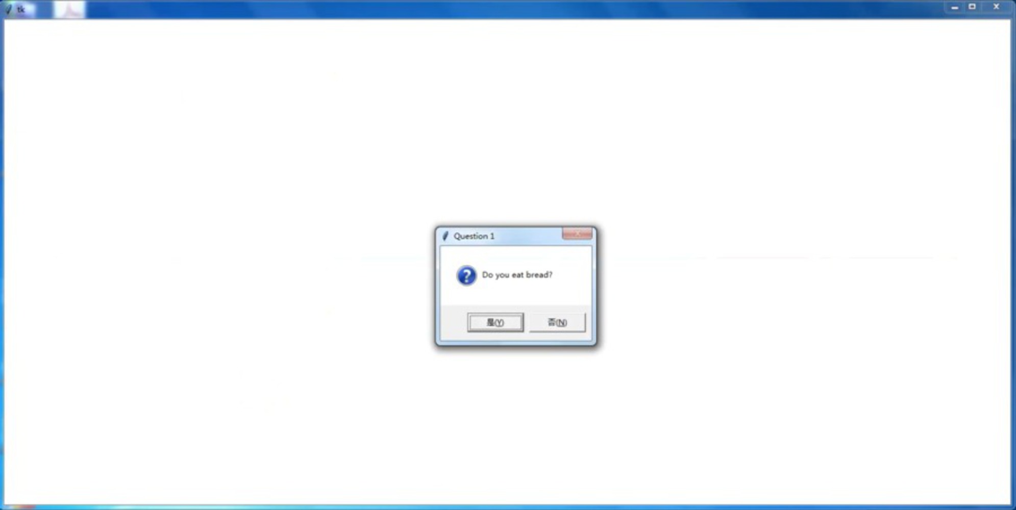
The installation did not include any interaction or player input at first as it was just generating some random patterns according the rules that I wrote. But Kevin’s saying that "everything seems arbitrary" enlightened me all in a sudden and I realized that I should allow the program to generate patterns according the players’ preferences. Therefore, some questions were added at the beginning to gather information needed; and lastly I inserted an audio of the “tic-tac” of a clock as the background “music” to echo and emphasize the "time" passing by.

Questions.thumb
Show Advanced Options

Reflection:

There are lots of spaces for improvement. First, I did not test the program thoroughly and it seems to generate bugs from time to time during the showcase… In addition, the font of questions shown via the message box was too small compared to the size of the project interface. Second, as mentioned earlier, this is just a very basic version of the daily bread consumption process, where each day was considered the same and there were no difference between weekdays and weekends, or any special adjustment for holidays. Note that a new loaf of bread would not be bought until the previous one was eaten up, which is impractical, as I did not take the shelf life of the bread into consideration. Yet, to move along that direction further, a bunch of questions will come along as to whether the player would keep eating the bread even if it has already passed the expiration date, whether he/she would like to store some loafs in advance, and etc. So ambitiously speaking, the whole project may end up with something similar to John Conway’s Game of Life but with bread.

Although the project represents the process of consumption more clearly now (which is some improvement from the previous one), my inner critic still find the “big ideas” behind the project not being expressed… Or perhaps the idea that “life is art” is too broad and I haven’t found an appropriate form to shape it. 

Tags.jpg.thumb
Show Advanced Options

Acknowledgement:

Thanks to all the classmates and TAs or those who I didn’t know that came to look at my project. Some said that the bread tag was cute, but most of them, in my opinion, would find the project somewhat quirky or weird…


Thanks to suggestions from:

Almeda that showing the price of bread in different currency would be interesting and including the total amount of money spent would be a good idea.

Ray that maybe I should also provide different versions of the calendar other than bread as he personally prefers cookies :)

Miso that maybe I can set the current relatively “arbitrary” bread (although I actually referred to the Pepperidge Farm Bread when creating the bread tags, there was no obvious indication) to be from a certain brand (for example, Wonder Bread) in response to the particular Campbell Soup that Warhol used.


And especially, great thanks to Professor Byrne and Kevin for providing feedback during the development of this project, which motivated me to push it to the current stage.
Proposal (Initial):

 I was deeply impressed by the expressive effect of Warhol’s brightly colored silk printing portraits of Marilyn Monroe. One of the ideas was to "activate" the previous multi-color bread work (composed of 36 small pieces), such that each small graph show up randomly (not necessarily as the original order) in the position of that 6 by 6 grid; or representing each row as a dynamic image (made up of the original 6 images in that row) and displaying the 6 dynamic image in a row or some other pattern. I think making each row dynamic will emphasize the difference among the originally side-by-side pictures (the decreasing number of bread pieces in the loaf) and showing the process of bread being consumed (or simply showing the change) better. Maybe the dynamic outcome will exemplify my previous idea about “different eating habits, or more generally, pace of life of different people”, but I might not need to find any meaning behind the work as not all the artwork, or art, have to mean something… 

Note that the previous overlay effect of each small piece was not very satisfying and I'll also work on that.

Drop files here or click to select

You can upload files of up to 20MB using this form.