Back to Parent

Outcome


Curatorial Statement:

As one of the major figures of the postmodernist movement in Japanese animated filmmaking, animator and director Satoshi Kon developed a name for himself in his decade of work. Throughout his four animated movies such as “Millennium Actress” to his serial animation “Paranoia Agent”, Kon demonstrated a style of cutting and editing of film unique in style and meaning. From themes of experience of time and space to the different lives individuals lead, his work utilizes such editing styles excellently in order to edit the space and time required to emphasize his points.

This piece intends to experiment with his style of editing with the medium of 3D animation and animated GIFs. By sending a character walking into the foreground, the background scene can “cut” in time when the foreground character passes over characters and space in the background. The intent is that each of the cuts is ambiguous in their relations to each other in time. The main difference between this piece and Kon’s style, besides visual quality, is that this piece uses the looping nature of the animated GIF as a final cut, as the repeat can be viewed as either a single loop or an endless cycle across time.

In a similar fashion to Satoshi Kon, the piece intends to use those cuts as enhancement to the message; people’s relationships can change across changes in time of any size. However, it also suggests that not everything changes; the bench and vending machine continue to exist in the same locations, and the person walking back and forth in front of the camera follows repeating paths in space.

Product:

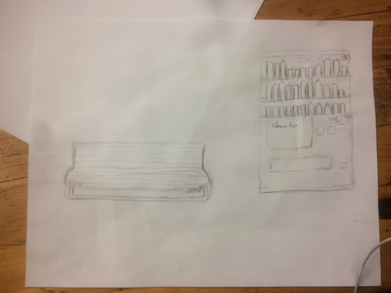
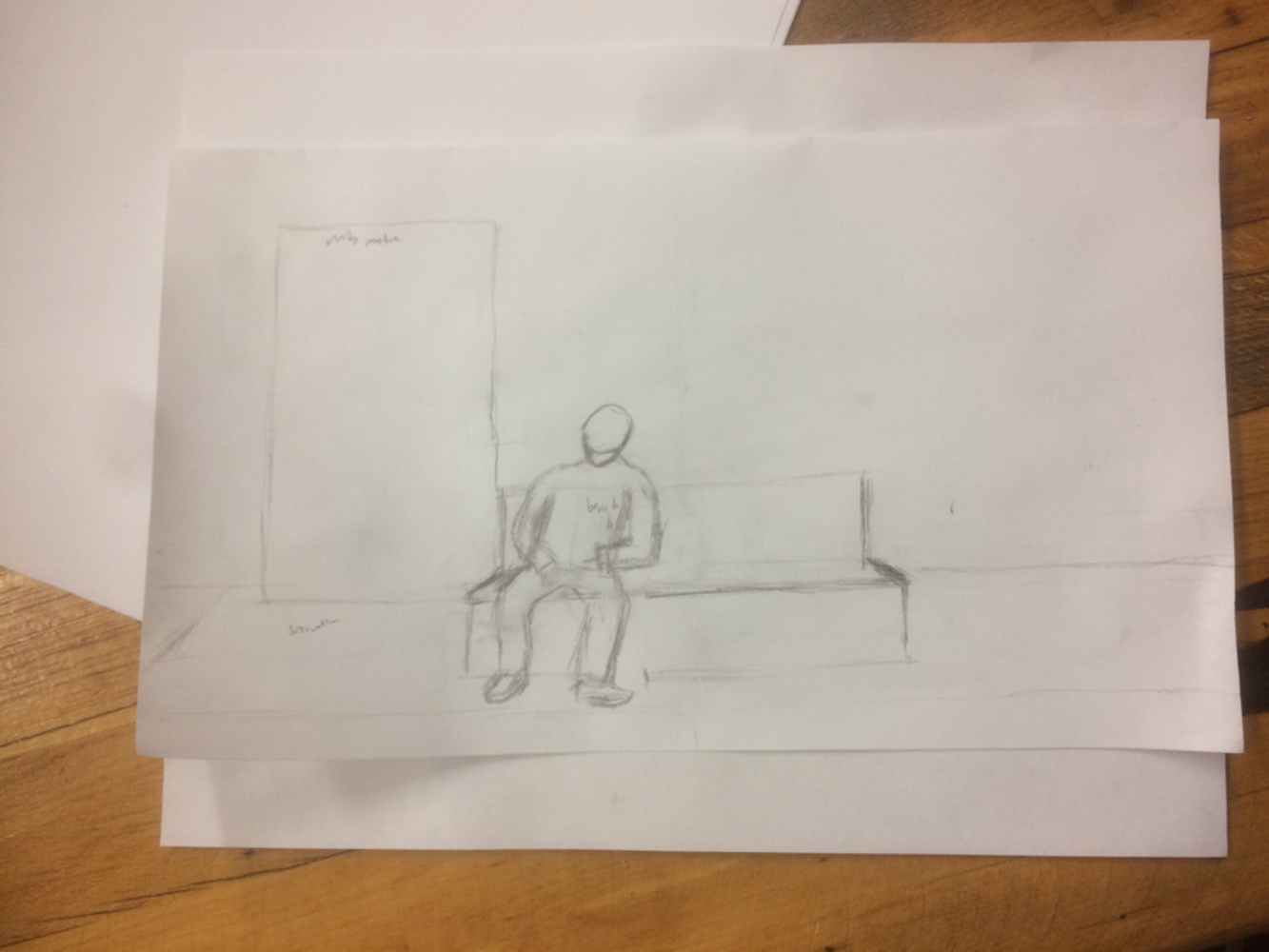
The final result of the project ended up being a 14 second blocked out animated gif.  The animation was done in the 3D software Autodesk Maya 2016, with the rendered image sequence turned into a 24 frame video in ImageJ and finally turned into a GIF using Gifrocket.  For the character models, I used the Morpheus Rig 1.0.  Below is a bit of concept sketching and storyboards, as well as a screenshot of the scene, and finally the completed GIF/video.

Time of life.thumb
Show Advanced Options
Img 1776.jpg.thumb
Show Advanced Options
Img 1777.jpg.thumb
Show Advanced Options

Intention:

The intention behind this piece is to experiment with Satoshi Kon's cutting style and meanings, as well as revisit the ideas presented in Module 2 with regards to spreadability of media.  Specifically, I wanted to imitate his style of cutting time using a unique style of cut while at the same time making the actual cut in time significant.  With regards to spreadability, initially I wanted to create a video, but considering time constraints and actual spreadability, I decided to make a GIF.  Although it does not have the direct benefits seen through spreadability of media seen in YouTube or other video avenues, as a GIF spreadability is likely easier.

Context:

Editing: "Perfect Blue" Satoshi Kon
https://en.wikipedia.org/wiki/Perfect_Blue

Satoshi Kon is well known for his unique editing style, built upon the styles seen in early cyberpunk movies.  As outlined in the video by YouTuber Tony Zhou below, what he excels at is editing space and time, giving the viewer a sense of space and time through his editing.

The specific cut that will be the foundation to what I plan to use in this piece is a cut from Perfect Blue, in which a person passing in front of the "camera" works as a wipe, transitioning from one moment in time to another distant one.  The whole of the movie Perfect Blue is also an excellent example as to how Kon edits time in his movies, as scene conclusions are reframed through a cut as the beginning of another at a different time.

I plan to utilize the specific transition by using a person to wipe between scenes in an attempt to apply Kon's style to a short film.  There are two underlying reasons for this choice.

First is that it adds more emphasis on the viewer being the camera, a voyeur onto the life of two people.

The second is that by utilizing the specific transition, I can effectively edit in the experience of time into the piece.  It serves as the best transition for applying both my intended message into the piece, and as such is the style I intend to build my short on.

Show Advanced Options

Editing: Edgar Wright

Edgar Wright is also known for the use of transitions similar to Kon's style, although they are geared more towards comedy than drama.

Show Advanced Options

Camera:

In order to incorporate a level of distance in the viewer from the scene, I used a camera angle similar to the Lateral Tracking Shot demonstrated in the below video.  Instead of spatially navigating the scene through camera movement, the cuts act as the "movement" through time, yet with a level of intimate distance seen in this kind of shot.

Show Advanced Options

Storytelling: "5 Centimeters per Second" Makoto Shinkai
https://en.wikipedia.org/wiki/5_Centimeters_Per_Second

Makoto Shinkai, specifically in his work "5 Centimeters per Second", explores the effect that time and space has on relationships between people, specifically with the conclusion that in the pre cellular phone world, those connections naturally drifted apart.

"Your Name" Makoto Shinkai
https://en.wikipedia.org/wiki/Your_Name

In his most recent work, he seems to provide a more optimistic view on maintaining relationships with space and time as obstacles.  Specifically, he answers that the way to keep such relationships alive is through effort and luck.

I hope to incorporate both messages into the final product for this module, starting with the 5 Centimeters Per Second storytelling of the effect of time and space, while ending on a cut styled more like "Your Name", where luck and a level of effort can bring my two characters together again.

Process:

I started off the process by writing down the intended message and story of the visuals in the original proposal shown here at the bottom of the page.  From this story, and discussing it with the TA's, I narrowed down the clip to be something circular yet short in order to work well in the time frame given.  From the story, I started sketching rough storyboards for the animation itself to help organize how the scene would play out.

Then I started the animation.  I first intended to use the newer Autodesk Maya 2017.  Unfortunately, I learned that this iteration of the software used a new renderer license which although was a much more powerful renderer (the Arnold Renderer), it was not compatible with the rig I intended to use for my characters (the Morpheus Rig).  The textures for the Morpheus rig were specifically designed for an older license of a different renderer, specifically mentalray.  And again I discovered that in order to use the mentalray renderer with the new Maya I would need to purchase a separate license which not only was not under the licenses that Carnegie Mellon owned, but also was too expensive for what would be single use.  Also, a revamped version of the rig was under development, and so I could not use a more updated version of the rig for animation.  Therefore, I had to switch back to Autodesk Maya 2016.

Unfortunately for me, this led to new complications.  I had to change many settings back to what I was used to, except that I forgot to set the project to autosave.  I did set up the scene with the rough models (I focused more on the animation than the modeling/renders in the GIF) and setup models for animation, but I discovered too late that I forgot to set on autosave, and as a result due to a computer crash a good few hours work of keyframing was lost.  Thankfully it was work that was fairly rough and not terrible to make up.

From here I set on to keyframe and continue to refine the clip's cuts from the original storyboard.  I removed the portion with the old man and woman, as I felt that that scene did not have the impact that I wanted my clip to have.  I also decided to focus on the cutting of cuts more, and thus I increased the cuts in the individual scenes, an effect which I will describe later on how it affected the outcome.  I also did the animation in a more continuous animation style with limited pose to pose animation.

Even with the storyboards I changed the cuts from the storyboards themselves as I found poses that I felt were stronger than what I had intended.  From the original storyboard, I had four scenes: two young children getting something from a vending machine, two older children with a stack of cans, two working people getting drunk, and two old people reconnecting after a long time.  I cut out the older child scene and the older person scene, as I felt that with the resources such a long clip would get boring without music and strong render quality.  I also placed cuts between portions of the two leftover scenes; instead of a continuous scene with two people approaching a vending machine and one buying drinks for the other, I broke it apart into three cuts.  The first was of the girl leading the guy, turning around and suggesting to the guy to get drinks, the second was her getting drinks while he shifted closer to her (a move that I felt was fitting more or less on the fly of the animation), and finally the two drinking, with one shyly looking away while the other turns more towards the other, to suggest their personalities.

In the older scene, I keyframed the character edits to change their apparent ages.  I also changed their poses; the man is hunched over, seemingly troubled by a choice.  The woman is a bit stiffer, looking around as if their relationship had grown a bit awkward.  The little head wandering from the woman was also ad libbed.  The man pantomimes presenting a ring to the woman, and she pantomimes pointing to a ring on her hand, after another ad libbed shocked expression was added.  The next cut is of the man disappearing as the woman reaches out, but she gives up and stands up, with the final cut being her disappearing from the screen.

While working on the project, I discovered that the cuts had a new meaning to them.  Yes, the most major timeskip is a definite timeskip, but the other small ones can suggest variable sized timeskips.  My ad libbing may have also contributed to it, as initially the girl and guy seem a bit distant, and then the guy attempts to get closer etc etc.  In the process of making the animation, I discovered a new way to inject meaning into the cuts.

Collaboration: This project was done individually, all of the work was done by me.

Reflection:

I feel that a lot can be said about the work, both good and bad.  Unfortunately, I have a natural tendency to bias myself against thinking my work is good except in cases which I want someone to provide their own critique (like the editing note in Module 2).

Right off the bat the biggest regret that I have about the piece is that I was not able to get splining in the animation in order to make it smoother.  This problem is a product of both a time constraint and a mistake with the blocking.  The time constraint is that I do not believe that I could get a quality animation processed in time for the presentation if I tried to spline the animations, as there are a few hiccups in the animation blocking which works as a blocked animation, yet seems to fail once it is splined.

The other major problem is one of forgetting one of the rules when it comes to animating a rig.  I moved the entire rig around during the first few frames I posed, which means that if I splined it it would possibly make the walk cycle look horridly out of synch.  Because of this aesthetic problem, I felt it was best if I kept it blocked out, as it would be a problem that would require potentially reanimating an entire sequence, and could be considered the major failure of the piece.

Deliverywise I feel that the message is a bit vague.  Ignoring render quality, the cuts do convey a sense of time, yet at the same time my character designs for the younger and older versions did not convey that timeskip well enough in the important cut.  They did not look old enough, although I also attribute that to a lack of attire change in the characters to make the timeskip stronger.  Although I did note earlier that that cut suggests that the other cuts are also possibly significant timeskips, it really depends on the strength of the major timeskip.  When I received some feedback about the GIF, I noticed that the change in age was not terribly obvious in the clip.  And since it depends on that timeskip to give the message, it could be considered a failure on my part on creating enough distinction to give away the main point of the piece in meaning.

On the better side, there are two points which I would think I made that was okay.  In the initial cut, I made the female character to a jump spin into facing the male character.  Although it is just blocked out, I think that I may have captured the motion of someone spinning around in a jump and landing in such a way.  Although the anticipation and landing recoil is a bit limited, I did not want to make the clip seem too cartoony with squash and stretch, instead opting to try to match movement to a shallower wave pattern.  Obviously the clip needs cleaning up, but as a first try with animating such a drastic change in angle in a model, I feel like it is a start.

The second is that I feel that the piece actually may succeed as a digital performance piece.  Because the cuts are dynamic and in the scene, instead of a simple change in camera, it demands viewer attention.  If I had sold the timeskips strongly enough, I may have also been able to convince others of the potential for other meaningful and significant timeskips in the not so obvious clips.  But since such a potential for getting a message across through visual interaction, interactivity as seen in module 3's readings, exists, it does mean that it may succeed as an interactive installation if the piece was cleaned up a bit more.

Finally, the GIF aspect really has me torn.  On one side, the on fours animation and low quality makes it seem like GIF material, as well as taking advantage of the circular nature of the GIF as a new layer of meaning through a transition, but at the same time it is a short GIF, and it is in a lower quality.  It also has no way of tracking or monetizing spreadability, so technically it fails Module 2.  But as a GIF I believe that has much more potential to be spread due to the ease of sharing GIFs compared to other video content.

Overall I am a bit torn about my final product.  On one hand I do believe that my intention is there, but I did not sell the intention as strongly as I wanted it too.  In summary, as a starting off point for a cleaner animation, I feel like it is adequate.  It just requires a few more frames inserted in between, a few more extreme poses and character modeling, and possibly some sound to accompany for information, but by then it would just be a 14 second youtube video or a vine, the latter which I am uncertain of the ease of spreadability, the former being iffy due to the short nature of the clip.

Original Proposal:

Create a short animated piece (in Maya) based off of the interactions between two characters as they age through time. Cuts will be styled similar to scifi/Satoshi Kon, with people walking in front of the camera creating the cut. No explicit dialogue will happen in the short film as well.

The two will start as a pair of young kids, a boy and a girl, the girl being more energetic, the boy more withdrawn. They discover the bench and the vending machine, and for fun the girl convinces the guy to let her climb his shoulders to reach the machine (after both check their pockets for money). They sit down, start drinking in character, and then first cut.

Next cut is them around middle school age. Both are still friends, similar character still. Girl pulls out her phone, asks guy for contact (he acts slightly shy), and he puts down his drink and gives it to her. She laughs about him, and he acts embarrassed again, picking up his bag and walking off screen, the girl reaching out after him. Cut 2.

This time both are high school age, and she is at the machine, back facing camera. Guy walks to the bench and stops, looking at what she is doing, when she turns back around with a large stack of cans in her hand. She throws one at the guy and sets the pile down onto the middle of the bench, and the two work to finish off the sodas. Cut 3.

Suddenly they are both working age (late 20, early 30), and he is bent down, sobbing into a can of alcohol, a stack of cans near his feet. The woman is looking at him, a can in her hand as well, a slightly smaller stack too. She tries to console him, but he just looks sadder. Suddenly, he tries to propose to her, but she responds by showing him her ring finger (suggesting a ring). He settles back down, in sudden realization, and stares sullenly at the ground. Finally, he gets up, grabs his briefcase and walks off, as the woman half stands, reaching out similar to cut 2, but instead of dwelling on it, she sits back down, finishes the rest of the beer, picks up her own suitcase and walks offstage opposite to the guy. Cut 4.

Now a series of rapid direct cuts (no people transitions), of the two. Includes cuts of the woman with a man (presumed new husband), the man with a woman (presumed found someone and has wife), man with a child, woman with a child etc. This scene is a bit freeform.

Final cut, an old man (the man MC from before), walks slowly over to the vending machine with a cane, buys a small drink and sits down. He drinks from the bottle, pauses and sighs. He pulls out a photo and touches it (viewer is supposed to infer that it is his now deceased wife). He sighs again and takes another sip while the woman, also old, walks in from the other side, buys a drink, and also sits down. Both just sit, look around and drink until they see each other. They reconnect, she shows him that her husband has also died, and the two share a moment of solemn silence, with him patting her back as she lost her husband more recently. Finally, the two finish their drinks, he grabs her can and tosses it out with his, and offers her his hand to take them both offscreen. Before they go, the old woman leaves some change on the bench, and the two leave. For a moment it just holds the still scene with the camera slightly creeping closer, and finally, two children, again female and male, run over to the bench, see the change, grab it, and end scene.

The entire scene will be taken from a camera angle which matches the image below, with the cuts only being people wiping the screen, except for the freeform area. There will be temp models for everything static, specifically the scene, the vending machine, the bench, a recycling bin, and cans. The character models will be just variants of the Morpheus model and rig, and there will be no sound.

I unfortunately do not plan on adding full textures and completely unique characters due to the amount of time given, yet hopefully it would make for good material as a reel and as an application of the principles of animation.

This is a bit taking liberties on the second module, electronic media. But instead of taking the direct remix or mashup path to creating something, instead I plan on doing the opposite, create something new, although the use of music may tie back into the concept of spreadability. The main focus of spreadability is to create a piece that is unique enough not to challenge YouTube takedowns (which I experienced with the module) to provide for an avenue for spreading, and to create something wholly unique yet only able to live on the internet, something explored in videos such as "Don't Hug Me I'm Scared", or "TIE Fighter".  The latter does reappropriate the world of Star Wars into a piece, but ignoring the background of the piece it can be considered to be unique animation.

My
 end goal with the piece is to achieve a sense of the circular and fleeting sense of time, how time for individuals can sometimes feel fast, yet on a grander scale it can revolve back.  The camera angle is on purpose to save on camera animation, to utilize the unique cutting, and to make me animate stronger in order to show character intent without explicit dialogue.

This piece will take a lot of time for me to finish, and I do not expect to be able to use completely unique models for the character animation, as well as having complete textures for the static models done.  As such, there is plenty of room to cut down on the work if needed.  I have done character animation in Maya before, and I have done a 20 second animation (which should have been lengthened to about 40 seconds due to too little frames between poses) within the timespan of 8-10 hours over two days.  However, I do believe that such a short film would be doable within the three weeks of the module.

For example work:

Themes: "5 Centimeters Per Second" Makoto Shinkai
-How relationships can distance with time and space.

Editing style: Using objects to wipe the frame (Satoshi Kon)
Example outlined in video below from Tony Zhou at 2:12
Edgar Wright also uses a similar style in his film work.

Camera: For a feeling similar to a lateral tracking shot, with a level of distance given to the viewer, while trying to add a level of intimacy seen in Wolf Children

Drop files here or click to select

You can upload files of up to 20MB using this form.