Back to Parent

Outcome


SHADYSIDE TALKS

The premise of this project is the 'City Portraits & Caricatures' project by Pedro Cruz & Penousal Machado. The data visualizers contend that while scientific representation is useful and critical in its own context. However, the sterilization of data is in many cases unnecessary. They make the case for how no data is truly neutral and consequently 'figurative' visualization may be key to communicate data. If done well, figurative visualization can seemingly simplify data by being suggestive about its exaggerations and hence making it intuitive to read.

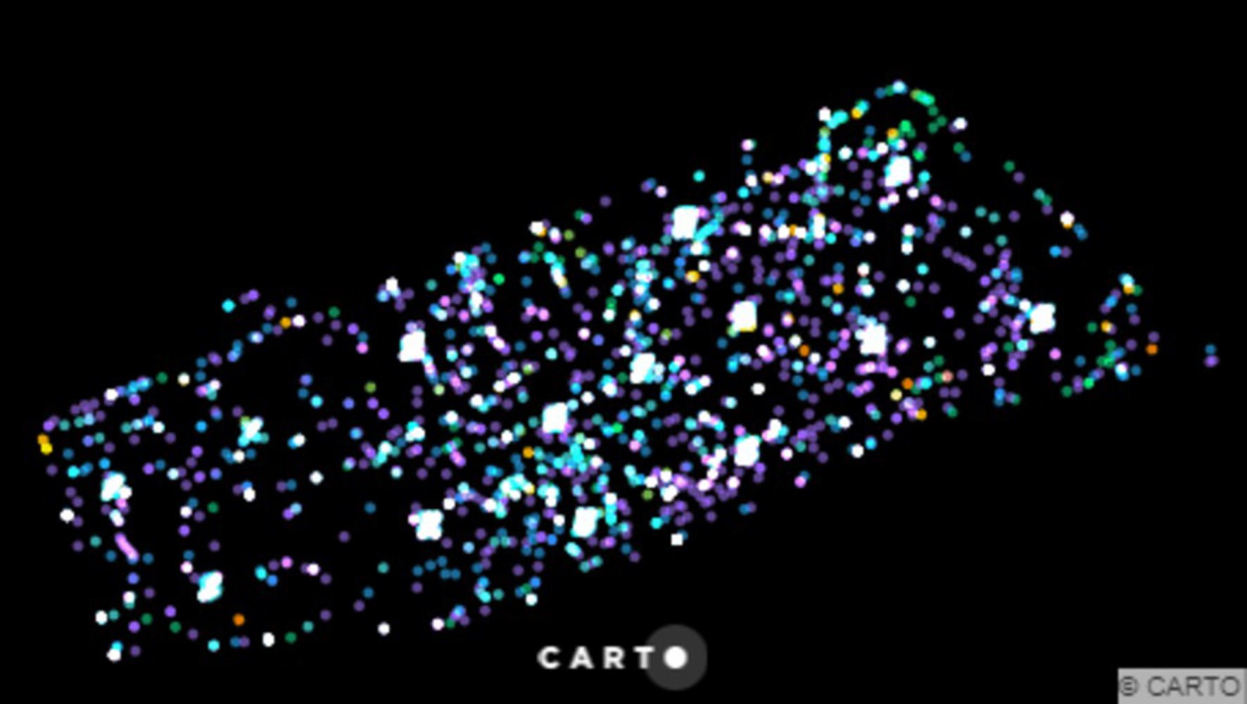
For ‘Urban Caricatures’, I wanted to speak about project that was closer home. I live in Shadyside and have experienced it to be a quiet neighborhood but wanted to know a little bit more how evocative its residents can be. How much do people care about Shadyside? The easiest way to find this was to assess 311 Complaints made from Shadyside.

https://data.wprdc.org/dataset/311-data

To do this I sought the WPRDC data on it and then mined those fields that related to Shadyside. There were 3619 records of complaints between 1st November 2016 to 9th December 2016 from Shadyside alone. Of these 32 departments were reached out via 7 mediums including Twitter. 


Shadyside talks.thumb
Show Advanced Options

  The data collected regarding the nature of the complaints seem a little patchy, the information about the media used to lodge the complaint and the departments to which they were made are telling. What was most interesting is that there are clusters of complaints that are made from at least fourteen clusters. It would be interesting to note if these complaints made by the same people during different hours or because these are problem areas. The analyses concluded that the largest irritants of Shadyside are its streets and that they generally make phone calls which might be indicative of lodging a complaint while on the move. What’s additionally interesting is the lines of source of complaints made, across the clusters crossing streets.   

Shadyside talks cluster.thumb
Show Advanced Options

  The idea of caricatures and representation is important to anyone who is serious about communication. In such cases, I, as do many others would see the merit in using less the advantages of exaggeration and art to ultimately convey our findings. For instance the product of this exercise, is aesthetically appealing to me but also resonates with me in that I would with the mention of the phrase ’Pittsburgh Data’ might be able to immediately identify Shadyside’s geometry. Even if I don’t I would question the logic behind the visualization by taking cues from the cluster that can be seen in the picture. What I find interesting is that had I used scientific representation, I would have to use just as much support data to clarify my observations. Maybe the fact that the scatter plot was more aesthetically pleasing got it more attention.  

Show Advanced Options
Drop files here or click to select

You can upload files of up to 20MB using this form.