Back to Parent

Outcome


Story

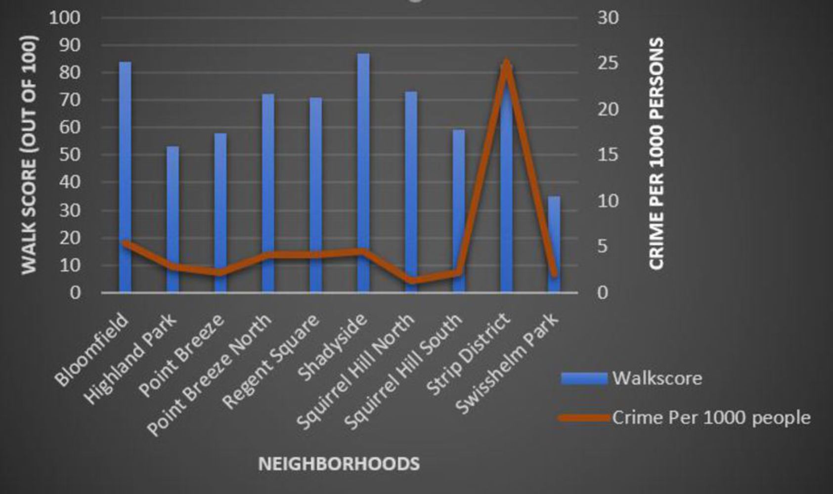
When you are buying a house, there are a lot of factors to be considered – price, features, aesthetics etc. While it is very important to consider all these internal house-related factors, it is equally important to look into external factors as well i.e. the neighborhood you are shifting into. This report contains such an analysis of two of the external factors – Walk score (ease of access via foot to nearest amenities) and Crime rate in ten different residential neighborhoods of Pittsburgh. The results can help us decide upon the best neighborhood to move into. There are a few assumptions that have been taken into account:

1. The buyer has enough money to buy a house in any one of the 10 neighborhoods.

2. The data sets for Walk score was per Census tract. Therefore, average value of all the Census tracts of a particular neighborhood has been considered for the analysis.

Collection

For this analysis, I have used a 2010 Census dataset available on WPRDC.org:

Show Advanced Options

Analysis

The data for Walk score and Crime rate for 10 different neighborhoods was extracted from a large dataset containing all the demographic information of all the neighborhoods of Pittsburgh. I plotted the information on a 2D graph using MS Excel with the neighborhoods on the horizontal (x) axis and both Walk score and Crime rate on each of the two vertical (y) axis.

Neighborhood analysis.jpg.thumb
Show Advanced Options

The inferences were as follows:

· Shadyside has got the best Walk Score of 87 and Swisshelm Park has got the worst Walk Score of 35.

· Squirrel Hill North has least crimes per 1000 persons (1.3) while Strip District has most crimes per 1000 persons (25.2).

· One of the interesting outcomes was regarding Squirrel Hill which has got the third highest Walk score but the number of crimes occurring in the neighborhood are way more than the next highest crime prone neighborhood.

Therefore, we can conclude that neighborhoods like Bloomfield and Shadyside are two best neighborhoods to move to.

Representation

I have used Data Portrait technique for visualization because the numbers shown here especially that of crime rate are very close to each other. Caricature can be used where we are trying to emphasize a characteristic. Here the emphasis could not have been represented properly.

Caricature vs Exaggeration

Any form of visualization technique distorts some form of data. For example, even if we are representing a data analysis in the form of a pie chart, it is only a comparative graph and down not contain exact numbers (information). However, pie charts are an easy tool for representation and are more visually appealing. In short, the data should be represented such that there is minimum distortion.

Data caricature is emphasizing a feature or a characteristic to increase its significance in a representation. However, it should not be such that all the other characteristics gets overshadowed due to the exaggeration of that particular feature or characteristics. The caricature technique should not distort what the data is trying to tell us.

Drop files here or click to select

You can upload files of up to 20MB using this form.