Back to Parent

Outcome


Intention

My overall idea for my first laser cut project is to create a basic wall clock. My girlfriend's birthday is coming up - so my main motivation for the project is to create a clock she would like and gift it to her. The major theme I am going with is Hippos. Her and I have an inside joke related to hippos - and I think she would love it and find it meaningful if I made her something thing related to hippos. 


Context

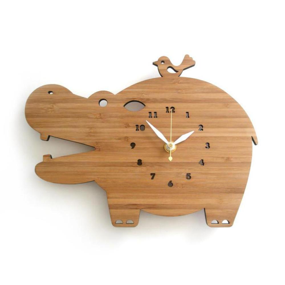
So going forward with my motivation of incorporating hippos into the project - my second goal for this project is to still keep a sense of aesthetic to it. With something like a hippo clock, I could go with a more childish route or still maintain a degree of aesthetic, and I want to go with the latter. Below is a precedent project that serves as my main inspiration. 

Hippo.thumb
Show Advanced Options

Process

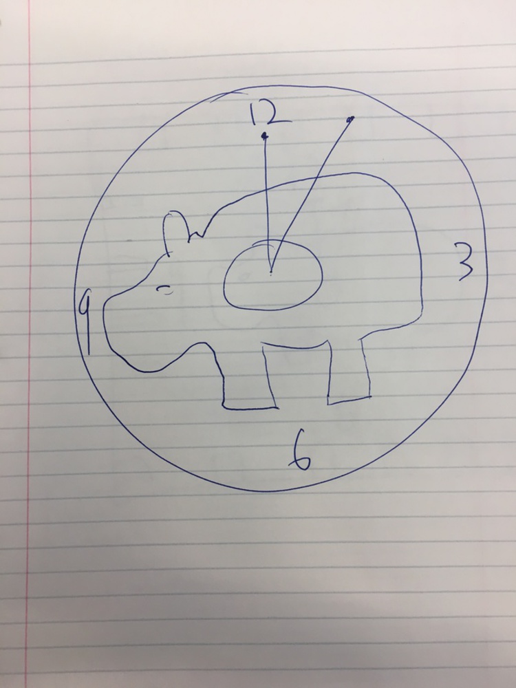
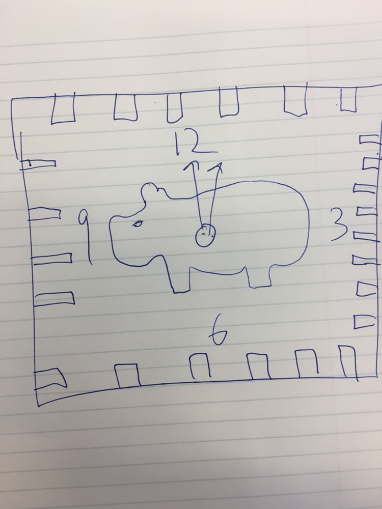
Below are some of my initial sketches. One way I can go with this is to imitate my original inspiration, and have the clock be in the shape of a hippo. But, I find something more appealing about having a standard circular or rectangular clock, with a hippo within the design - I find this to be more aesthetic. In terms of colors, perhaps having a grey material as the outline, and having the hippo be black - I feel like would be a pretty clean look. 

Img 5997.jpg.thumb
Show Advanced Options
Img 5996.jpg.thumb
Show Advanced Options

Product

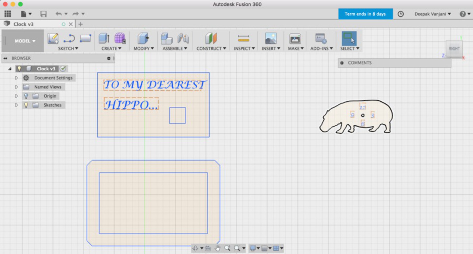
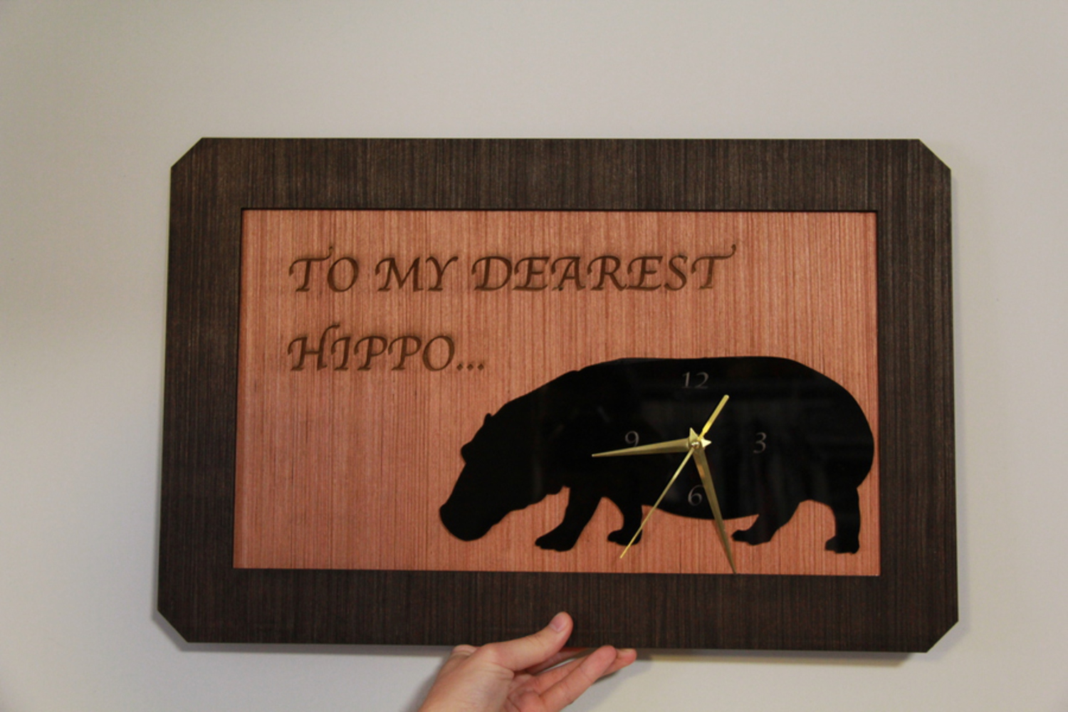
After giving my sketches some thought and playing around with programs such as Illustrator, Fusion360, and Vectorworks, I came up with a final design of my project. I decided to go with a design where the clock had a rectangular base, with a message reading "TO MY DEAREST HIPPO", and the bottom right side of the clock would have a engraved hippo with a clock on it. 


I have posted a screenshot of my component designs on Fusion360 below. In order to go along my theme of keeping the design elegant, while still maintaining the fun-natured idea of incorporating a hippo clock, I chose an elegant font (Lucida Calligraphy) for the text as well as the numbers. I also chose to outline a simple design of a hippo, and nothing too funky to go along with this theme. Furthermore, I thought it would be classy to have a border around the main rectangular design, so I incorporated that as another layer in my design. Finally, I had to measure out the dimensions of the clock kit, to make sure that there was space to place the kit on the design, as well as a circular hole on the hippo. 
Screen shot 2017 10 10 at 6.46.24 pm.thumb
Show Advanced Options
Screen shot 2017 10 10 at 10.48.10 pm.thumb
Show Advanced Options

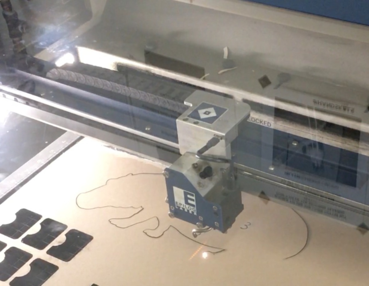
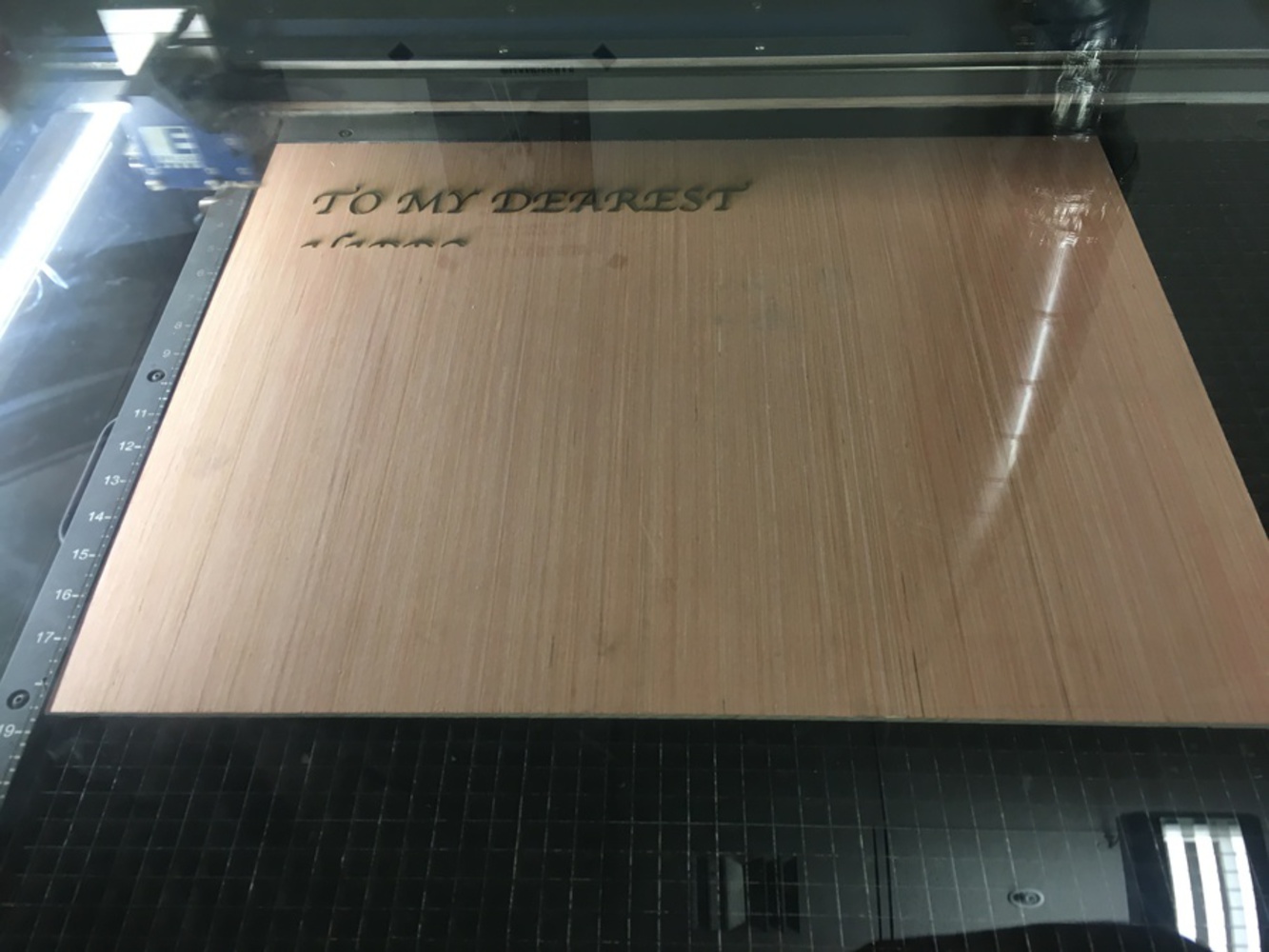
After creating my design, I was ready to print. Below are some photos I took throughout the process. 

I decided that I wanted to use wood as my main material throughout this project. So I was able to find a nice wood sheet. Above is my first print ever! 

Img 6014.jpg.thumb
Show Advanced Options

This photo is depicting the laser cutter cutting through a piece of black acrylic. I thought to make my hippo a solid black color, to continue with my theme of simplicity and elegancy.

Img 6009.jpg.thumb
Show Advanced Options
Img 6016.jpg.thumb
Show Advanced Options
Img 6008.jpg.thumb
Show Advanced Options

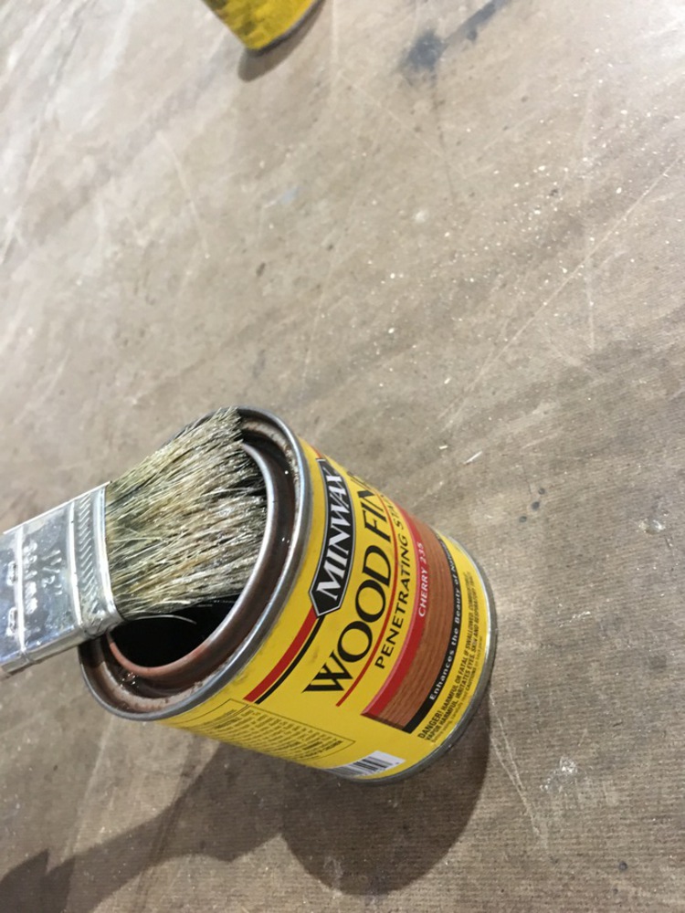
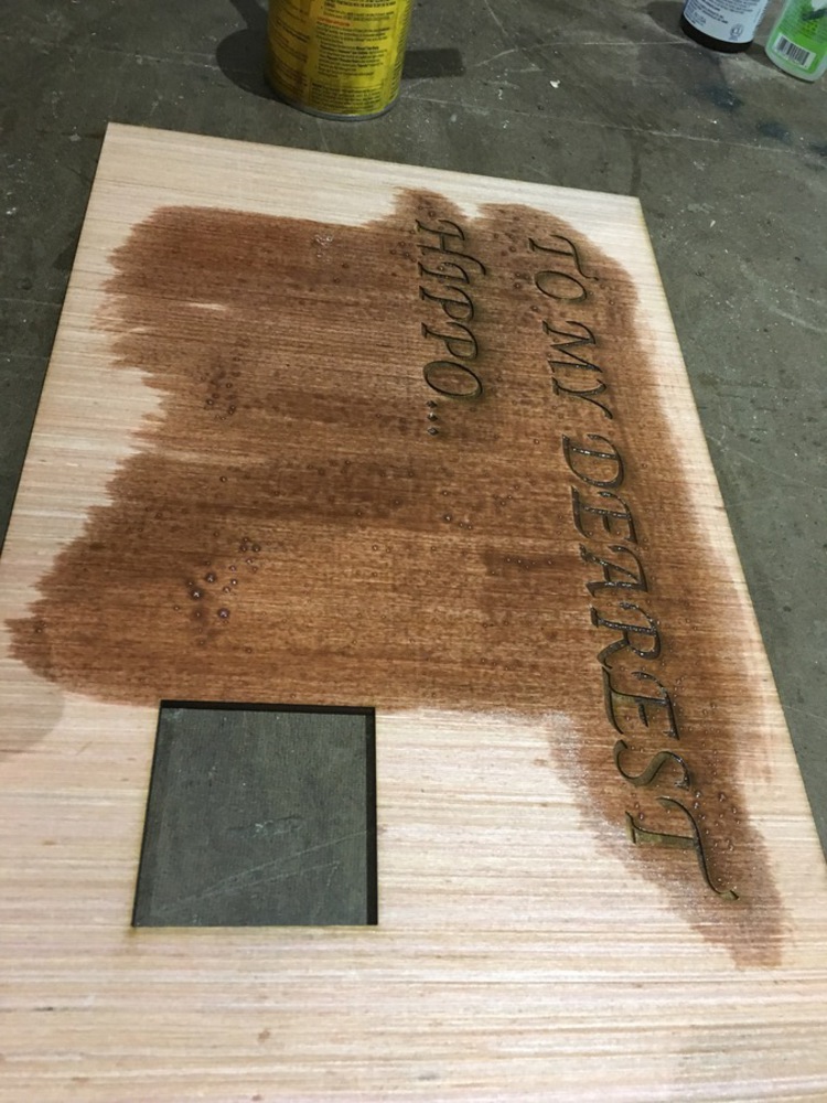
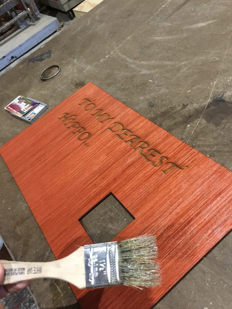
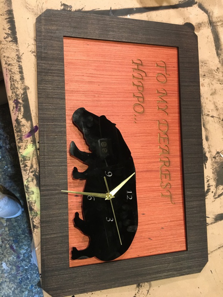
After my main board printed out, although I liked the natural color of the wood, I was able to get access to some wood stain, so I went ahead and stained the wood with a deeper brown color, which really made the piece look much more polished and professional. 

Img 6012.jpg.thumb
Show Advanced Options

I also stained the boarder, and I decided to go with a darker color to create some contrast with the main inner board, as well as create some unity with the black hippo. I was contemplating cutting the hands of the clock a little shorter, but after pondering upon it, I realized I really liked how the hands were a little longer than the body of the hippo, so I decided to stick with the way the hands were. 


Above is an image of one of my drafts - I accidentally spilled some stain on the main board, so I went ahead and re-cut my design, just to make sure everything was perfect!

Fullsizerender.thumb
Show Advanced Options

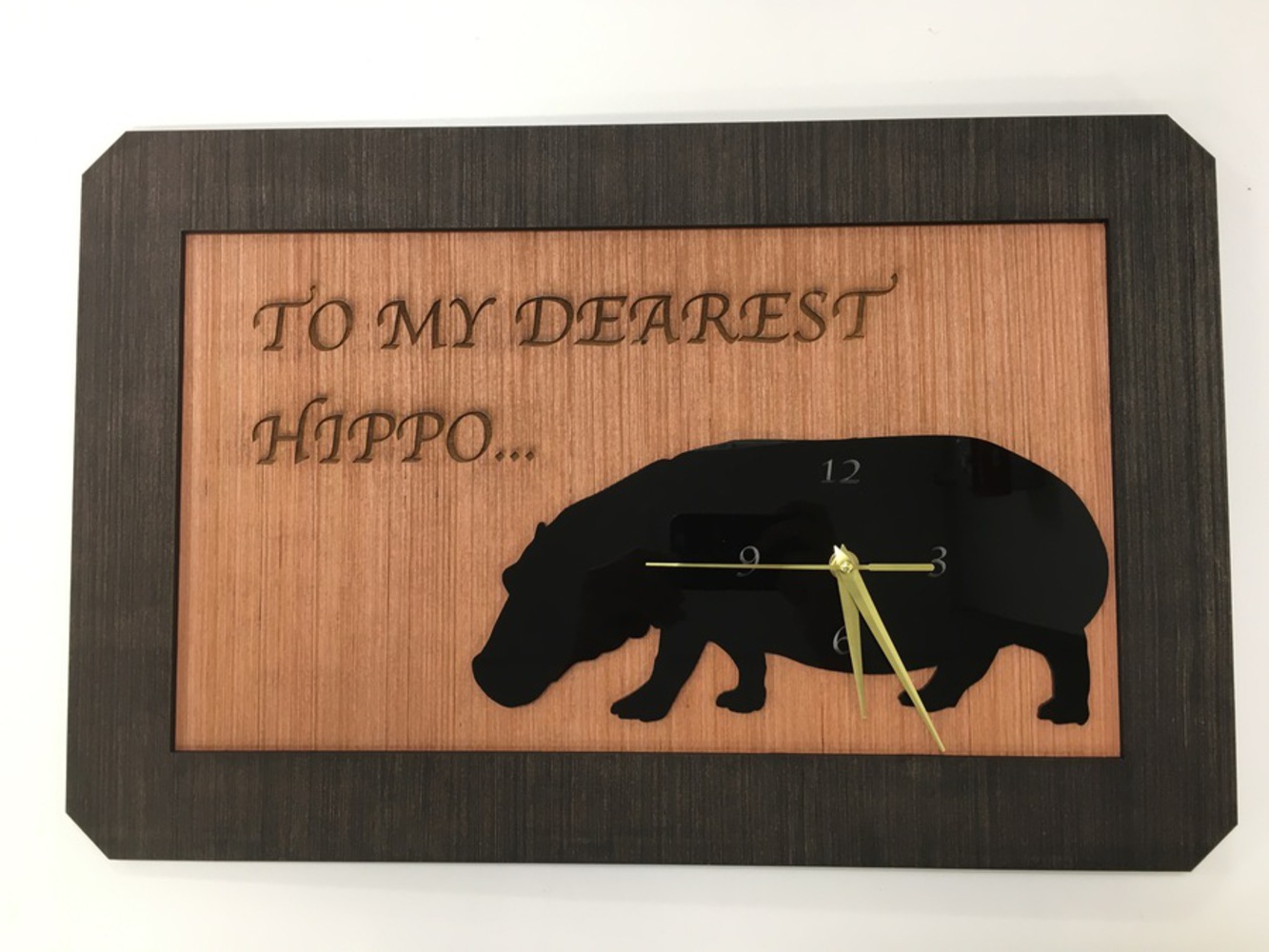
Above is a final image of my project. 

I am really happy with how it looks. I think it was really able to achieve the theme I was going for, and it also achieved the purpose. 

Reflection

I learned a great deal through this project. I was introduced to so many things for the first time, particularly how to use Fusion360 and how to Laser Cut. As a quantitative major at CMU, I never get to push myself artistically, and this project definitely challenged me creatively. I was definitely able to get everything I wanted to out of my process, and was able to create a cool gift while I was at it. 

I am not sure if I would have done much differently, but I think I could have pushed myself a little harder on the design, as I could have played around with some more complex dimensions and layers. However, the theme I was going for was simplicity, so I don't regret that too much!


Collaboration or Attribution

Who helped you design? Test? Brainstorm?

I received a lot of help from other classmates and my teacher throughout the process!

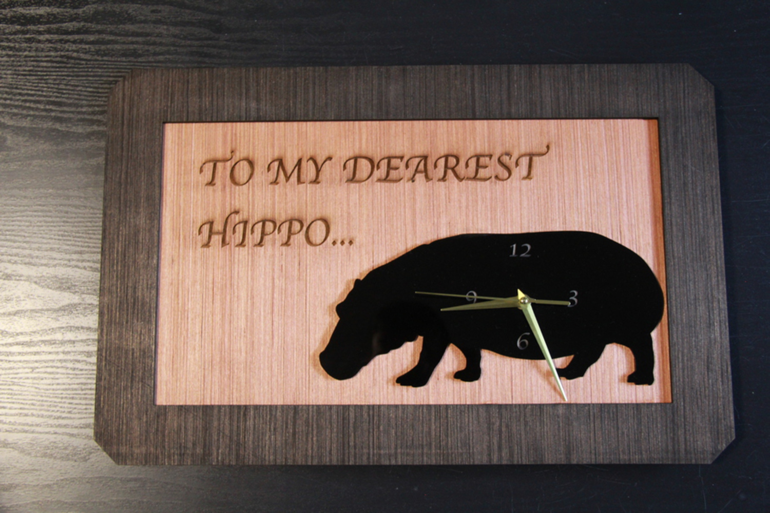
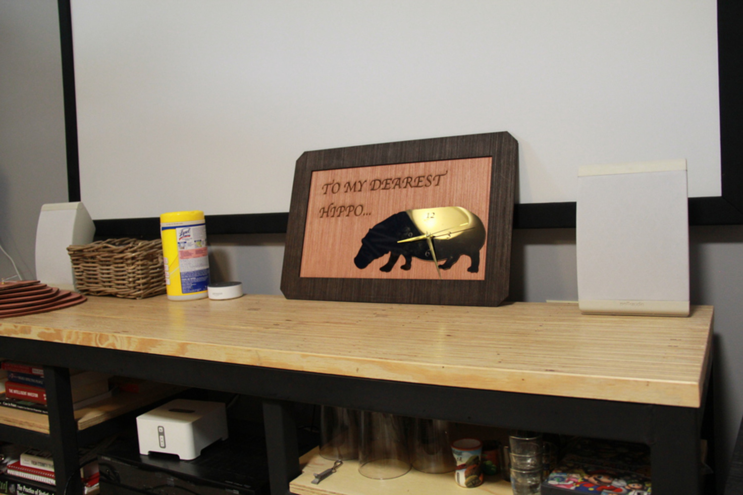
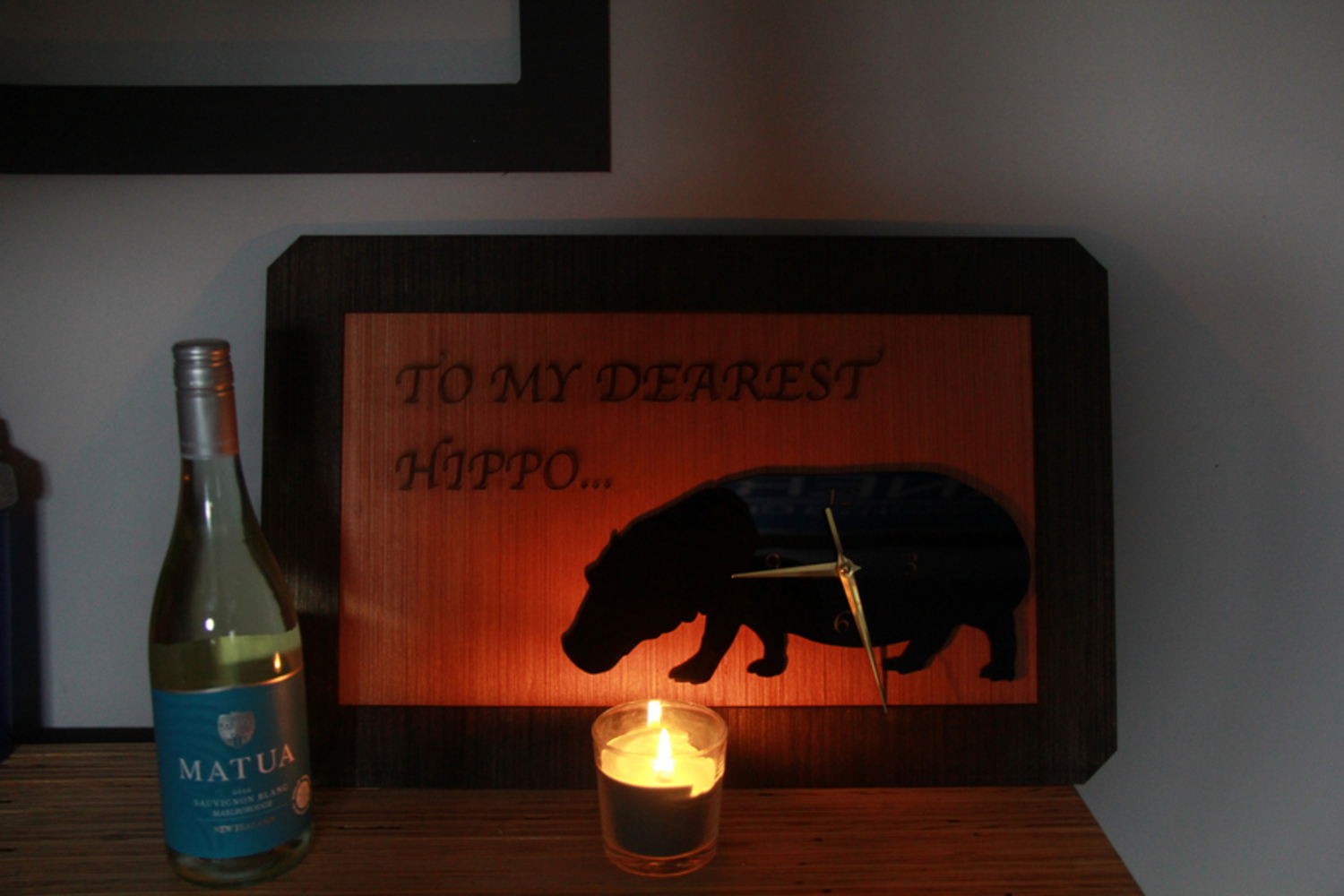
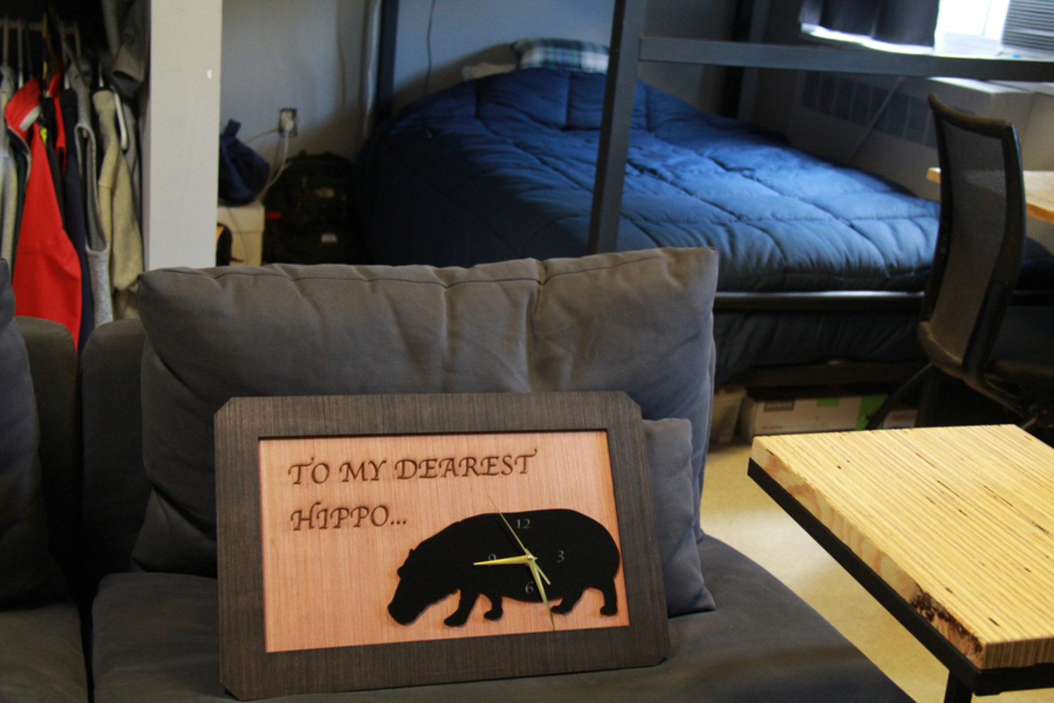
Below are some final photos of my clock. 

Img 0907.jpg.thumb
Show Advanced Options
Img 0909.jpg.thumb
Show Advanced Options
Img 0912.jpg.thumb
Show Advanced Options
Img 0915.jpg.thumb
Show Advanced Options
Img 0913.jpg.thumb
Show Advanced Options
Drop files here or click to select

You can upload files of up to 20MB using this form.