Back to Parent

Outcome


Intention

Based on the study of the Summer Food Sites in Allegheny County, I found there is a congregation in Woodland Hills School District. Thus, I zoomed into Woodland Hills to explore how the distribution and characters of food sites are correlated with food resources, such as convenience stores, supermarkets, farmers market and fast food restaurants.  

Collection

I collected several data sets from WPRDC:

Summer food sites, fast food restaurants, farmers markets, school districts, supermarkets and convenience stores.

https://data.wprdc.org/dataset/allegheny-county-summer-food-sites1There are overall 79 summer food sites, 44 of them offer breakfasts and 76 of them offer lunch. Woodland Hills is the school district which has the most aggregation of the food sites, 11 food sites located there.

https://data.wprdc.org/dataset/allegheny-county-fast-food
https://data.wprdc.org/dataset/allegheny-county-supermarkets-convenience-stores
https://data.wprdc.org/dataset/allegheny-county-farmers-markets-locations-2017
https://data.wprdc.org/dataset/allegheny-county-school-district-boundaries
The image below is the processed metadata of summer food sites.

Capture.png.thumb
Show Advanced Options

Analysis

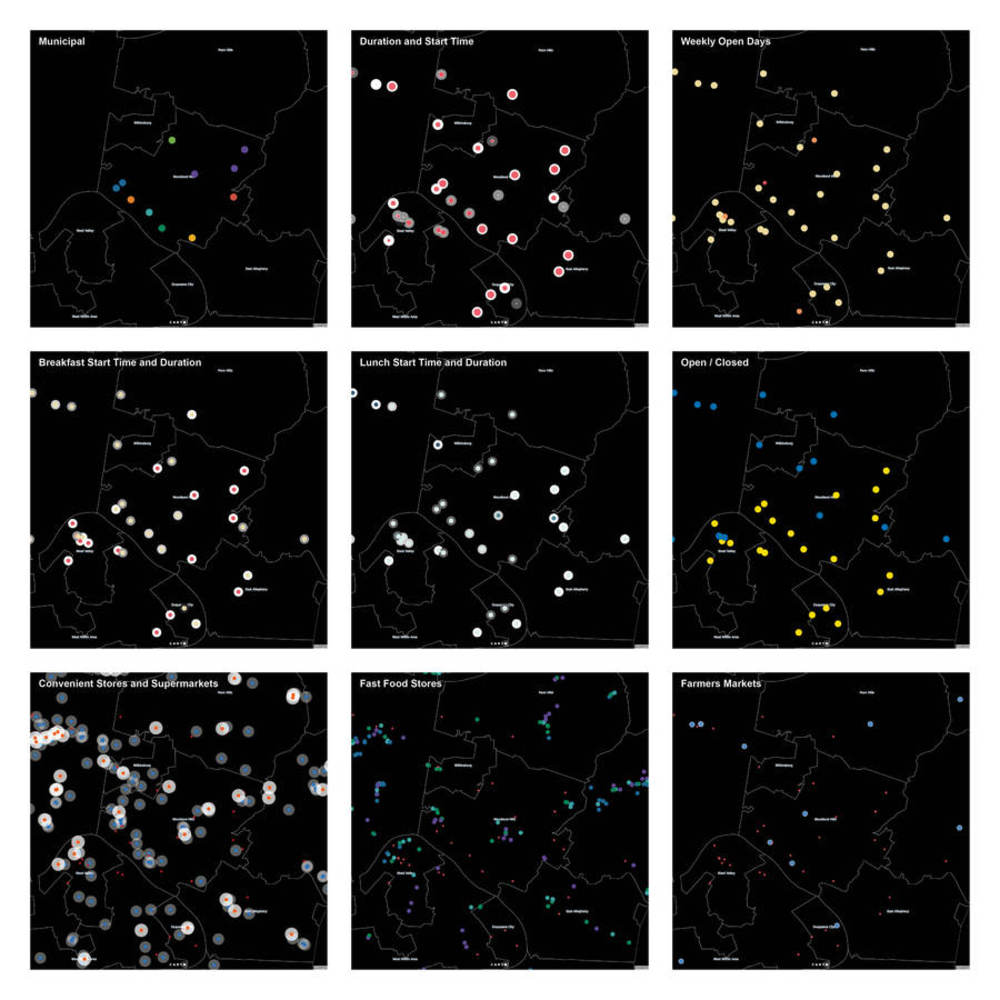
Based on the basic information that metadata gives me about the summer food sites, I categorized the start time and duration of breakfast and lunch. Meanwhile, I calculated the opening duration of the food sites according to the open and close date.

Product

By inputting layers of data into Carto, I overlapped the start time, duration of the food sites in terms of breakfast and lunch to explore how active they are. And I overlapped the location of food sites and fast food stores, farmers market, convenience stores and supermarkets to study the geographical distribution character.  Filter, order and identify color and size according to value are the main methods I used in analyzing and visualization.

Untitled 1.thumb
Show Advanced Options
 blank
3_3.pdf

562.768 KB · Download / View

Show Advanced Options

Reflection


In this exercise, I did not explore the extreme situation of caricature where it exaggerates the visualization while keeping the integrity of data. I think this is an interesting topic which I would like to explore in the following exercises.

After the warm-up and caricature exercise, I begin to have a clearer understanding of representation and accuracy. I think there is never a neutral ground between the representation of data and accuracy. Every graphic is needed to be generated based on the understanding of the character and meaning of the data. And it is important to select specific method to visualize data according to the character of the data. For instance, when I studied the distribution of convenience stores, it is necessary to consider a buffer zone of the service of the stores which represent the impact of the stores and how they influence.



Drop files here or click to select

You can upload files of up to 20MB using this form.