Back to Parent

Outcome


Intention

After looking at the potential of the Walk Score measures, the idea is exploring and understand the value of different dataset in depth to produce objectives outcomes for a purpose. In the case of these project, the goal is to peel out the reasons why three neighborhoods of Pittsburgh have different walk scores.

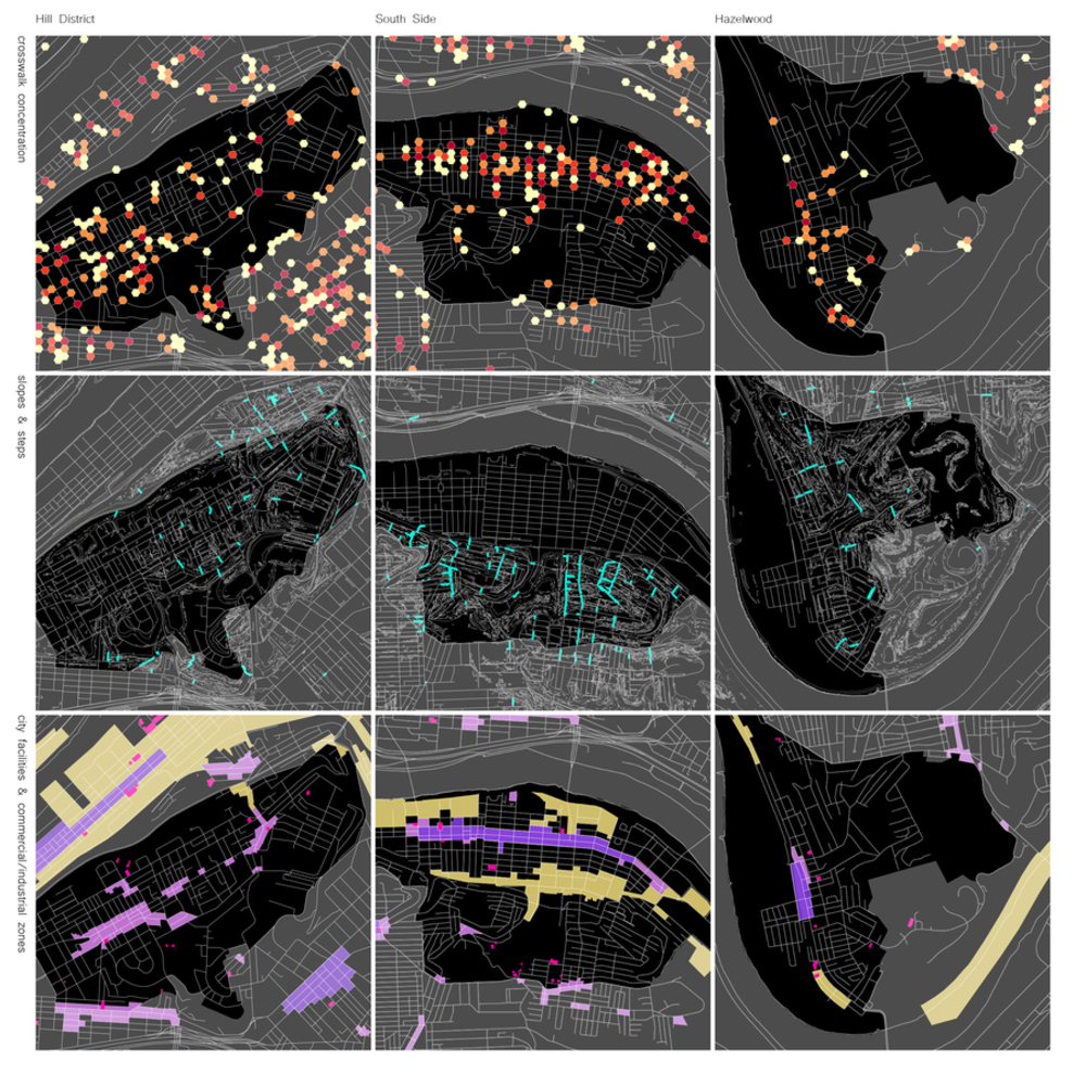
Then, crossing three of the datasets from WPRC, grid tries to compare different places with same metrics and conclude if the company's result does show a valid graphic and if we can learn from a self-made datasource mapping process. The datasets are: crosswalks concentration, slopes and steps, and city facilities & commercial/industrial zones, the result. Each one has the ability to learn how people in these behave depending if the sidewalks and streets are easy to navigate, if the topography plays a big role and if you can take a path to go from point A to B, and finally, if the concentration of jobs and commercial activities, plus city facilities like schools and medical centers, enables people to prefer to walk instated of taking public transit or cars.

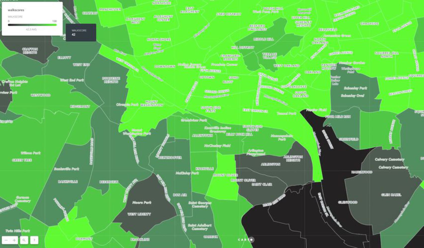
The chosen neighborhoods are Hill District, South Side, and Hazelwood. The Walk Score of these neighbor is 60, 85 and 18 respectively (see graphic). So the question is why different places in the city have different values and if we can use open source data to discover these question.  

Note: the interactive map is available at the following link, https://wprdc.carto.com/builder/d34f1c10-efba-11e6-853f-0e233c30368f/embed 
Capture.jpg.thumb
Show Advanced Options

Collection

- For the first row: 
City of Pittsburgh Crosswalks dataset, https://data.wprdc.org/dataset/city-of-pittsburgh-crosswalks
- For the second row: 
Slope25Polygon PGH dataset, https://data.wprdc.org/dataset/slope25polygon-pgh
City of Pittsburgh Steps, https://data.wprdc.org/dataset/city-steps 
- For the third row:
Pittsburgh City Facilities, https://data.wprdc.org/dataset/pittsburgh-city-facilities
Pittsburgh Zoning Districts, https://data.wprdc.org/dataset/pittsburgh-zoning-districts
Pittsburgh - Main St., https://data.wprdc.org/dataset/pittsburgh-main-st 
The idea behind using these datasets is: if a neighborhood has higher Walk Score then is because the ability to move and use the public infrastructure is easy, accessible for all, and close enough from residents. The question arises the following deduction, How to compare an existing score with dataset provide by WPRDC? It is valid then to think how people behave and move in the city and which constraints and availabilities, and if the metrics are good enough, they will imply a preference to walk or not in their neighborhood, thus the score could it be higher. 

Analysis

The datasets are varied, to analyze the project GeoJson files has been used, this allows Carto to show information provided with a code that shapes the values on the map. Then using Carto analyzing, it is possible to create different ideas.
For the Crosswalk concentration, the idea is to show how concentrated or not are the crosswalks in the different neighborhoods.
For the slopes and steps, the idea is to show the relationship between topography barrier, like hills, and how the steps help to communicate different places of the city. 
For the city facilities and commercial/industrial zones, the idea is to map where the commercial activities and job sources are located in relation to each neighborhood, but also the location of important facilities like schools and medical centers. 


Note: the interactive map is available at the following link, https://carnegiemellon.carto.com/u/paulmoscosoriofrio/builder/ddbceafa-599a-41e2-bcee-2e74c5e4831a 

Show Advanced Options

Product

Once the analysis is done, the grid shows the different neighborhoods with the datasets at eh same scale and graphic format to easily compare. To focus the attention of the viewer in the three neighbors chosen, while not to forget that theses places work in close relation with their adjacent neighbors, the neighbors are highlighted. To create these maps is necessary to use Geojson software, Carto, and Adobe. 

Grid 01 01.thumb
Show Advanced Options

Reflection

Once all presented, the viewer is able to become familiar with the three neighbors and the values in them, and then judge with objective data if a map showing random numbers provides by any company or institution becomes relevant and accurate. The possibility of any map maker is endless in terms of graphic representation and the ideas behind them. Certainly, a person with these abilities has the power to persuade the public to value a place positive or negative, there is why a proper ethical foundation should be basic in these jobs. As per the line between caricature and exaggeration, it is not a clear line, more like a limit in our minds to decide which data choose to create a graphic and why. This is a technical and artistic job, so there should not be ultimate rules to decide how to data the city.

Drop files here or click to select

You can upload files of up to 20MB using this form.