Back to Parent

Outcome


Goals & Process

The objective of this project was to work on the Healthy Bike Program data for the first quarter of its inception (2015 Q2) and look at the dynamics of biking networks around Pittsburgh. Certain outliers/cases were also looked into to form a unique narrative around these networks for the first quarter.

The steps involved in the process are listed briefly below:

1. The raw and a bit complex data was first sorted, cleaned and processed as per the required approach taken.

2. This ‘processed’ data was then used to identify the dynamics of bike networks around Pittsburgh.

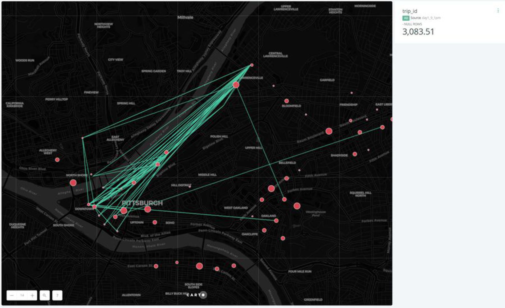
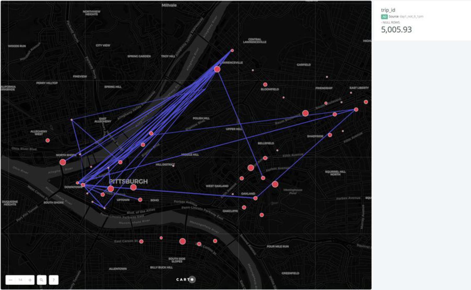
3. Case studies were  identified to illustrate human/bike movement with respect to the program.

4. Visualizations/illustrations created to form a narrative around these movements

5. Insights gained from these visualizations noted and further used to create a narrative

Data-set:

Bike Activity Data

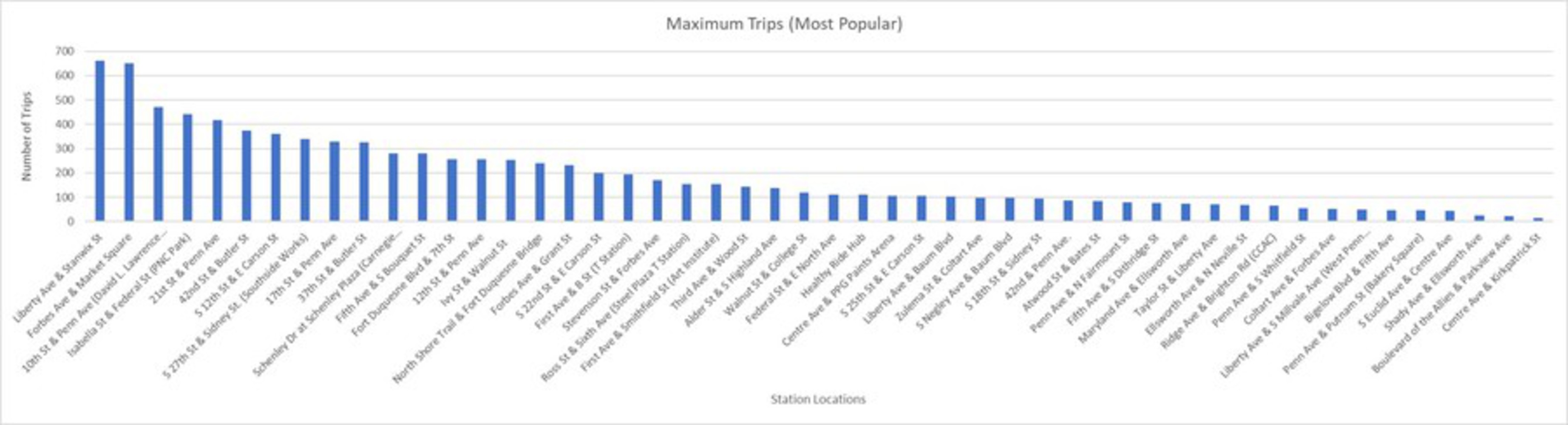
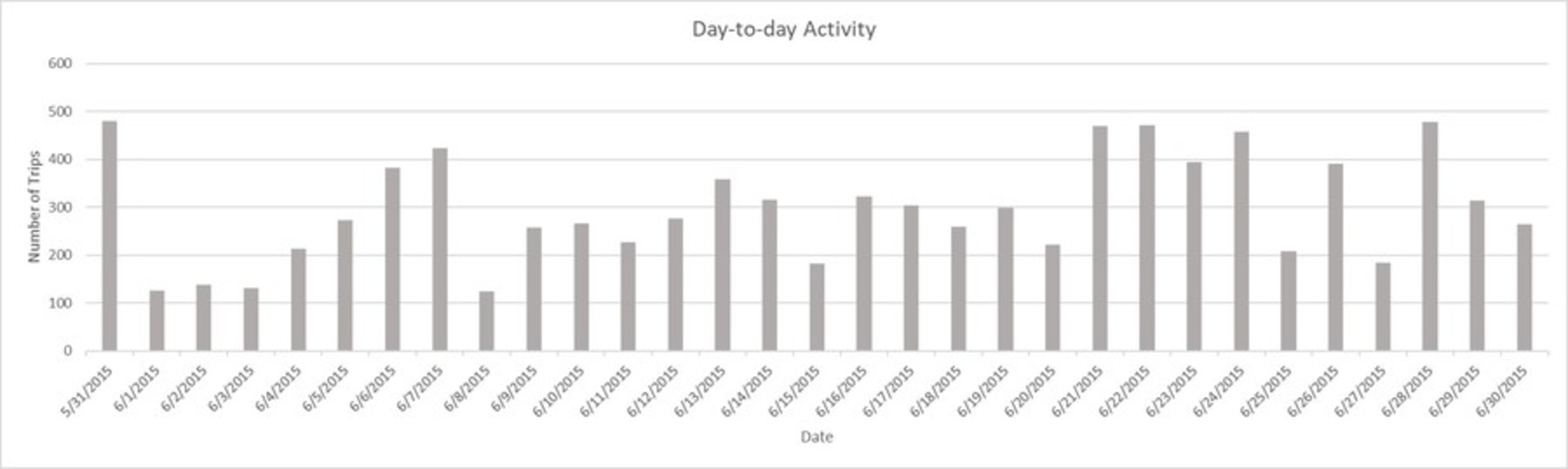
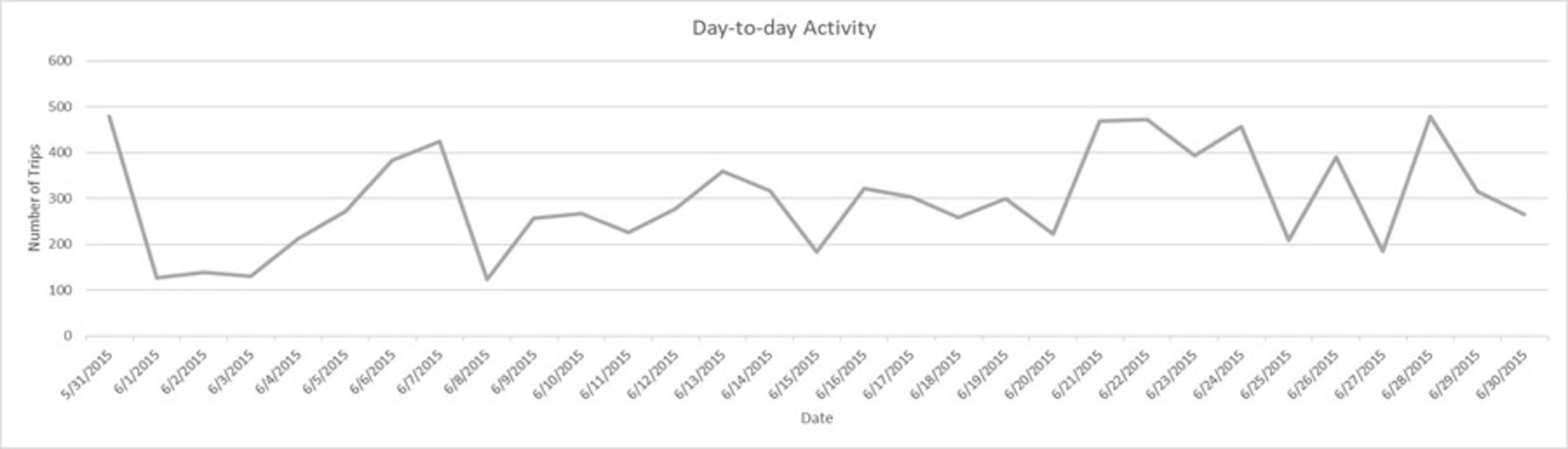
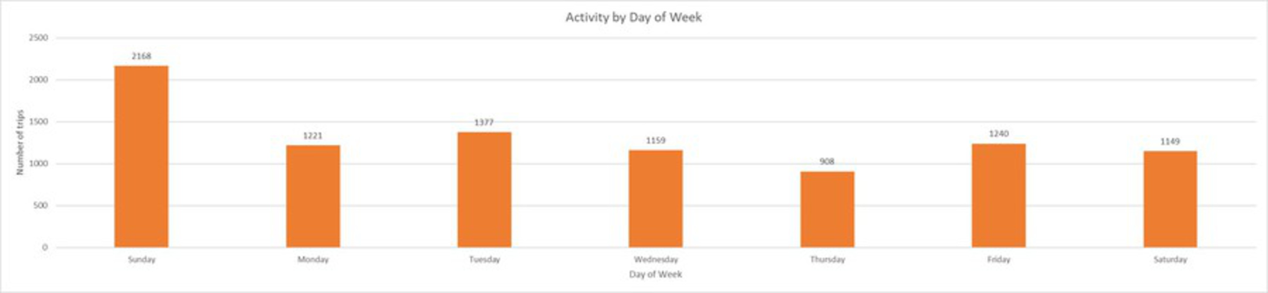
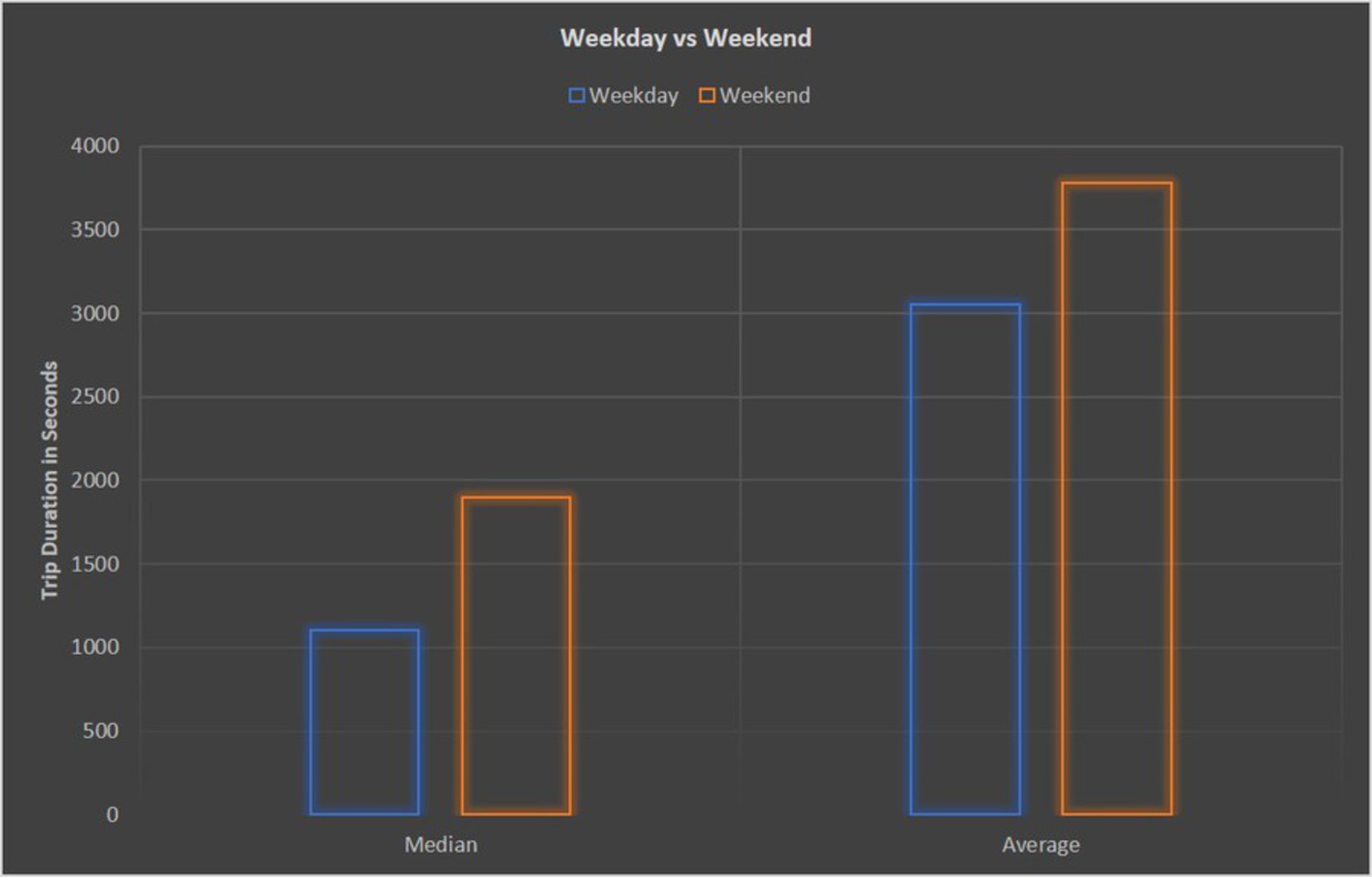
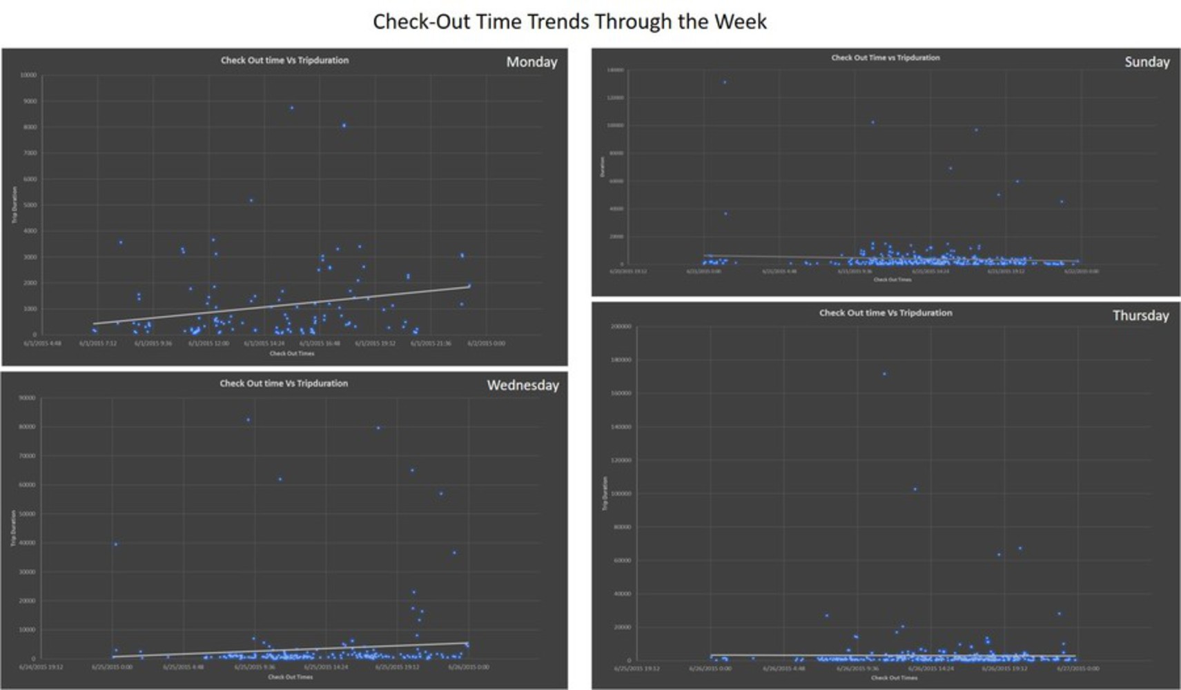
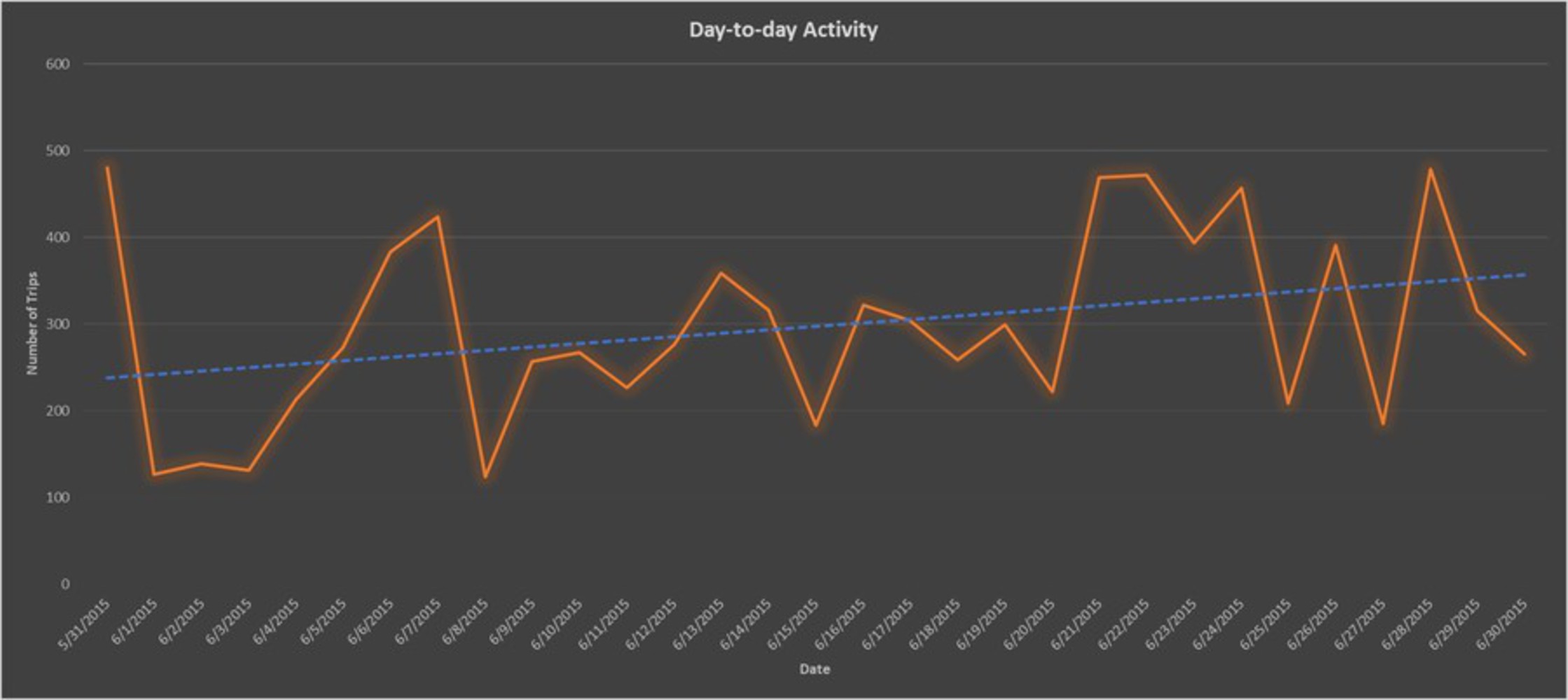
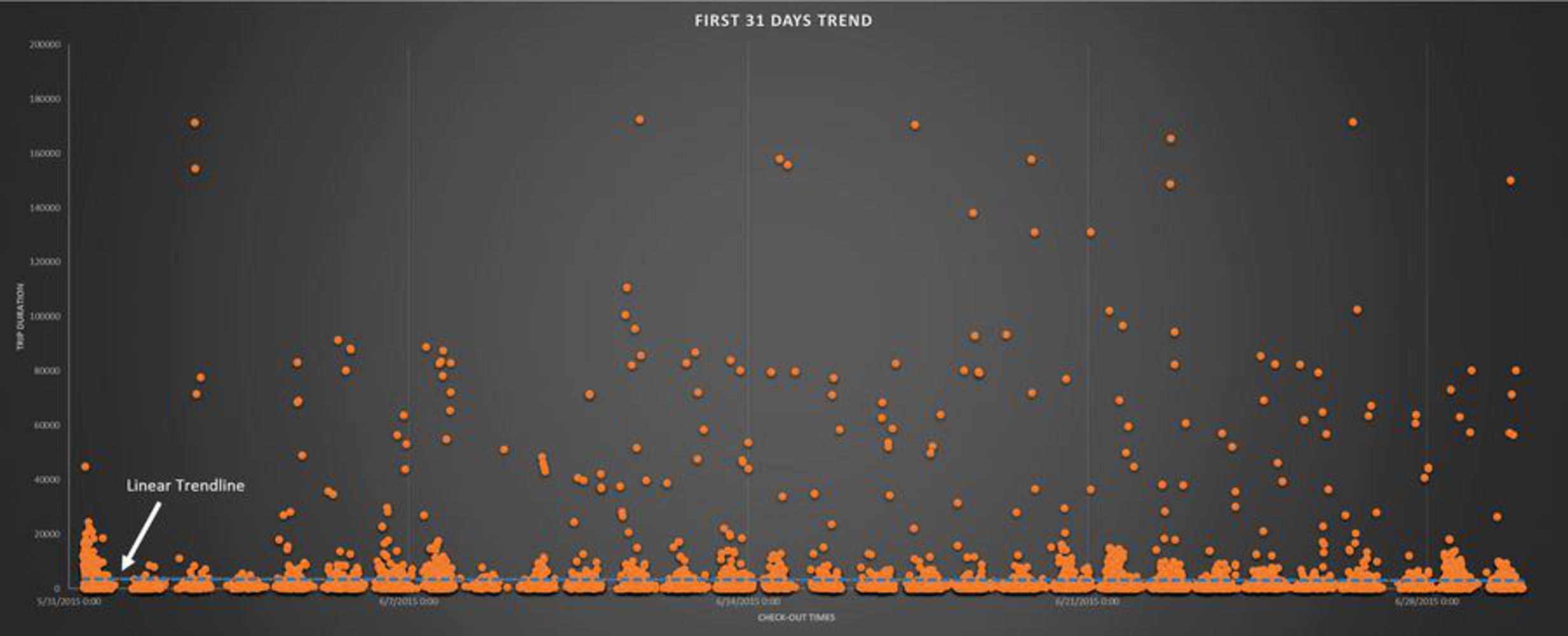
Healthy Ride Trip Data available on the WPRDC website was used and datasets downloaded from https://data.wprdc.org/dataset/healthyride-trip-data. The data was taken starting 31 May 2015 to 30 June 2015 and includes 9222 trips taken from 488 bikes docked at 50 different stations around Pittsburgh. On an average the trip lasted 55 Minutes and 20 seconds with a maximum of 48 hours and a minimum of 1 minute.

Station Data

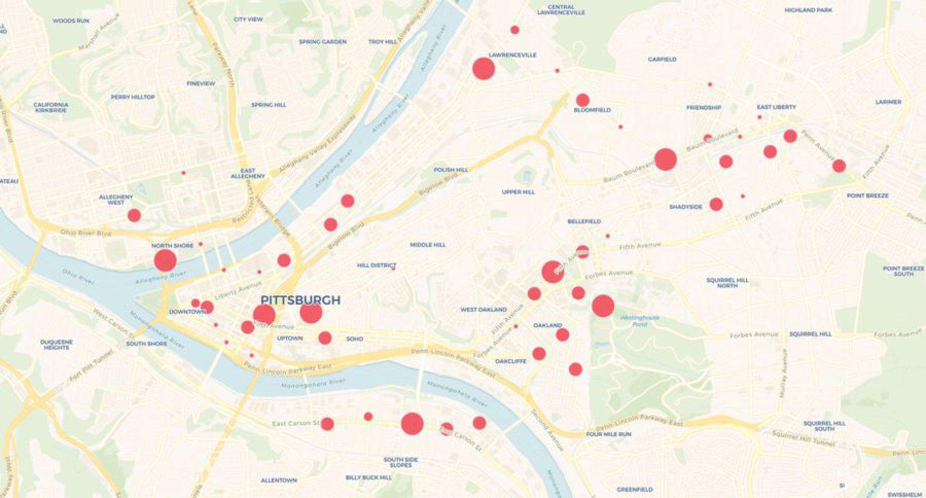
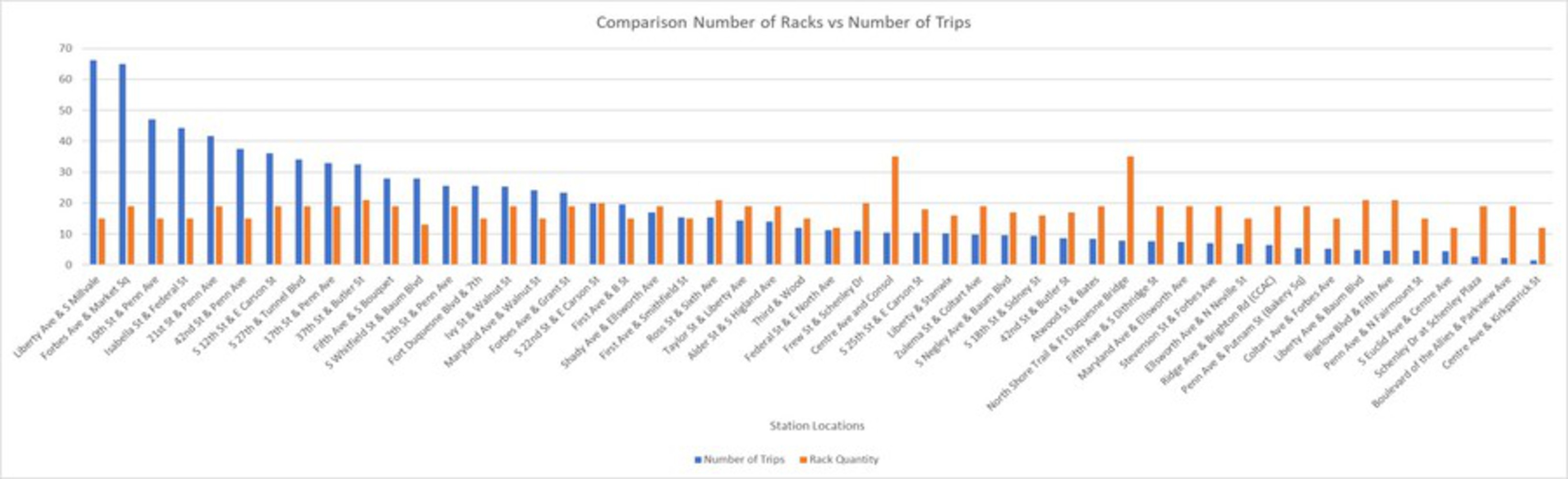
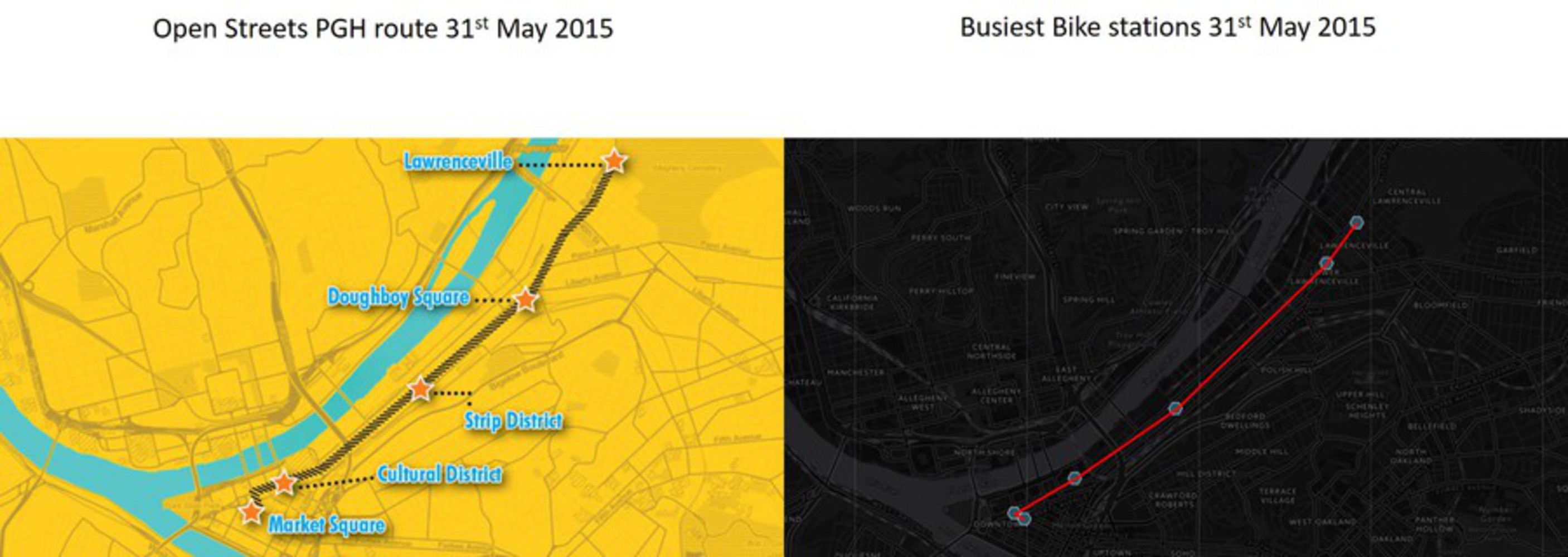
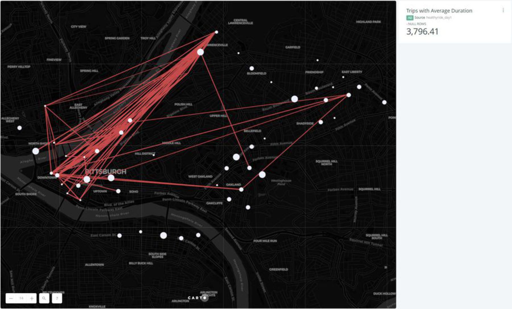
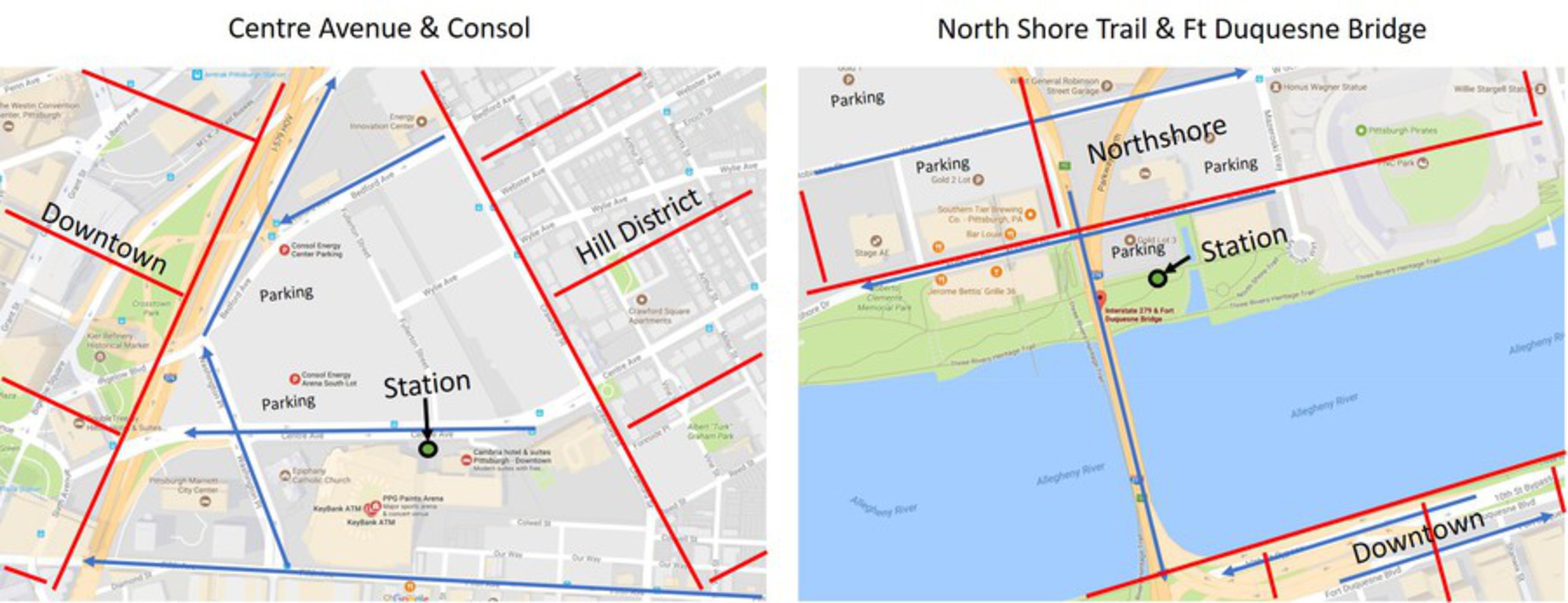
There are 50 bike stations in Pittsburgh with an average of 18.12 racks (min 12, max 35). The stations at Centre Ave & Consol and North Shore Trail & Ft Duquesne Bridge are the most resourced with 35 racks. Ones at Federal St & E North Ave, S Euclid Ave & Centre Ave and Centre Ave & Kirkpatrick St are the lest resourced with 12 racks. The Image below shows the bike stations around Pittsburgh. The intensities of the location identifiers are based on the number of racks per station.

Station locations.jpg.thumb
Show Advanced Options

Preliminary Analysis

Maximum trips.thumb
Show Advanced Options
Racks vs trips.thumb
Show Advanced Options

The above graph shows a comparison between number of racks and number of trips per station. To make the comparison more readable, the number of trips per station was weighed down by a factor of ten .This was performed to see if the stations with the highest capacity was also the most popular one. This was not the case. The Number of trips actually reduced a bit with the slight increase in number of racks from left to right.

Monthly activity.thumb
Show Advanced Options

As this quarter has just two months of data available, that too with just one day in May, a month-wise comparison was plain and not very insightful.

Day to day.thumb
Show Advanced Options
Day to day line graph.thumb
Show Advanced Options

As shown in the image above, the day to day activity showed the first three days of the month having some of the lowest trips per day. The number of trips per day seem to increase a bit after the 20th of the month.

Day of week.thumb
Show Advanced Options

Based on comparison of activity by day of the week, Sunday had the most number of trips and Thursday had the least. Sunday was also supported by intuition as people prefer to be out Biking on weekends mainly for leisure. As Sunday is an off day, this could also indicate that more people use biking for leisure than for travelling to work which is on weekdays.

Case by Case Analysis

What happened on day 1?

Day 1 or 31st May 2015 had an unusually large number of trips even though the program had just started. The high usage of Healthy Ride infrastructure on 31st May 2015 can be attributed to the start of the program on the same day. Bike share start date coincided with the years’ first OpenStreetsPGH event. As a result, 3.5 miles of streets from Market Square to Sixth Street, Downtown, and Penn Avenue in the Strip District to Butler Street in Lawrenceville, ending at Allegheny Cemetery were closed.

As we can see in the below image, the locations of the top 6 busiest bike stations fall exactly on this 3.5 routes. These stations are not the ones with the most bike racks, nor were the top 6 busiest overall. This shows how even though it was just the first day, the program was received so well. The same can be said for 28th of June which was again a OpenStreetsPGH event.

Day 1.jpg.thumb
Show Advanced Options
Day 1 trips.jpg.thumb
Show Advanced Options

When further refined to just the bike check outs during the Open Street Pittsburgh duration, which was 9am-1pm that day, it can be seen that most of the checkouts were again on the same route with only a few (<10) outliers. The average duration of each trip was 51 minutes 24 seconds. Total number of trips made were 301 out of 479 total on day one (63% of all trips were in these 4 hours), indicating that the open streets even was instrumental in getting riders on the first day.

Day 1  9 1.jpg.thumb
Show Advanced Options

Looking at the trips outside of the 9am - 1 pm on day one, we can still see the majority of the traffic is on the same OpenStreetsPGH route. However, as the restrictions are lifted, more people travel outside of that route. Total trips during this time is 178 reducing from 301. The average trip duration also increases to 83 minutes 26 seconds. This was after 1 pm on a weekend, which could indicate people coming out in the afternoon and using the bike for leisure and not specifically for the OpenStreets event.

We have people travelling to Oakland, East Liberty and north side. The trips on the north side are very interesting as they seem to start and end at the same station. If we had the names of the person checking out the bikes, it would have been an interesting case to see if those were the same people.

https://carnegiemellon.carto.com/u/adobriya/builder/964b2084-24d5-4874-9084-6ec029a6a21c

Day 1  not 9 1.jpg.thumb
Show Advanced Options

What Happens on Weekends?

Weekends see a higher number of trips than a weekday in any given week. A possible reason for this can be found when looking at the trip data for a weekday. Comparing the bike check-out times to the trip duration gives us some great insight into this question.

The first image below shows the difference in the median and average trip duration during the week and the weekend. the duration of trips on the weekend seems to be significantly higher. This is a preliminary insight which will help us later.

We can see from the ’Check-Out Time Trends Through The Week’ visualization, that the number of trips during a weekday increases significantly after 4.30-5pm. These numbers are not like ‘before office’ hours (7.30-9) and this indicates the use of the bikes just after office hours and in turn we can infer that most of these bikes are used for leisure. As this is the primary usage of these bikes, it now becomes clear why weekends see a higher number of trips.

This also points towards possible shortcomings in biking infrastructure and acceptance of biking as a mainstream mode of transportation to work and back.

Weekdayvsweekend.png.thumb
Show Advanced Options
Time trends through the week.thumb
Show Advanced Options

What is the significance of locations of stations with the most number of racks?

The stations with the most number of racks are the ones located at Centre Avenue & Consol and North Shore Trail & Ft Duquesne Bridge with 35 racks each. To look into why these stations have a significantly higher number of stations, lets look at the locations.

The first station is at the Consol arena site, right across the new PPG paints arena which makes it a very favorable location. It sits across from one of the busiest intersections and at the foot of the Hill District. Both these reasons make it a good spot for parking your car and taking a bike to work into downtown. The second site sits at the end of the North Shore Trail and the start of Fort Duquesne bridge which acts as a gateway into Pittsburgh downtown. The station is also centrally located from both Heinz field and PNC park and therefore has a favorable location for a high capacity station. 

Highest capacity racks.thumb
Show Advanced Options

Two Significant Insights

1. The image below illustrates the monthly trend of number of trips with respect to the date and we can clearly see a positive gradient of the trend-line. This infers that the number of trips increase as the month progresses and this shows the Healthy Ride program gaining popularity among the population of Pittsburgh in the first month after its inception.  

Daytoday.thumb
Show Advanced Options

2. The second image plots the number of trips with the check out times for the bikes in a time-series format. What this does is looks at the trend over the month with respect to time of day. We can see from the image that this trend-line has an almost zero gradient. This shows that even though the number of trips increase overall through the month, they are spread across different times during the week at the end of the month same as they were at the start. 

This insight was particularly interesting as it was not obvious through the preliminary analysis and appeared only while trying out different visualization formats 

Capture1.jpg.thumb
Show Advanced Options

Ideas for future work

1. The trip routes could be mapped to identify which routes do bikers prefer in Pittsburgh. Certain insights can be gained from this such as traffic issues or infrastructure issues.

2. Stations which frequently run out of bikes and those with excess bikes always, can be identified and this information can be used to alter their capacity.

Drop files here or click to select

You can upload files of up to 20MB using this form.