The two paintings I chose from the Carnegie Museum of Art are "Self-Portrait" by Raymond Simboli and "612-1 Untitled" by Gerhard Richter. Although both pieces have very generic names, they are very unique in their effect on the viewer. ***NOTE*** I forgot to remove the filter on my phone camera before taking these pictures, so actual colors are less vibrant than whats seen here.
Outcome
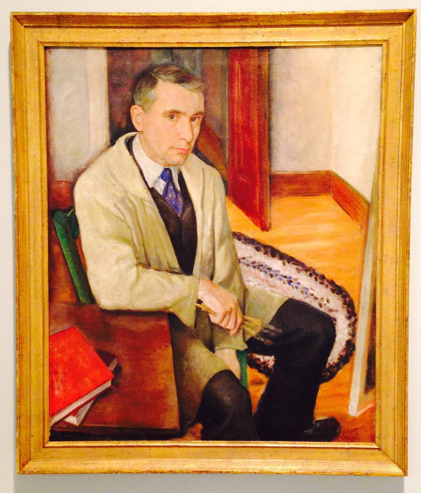
The museum was laid out by time period, with works of Renaissance and realism early on, and works of modern and abstract art later on in the gallery. This painting was actually somewhere in between the two sections, but I decided that it reflected more of a realistic approach than an abstract one.
The intense stare of the subject (and artist) of the painting was what initially caught my eye. The whole upper region of his body seemed to be leaning out of the painting, as if he were observing the viewer as the subject of his next painting. After trading several glances with the work, I noticed the peculiarity of the background. The most obvious element, which pulls the painting slightly away from realism, was the dark shadow/aura around the painter's face and shoulders. Of course, this produces the contrast between the artist and surroundings, but also makes it seem like the artist does not belong in his surroundings. Its almost as if he is a 3-dimensional object in front of a 2-dimensional screen. Normally, shadows do not fall in such a way that they appear in the airspace behind you. This 3-d vs 2-d effect is further exemplified by the awkward perspective of the carpet, and the blurriness of the background.
The colors are very warm. The artist used a lot of browns, reds and oranges. Even the blues and greens have tinges of red and orange mixed into them. Overall, this gives the painting a very comfortable feeling. Within another context, the artist's stare may seem a little creepy. But here, it seems kind and understanding. The colors are also blended in a way so that everything feels very soft, apart from the sharpness in the artist's face. This effect definitely draws your attention to his gaze. As I observed the painting, I noticed that my eyes would constantly reconnect with his stare as I scanned the full work.
In terms of space, the artist plays with some of the painting rules to further enhance the optical illusion described in previous paragraphs. Normally, foreground an background objects overlap so you can have a clear sense of what is supposed to be closer to you. However, in this piece, several objects are just barely touching each other. The carpet just nicks the edge of the canvas. The man's shoulder comes extremely close to the edge of the door, and he also leans on the very edge of the table. Again, this flattens out the space, and creates the 3-d on 2-d effect.
Personally, I found this piece rather mesmerizing, and a little bit mysterious. The man seems to observing the viewer just as intently as the viewer observes the man. Even though the work is very still (he is sitting, staring, and holding his brushes rather tightly), the artist seems no less alive. It gives me the impression that this man has many thoughts and observations going through his head, and is waiting for me to say something to him.
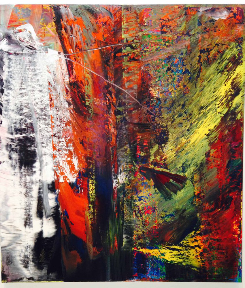
This painting didn't really spark my interest until I read the description. Originally, this piece was very well-ordered and geometric. Then, the artist decided to squeegee the whole painting and leave the results up to chance. Thus, this wild scraped effect was produced. Because of the squeegee effect, the composition of this painting is relatively simple. There isn't much depth, and the layering of color does not really add to any sense of foreground-background. However, the effect created does seem to reflect the goals of the artist. There was obviously some sort of layering effect used here. The bright and vibrant reds, yellows, and blues were painted over by the duller greens and browns before they were scraped away. Thus, this left small patches of bright color peeking out behind the darker colors. Overall, the results parallel the technique used. The artist scraped away the dull order and repetition to reveal something more beautiful underneath.
Although there are no clear forms, shapes, or sense of depth, the directional strokes of the squeegee remind me of a forest. There are several strong vertical strokes, which could be tree trunks, with intermittent downward sloping strokes, which could be evergreen foliage. The foliage is also lighter, compared to the shaded trunks and ground layer. The colors certainly give the piece the liveliness of a forest. The quick-changing colors give the strokes movement, and intensity.
The odd part of this painting is the huge white block on the left side, which I don't completely understand. Because it is the only pure white color in the painting, it gives the left side a sense of heaviness. It also is rather glaring, and draws the attention away from the rest of the work. Similar to the self-portrait, this patch doesn't seem to belong in the work. The rest of the painting looks rather alive and vibrant, while this block seems pasted on top: lifeless and static.
Personally, I found this work a more frustrating the longer I stared at it. Compared to the self-portrait, I couldn't see much motivation, or feeling from this painting. That may be because the artist left most of the aesthetics up to chance. There is definitely a lot going on, and it is hard to focus on a particular spot for too long.
You can upload files of up to 20MB using this form.