Back to Parent

Outcome


Goal

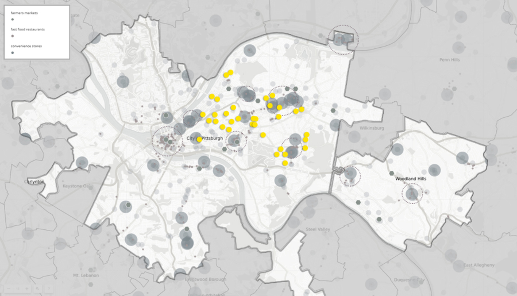
I developed the community engagement based on the previous study on Summer Food Sites. As Woodland Hills have the most summer food sites, I chose it as the study object together with Pittsburgh city. I tried to compare them in terms of the current school menu, number, and location of convenience stores, farmer's markets, fast food restaurants to study the access to food and the quality of food in the respective school districts.

Datasets and Data Processing

I gathered the datasets from WPRDC in terms of fast food restaurants, convenience stores, farmers market, and school district boundaries.

https://data.wprdc.org/dataset/allegheny-county-fast-food
(Links to an external site.)Links to an external site.
https://data.wprdc.org/dataset/allegheny-county-supermarkets-convenience-stores
(Links to an external site.)Links to an external site.
https://data.wprdc.org/dataset/allegheny-county-farmers-markets-locations-2017
(Links to an external site.)Links to an external site.
https://data.wprdc.org/dataset/allegheny-county-school-district-boundaries (Links to an external site.)Links to an external site.

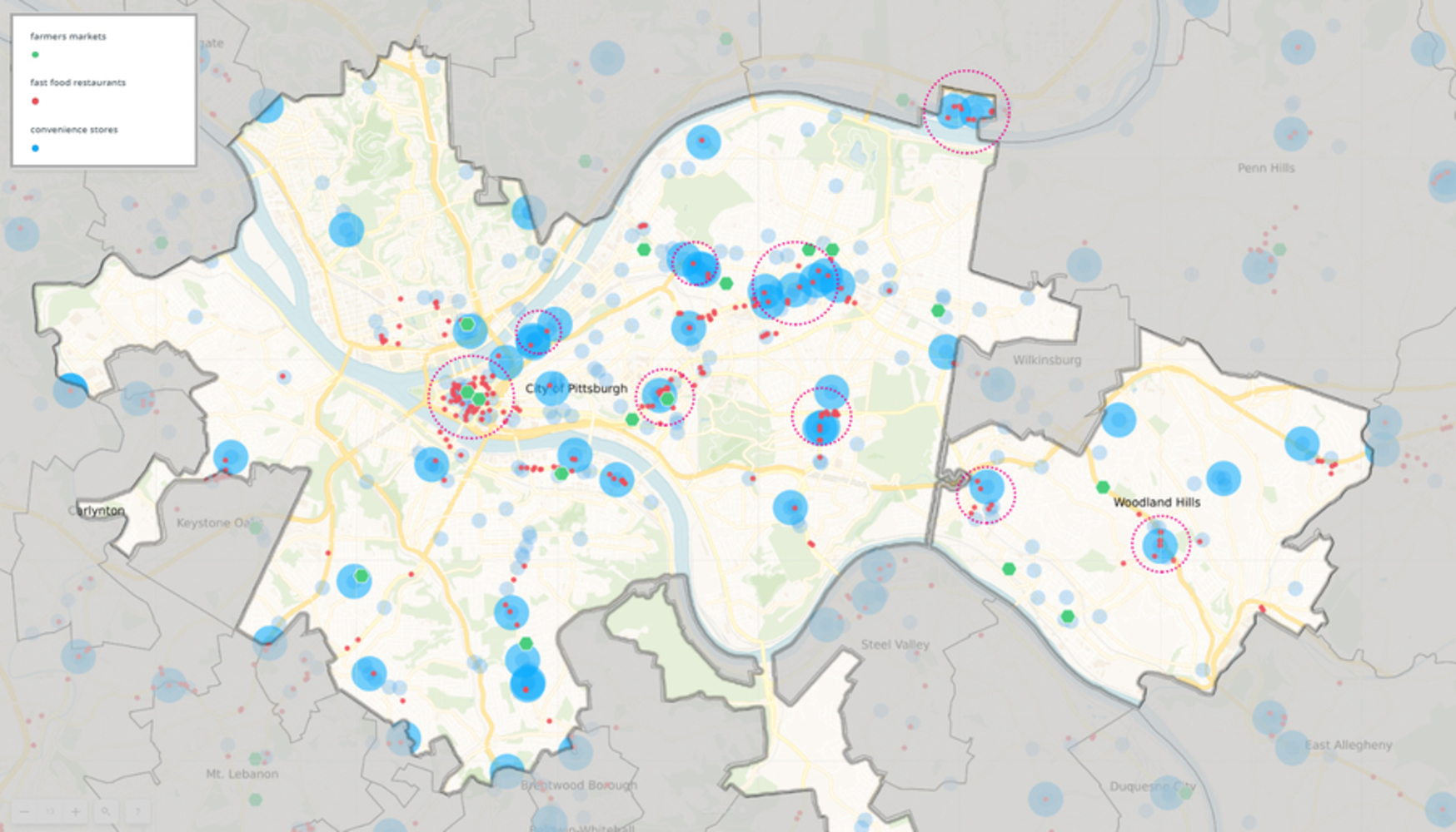
By doing the data processing in Carto, I integrate the datasets and overlayed them together. It is interesting to find that In Woodland Hills School District, the food resources are located more even than Pittsburgh, where the restaurants and convenience stores are aggregated at business districts and streets.

https://carnegiemellon.carto.com/u/yidan-g/builder/f6a29f75-4d25-44fd-8ae8-4ad722284c38/embed  

Food health.thumb
Show Advanced Options

Engagement Process

First, set up a pavilion in the neighborhood to engage with the community. In the pavilion, there will be three steps to involve the engagement: A pin-up board, a mobile pin-up installation, and a tasting dish.

1.  Pin up your residence and your/your children's school location

In this step, the residents are encouraged to pin up the location of residence and school as a way to see if there is an imbalance between needs and supply, as currently, the food resources are aggregated at commercial districts and streets. This will help them to understand the level of food scarcity in terms of accessible supplies.

Pin up.thumb
Show Advanced Options

2. Evaluating the diet pyramid

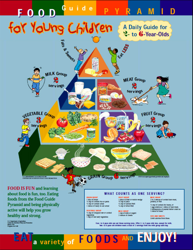
According to the suggesting food guide pyramid, there is a correlation between servings and types of the food. However, I guess many children like sweets and cheese very much which are actually not healthy. So now it is a great chance for them to understand whether their diet is healthy.

Food pyramid for kids.thumb
Show Advanced Options

Participants are encouraged to attach the symbolic magnets to the board, i.e. sweets to the right of the board, and bread to the left. The mobile will be balanced at the initial point to resemble the healthy diet, then with more and more people attach their diets, the board will tilt according to the attached food. As a result, people will see which end is heavier than the other, which means they need to get eat less food of that end to get back the balanced diet.

Model.thumb
Show Advanced Options

3. Taste the diet of the region

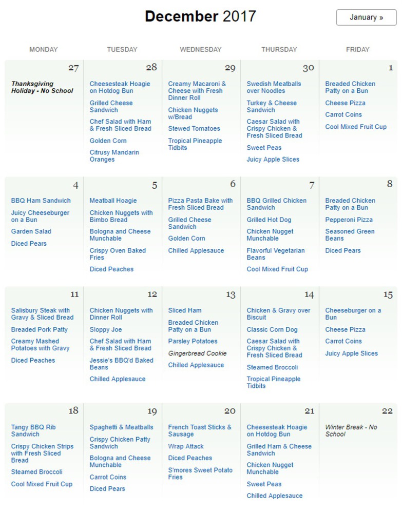
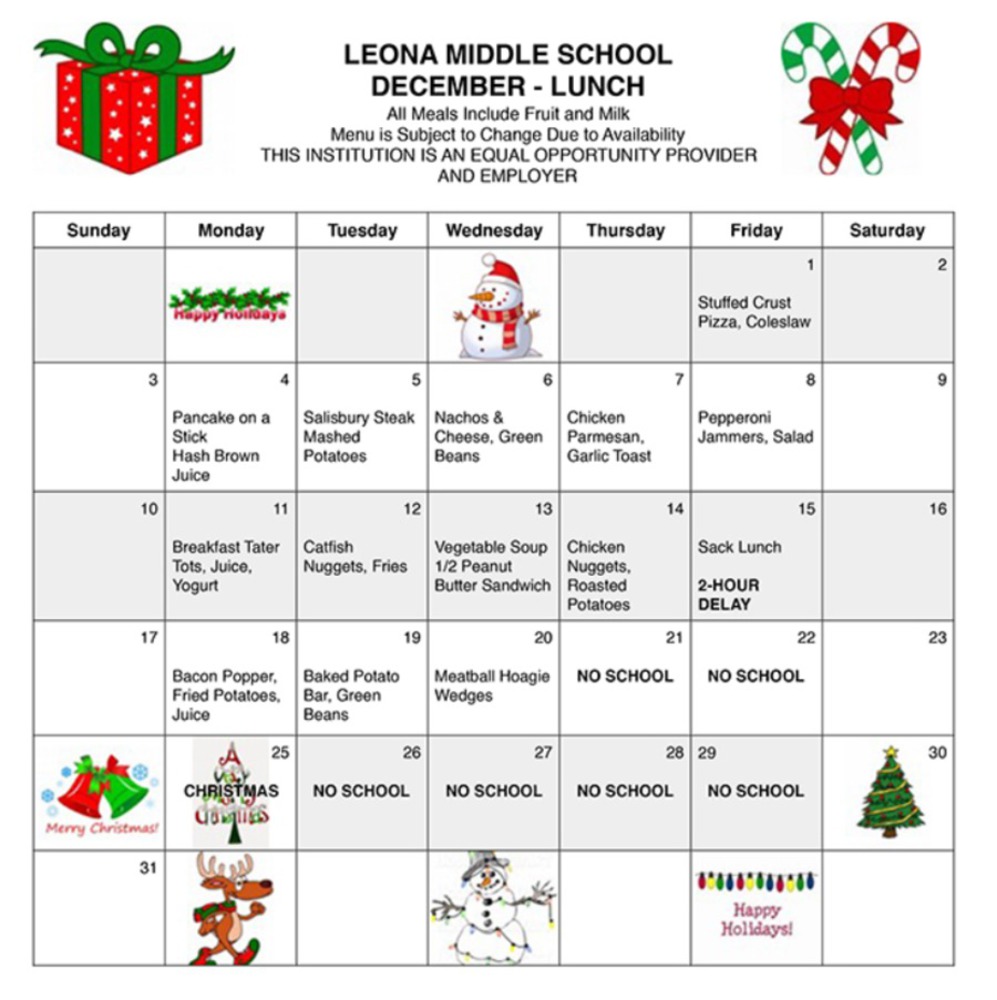
I chose one lunch menu in both Woodland Hills School District and Shadyside School District. Overall, the diets are healthy. In Woodland Hills, the lunch is usually composed of a main dish, vegetable, and fruits. However, in Shadyside School District, there is often lack of fruits.   

Woodhills lunch!.png.thumb
Show Advanced Options
Woodhills lunch.png.thumb
Show Advanced Options

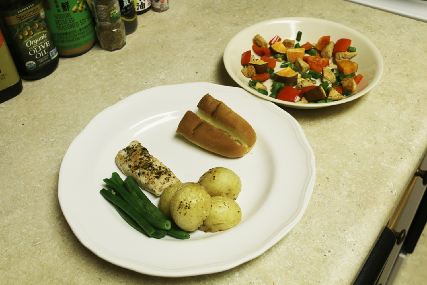
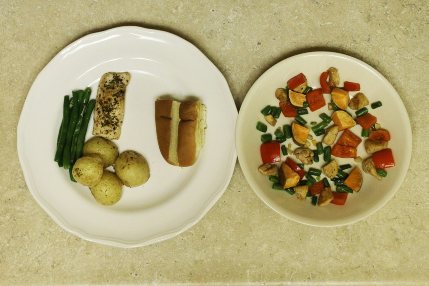
According to the dishes from the two menus, I basically use chicken, green beans, potato, sweet potato, and pepper as ingredients to illustrate the current situation of food resources in Pittsburgh and Woodland Hills School District. 

Prepare2.thumb
Show Advanced Options

The raw materials in these two dishes are quite similar, however, with the different cooking methods, they reveal the difference between the two regions. The left dish is Pittsburgh, which has large slices, and many potatoes as carbohydrates. The right dish is Woodland Hills School District, which is of smaller dices, and sweet potatoes as carbohydrates that is healthier than potatoes. The former represents Pittsburgh that the resources are aggregated together and not located evenly, and the school's menu is not that healthy. The latter illustrates that the food access are distributed relatively even in the area and the school's menu is healthier with fruits.

I guess, by looking and tasting these two dishes, people will get a direct and clear understanding of the food resources in these two regions and how healthy are the foods in the school are. And this might raise people's awareness of healthy diet, thus may improve the balance in the diet in the future.
Final1.thumb
Show Advanced Options
Final2.thumb
Show Advanced Options

Lesson Learnt

By trying the method in Data Cuisine to illustrate the food health in Pittsburgh and Woodland Hills School District, I realize that there is much more than what we see the dishes. I need to study the characters of the two districts and think about how to illustrate it using the food. If I will do it again in the future, I would like to further explore how to involve taste in engagement. Maybe if there are more fast food restaurants, the food could be more oily and heavier taste. And if I could improve my poor cooking skill, I would like to try desserts or other more complex dishes to show the complex information.

Drop files here or click to select

You can upload files of up to 20MB using this form.