Back to Parent

Outcome


Goal

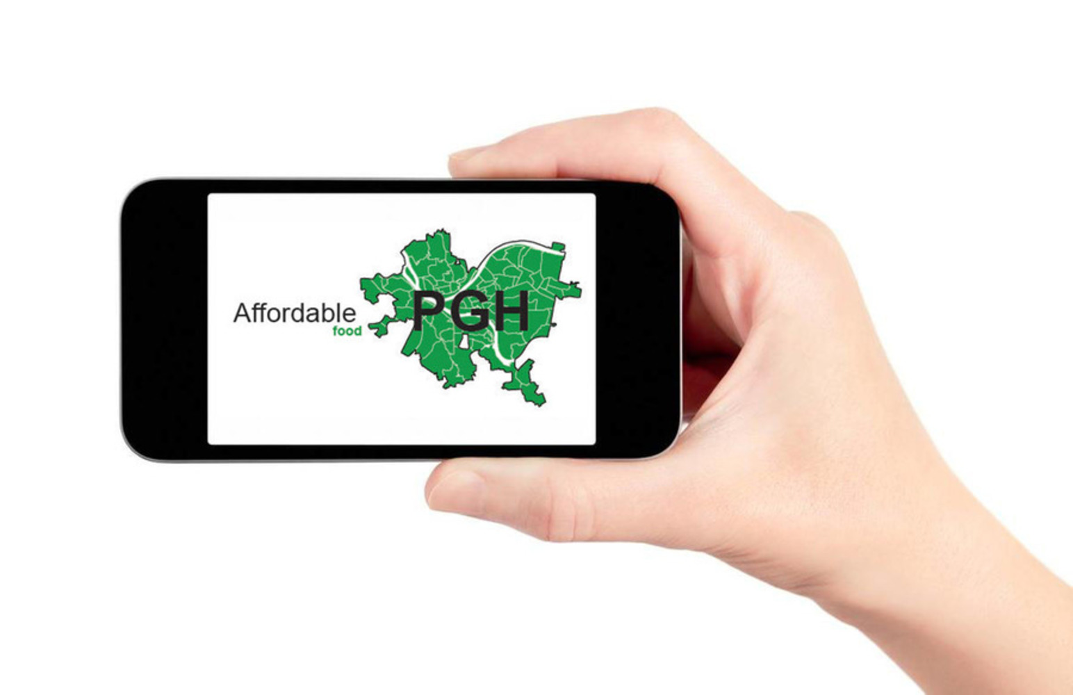
Miami/Pittsburgh Affordability Map

A current of exploration and personal interest over the past few years has been the growing economic inequalities leading to unaffordability in Miami. First proposed as my capstone for a local Affordable Housing cohort (Cultivating our Community), the Miami Affordability Map parallels research I'm currently pursuing in my Urban Design Thesis and could lend itself to a more robust outcome at its conclusion in May 2018.

As a definition…

As defined by Merriam-Webster, Affordability is: able to be afforded: having a cost that is not too high. Products sold at affordable prices; an affordable purchase

And as defined by Business Dictionary.com, Affordability is: Conclusion drawn from the analysis of the 'life cycle cost' of a proposed acquisition, that the purchase is in accord with the resources and long-term requirements of the acquirer.

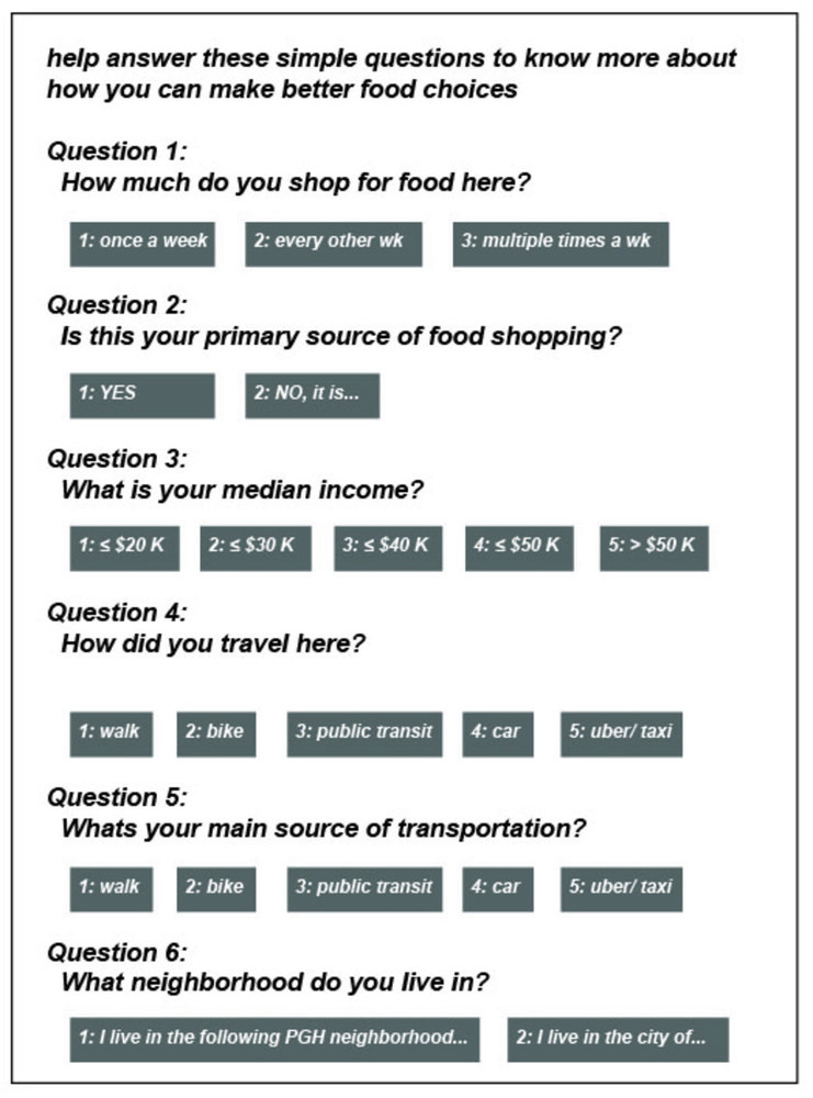
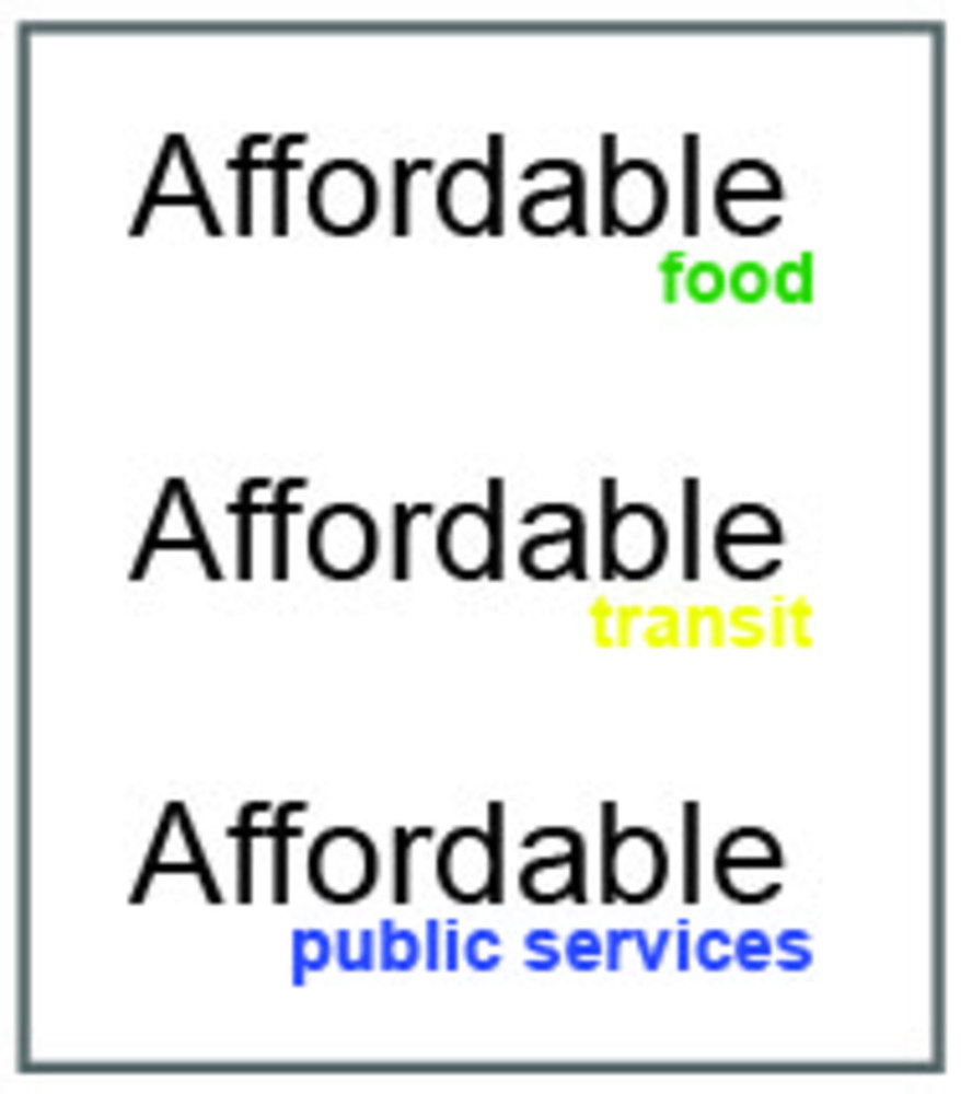
Taking the two, and reframed in the context of livability, Affordability is about the ability to afford to live in a certain area/neighborhood given the constraints of the local market factors (such as housing cost, transportation costs and options, access to skilled jobs, and quality education options).

To be clear, this is not about the mapping of affordable housing offered by local governments, or a mapping of mixed-use developments, which is information easily obtainable from any local governmental public housing authority. This is about finding a better, and deeper understanding to the issues of an area’s ease or difficulty in residents right to live non-cost burdened (when 30 percent or more of its monthly gross income is dedicated to housing).

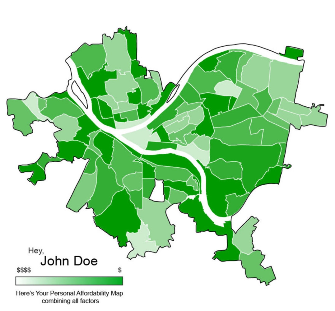
It’s from here where I would like to explore mapping out pockets of Miami where a level of affordability exists based upon the median income of the region as a base benchmark to maintain.


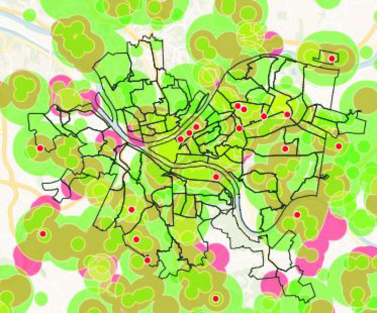
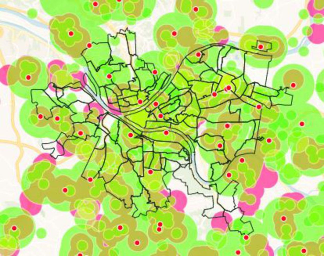
While Miami's Open Source Data is a ways off from being as complete as Pittsburgh's, I will utilize Pittsburgh's Data as a test of my theories.

Context

Websites that have served as precedent for visually reaching audiences in attractive manners I wish to engage are as follows

Zillow: www.zillow.com (Links to an external site.)Links to an external site.

Zillow gives users multiple options for searching for homes for sale and apartments for rent based on a shoppers preference in unit size, cost and, grade school proximity and performance.

Washing Post, Rush Hour Commute Mapping: https://www.washingtonpost.com/graphics/2017/national/escape-time/?utm_term=.64c525e0c738 (Links to an external site.)Links to an external site.

Washington Post Graphics Reporter Sahil Chinoy used anonymized cell phone data to map how far you can drive across major U.S. cities.

Due to finals week constraints, analysis of this example is limited.

Isoscope:http://isoscope.martinvonlupin.de/ (Links to an external site.)Links to an external site.

Knowing hourly flows of commuting.. this could lead to a better understanding of a neighborhood area or region how a flow can aid or impede your access to where you personally want to go.

Analysis

Reviewing multiple layers of Data stacked upon each other to see what revelations become revealed. In this Analysis, I want to help citizens be better informed on how/where they live will affect their overall personal budgets.

With a simple stacking of information, I hope to expose pockets of affordability which citizens could use to better position themselves within the city. This analysis uses the following data stacked upon itself: Supermarket Location Data with Convenience Store, Fast Food Restaurants, and Farmers Markets.

Recommendations

Food Security (access/proximity to a grocery store and/or fresh food) 
Starting with the U.S. Standard definition of a food Desert: A location which does not have access to a Supermarket within a 1-mile radius, I gave proportional radii to the other categories, giving dominance to Supermarkets.

Convenience Stores: 1/4 miles
Fast Food Restaurants: 1/2 mile
Farmers Markets: 1/2 mile

Show Advanced Options

Engagement

Similar to utilizing the Textizen approach, I could imagine a CDC, Borough/Town, or city health department utilizing simple surveys of users of these establishments to quickly poll them over there use of said category (Supermarket, Farmers Market, Fast Food, Convenience Store) for frequency of use, and major source of goods.

Questionaire outside of a Food Establishment

Affodable   pgh 03.thumb
Show Advanced Options

I could envision how this data could be given back to the resident in the form of the map, catered to their user profile to be an informative tool to their habits but also what is available around them. In turn, I could envision how a City or County development authority along with the Health Department could strategically place assets for a better food security of the public.

Giving visual power back to the people will not only inform them on there current state, but also the state of future home/rental locations, which may serve them and their budgets better.

Data Scrubbing

Applying information garnered from yelp on the priceyness of Supermarkets, I've been able to garner a better sense of which supermarkets are more affordable than others. This information given back to citizens can be powerful in their decisionmaking about when and where to shop, as well as how to better position themselves to more affordable foods.

Low-Cost Supermarkets

15 in PGH

Low cost pgh.jpg.thumb
Show Advanced Options

Medium-Cost Supermarkets

= 21 in PGH

Med cost pgh.jpg.thumb
Show Advanced Options

High-Cost Supermarkets
=1 in PGH

High cost pgh.jpg.thumb
Show Advanced Options

A similar analysis can be conducted on the other data sets to add clarity to Fast Food (dollar Menu or no Dollar Menu, Breakfast service, Fresh Fruit options, etc.), and Fresh Markets (days of operation, seasonal or year round).

With all systems firing, the simple location of these assets can turn into a more richer telling of food options.

Civic Official Web Portal

Desktop app.thumb
Show Advanced Options

Citizen Engagement website

Phone app.thumb
Show Advanced Options
Affodable   pgh 04.thumb
Show Advanced Options

Other Engagement sources

Polling Citizens in different ways to gain insight on broader affordability

Affodable   pgh 02.thumb
Show Advanced Options

Hypothetical End Product for citizens

Pittsburgh affordability map 01.thumb
Show Advanced Options

With this test case, I could imagine a Mapping a populations affordability based on personal factors and the community as a whole. After a successful period mapping out of a test case city (Pittsburgh or Miami), I could envision a board rollout of this polling across multiple cities.

See my map here!
https://carnegiemellon.carto.com/u/ebellamy/builder/bb431752-e898-4191-af33-ab9d4d30cd63/embed

Drop files here or click to select

You can upload files of up to 20MB using this form.