Back to Parent

Outcome


Overview

The Integrative Design, Arts and Technology (IDeATe) program at Carnegie Mellon University connects diverse strengths across campus in order to advance education, research, and creative practice in domains that merge technology and arts expertise. Our semester challenge was focused on applying the Maker Ed open portfolio initiative - how learning artifacts are captured and documented, and how these digital portfolios can enhance an educational or professional experience - to the IDeATe program. Through careful and methodical research, concept ideation, and prototyping, we explored the documentation practices currently used in the IDeATe program, and we worked to develop a public feedback system that would improve student experience in their documentation and portfolio processes. Below, we present the problem and vision statements of our design solution.

Problem Statement

Although the IDeATe program houses creative thinkers and makers, all students who are constantly developing unique projects and learning artifacts, the documentation of such creative works often does not keep up the pace. The Maker Ed open portfolio challenge questions how we can better construct a documentation experience for students, and we identified two specific reasons why students in IDeATe courses are not currently more engaged in documentation and portfolio practices. The first overarching weakness in existing IDeATe documentation practices stems from the overwhelming demands of the documentation and critique process. In addition, student vulnerability also prevents students from showing incomplete or simple projects.

Vision Statement

We believe we can address students’ vulnerability and the documentation learning curve by: (1) structuring the feedback process, and (2) displaying projects anonymously to public critique. We plan to do this by using a feedback process open to the general public, which implements familiar communication channels such as texting or social media. Our aim is to motivate students to build a culture around documentation, as well as to better value the feedback and iteration that is necessary for successful documentation and portfolio practices.

Success Indicators

We identified several different heuristics that we can use to evaluate our public feedback system’s success.

First, we turned to quantitative statistics. A simple metric could be from the raw number of public responses received over a given period of time. Additionally, with a little more effort in observation, we could track overall public interest over a given period of time. Public interest could range from merely glancing over at a project display, to reading the posted signs, or even spending a few moments learning about the project (perhaps without leaving feedback).

In addition to the quantitative metrics, there is further qualitative analysis that needs to be done in order to fully understand this system’s success. One big question we want to answer is “How valuable was this feedback?”. Getting 10 responses to a question means relatively little, if all of them are yes/no or one-word answers. Ideally, the public feedback would resemble traditional critiques, pointing out specific areas for further improvement. In addition, the public feedback should not be ill-mannered in any way, as it might make students uncomfortable about displaying their work. Finally, we need to understand how the artist (the creator of the displayed project) actually made use of the critique. This would be a harder heuristic to track, but could be done with pre- and post-surveys of the artists.

Overall, the success of this public feedback design requires both quantitative and qualitative analysis. Not only can we gauge our design’s success on basic interest and participation, but the value of this system also depends on the value of feedback and how it affects the IDeATe students’ creative process and documentation.
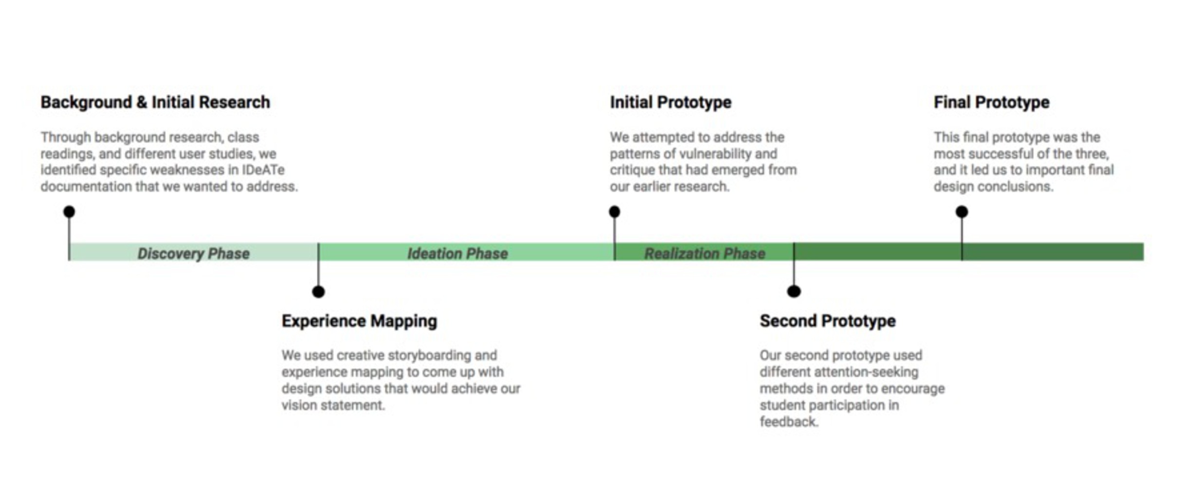
Screen shot 2017 12 17 at 8.41.14 pm.thumb
Show Advanced Options

Discovery Phase

Our semester began with a “discovery” phase, which familiarized us with the Maker Ed challenge and existing documentation practices within the IDeATe program. We developed our initial research findings through several rounds of user studies. This research phase was critical in identifying the needs of our clients, both IDeATe and MakerEd, and using these to form design implications for our continued concept and prototype development.

Below, we present some of the pictures and checkpoints along our discovery phase:

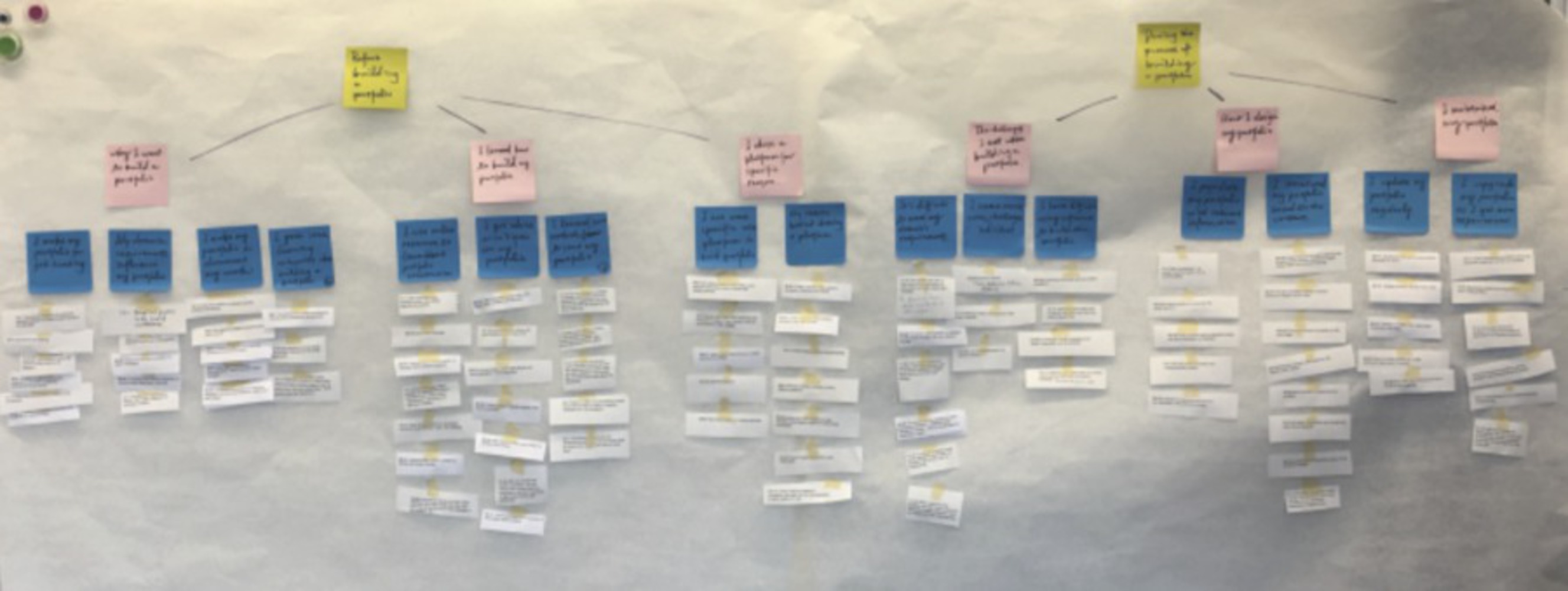
        • We first conducted interviews to understand more about general documentation and portfolio practices. This took the form of interviewing 4 different portfolio creators, and we used affinity mapping to analyze the resulting data.
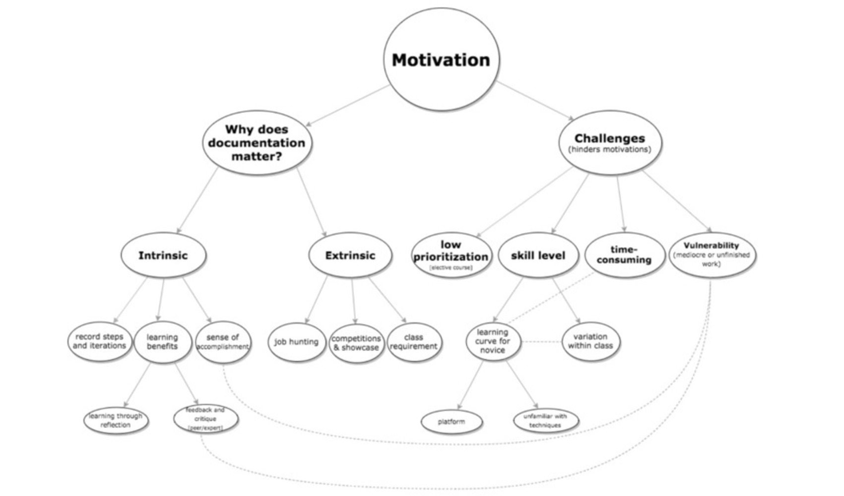
        • After the exploration into general documentation practices, we investigated current documentation practices within the IDeATe program. One major theme that emerged was student motivation, and we created a concept tree rooted at "Motivation" in order to pinpoint several specific areas that our design solution could target.
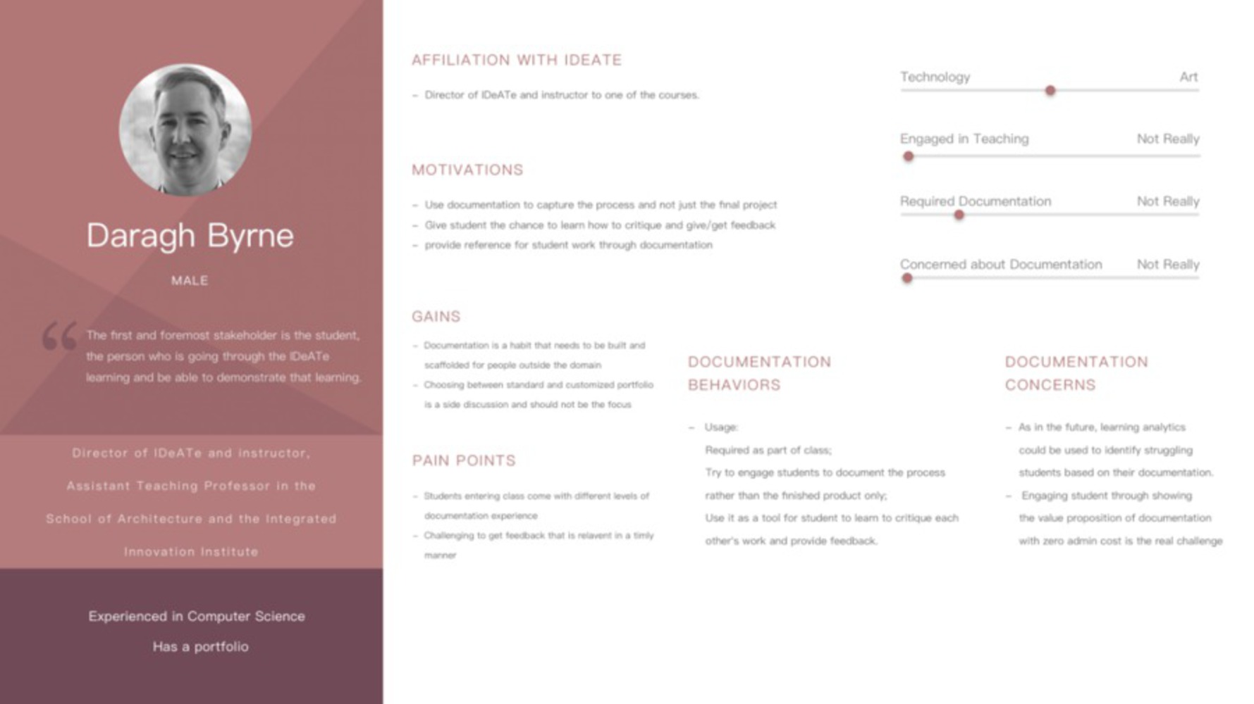
        • We also developed user profile insight boards, which helped us understand the varied backgrounds, talents, and experiences of our user study interviewees.
Screen shot 2017 12 17 at 8.49.52 pm.thumb
Show Advanced Options
Screen shot 2017 12 17 at 8.49.30 pm.thumb
Show Advanced Options
Screen shot 2017 12 17 at 8.46.51 pm.thumb
Show Advanced Options

Concept Generation

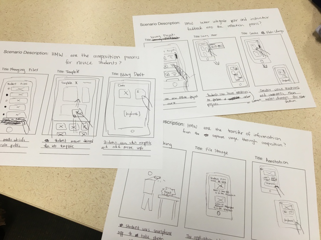
Once we finished the initial discovery phase of background research and user studies, we needed to begin generating concepts about what our design solution should look like. We had a general guideline of design needs, formulated by analysis of our user study results, and we also had our vision statement (found in this paper’s Overview section). The next step was storyboarding different design concepts that could address these design needs. 

Img 2447.jpg.thumb
Show Advanced Options

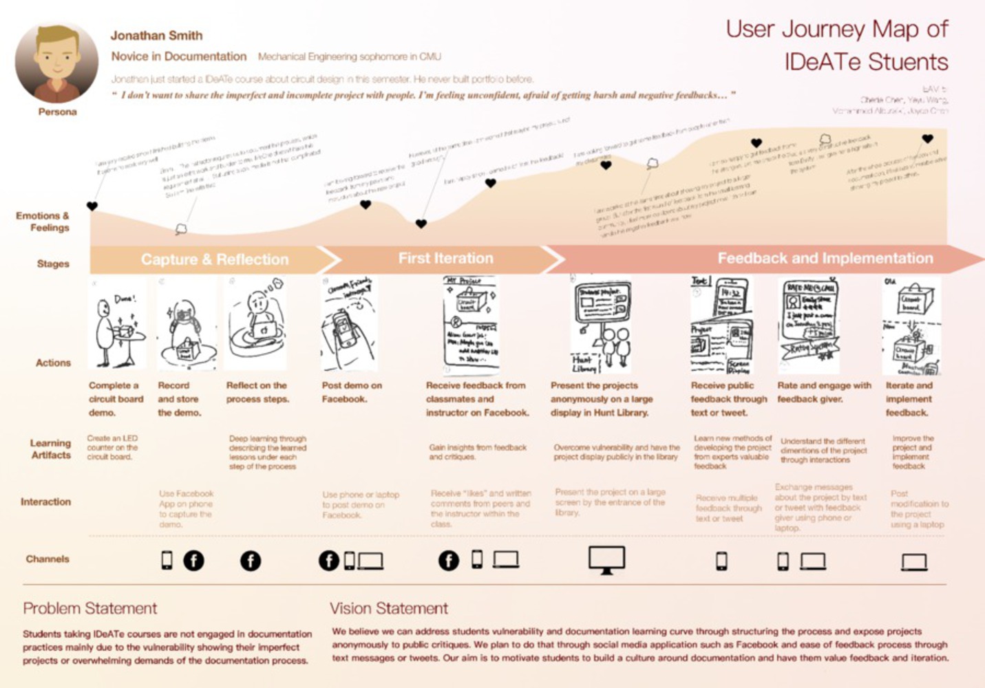
We also outlined and created a user journey map of the documentation process. This map, originally presented as a large poster for in-class presentation, is presented below. It includes a model persona, a mapping of the emotions and feelings of an IDeATe student through the process of project documentation, and the specific actions and interactions that the student would experience along this journey. In this journey map, we inserted some of the unique ideas from our storyboarding concepts - the idea of public feedback during the critique/iteration cycle of a student project.

Screen shot 2017 12 11 at 6.06.00 pm.thumb
Show Advanced Options

Prototyping

We moved forward with prototyping this public feedback system. The basic idea was to use a large monitor or screen to display a student project, and then passing students could stop for a moment and provide feedback about the project. Below, we present the three iterations of prototyping in order:

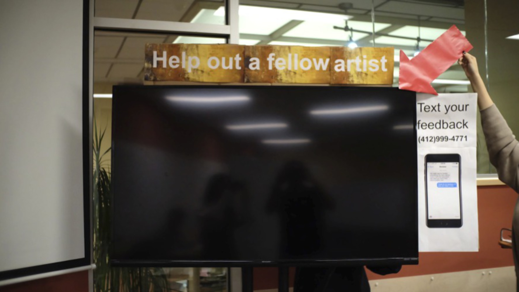
First, we used the large TV monitor and set up signs around its perimeter. We moved this large TV screen into the lobby near the Maggie Murph Cafe in Hunt Library, and we showed a student design project on the display. Unfortunately, we did not receive any active participants over a 1-hour period of supervised observation.

Screen shot 2017 12 17 at 9.07.26 pm.thumb
Show Advanced Options

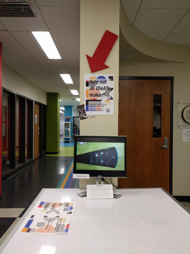
As a result of the first prototype's failure, we identified the following factors to change as we moved into a second iteration: 

  • Location - For our next prototype, we should move somewhere closer to the IDeATe community (perhaps the IDeATe basement, which houses the fabrication labs and lending resources for the program).
  • Feedback method - For our next iteration, we should provide a more convenient method for feedback and response.
  • Call to Action language - The call to action should appeal more to the IDeATe and Maker movement, since these are established communities with common student passions.
  • Display format - The project display should be both concise and visually appealing.
Img 20171204 195631.thumb
Show Advanced Options

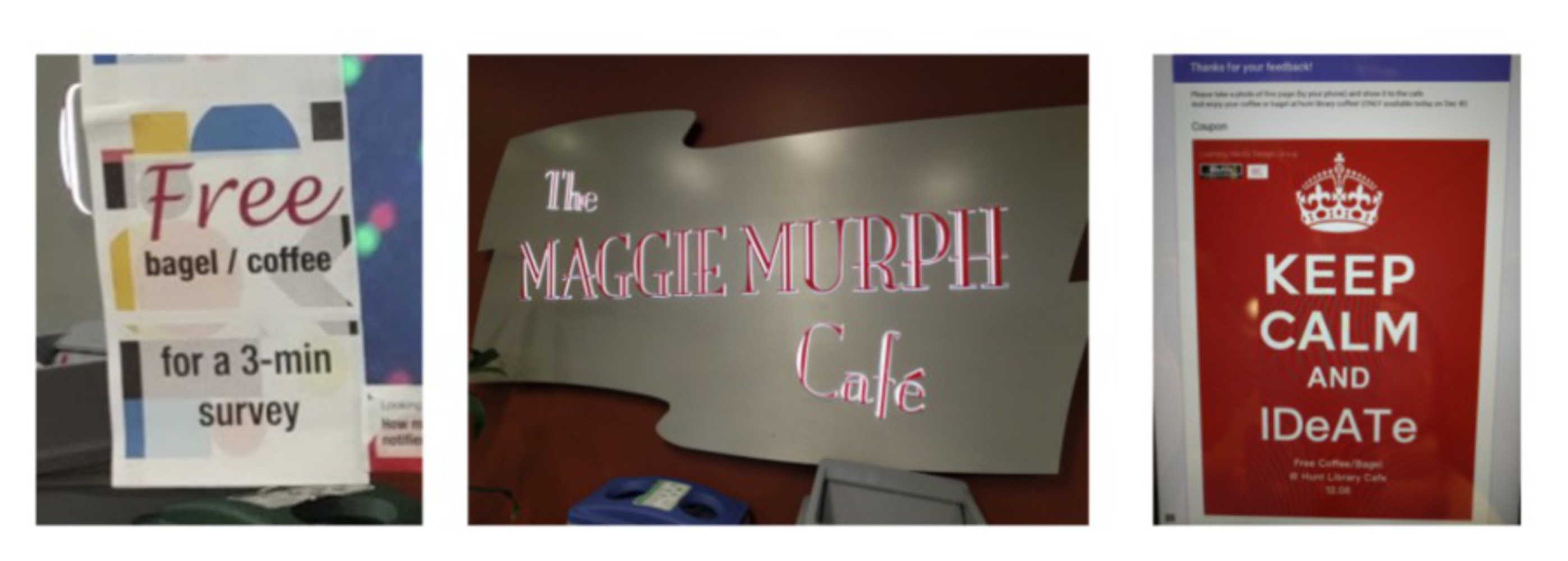
Unfortunately, this prototype also did not generate the success we hoped for. After long discussion, we attempted a third iteration of prototyping. For this iteration, we used both locations (the first floor and basement levels of Hunt), we changed some wording to appeal more to the IDeATe community, we added more project description to display on the screen, and we added a sense of extrinsic motivation (free coffee for answering our survey).

Screen shot 2017 12 17 at 9.09.56 pm.thumb
Show Advanced Options

Final Design Recommendations

Synthesizing all our research and findings from all the three iterations, we concluded that a successful public feedback system should include the following:

  • The presented project should be simple enough for the audience to quickly understand the concept.
  • The optimal presented project should align with audience passion.
  • The public feedback system should be intuitive to use, with optional channels to communicate back and forth with a project creator.
  • The public feedback system should be set up in a common location, to develop the habit of feedback-giving in the community.

Future Implementation

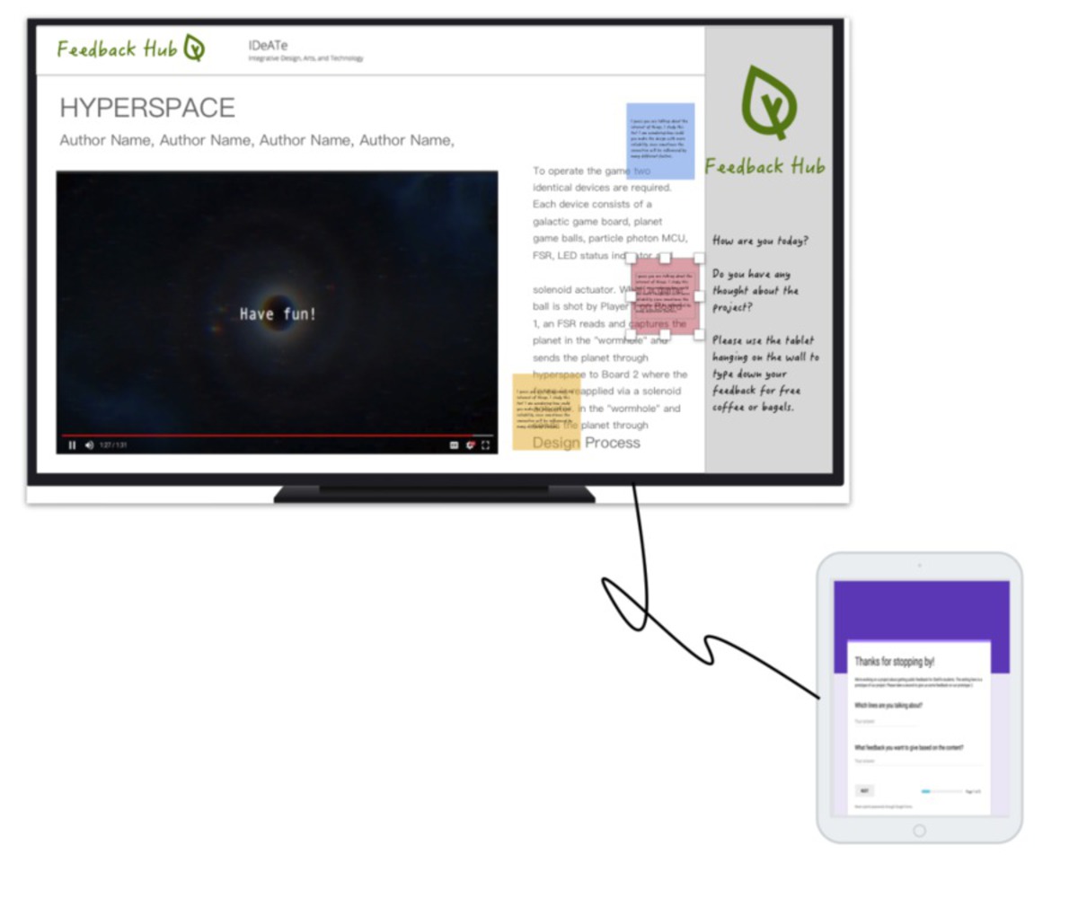
Moving forward, we also generated mock-ups for what a fully-implemented "Feedback Hub" might look like. The interactions are similar to what we had set up throughout our prototyping, but this imagined system could be more easily scaled and could run unsupervised. The monitor would display the project (both the video and the description, so that passersby could easily understand it), and it would also show feedback provided from other users. Attached to the monitor would be a tablet, where users could enter in the feedback on a survey form. Survey answers would be added to the monitor display, and project creators could then use this public feedback to iterate on their designs.

Screen shot 2017 12 17 at 9.14.41 pm.thumb
Show Advanced Options

Final Thanks

Finally, thank you to everyone who helped make this work possible. We could not have finished this project without the excellent guidance of course instructors Marti Louw and Francis Carter, our Maker Ed contact Stephanie Chang, our IDeATe points of contact Kelly Delaney and Daragh Byrne, and all of the course visitors throughout the semester. We also want to thank Carnegie Mellon University and the overall IDeATe program, as well as Hunt Library, for providing us an overall space to develop and iterate on our prototypes.

Drop files here or click to select

You can upload files of up to 20MB using this form.