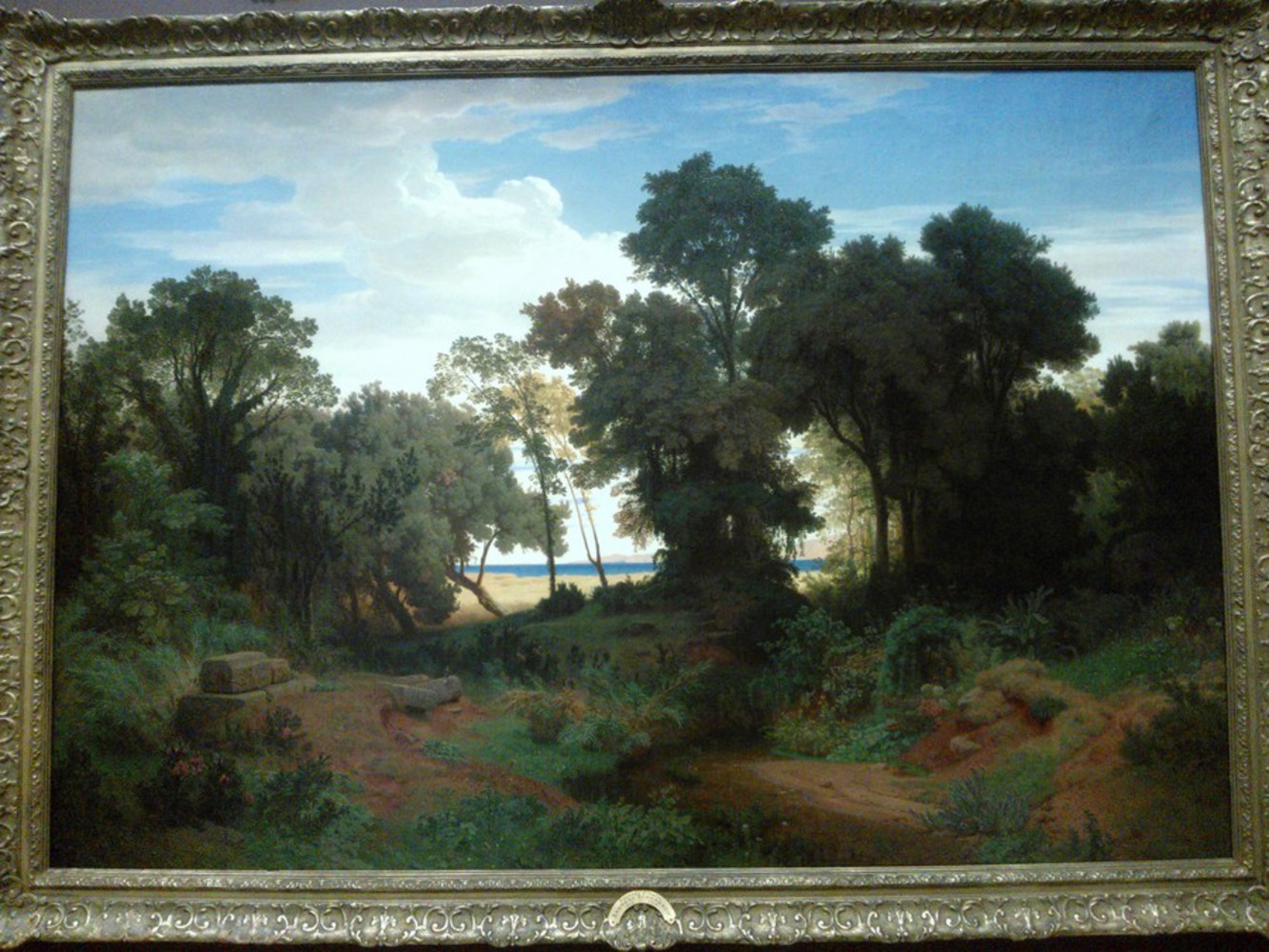
Realism Painting : Paysage D' Italia
By Andreas Aschenbach (1815 - 1910)
When I first looked at this painting, I found it interesting mainly because other than the greenery, it seemed utterly devoid of life. Even the parts of the beach and the sea that we can see do not have any signs of life there. However, on closer examination, this is not the case. The artist seems to have left in the bare bones of symbols representing other forms of life. If you look at the rocks settlement on the bottom left area of the painting, there is a small bird perched on one of the rocks, staring at the open view of the beach in front of it. Furthermore, the rocks in that area somewhat resemble the remains of campsite, as the the rocks are arranged around the edges of a center that could very well have been used for a campfire. This is what I mean by the bare bones of showing evidence of life. Another instance, that is harder to see in the picture above is in the middle of the right area, in the dark area underneath the trees. You can't see it here, but there is a stone wall there, that could only have been built by humans. It seems like perhaps the artist wanted to show that this area had life here in the past, but not in recent times. This is also clear from the fact that there are no traces of footprints, or trampled grass anywhere in the forest.
Next, I started to think more about the contrast between the forest and the beach. The colors of the dirt trails in the forest, with the small stream in the middle, adds a dark tone that contrasts with the bright colors of the open beach just steps away. However, this actually resembles how that environment might look in reality. The sun seems to be shining down from the horizon and seems to be shining towards the forest. The cover of the tall trees block us from seeing the sun, and also leave the forest in darkness. I feel like the artist could have made the painting more realistic by letting small streams of sunlight cast through and having the trees cast shadows but clearly, he did not want that. Instead, the artist filled up the skies near the forest with clouds, and only some of the trees closer to the beach have sunlight shining down on them, but the trees further away do not have any. This could be to further show the contrast between the forest and the beach.
Something I thought was interesting was how the only open views of the beach were placed near the center of the picture. Also, the skies directly above the beach was very cloudy but the skies to the right were not at all. The author probably wanted to focus our attention on the beach itself, almost making it seem like the light at the end of a tunnel. This was when I realized that perhaps this is the type of scene someone taking a journey through the forest might long for when he starts tiring of the long hike. The view of the beach boosts his morale and is meant to lift his spirits since his goal is in sight. The earlier contrast I mentioned between the dark forest and sunny beach exemplifies this. In a way, the small bird on the rock looking intently at the beach also symbolizes how the beach is the goal. Even the name of the painting (Italian Passage), seems to imply a journey through a passage of some sort, and this painting's purpose is to depict the end of that journey.
Another point of note are the mountains in the horizon of the beach. They could simply be there as background scenery, but it could also be that they are there to symbolize another journey. Something like, the end of one journey is only the beginning of another.
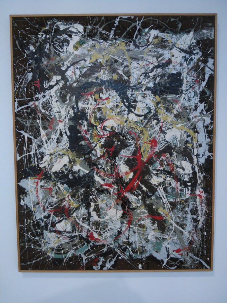
This painting caught my attention in how it looked like a giant mesh of colorful strings, all strung together to make some a web and cocoon like space. In order to make sense of this painting, I first focused on the different components of the painting. For one, there are 8 different colors in this painting as far as I can see. There is white, light-blue, grey, yellow, teal, brown, black, and red. Each color seems to have a different purpose and there are different layers of colors too. The color red is the very first layer, above all the other colors. Then, comes the color yellow. Next, the black and grey layers seem to interleave with one another but both stay above the remaining layers. We then have another interleaved layer in the form of light-blue and teal. Finally, the white layer, followed by the brown layer at the very bottom.
It seems quite clear that the brown color has been used to signify space. It was mostly used to color the boundaries of the painting and also a small brown blob in the center seems to function as a nucleus, with the other colors flowing around it. The white color is what gives this painting a web-life appearance. It permeates the entire center of the painting and forms the base of this painting. I feel like this might signify a clean slate that has been marked with various flow patterns from the other colors. The other colors all streak across the white web, in different thickness and clumps. The black is the thickest, which makes sense as it is the opposite of white, and seems to be destroying its base. I started to wonder if the different colors represent different types of events, and the emotions that surround such events. This painting was made the in the aftermath of WWII after all, so that definitely had an impact on this painting. Perhaps the black symbolizes the painful memories, while the thinner, lighter colors like yellow and red signify newer, happier memories. As such, the layers could have a deeper meaning of time.
Another interesting point is that different colors are more prominent depending on their distance from the boundaries of the painting. The teal and silver colors are more common towards the edges while yellow and red are more prominent towards the center. Perhaps this distance represents the proximity of those events to the artist's life, to the center of his world, represented by the brown nucleus in the center. The color grey has streaks throughout the painting, literally making them events representative of grey areas. Events where it is hard to judge wrong or right.
The concept of flow is interesting in this painting too as centrifugal force seems to be a pivotal point to this painting. When looking at it from a distance, I was struck by how you could make out a whirlpool like flow in the painting. However, the flow isn't always continuous; it is broken apart at times and joined up together again at times. The black streaks especially break the flow more while the lighter streaks start the flow more often. The flow itself could be representative of the flow of events.
Conclusion:
I looked at the realism painting first before the abstract painting. As a result, when I first saw the abstract painting, I attempted to break it down in the same manner. However, I tried to look beyond the symbols I could make out and attempt to look at the under-structure of the painting after a while when I couldn't get any further with my original method. Both paintings seem to be similar in what they want to depict, but the manner in which they depict is different. Also, the realism painting uses more linear methods of painting but the concept of flow is instrumental to Pollock's piece.
You can upload files of up to 20MB using this form.