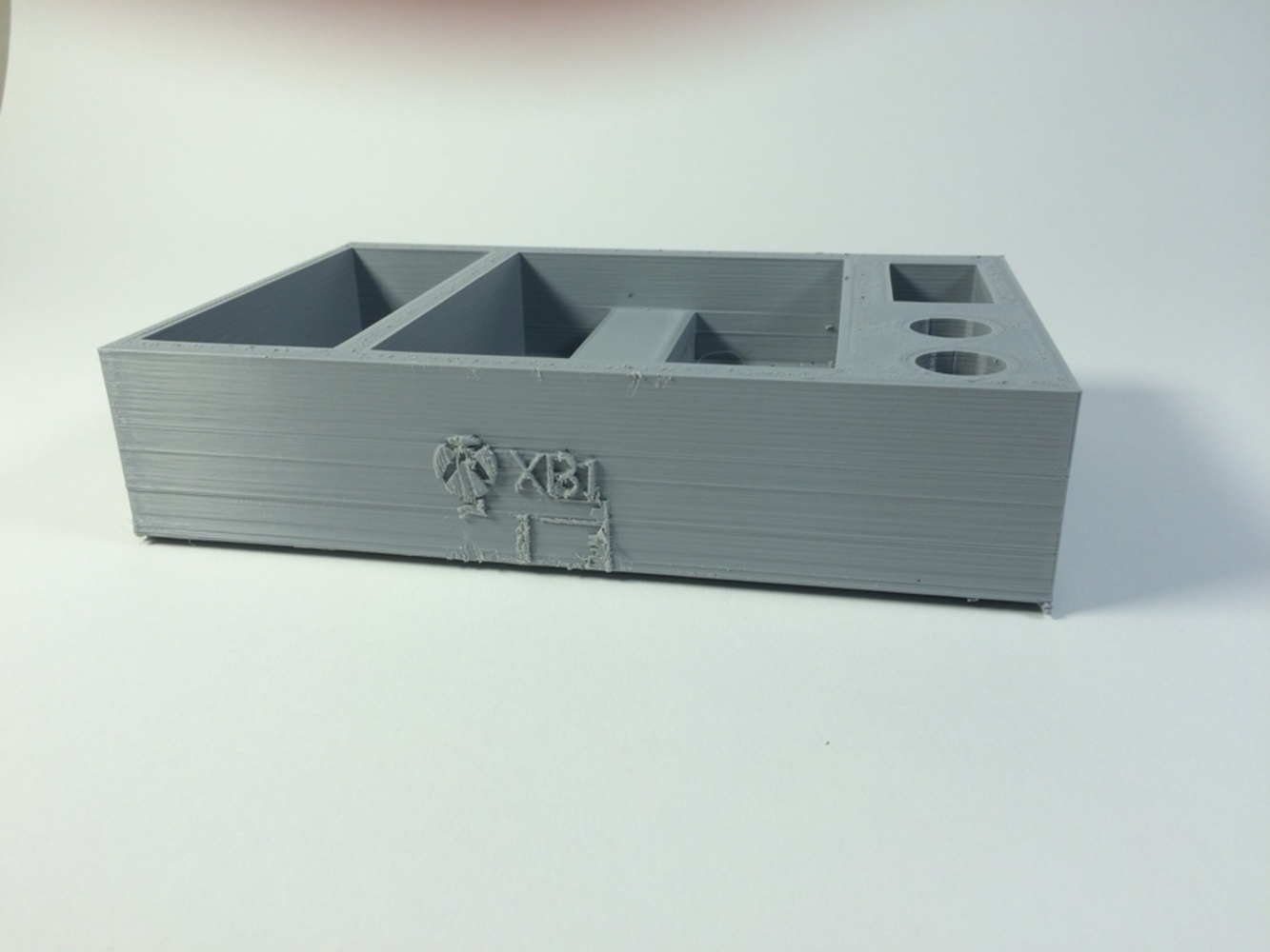
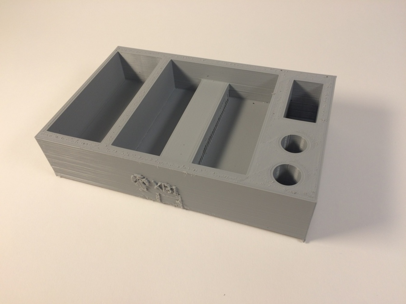
Reflection
PROS
• Holder’s size is relatively compact when the amount of stuff is can hold is considered
• Relatively light – easy to move around
• Not fiddly to insert anything into the compartments
• Durable – it’s just one part so things are unlikely to fall off/break off.
• Fits in the designated area
CONS
• Looks boring (simpler may not always be better)
• Things can fall out of their compartments if the holder laden with things is jerked/moved around quickly
• Design could be optimized to make it smaller but have the same carrying capacity. This would reduce print time, weight, cost, etc.
• Forgot to put supports for the text on the side
If I were to make a second prototype, I would change:
What would change:
• Reduce spacing between the compartments
• Use supports properly, so they break away easily instead of requiring a hack saw
• Color
• Add some more detail, like more writing on the side
• Potentially a lid to prevent things from falling out during transportation of the holder
What would remain the same:
• Exterior dimensions
• Interior capacity
• Method by which is holds its contents
• Overall layout
In conclusion, this project has taught me how to use Fusion effectively, how to design a project in a systematic manner and how to present my ideas in a way people can understand. In the future, I would incorporate more complex geometry (like lofting and sweeping) into my models.

